Design
Looking for inspiration, design tricks, how to make a great cover, promoting your yearbook and engaging your community?
Most recent
.jpg)
4 tips to get you print ready
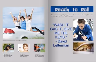
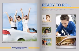
As soon as January rolls around, teachers, students, and parents begin the countdown to summer vacation. Are we thinking of finishing the yearbook yet? Before the glorious moments of sunshine, vacations, and empty calories arrives, the myriad end-of-the-year festivities dominate our, ahem, social calendars. From Teacher Appreciation Week and school elections to school carnivals and yearbook singing parties, the final days of school life are packed. In between all the things, the yearbook is awaiting its final moments of the design cycle. Working with the Treering Community Advocate Team (CAT), we put together this list of things to know before flipping the switch to go print ready.
1. Help is here!
Really, help is here, here, and here:
- On the blog, find ideas.
- In the Help Center, receive 24/7 support including video tutorials so you can move at your own pace. Additionally, over the phone, live agents will help you flow portraits, set up your cover art correctly, apply theme packages, update your page count or deadline, upload your own designs, and do anything else you ask.
- In live Yearbook Club webinars, learn and connect with other yearbook coordinators.
2. Before you go print ready, proof in print
A month before you expect to finish your yearbook, order your printed proof. A printed proof is an exact copy of what your yearbook will look like once you toggle the Print Ready switch and send your book to print. Works in progress are welcome! We encourage you to double or triple check
- Portrait names and class/grade assignments
- Cover art alignment
- Formatting and page count
3. You have options: sorting
Every school handles yearbook distribution differently, that’s why we let you choose how you want your books packed. You can opt for books sorted
- Alphabetically by last name
- Grade, then alphabetically by last name
- Teacher, then alphabetically by last name
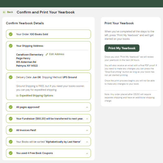
Are you ready to make your yearbook dreams a reality? Tick the boxes to send your hard work to production.
4. Cross the finish line
You tell us when you’re ready to go to print. With flexible deadlines and no late fees, you can take all the time you need to make sure your book is absolutely perfect before sending it off to be printed. At this time, you will confirm the bulk shipping address, approve all the pages for printing, and decide how to use or receive your fundraiser earnings.
As soon as your book is set to Print Ready, you'll receive the Final PDF of your yearbook directly in your email inbox. Take a few minutes to carefully review the PDF and make sure everything is exactly as you want it. Look out for any errors or mistakes that might have slipped through the cracks. This is your chance to give your book one last look before it goes to print and to make sure that everything is exactly as you want it. If you find something that needs correcting, you can choose to pause production for a short period of time during the review process to make those changes.

The only yearbook page template you need
A yearbook page template is one of the best ways to save time (and a ton of sanity) during the yearbook layout process.
All too often, though, we talk to yearbook advisers who are skipping them for the same reason: They don’t want to use the same template over and over and over again, on every page. They think that’d be boring.
Fair enough.
In fact, we won’t even try to argue. That would get boring. But you know what? There’s a way to fix that.
You can take one yearbook page template and turn it into four different ones that’ll give your yearbook pages that cohesive, but not boring, look. The trick is so easy you’ll be laughing, and so effective you’ll pinch yourself.
What is it? Why does it work? We’ll get to that. But let’s start by looking at what makes page templates so valuable in the first place.
Why yearbook layout templates are a go-to resource
When yearbook design is done well, the pages flow, the photos stand out, and the copy complements the visuals.
If you try to achieve all this from scratch, you’re looking at an huge amount of work that requires pro-level design knowledge and a significant time investment. (And let’s be real: You can’t always find that on your yearbook committee.)
That’s why page templates have become a go-to resource. Yearbook page templates:
- Simplify the design process: Templates allow you to drag and drop photos into placeholders, add copy, and… that’s it. No need to stress about page setup or search for a volunteer with a design background.
- Control the overall book design: Templates give you a set structure. This means yearbook advisers can control the layout process without micromanaging or limiting the people who help out with design.
- Save time: Templates require less prep time and overall work. Plus, the learning curve is minimal—anyone with even a small amount of computer savvy can use page templates.
- Help teach design principles: Templates can help students volunteers learn the principles of great design. Students can express their creativity within the template structure, and gain more responsibility as their skills progress.
Since page templates are so helpful and there are so many options available, it’s tempting to fill your yearbook with a variety of layout styles. But that makes more work, and—good news here—it’s not necessary.
The solution—one that saves even more time and stress—is to get creative with just one template.
Sounds crazy, right? It’s not. One template, flipped into four, can result in a far better outcome than a variety of templates. Here’s how to do it.
How to create four unique layouts from one yearbook page template
Find a yearbook page template you love, and make multiple new ones by recreating it in three rotations. Because this type of thing can sound confusing, here’s a visual example of how to do it.
Original:
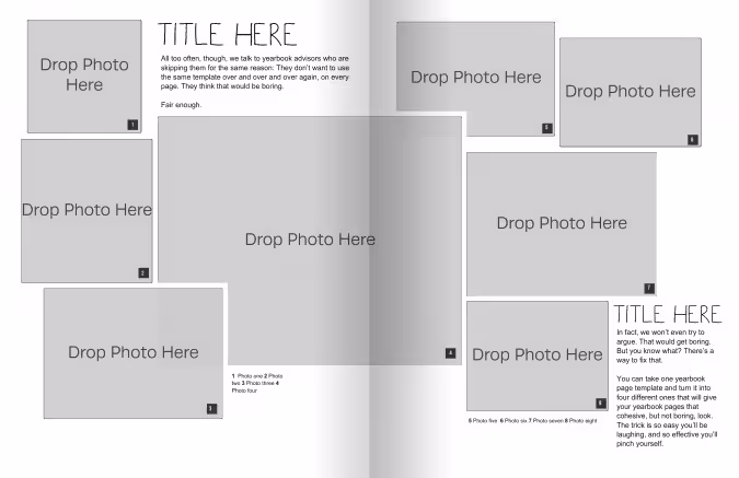
Now, let’s flip it vertically:
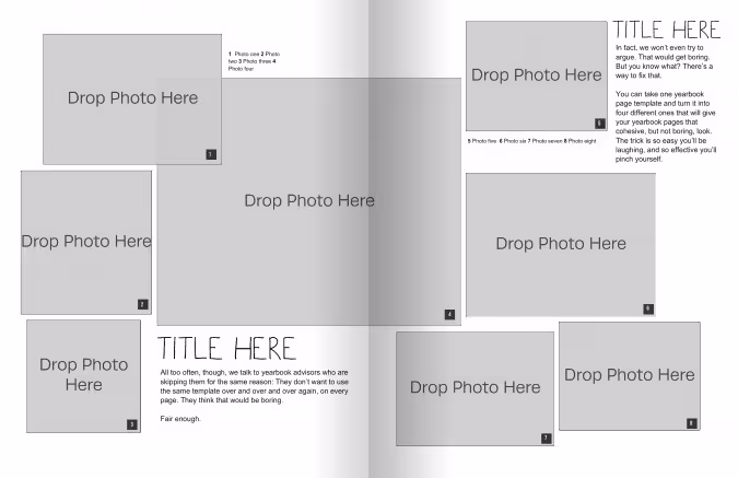
Then, we’ll take that template and flip it horizontally:
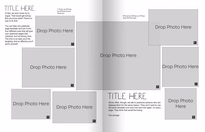
Last, let’s go back to the original template and flip it horizontally:
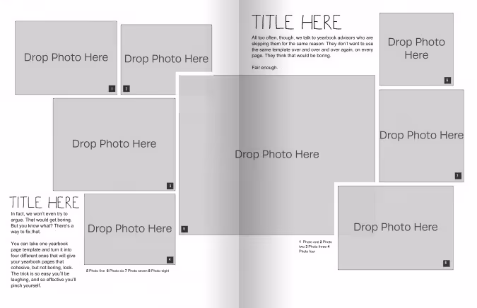
Notice how each one looks similar to the other, but still different enough to give some variety? That’s exactly what we’re going for.
By re-drawing the original template in different directions, you end up with four page layouts. Each one is unique enough to add variety to your pages, yet similar enough to give your yearbook a cohesive feel.
If you want more than four options, you can further adjust each template by adding or removing text or photo boxes to create new layouts. Or, you can mix up the portrait and landscape orienttaions of the photos.
These small alterations don’t take much time, but they give your entire yearbook a fresh feel. By approaching your yearbook layout this way, you get all the benefits of a yearbook page template—without the repetition.

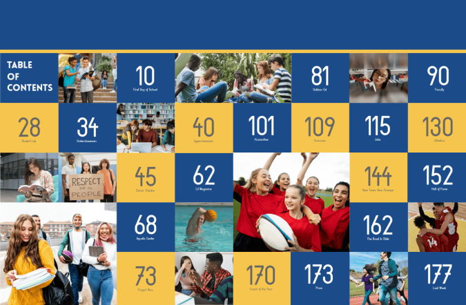
Table of contents tips
Form and function. A yearbook table of contents needs both. A well-designed one can make it easier for students and families to navigate, even in a smaller book. It’s another avenue to communicate your theme. And it’s also a layout worthy of those images that didn't make it elsewhere in the book.
Do you need a table of contents in your yearbook?
Yes, especially, if you do not do an index. A table of contents is the proverbial road map or neon directional sign for your book. It’s also professional.
Normally, I’m not a proponent of “everyone else does it.” This is an exception. Yearbooks are reference books. Reference books have tables of contents. Therefore, yearbooks should have tables of contents. (Somewhere, my son’s logic teacher is smiling.)
Tips for small yearbooks (<60 Pages)
If you're working on a smaller yearbook, here are a few additional things to keep in mind when designing your table of contents:
- Keep it Simple: Stick to the essentials and only include major sections or events in your table of contents.
- Use Space Wisely: You may not need a double-page spread; integrate your table of contents on the title page.
Tips for larger yearbooks (>100 pages)
For larger yearbooks, consider the following:
- Add Sub-Sections: Include sub-sections or categories to help readers navigate through the content more easily.
- Use Visual Cues: Incorporate visual cues such as icons or graphics to help readers quickly identify different sections of the yearbook. These should of course correspond to your theme.
How do you arrange a TOC for YB?
It may be tempting to tackle this first since it spans the first few spreads of your yearbook. Wait! You may increase sections or move pages through the design process.
- Let your ladder be your guide: A yearbook ladder is essential when planning your book and for creating the table of contents. Make sure your ladder and table of contents align.
- Determine the level of detail: At minimum, include the major sections: people/portraits, events, clubs and organizations, athletics, and arts. Larger yearbooks may need to create sub-sections.
- Focus on clarity: Ensure your sections and page numbers are easy to read and understand, even at a glance.
4 tips to integrate your yearbook theme
Because every detail counts when creating your epic school yearbook, there are a few ways to apply your theme to your yearbook’s table of contents.
1. Use Theme Colors: Incorporate theme colors into the layout for text, borders, or background elements.
2. Include Theme Graphics: Add graphics or illustrations related to your yearbook theme to enhance the visual appeal. This could be icons, symbols, or images representative of theme elements.
3. Custom Fonts: Choose fonts that complement your yearbook theme and use them consistently throughout your table of contents. This will help tie the design together and create a cohesive look and feel.
4. Creative Section Titles: Get creative with your section titles and use language that reflects your yearbook theme.
A well-designed table of contents is a requisite element of a school yearbook, helping to guide readers through the content and enhance their overall experience.
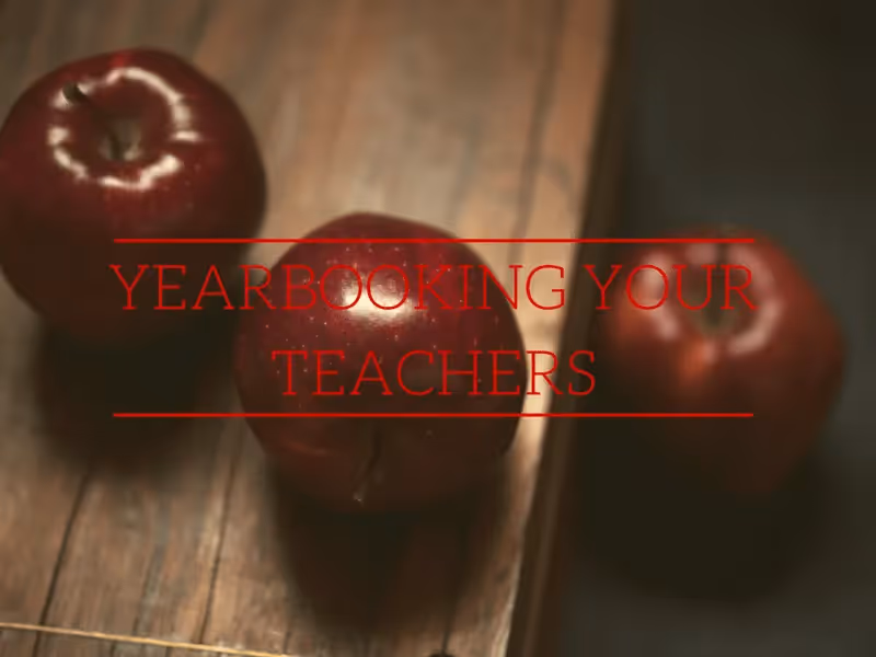
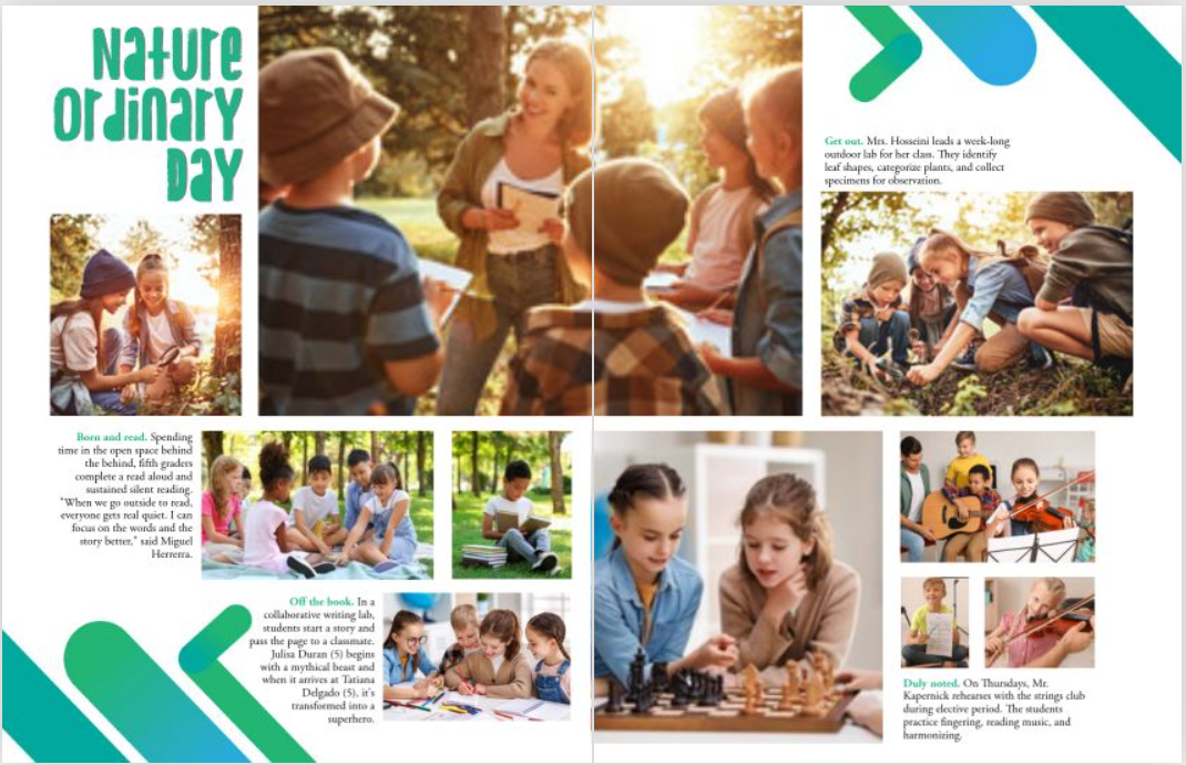
Fresh ideas for yearbook spreads highlighting your teachers
Teachers are the greatest, so you don’t want their yearbook pages to fall flat. The one thing teachers truly deserve (besides a raise) is an amazing yearbook spread or two. So let’s give these hardworking folks their due and give the student body something to talk about by including fun and clever teacher spreads in this year’s book.
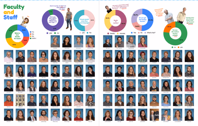
Here are some fresh yearbook spread ideas to capture a more dynamic view of your teachers and staff on your book’s pages.
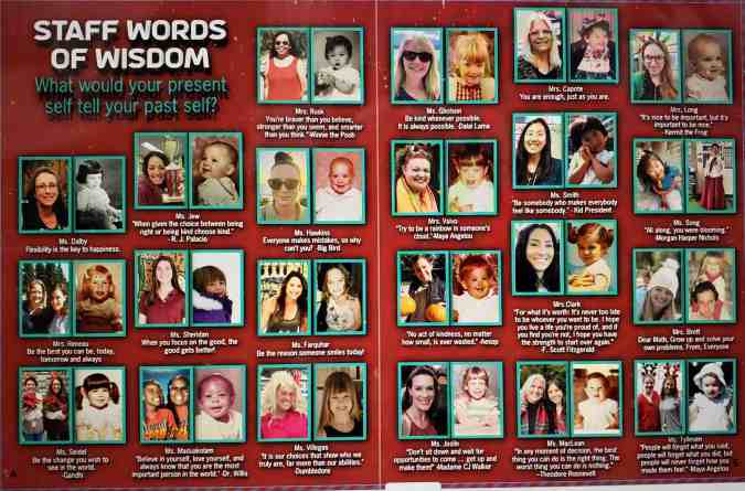
Throwback
Did you know that teachers were once students themselves? Well, of course. But this concept might be mind-blowing to some of the students at your school. Ask your teachers to submit images of themselves when they were the age of their current students and give a little insight into what they were like.
When I was a junior, our Chemistry teacher showed us a commercial that he starred in when he was a high school track star. It was hilarious (those shorts!) and it gave us a glimpse into our teacher’s background.
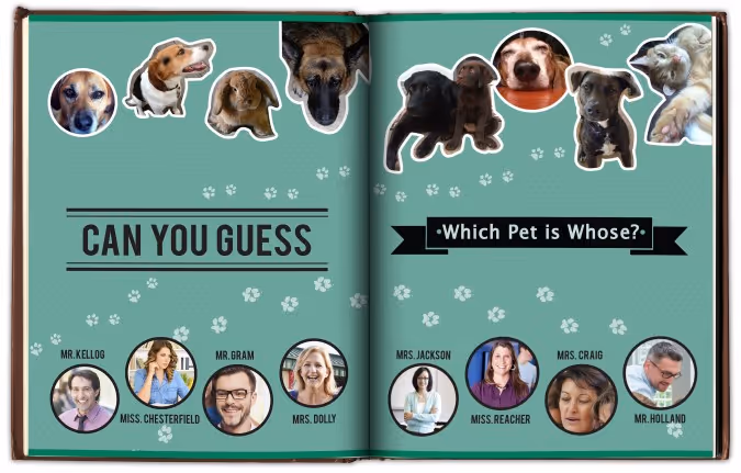
Teacher’s pet(s)
Create a collection of photos featuring your teachers with their adorable animals. Whether it’s a poodle or a piranha, there is a lot to be discovered by displaying these companions. To add some dimension, you could create a mod displaying quotes about different teacher’s childhood pets. Another idea would be to create a guessing game where you have to match the pet to the teacher.However you style it, animals are a big hit.
Just like us
Teachers seem like a different species to your students sometimes. So for a spread to tie everyone together, gather some similarities between your teachers and the students. You might have to poke around a bit, but you won’t have to look too far to find some teachers that enjoy a snow day, Taco Tuesday, or cheering on the team. Teachers stay up late to finish their work, play games on their smartphones, and like to get all decked out for Halloween. Finding similarities between the teachers and students will remind the reader that they are all part of a tight-knit community.
If I wasn’t a teacher
Poll your teachers on what they thought they were going to be when they grew up. Pick some of the best responses and use illustrations or Photoshop to make these ideas come to life. Everyone will get a little chuckle out of seeing their favorite teachers outfitted as cowboys, astronauts, soccer players, or mad scientists.
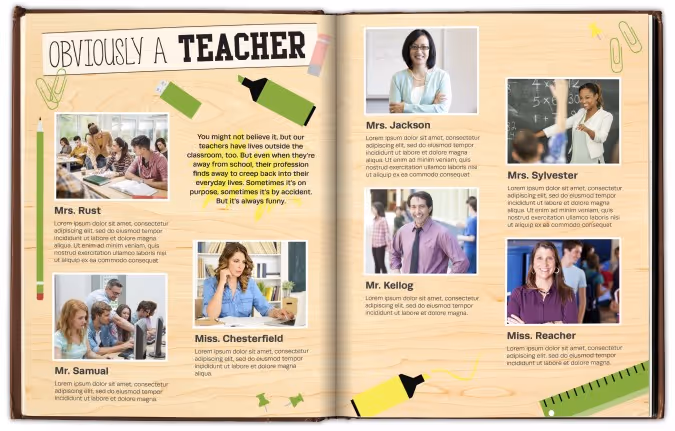
Obviously a teacher
A while back I was out to dinner with my sister. She reached into her pocket to retrieve her chapstick and managed to fish out two glue sticks and a flashcard. I immediately glanced at her inky fingers and the pencil in her hair. She was such a teacher at that moment.
So for an ‘obviously a teacher’ spread, ask teachers to identify their own moments like these and photograph the evidence. Whether it’s the day they realized that all their shoes were built for comfort or when they referenced their nephew being born “last semester,” every teacher gets the self-realization epiphany now and then. These moments are usually marked by a quick giggle; make room to share the laughs in your yearbook.
Two truths and a lie
It’s a simple game, on the surface: each participant provides three statements–two are true, and one is false. It’s up to everyone else to determine which is which. And it’s a great idea for a spread about your teachers.
Ask teachers to craft their three statements, and have them pose for the camera with their best poker face. Whether you include the answer key is up to you, but we’d recommend hiding the answers somewhere in the ads. For additional photos, you can show a mix of the facts and the fantasy for a really fun and creative spread.
The annual yearbook is a great platform to show your teachers’ human sides and cement a lasting impression for years to come. The best spread ideas contain an unexpected, personal glimpse into the teachers’ lives. So step away from the blackboards and apples, and provide a new, exciting spread.
Your goal is to add another dimension to the teachers that all work so hard educating today’s students. These teachers are wholly invested in their students’ futures, and the yearbook should be equally tenacious in capturing our teachers in their best light—as themselves.
2025 custom page design contest winners
You, too, believe every child deserves the spotlight. And when you took on the open-ended challenge to celebrate in style, your creativity, honesty, and heart were on full display.
We're honored to showcase the showstopping designs and the stories of the creators who brought them to life.
Grand prize winner
Narrowing down over 1021 entries to the top 100 took two days. We reviewed every submission carefully, appreciating the heart behind each one. Designs that went beyond the template rose to the top because they had personal touches.
In each round of evaluations and re-sorting, one spread stood out and eventually became the $500 Grand Prize Winner.
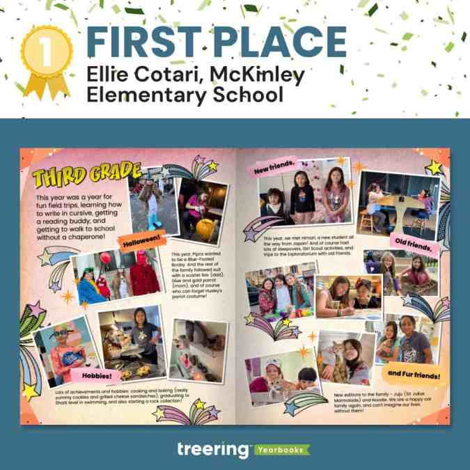
Why we loved it
It showed how design can be energetic and balanced. Both the warm colors and shooting stars are lively.
"It screams, 'third grade,'" a judge said.
And yet, with all that is going on, the main entry point is still the headline, and your eyes move in a circular pattern. There are verbal guides to highlight the five main sections. Cotari keeps it grounded by using a consistent photo style and typeface.
Cotari said, "It matches [my daughter's] personal style, hobbies and interests, and her playful personality!"
POV: people sent their favorite moments and somehow they're OURS too!
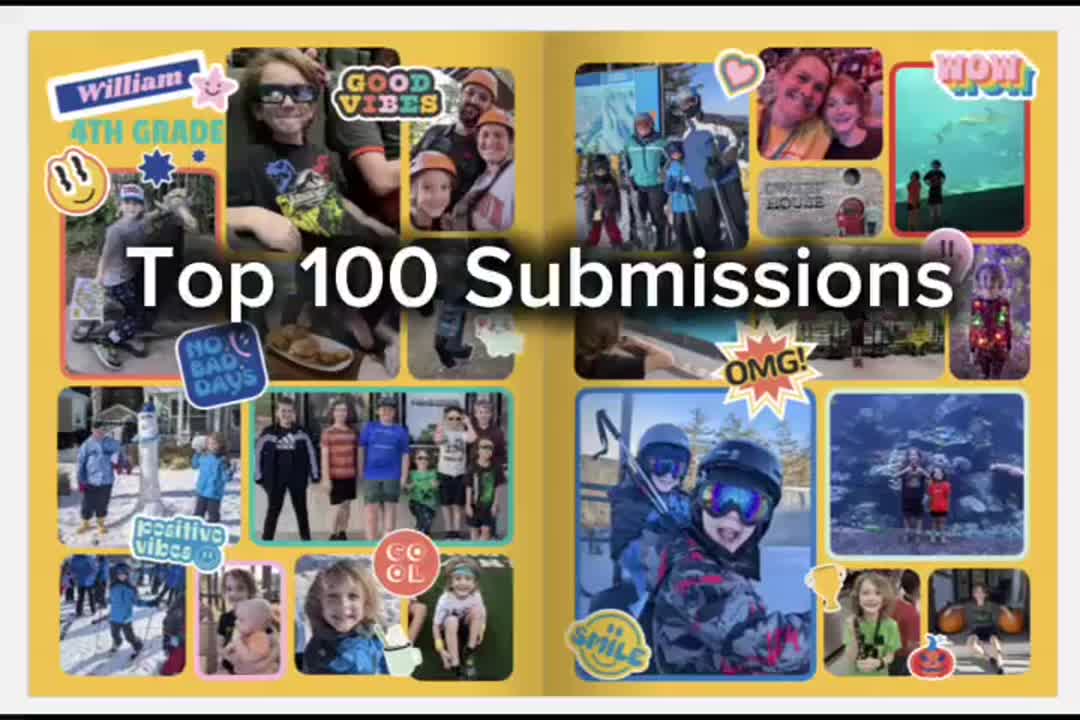
Nearly all the submissions captured a different perspective: students shone across academics, athletics, and activities. Grandparents held places of honor and remembrance. Together, we gushed over pet pics and cried over stories of overcoming trials. Check out the top 100 submissions before seeing the Big Ten.
Thank you for embracing the spirit of Treering's custom pages and giving your child the spotlight.
Custom page design contest finalists aka the big ten
A group of judges combed through the top 100 to create the top 25, then top 15, and finally, the top ten. Each of the runners up earned a $50 Amazon gift card for their visual interest and originality.
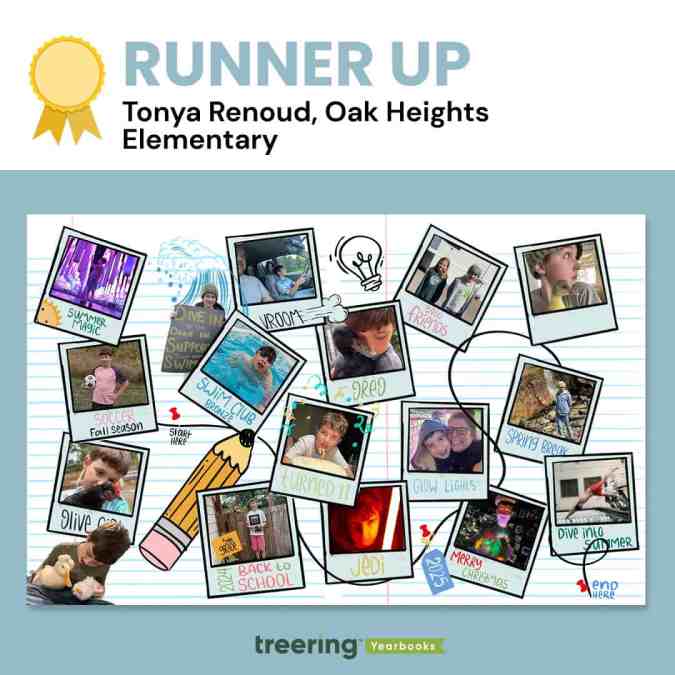
Tonya Renoud, Sweet Home, OR
Why we loved it
Renoud had us at start here.
"When he looks through these years later, he can walk down memory lane," she said.
This is exactly what she gave us. There is a path peppered with highlights from the end of summer to the start of next summer. Pets—this might be our first-ever duck submission—are especially timestamps in childhood.
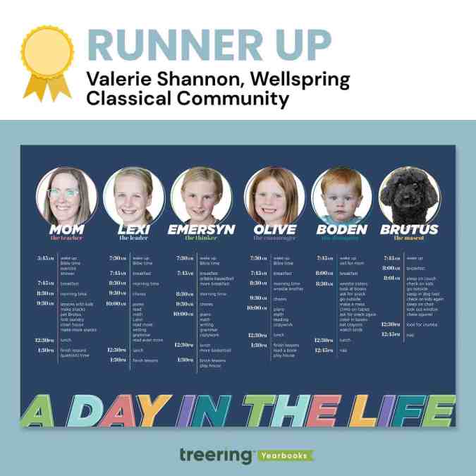
Valerie Shannon, Findley, OH
Why we loved it
Brutus and Boden.
At a glance, these two family members stand out because of their cute factor. Once we stopped to read, Shannon won us over with her tongue-in-cheek copy, which she called a "fun peek into our homeschool day."
"The theme of this year's contest was 'Every Child Deserves the Spotlight,'" a judge said, "and she managed to use her spread to give four kids, the dog, and herself a moment to shine."
Shannon's design is clean despite being full of copy. We love how she chose a color palette and anchored each family member's daily routine with one color using a tool line and circular frame. Both the frame and the knockout on the heading text are offset. It's these little details that elevate the design.
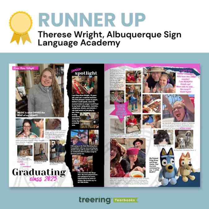
Therese Wright, Albuquerque, NM
Why we loved it
This was one of two magazine-style custom pages that captivated us. We loved the torn elements and how Wright used the black paper to highlight moments from her daughter's senior year. For Wright, these design elements held further meaning:
"Torn pages with rough edges, curving tracks, splashes of pink (representing moments of easier breathing) brighten up the darker moments that have strung these ups and downs together and keep her rock 'n rollin toward an unknown future, able to face each new challenge and sing, 'I am ready! Hold Tight!'" Wright said.
The watermarked roller coaster further illustrates the Wright Family's journey, which began with a 17-month ICU stay. Despite countless hospitalizations, communication barriers, and daily health challenges, Wright's daughter has persevered with strength and joy, communicating through American Sign Language and music.
This is the ultimate senior celebration.
"Albuquerque Sign Language Academy gave her a voice in the world and a place to belong from 1st grade to 12th," Wright said.
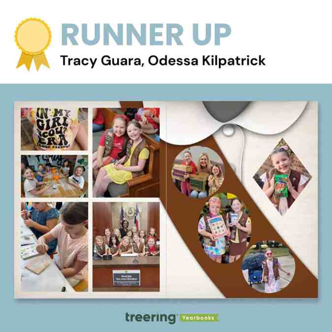
Tracy Guara, Katy, TX
Why we loved it
The photos as badges caught the judges' eyes, as many identified with this milestone as troop leaders or former Brownies.
"This is a moment in time," said a judge. "It's exactly what custom pages should be."
Guara's daughter is a fourth-generation Girl Scout who achieved badge and cookie-selling goals.
"I was honored to create this spread mimicking a Girl Scout Brownie sash," Guara said.
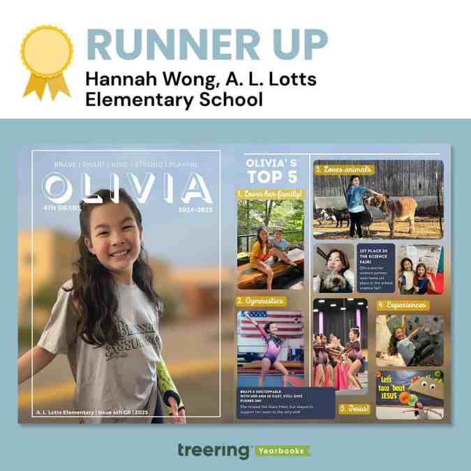
Hannah Wong, Knoxville, TN
Why we loved it
It looks complicated.
"This spread is not just a collection of photos and milestones," Wong said, "it's a heartfelt tribute to her dedication, growth, and the pride I feel as her parent."
The layers made it rich. With a single photo as background across the spread, Wong layered photos, editable shapes, and textboxes to create this magazine-inspired look. Even with all the content, she maintained alignment in her columns (the designers really geeked out over this) and pulled color from the background to connect the top five headlines.
While it looks complicated, the layout is clean and straightforward to recreate with Treering tools.
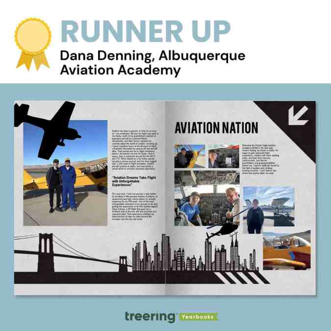
Dana Denning, Albuquerque, NM
Why we loved it
Everything points us into the spread.
Denning's choice and use of graphics here are masterful: the plane is flying toward the center, the arrow points to the center, and even the shadows on the skyline at the base of the spread lead toward the center. Additionally, her spread uses a design hierarchy we don't see outside of traditional yearbook pages.
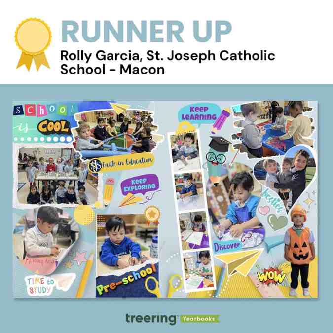
Rolly Garcia, Macon, GA
Why we loved it
It's cliche, but this spread truly put the cool in school. With playful colors, encouraging graphics, and photos of highlights in- and outside the classroom, Garcia captured the spirit of early childhood education.
"The filmstrip has those fine motor milestones in the classroom," said an educator-slash-judge. "We see pencil grip and dexterity skills developing."
Garcia said, "A notable element in the design is the paper airplane, which symbolizes the concept of 'soaring'—reflecting the idea that when students learn and grow, they are empowered to reach new heights."
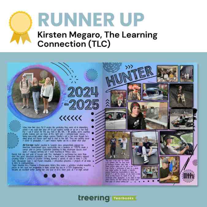
Kirsten Megaro, Great Meadows, NJ
Why we loved it
Megaro's extra touches of texture made us want second, third, and thirtieth looks.
"I know this was made in the Treering app," said a judge, "but I can't help but think it was first a pen-and-ink creation in a notebook during math class."
The judges loved the rectangle at an angle, the use of circles, and the font choices. They also emphasized the black scribbles and frames, which brought clarity to what could have been a complicated visual.
"We want to celebrate and remember the 'regular' moments of life," Megaro said, "not just the school-related stuff, so these pages allow us to do that and we love being able to look back on them from year to year."
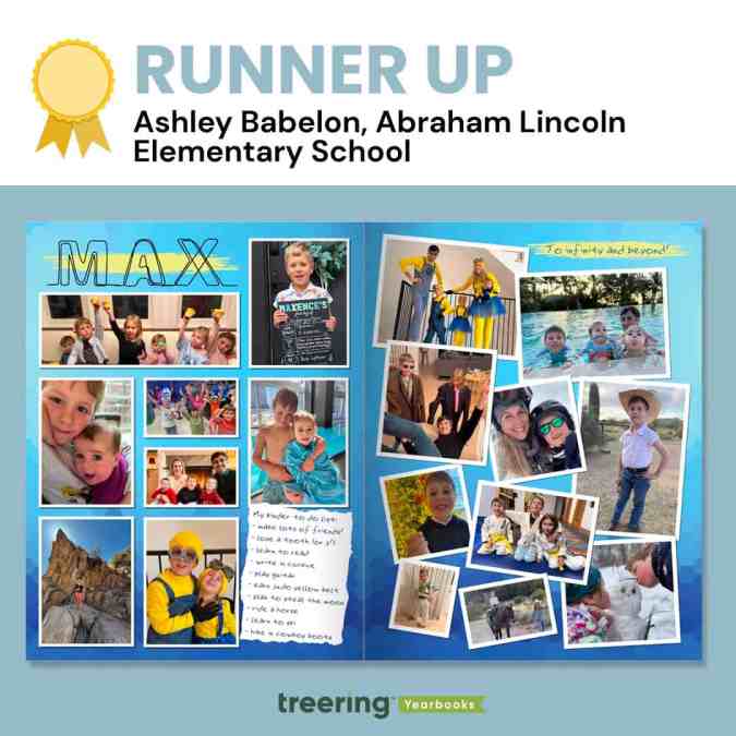
Ashley Babelon, Chicago, IL
Why we loved it
Max's kinder to-do list became an "eye spy" moment for us. We wanted to see if he ticked all the boxes. (He did!)
"Max also loves 'Toy Story' and Minions, and so the color scheme and font act as a mini time capsule of the things our little boy loves right now," Babelon said.
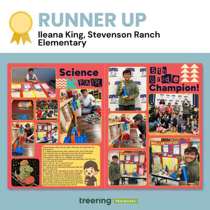
Ileana King, Stevenson Ranch, CA
Why we loved it
From the interview to the before-during-after photos, we loved the depth of coverage on this spread.
King said, "To add a fun twist, I used AI to create the sticker of a capybara and a T-rex, two of his favorite animals, riding a roller coaster. Then I added Treering graphics to make it look like Space Mountain, which is my son's favorite roller coaster."
One of the judges said, "This is one of the things you pull out when a future daughter-in-law comes over."
Thanks to all who entered and shared their story with us.

Scrapbook yearbook themes
Scrapbooks are deeply personal and emotionally charged. They’re where Millennial moms stash ticket stubs, scribbled notes, and snapshots. Students also lean towards the collage aesthetic via pop culture inspiration—like the Burn Book in “Mean Girls” or My Adventure Book in “Up.”
While the Burn Book itself is not the kind of sentiment you want to capture in a school yearbook, its visual style has inspired many scrapbook-themed designs: magazine cutout lettering, sticker overload, and chaos-meets-craft aesthetic speak to the way students envision personal memory books.
Likewise, Carl and Ellie’s book is a love letter to scrapbooking itself. It balances whimsy, sincerity, and nostalgia. (We’re not crying. OK, maybe a little.)
Three free Treering themes to get the scrapbook vibe
One of the best parts of the scrapbook yearbook theme is its flexibility. You can up the visual intensity depending on your staff’s skill level and your community’s taste. We have three complete yearbook themes that model scrapbook yearbooks.
Because a scrapbook style mimics personal journaling, students feel connected. It looks like their notes, their lockers, and, to an extent, their social feeds. The collage-inspired layouts also let you pack in more visual content, perfect for schools that crowdsource images from parents, staff, and students.
“Crafted” - intro to the DIY aesthetic
The 75 pre-designed templates have built-in white space and subtle borders, which gives a clean scrapbook look. The 64 graphics, which include a variety of torn papers and tapes, allow teams to add variety and rough edges. This look works well for journalistic high school books that want polish with personality.
“Collage” - scrapbooking to the max(imalist)
Lean into creative chaos with 862(!) design elements. This theme mimics a real-life scrapbook packed with overlapping images, ripped notebook paper, buttons, stickers, and magazine-style clippings. Because it is a maximalist look, you can create unity among the varied elements by
“Venture” - the vintage journal
Inspired by antique books, this yearbook theme includes 100 aged paper backgrounds plus 616 graphics including typewriter keys, delicate handwritten fonts, antique elements, and photo corners. The textures and photorealistic elements work well in layers with a handwritten or type-writer font. Like the maximalist approach above, remember the rules of design to keep it from looking cluttered.
A scrapbook yearbook theme works at any level, elementary, middle, or high school. It can look rustic and handmade. Retro and analog. Colorful and chaotic. Minimalist and soft. The best part? It doesn’t lock you into a single aesthetic—it's more of a concept than a rulebook.
Use a style tile as your yearbook style guide
Templates and online inspiration can make creating your yearbook so much easier…except when they don’t fit the style you’re going for.
It might sound like a big problem, but it’s not. You can easily fix any of this with a yearbook style guide.
Here are three tips on how to keep yourself honest—and your yearbook style consistent—with the easiest style guide of them all: a style tile.
Apply your style tile to a template
Going into your spreads after they’re laid out and applying your style to each page works–but it’s not the cleanest option. What can save you time would be to apply the style to your templated page layouts before any content is added, and have each page start out styled correctly.
When to Use: Before you start creating content and sorting through your photos, you will probably have some templated layouts you’re going to use for your pages. These might be provided by your yearbook company, and can be a boon when it comes to organizing. But they can be a bit generic, which is why you want to use the style tile to apply your design elements to each page.
How to Use: Your template has space allotted for different elements like photos, an article, and pull quotes. Using your style tile, you can update the fonts and sizes, and figure out where to incorporate additional splashes of color that align with your pre-determined style choices.
Why: If you’re applying your style after the fact, it’s easy to miss a color or font or caption somewhere. It’s much better to give a template the style treatment and standardize the style elements before you add content. Also, if you apply your style tile to the template and don’t like the look you’ve created, it’s easy to switch up your style before you’re in too deep.
Apply Your Style Tile to Outside Inspiration
There is great inspiration everywhere, and some of our best yearbook ideas can grow from a spread, picture, or concept we’ve found online or in previous yearbooks. But if you just take an idea verbatim, its style will probably clash with the rest of your book–which is why you need to reach, once again, for that style tile.
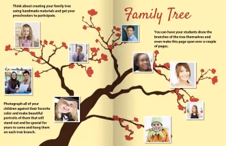
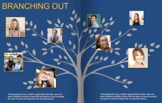
When to Use: Say you find an amazing spread layout, but it doesn’t conform to your style. Well, it’s time to bust out your style tile and get to work making it fit. Make that inspiration your own, and tie it into the rest of your book.
How to Use: In most cases, you will be off to a great start by swapping some colors and updating the fonts. For example, we found a great spin on a “family tree.” In order to make it work with the rest of our book, we switched our font and used a background graphic that matched our colors. With a few simple tweaks, it looks like it belongs with the rest of our yearbook.
Why: There are so many great ideas out there, but it can sometimes feel like fitting a round peg into a square hole. If you keep your style tile within reach while you’re surfing for inspiration, you will have a handy tool to help you visualize how something can work within the style of your yearbook.
Do a final run-through, style tile in hand
Before the book goes to print, you’re going to be doing multiple read-throughs, checking everything. Make sure design is one of those things you’re checking, and that consistency exists across all the pages of your book.
When to Use: You will want to proof the design on each page before your book goes to print. Style tile in hand, make one read-through just for style inconsistencies, just to be safe.
How to Use: Walk through your yearbook page by page with an eye on the style sheet. If something feels out of place, you can easily correct it by altering fonts or adding an additional color from your toolkit.
For example, as you assess the spread on the left, you would look at your style tile and determine the incorrect or missing elements. In this case, the size of the pull quote is gigantic and the font of your headline is different. This is easily fixed by correcting the font size, rearranging the content, and consulting your style tile for the correct headline font.
Why: There are a ton of things to look for when you are going through your final proof, so you need to take time to do individual run-throughs for each element, or something might get missed. For one read-through, keep your style tile close at hand, and hone in just on it. In doing so, you are making sure that the final design is consistent throughout your yearbook.
Style tiles keep your yearbook consistent
Using a style tile can help you stay consistent when customizing pre-designed templates and designing your own. What’s more, it’ll help you keep your design in check when you’re pulling inspiration from across the board. You’ve deliberately chosen each element of your yearbook’s style, from color to font, and your style tile will help that vision come to life by keeping a strong hold on your original intentions.

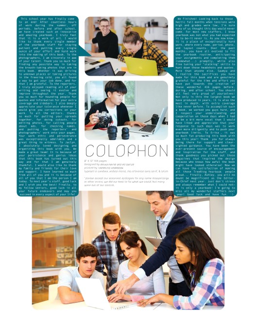
Three yearbook colophon ideas
What is a colophon anyway? Publishers include this vital piece to record production notes and sometimes acknowledgments. Since your yearbook is a historical document, including a colophon adds professionalism to your publication. But it doesn’t have to be boring! Below are three examples of yearbook colophons that include theme details, shout-outs, and yearbook staffing information.
Essential components for your yearbook colophon
- Title of yearbook and theme information: include any behind the design information
- Book details: the number of pages, cover type, and paper weight
- Design specs: font names sizes and use cases
- Photography credits: Identify your portrait photographer, staff photographers, and any volunteer super parents who contributed
- Software tools: list which applications you used to build your book
- Publisher information: name of the publisher and the names of the publishing staff who helped
Thematic colophons


Both of these colophons leverage their themes (Stay Gold and Speak Life, respectively) with the headlines as well as the graphics. (The actual copy of their colophons is below for you to use.)
A bold colophon
We love this one because it features the yearbook team, gives the book details in an easy-to-read format, and both editors have space to say thank you.
Yearbook colophon template
To create a quick colophon, copy and paste the following in your yearbook. Make it your own by giving behind-the-design details.
[Yearbook name] is produced by [School Name] in [City, State] and published by Treering Yearbooks in San Mateo, CA. The [hard- and/or softcover] yearbooks are [matte or glossy] finish [with upgraded embossing or foil]. The book's [number] pages are printed in full color on 100lb. sustainably sourced paper—the Treering standard. We used the Treering app for the layouts; [if applicable, list software used to make photo illustrations]. The theme art is [theme name from Treering] and [name] designed the cover. Headlines are [font and size] with subheadings in [font and size]. Body copy is [font and size]. [Photographer] took the school portraits and [parents, coaches, non-yearbook students] contributed [team, event, and/or candid] photos.
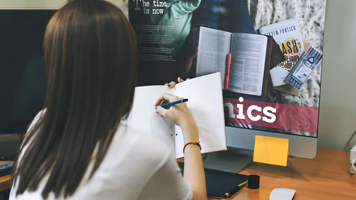
Yearbook fonts can make or break your yearbook design
Nowhere in yearbook design can a series of small or minor changes add up to create a dramatic difference as easily as yearbook fonts. Really, it’s true. Science says so: A Microsoft researcher and MIT professor found in two different studies that good typography can make a person feel better while reading and can actually make them think they’re reading for shorter amounts of time. Moral of the story? Pay attention to your yearbook fonts. Your readers will be happier, and they’ll spend more time with their yearbooks.
In this all-purpose guide, we’ll introduce you to the basics of fonts and typography, how to create a font strategy for your yearbook (which includes picking yearbook fonts, pairing them, and setting their size), and how to make the yearbook fonts you choose look great on your pages.
- The Basics of Yearbook Fonts
- How to Create Your Yearbook Font Strategy
- How to Make Your Yearbook Fonts Look Good on Page
The basics of yearbook fonts
In addition to making us feel what we are reading, fonts can actually speed up—or slow down—how quickly you can read. Science has our backs once again.
Readability is an important factor when setting your yearbook style guide. On printed paper—like yearbooks—the fastest, easiest-to-read fonts are usually serifs. On computer screens, like on this blog, the fastest, easiest-to-read fonts are usually sans serifs.
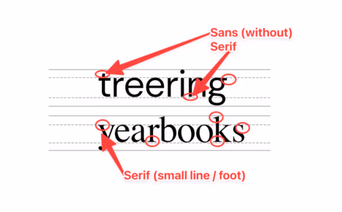
Sans serif fonts
Sans serif fonts are different from serif fonts in that they don’t have decorative elements at the end of the strokes.
Sans serifs are more commonly used online and in digital projects since they’re easier to read on computer screens. Because so many people read on computer—and phone—screens, though, sans serifs are more familiar to readers and growing more popular in print. They’re also considered to be a little hipper than a serif.
Some of the most common sans serif fonts include:
- Arial
- Helvetica (period)
- Calibri
- Open Sans
- Gill Sans
There are, of course, some other fonts, like scripts and decorative fonts. While they can be plenty attractive, they’re often not great for legibility—especially in large blocks of text. If you’re planning to use something a little different, it’s best to reserve those scripts and decorative fonts for headlines and your folio.
Serif fonts
Serif fonts have small, decorative elements at the end of the strokes on the letters. They’re more legible at smaller point sizes and are generally considered more conservative (think newspapers and academic journals). Like we mentioned above, they’re also easier to read on a printed page.
Some of the most common serif fonts include:
- Times New Roman
- Garamond
- Georgia
- Baskerville
- Cambria
How to create your yearbook font strategy
We already mentioned that fonts can change a reader’s mood, make text easier to comprehend, and speed up the process of actually reading while making it more enjoyable.
To do that, ask yourself these questions:
- How do you want people to feel when they’re reading your yearbook?
- Do you want your yearbook to look buttoned-up or trendy?
- Should the fonts you use be familiar to your readers?
- If you were to describe the look and feel of your designed yearbook pages, what words would you use?
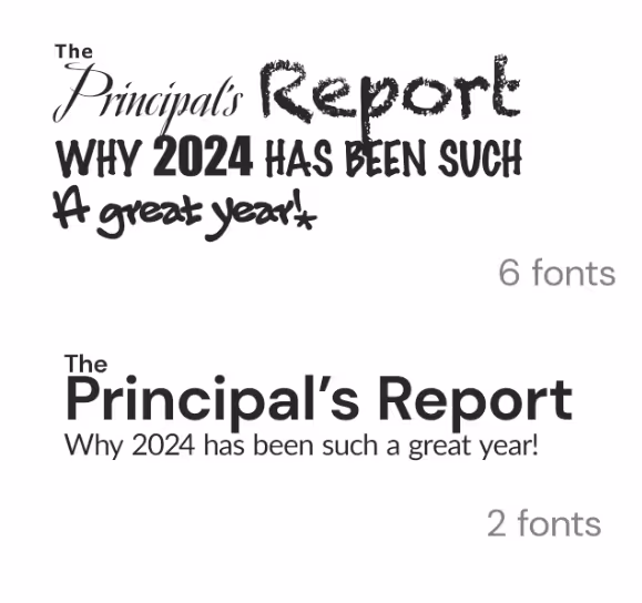
The answers will give you a strategy for your yearbook fonts, something that will help you cut down your potential choices to something more manageable. With thousands of fonts in existence, and hundreds in the Treering app, it’s easy to get overwhelmed. Your total number of yearbook fonts should pretty much always be two, and shouldn’t really exceed three.
How many fonts should I use in the yearbook?
Consistency is key for a balanced yearbook. Fonts are no exception. It’s better to use a couple of (literally two) well-chosen fonts than to have so many that they distract from your design. By limiting your yearbook to two (max three) fonts and assigning them distinct roles, you establish a precedent.
Create a style guide where you’ll be using the fonts you end up choosing. Your style guide should include every printed element of your yearbook like headlines, sub-headlines, body copy, photo captions, pull quotes, and page numbers. Once you’ve listed out everything, you’ll want to bucket these items into two groups:
- Theme elements: This is the group for headlines, sub-heads, and folio information (like page numbers, book title, and section title).
- Copy elements: This is the group for narrative text, photo captions, and pull quotes.
Historically, serif fonts have been used for copy elements, because they’re more legible in large bodies of text. (This adviser loves Garamond.) Sans-serif and decorative fonts, on the other hand, have historically been used for theme elements, since they’re generally considered to be more flexible.
If you’re to follow those historical queues, your font palette may look something like this:
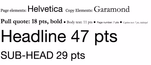
Two things to note here:
- First, just because folks have historically chosen serifs for copy elements and sans serifs for page elements, that doesn’t mean you have to.
- Second, you probably noticed the font sizes here. The best way to determine the various size elements is to use a scale.
When someone opens the book and focuses on a message, they’ll know what a headline is going to look like and what a caption is going to look like. They don’t need to think. Consistency allows your message to get right to the reader without distraction.
Setting your font sizes
Because your yearbook fonts can vary in legibility so much, you’ll want to determine a set of sizes that work best for the fonts you pick—and for your readers. Do that by setting a scale.
A font scale is an organized approach to increasing or reducing your font size, based on where that font is going. It’s easy to do, and once it’s set up, it’ll save you a ton of time.
To create one:
- Pick what you consider your most important element. For the sake of an example, let’s say “body copy.”
- Find a font size that feels nice and legible. Rule of thumb: Something between 10 and 12 pts usually works best for body copy. We’ll split the difference and use 11 for this example.
- Multiply—and divide—that font size by a predetermined ratio to get the font sizes for your other elements. There are a lot of ratios that typographers and designers use when scaling fonts, but one of the oldest is the Golden Ratio (we’ve been crushing on it for a long time ourselves). The Golden Ratio roughly translates to 1.618. So, you’ll use that number to scale up—and down—until you find the right sizes for each of your elements.
At this point, you’ve got a fully developed yearbook font strategy. Document it somewhere. That way, your team will have access to it when designing pages.
How to make your yearbook fonts look good on page
The cool thing about yearbook fonts is that you can slightly manipulate the way you use them to create a variety of different looks.
Justifying your text
One of the easiest, and most impactful, ways to create different looks is to play with your font’s justification. Justification is basically a fancy term for how you align your text.
There are a few different ways you can align text and different reasons why you might choose one style over another:
- Left Align. Your text is flushed with the left-hand side of the margin. This is pretty much a default these days, since left-aligned tends to be easier to read, and has a reputation as being more modern.
- Center Align. Your text is in the center of your margin, so it’ll end up surrounded by a good amount of white space. This helps draw attention to your text, so you’ll want to use this when you have something you want the reader to focus on, like, say, a headline.
- Right Align. Your text is flushed with the right-hand side of the margin. Given the fact that readers read from left to right, a right-aligned font block has a distinctive look. Some might even say unnatural. But if you use it correctly, it’ll look great. Use it for a pull quote to separate that block of text from the rest of the page.
- Full Justification. Your text is aligned to both margins. It’s a very traditional look that’s still used in legal briefs, court decisions, and things like that. If you’re looking for something really buttoned-up, this would work well for you (especially if paired with a serif font). Beware, though: If you justify your text, you’ll probably end up with some weird spacing between words.
Here’s an example of a page that features just about all of them:
Accenting your text
One of the best ways to make your text stand out (without switching fonts) is to punch it up with accents. You can use drop caps, accent them with graphic elements like highlighting, and stack your text to create more compelling visuals.
Here are a few headline examples to help you visualize the possibilities.
Drop cap
Highlighting text
Stacking your text
Remember, fonts impact the way people feel when they’re reading your yearbook, so have fun selecting the right ones!

7 yearbook mistakes to avoid
Avoid common yearbook mistakes with these tools and tiny changes to up your design and proofing game in the nth hour. Panicked, you shout, "Do I even have time to make changes?"
You'll make the time to avoid notoriety like this. 💚
1. “Unintended cropping”
Eeek: you created a legendary layout, and then, poof. A classmate vanished. Unintended cropping is a nice way to describe the disappearance of a student caused during printing and binding. So often we focus on proofing and editing yearbook copy, that we neglect our showstopping images.
How to proof photography
Take precautions with photos on the edge of each page: the gutter between facing pages and the bleed areas can be problematic. Double-check both.
Gutter Space: This is where the yearbook pages meet at the binding. Be mindful of the gutter when placing photos across spreads. Avoid the mistake of placing important elements, such as faces or text, too close to the gutter to ensure they are not "cropped" in the binding process.
Trim and Bleed Areas: If photos extend to the edge of the page, ensure they extend beyond the trim line (where the printer cut your pages) into the bleed area. This prevents white borders from appearing along the edges of the printed page due to slight shifts during trimming. Keep faces on the inside of the trim lines.
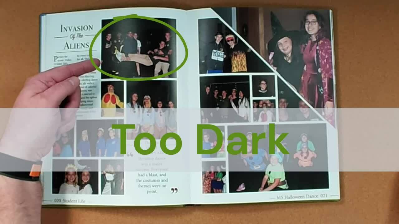
2. Poor photo quality
Another photo mistake has to do with our favorite extension of ourselves: our phones. Cell phone photos print beautifully in the yearbook when you follow these caveats:
- Since original images work best, set up shared folders so parents, students, and teachers can share directly. This ensures that the highest quality version of the photo is available for printing.
- Avoid destructive edits and filters; if you’re not using Lightroom, chances are, you’re ruining the photograph’s quality.
- Beware of texting photos, as some apps automatically reduce the file size.
Saying it loud for the people in the back:
- A screenshot is not a hi-res image.
- Your DSLR on auto will never get that volleyball in focus.
I feel better.
Built-in proofing tools
Treering warns you when your image may not print well while designing.

Your printed proof* is also the best guide. This allows you to identify any potential issues with image quality before officially going to print.
*A printed proof is just that: your yearbook as-is printed IRL so you can mark up mistakes, double-check contrast, and see your in-progress work. The best part: your Treering account includes one free.
3. The same kids over and over
And over. And over. Sometimes, it seems there are only two students on campus:
- The tri-sport athlete, who is also ASB president, the lead in the spring musical, a student ambassador, in eighty-five (OK, it just seems like it) AP classes, and works part-time as the PM custodian.
- The student whose name is on the roster.
Both are valuable members of the campus. The second is a little harder to find.
Creative yearbook coverage ideas for camera-shy students
Include more students (like #2 above) with modules dedicated to:
- Student spotlights and mini-feature stories
- Academics coverage through classroom candids
- Artwork and gallery spreads
- Quote bars
- Pet photos
4. MIA spring sports and events
We see it all the time in yearbook adviser groups: the woe of covering the final quarter of school with a traditional publisher. If your multi-year contract leaves you with no options, try:
- A spring supplement
- Creating photo slideshows and linking them via QR codes
How Do I Include Spring Events in the Yearbook?
With yearbook deadlines in February, a supplement used to be the only way end-of-the-year activities made it in the book. Technology changed that. With digital printing and a three-week turnaround, spring sports, ASB elections, and award ceremonies can be in the book.

Need even more time? Treering’s ship-to-home option eliminates the summer shuffle and back-to-school distribution.
5. Inconsistent formatting
Someone once told me if a bunch of yearbook advisers were in a room and our proofs fell on the ground, we should be able to rebuild our books just by the the design consistency. It’s a mistake to not have a cohesive look.
New to yearbooking? A templated solution may be the best. A Treering theme built with consistent formatting elements maintains uniformity across pages and sections.
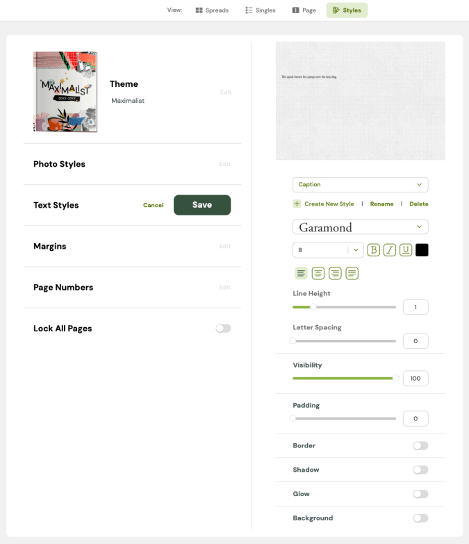
Use the styles panel to establish guidelines for text (size, alignment, formatting) and images (border, effects) to ensure consistency. While you can have all the styles in the world (please don’t), make sure they are intentional.
When in doubt, use Garamond for body copy (8-point for captions, 6-point for portrait names). If it’s good enough for Harry Potter, it’s good enough for your yearbook.
6. Ignoring the principles of design
Piggybacking on formatting, we’ve all heard the adage, “Learn the rules, then break them.” The rules exist for a reason. (Did you read that in my teacher voice?)
Design 101
Designing from scratch? Start from the center and move out.
- Place your dominant photo. Contrast in photo size helps guide the reader.
- Build out related content. Captions help identify the subject of the photo and supporting images give the full event story.
- Add secondary content. Use pull quotes, interview bars, modules, and graphs to diversify your storytelling.
- Add theme visual elements. Everything should go back to your theme. Everything.
7. Costly yearbook overruns
Sales quotas and surprise boxes of “extra books” add up. The same digital printing that allows for a three-week turnaround also gives you peace of mind when it comes to ordering. Say goodbye to guesstimating in November what you’ll distribute in May. Treering only prints pre-paid orders. This way, every year is a sell-out year. Additionally, there’s no waste and no leftover books.
Yearbook mistakes occur in design and coverage, affecting the quality and reception of the final product. The simple changes above, including proofing, understanding how design affects the (no pun intended) whole picture, and using back-end tools that help–not hinder our process–you can elevate the overall vibe of your yearbook program.
Designing divider pages
Yearbook divider pages are just that: they divide the book topically. Generally showstoppers, these spreads share similar layouts as they introduce the content within while reinforcing the yearbook theme. While they aren’t the pages over which students argue for editing rights, they hold deep editorial power. Divider pages enforce the book’s identity while giving each section a voice.
Use dividers to develop your theme
Yearbook theme development starts on the cover and flows through the book visually and verbally. It wows on designated theme pages. These pages include:
- Opening and closing
- Table of contents
- Divider pages

Independent of the book, these theme pages form a cohesive “brand” package for your year. They repeat and reflect cover elements. They have the same voice. They develop the story of the year through copy and visuals. Each divider reflects the theme and shows how it impacts that section.
Do epic dividers mean you no longer have to include theme elements throughout the book? Think again. They’re just one more way to level up your design.
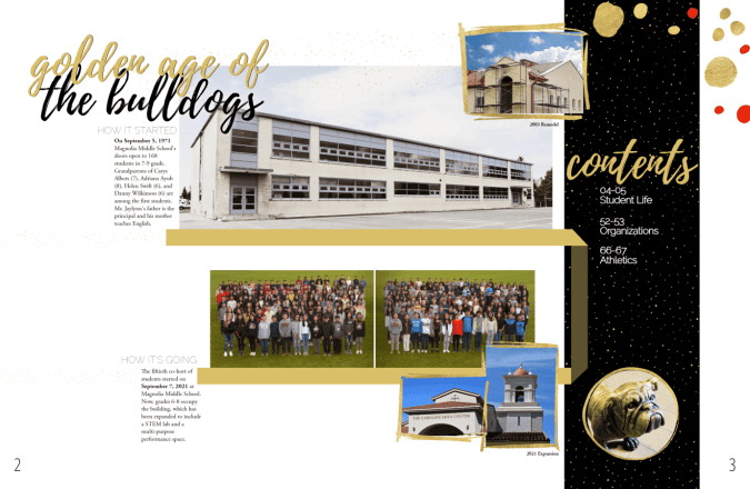
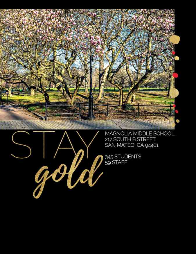
An example from Magnolia Middle School
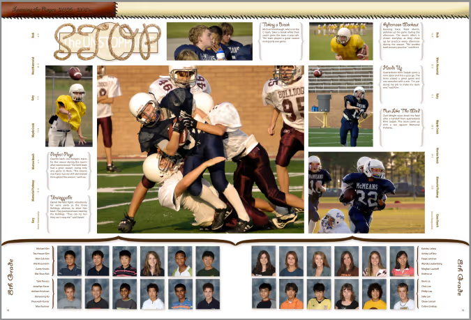
From the start, the book is gold and black, with pops of the school color, red. The simple title page has the theme "Stay Gold" and the school information. The iconic 50-year-old Magnolia Grove walkway is the only original part of the school remaining after a major renovation. The yearbook team re-visits the grove for the closing page.
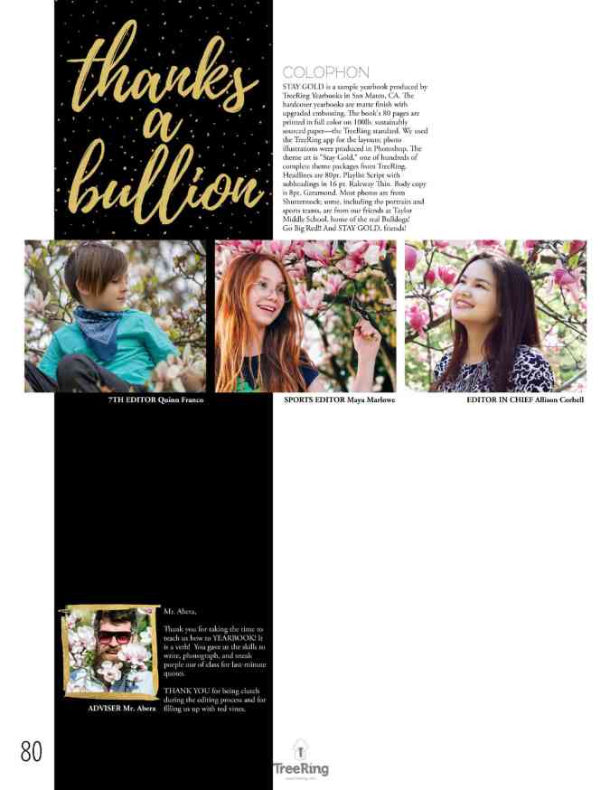
Here are the divider pages. Notice how they created a unified narrative:
- Magnolia repeats key elements: script font, circular callout for pull quotes, and gold dots.
- The new building is the visual feature and showcases how students impact each area.
- Wordplay: “The Golden Age of the Bulldogs,” “The Gold Standard,” “Shining Example,” “Shine On,” and “Thanks a Bullion” all tie back to the book’s theme, “Stay Gold.” (Fun fact: the book is built using Treering’s free yearbook theme with the same name.)


Essential yearbook sections
Like a table of contents, divider pages help readers navigate the yearbook. They help reset and refocus readers.
Most yearbooks include designated sections for:
- People (portraits)
- Academics
- Student life
- Organizations and clubs
- Athletics
- Reference (index, ads, and teams)
You may further divide with lower/upper school, fall/winter/spring sports, or even subject dividers for larger campuses.
Creating divider pages
Consistency is key when designing divider pages, OK any yearbook spread. While each divider should highlight a unique section, they should all share common design elements to maintain a cohesive look. These elements can include using the same fonts, color palette, and layout style across all dividers. Repeating theme elements, such as graphics or photo styles, help reinforce the yearbook's identity while keeping readers oriented.

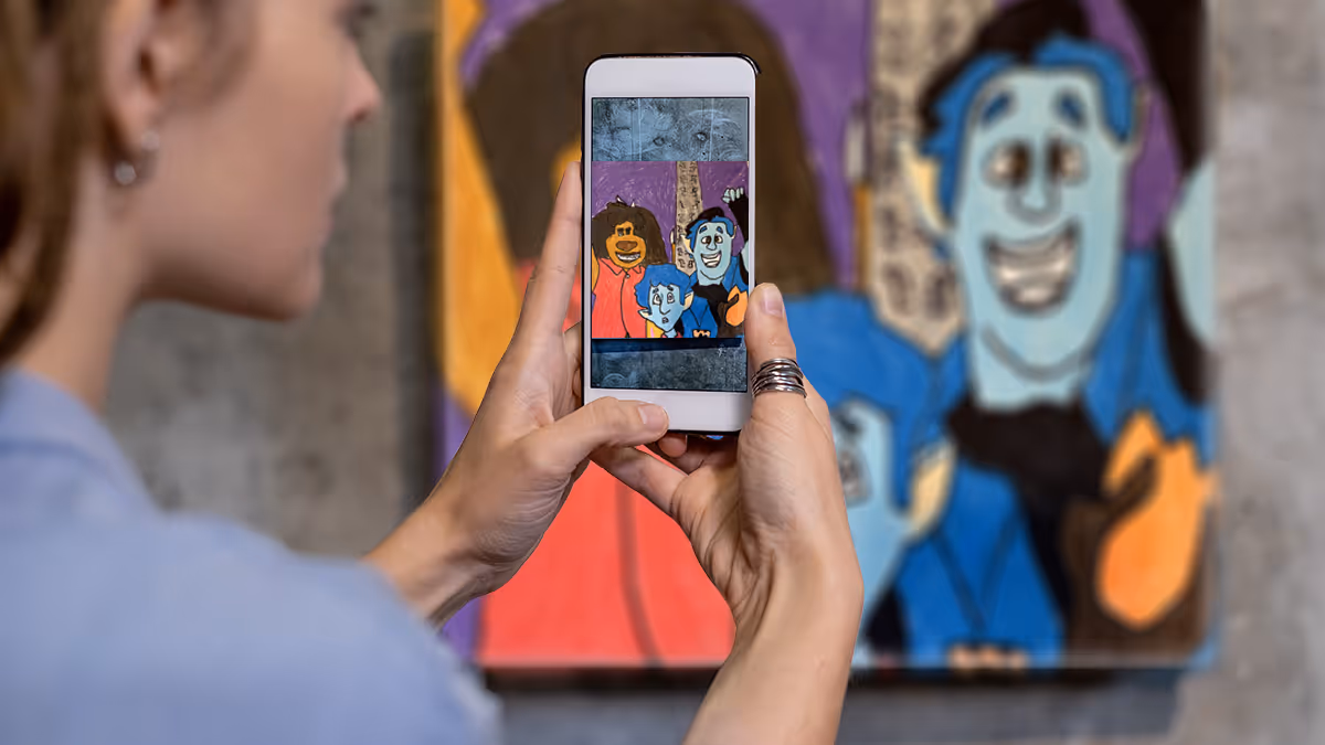
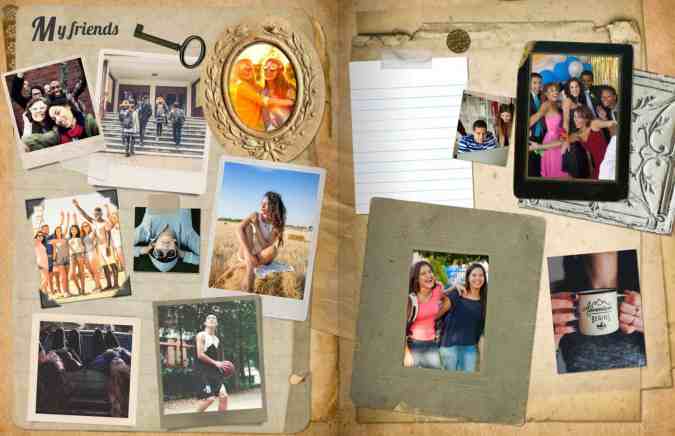
What should I do with all my child's art?
Dear Mama, you're not alone. Many of us look at the creations in our children’s portfolio and think, “Now what?” The fridge is covered. The more ambitious among us swap out art in frames, while others load up bin after bin (or just chuck it in the bin). We have an art display idea to help you preserve your child's memories.
How to photograph your child’s art
The number one rule in photography applies here: get your lighting right! Eliminate shadows and flares by having multiple points of lighting. Natural lighting by a window is best.

Second, you’re going to want to make sure your camera angle is congruent to your art. (See, that high school geometry class has real world application!) This gets rid of distortion. You can make slight adjustments using your camera app.
Personalized pages
Now that your child’s art is digitized, do something with it!
Since every Treering yearbook comes with two, free personalized pages that print only in your yearbook, you can create a mini-gallery to display paintings, sculptures, and sketches without giving away more real estate in your home. (You can also add more pages for homework, family vacations, and events.)
Fast forward to high school graduation: all your yearbooks are lined up and you can show off your child's progression in penmanship, Scouting, or science fair.

Instead of suffering from mom guilt, you can display your child's year in art forever.