Design
Looking for inspiration, design tricks, how to make a great cover, promoting your yearbook and engaging your community?
Most recent
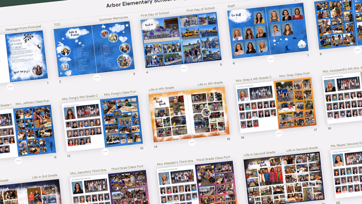
Pages to put in the yearbook
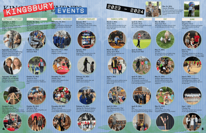
It’s go time: a blank yearbook ladder is in front of you and you need to know which pages to put in the yearbook. Do you take a chronological approach and cover events as they happen? Or should you create a sectional yearbook and handle coverage topically? Did you even know there were options beyond this is what we’ve always done? Below are samples of how other schools have done it and their rationale.
Put your yearbook pages chronologically
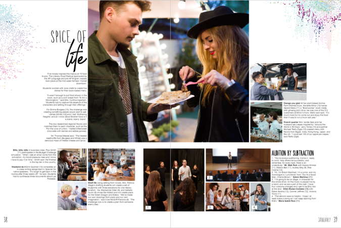
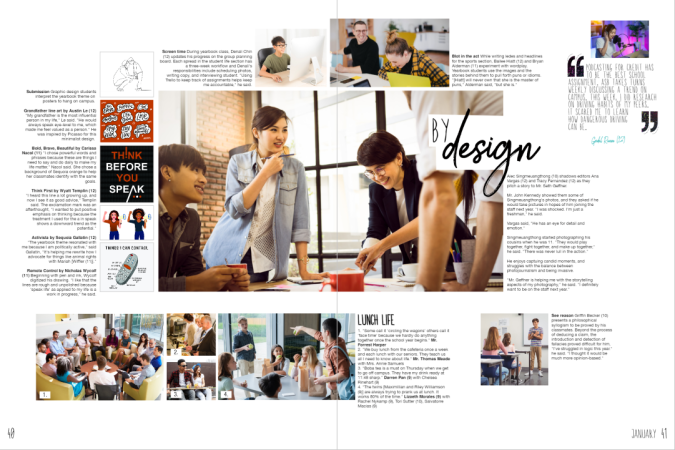
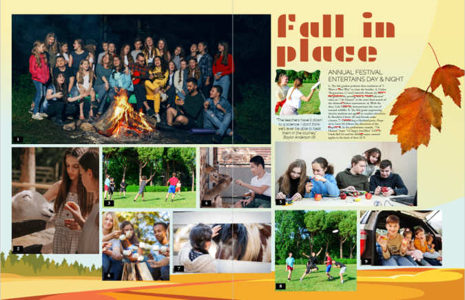
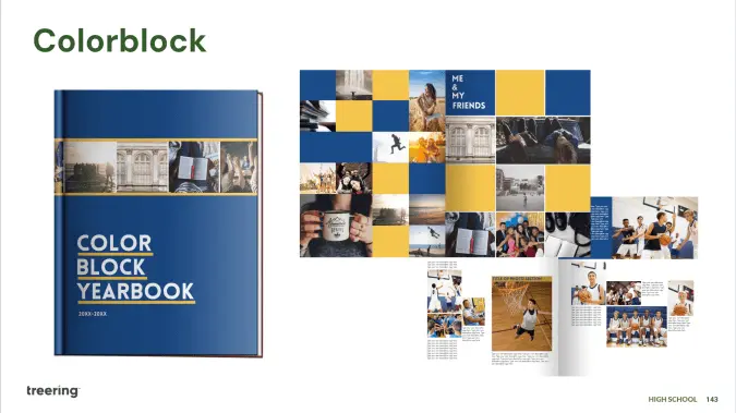
Sequoia high school’s yearbook uses 50 of its 148 pages to cover academics, student life, and special events on spreads. The two spreads below show what happened in the month of January and cover the literary food festival, spring musical auditions, lunchtime candids, as well as coursework from economics, Spanish, drafting, logic, yearbook, and graphic design classes. These spreads feature over 40 students and five faculty members.
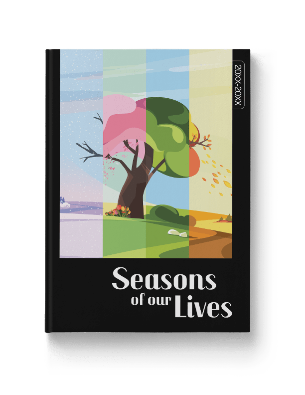
There’s no rule on how to put pages in your yearbook chronologically: we’ve seen schools organize their yearbooks monthly, quarterly, and seasonally. Treering's Seasons of Our Lives yearbook theme makes it easy to put pages chronologically in your yearbook.
Feeling ambitious? Weekly chronological coverage can be of value to larger or K-12 schools within modules dedicated to academics, club activities and meetings, plus a sporting event of the week.
Chronological cover yearbook coverage helps keep you organized by:
- Structuring your coverage: you can’t cover an event after it’s passed
- Building in mini-deadlines: because you have a structure, you can build due dates and workflows
- Telling the story of the year as it unfolds
Use traditional yearbook sections
Tradition works for a reason. Done right, yearbooks show the complete picture (pun intended) of how students contribute to their communities. It’s a visual reminder of how each story weaves together to become a group narrative. Yearbooks are definitely worth bonding over.
By using sectional, or traditional, coverage to put together your yearbook, pages are placed in topical categories. We know to find Start with Hello in the club section and volleyball in sports.
Traditional sections to put in your yearbook include
People
Student portraits (organized by class, homeroom, or grade), staff, and personality profiles tend to dominate yearbooks. Consider breaking up coverage by adding in siblings, outside-of-school hobbies, and international students.
Student life
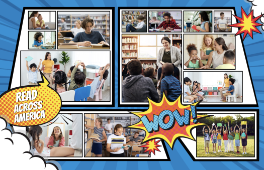
All the big, schoolwide moments plus the small distinctive ones (think homecoming, Read Across America, hot cocoa in Mrs. Cruz’s classroom, Dot Day, lawn chair lunches, etc.) make their home in the student life section.
Organizations
Clubs and committees that comprise a large portion of student life may warrant their own section. If most of your clubs are inactive beyond a monthly lunch, consider keeping club activities in the student life portion or feature the group photos in the reference section.
Sports
Remember, action shots have a place, as do club sports, pre-game rituals, and scoreboards.
Academics
If you’re not putting a “Life in…” page, consider grouping academics coverage by grade or subject. Ensure daily classroom activities, as well as holiday parties, are included in the coverage.
Reference
Put pages devoted to the index, group photos (club and team), and ads in the reference section of the yearbook.
If you need additional inspiration for which pages to put in your yearbook, check out these sample ladders from other schools and adapt them to fit yours.
Making yearbooks more accessible with opendyslexic
Fonts can be the Marsha Brady of the yearbook world. Overshadowed by epic theme packages and color palettes, the power of typography cannot stay silent. (In fact, the correct font can be louder than your graphics.) With 44 new fonts in the Treering catalog, you can share your story with boldness or a touch of whimsy. It can be focused or zany, handwritten or high-tech.
“Typography, like other design elements, evolves over time. Keeping up with current trends ensures that your designs feel fresh, relevant, and aligned with contemporary aesthetics,” Treering’s Director of Design, Allison V. said. “Typography also strongly impacts how a message is conveyed and perceived. More importantly, we listen to our users and try to accommodate their needs and wants. We often receive requests for fonts and appreciate the input from you.”
One such request came in the form of a text.

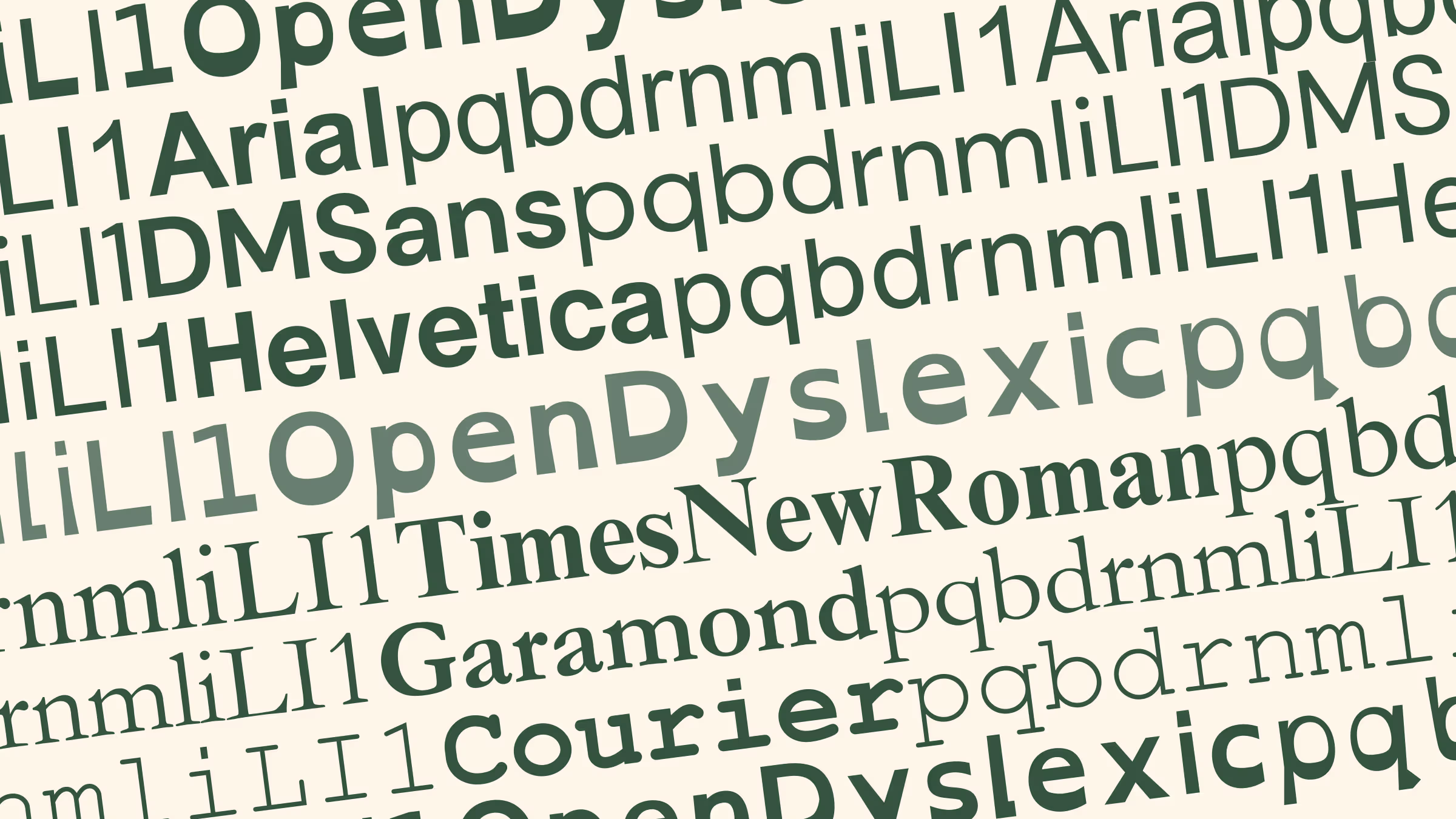
Meet OpenDyslexic
Since origin stories are a big deal in the superhero world, here is OpenDyslexic’s: app and game designer Abelardo “Abbie” Gonzalez developed the font in 2011 to help people with dyslexia improve their reading experience.
OpenDyslexic’s design addresses common challenges faced by many readers with dyslexia:
- Letter Weight: OpenDyslexic uses a slightly heavier letter weight, which helps the letters stand out more clearly on the page and reduces letter crowding. When designing for readers with dyslexia, avoid using italics or underlines because they cause letter crowding.
- Bottom Heavy: The base of the letters is slightly thicker, which provides better anchoring for letters. This can reduce the chances of them being flipped or reversed.
- Distinct Letter Shapes: The font uses distinct letter shapes to minimize letter confusion, such as avoiding mirror-image similarities between letters like "b" and "d."

Because it’s an open-source font, it is freely available. You can even make it your web browser’s font.
How would you use OpenDyslexic in yearbook design?
The short answer: headlines and captions.
The British Dyslexia Association and the UX Movement established Dyslexia-Friendly Style Guides. Summed up, the following tips can increase the readability of your spreads:
- Modular design: use negative space to break up content into meaningful chunks
- Keep backgrounds to a single color, ideally cream or pastel peach, orange, yellow, and blue
- For text, ensure there is contrast between the background and words on your yearbook spread
- Left align text
- Use font size 12-14 pt.
As with anything, it is essential to note that while dyslexia-friendly fonts and design can be beneficial for some individuals, there is no one-size-fits-all solution for all learners. If possible, seek stakeholders' feedback during the design process to identify potential improvements.

Your throwback yearbook theme needs this laser photo background
Like retro trends themselves, what goes into a throwback yearbook theme gets updated (can we call it updated?) every few years. Because those trends are usually rooted in fashion or pop culture, they can take a good amount of creativity to link back to your throwback yearbook theme. Right now, though, there’s one retro trend that fits the yearbook perfectly, without making any adjustments or working hard to make a creative connection: the laser photo background. Yup, you read that right. We’re talking about that 80s-style school photo backdrop emblazoned with neon lines and electric bursts, because they’re back, and they’re pretty meme-tastic. Don’t believe us? Do a quick Google search and you’ll be bombarded with some amazingly awkward glamour shots. While we don’t advocate purposely creating cringe-worthy student portraits for your yearbook, we do suggest you find a few ways to fit this retro trend into your throwback yearbook theme. Keep reading to learn where laser photo backgrounds came from, where to find them today, and how to create your own.
A brief history on the laser photo background
The laser photo background was all the rage in the 1980s, when many school portraits featured backdrops crisscrossed with bright, glowing lights. Back then it was totally stylish—and not at all ironic. The fad faded (or fizzled, if you will) and was banished to old yearbooks and family photo albums until 2007. That’s when a blogger posted this photo, titled “Me in ‘91”. It was, up to that point, the first laser photo background on the blog, which described itself as being dedicated to “the celebration of the perfect portrait.” (There is, in case you’re wondering, some sarcasm involved there.) Pretty much everybody sharing the image and basking in its cheesy glory essentially made that single portrait a meme before memes were even popular. The following year, a Tumblr blog called “We have Lasers!” debuted and—yup, you guessed it—it was dedicated entirely to school portraits with a laser photo background. As Lindsey Weber, the blog’s creator wrote in it’s “About” section: “You begged your mom to pay the extra $4. A tribute to the greatest school photo backdrop there ever was.” To say “We have Lasers!” took off would be an understatement: People submitted more than 500 portraits to be featured on the blog in less than two years, and the blog was featured on NPR, CNN, Time, and CBS News. Quickly, laser photo backgrounds went from meme to viral to mainstream. Popular sites, such as Awkward Family Photos and BuzzFeed, began featuring compilations of people posed in front of the iconic background. Even celebrities began recreating laser photo background images as spoofs (re: this picture of former 98 Degrees frontman, Nick Lachey). The Internet was, and in a lot of ways still is, in a laser-photo frenzy. So, how do you pull this trend into your throwback yearbook theme?
Where to find—and how to use—laser photo backgrounds in your throwback yearbook theme
There are two places to find laser photo backgrounds:
- Buy an actual laser photo backdrop, in the form of a poster, online at Zazzle.com.
- Use this free laser photo background, created by Emily Coxe.
The poster at Zazzle.com comes in a bunch of different sizes. Deciding which size to buy is based pretty much entirely on deciding how you’re going to use it. So, before you pull the trigger and shell out a few bucks for a bit of nostalgia, think through your use cases and make sure you order the right one for your needs. The easiest way to do that? Do a test run of your photo shoot by placing your subjects against a plain wall and marking off the various poster sizes with painter’s tape. When you frame up your shot, pay attention to which size poster markings are inside the viewfinder, and order the next size up. If the idea of planning out your photo shoots and spending cash has you feeling a little bummed (and, hey, we get it; we make creating a yearbook free for schools), you can always work a little Photoshop magic. Really, if you have some super-creative students or parent volunteers on your yearbook committee who know their way around Photoshop’s masking tool, this is the way to go. In fact, even if you don’t have someone like that on your yearbook committee, but you have someone who is willing to give new stuff a try, this is the way to go. Because you can even use PowerPoint to do this. Here’s how to add a laser background (or any background, really) to a photo in Photoshop:
- Choose your image. A picture with a plain background is easiest to work with, so—if you have control over this—have your subject stand in front of a plain wall or against the side of a building to capture some natural light.
- Mask it. In Photoshop, use the pen tool to mask the person in the image. (Learn more about masking here.) You can also use more sophisticated Photoshop techniques, depending on how precise you want the image to appear. If you’re new to Photoshop, however, we recommend sticking to the basics.
- Insert the background. Drag and drop, or copy and paste, the laser background of your choice. Size and position, save your image, and you’re good to go.
- Here’s how to add a background to a photo in PowerPoint:
- Add your image to a PowerPoint slide. Again, a picture with a plain background is easiest to work with.
- Use the “Remove Background” feature. When you upload a photo in PowerPoint, your toolbar should automatically reset to display the “Format Picture” options that are available. You’ll want to be on that section of the toolbar, so make sure you’re there. Then, under the “Adjust” settings, choose “Remove Background.” PowerPoint guides you through the process from there, and it’s super simple.
- Insert the background. Once you upload the background, you’ll want to size it appropriately and position it, like you did in Photoshop. Make sure you adjust your layers, so that the background is in the back. You can do that by finding the “Arrange” section in the “Format Picture” toolbar, and using the “Reorder” feature.
- Save your image, but be sure to save your image as a .png, .jpg, or .gif file, and not a PowerPoint file
That’s all there is to it. Not bad, right?Adding (or should we say “beaming”?) laser photo backgrounds into your throwback yearbook theme will totally put you in touch with today’s retro trends. It’ll also add a bit of irony and hipster style to your book, and we totally endorse that more than we endorse some of the other trends that are making comebacks.

Yearbook color theory: what it is and how to use it
Color is more than decoration: it’s a communication tool. In a yearbook, color helps reinforce the mood of each section, creates visual hierarchy, and supports your theme. Understanding the basics of color theory enables you to make design choices that are intentional and effective, not just trendy. (If trendy design is your thing, head over to this blog.)

The color wheel
I can’t emphasize this enough: color is a complement to content. The right combination can make your theme feel energetic, calm, serious, or playful. Understanding how color affects emotions will affect your readers’ experiences.
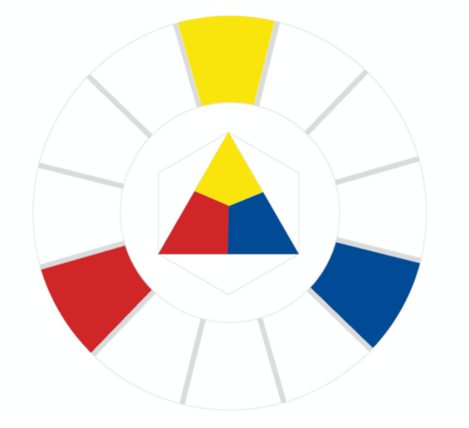
Primary colors
Red, yellow, and blue are the OG trio. As you learned in elementary school, you can’t make them by mixing other colors, and they can be combined to create every other hue. A section opener with a bold red or yellow background can instantly grab attention—just keep your type simple so it’s still readable.

Secondary colors
Orange, green, and purple come from mixing two primaries. Secondary colors are a safe way to add contrast to pages without them looking too loud.
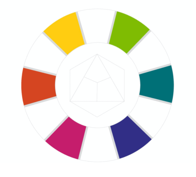
Tertiary colors
Mix a primary with a neighboring secondary and you’ll get shades like yellow-orange or blue-violet. These in-between shades are perfect for customizing your theme. For example, swap standard blue for blue-green to make a traditional palette feel more modern.
Color harmony
Color harmony is about choosing combinations that are pleasing to the eye, and useful to you, the designer. Whether you’re creating a visual flow across a spread or building a full-book palette, these harmonies keep your pages cohesive.
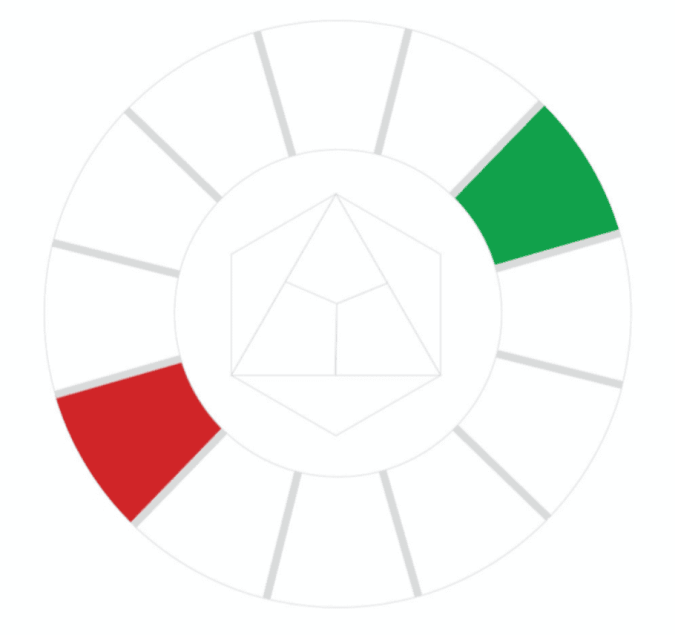
Complementary colors
These are opposites on the color wheel, like blue and orange or red and green. They create strong contrast. Use complementary color accents for headlines, callouts, or graphic elements.
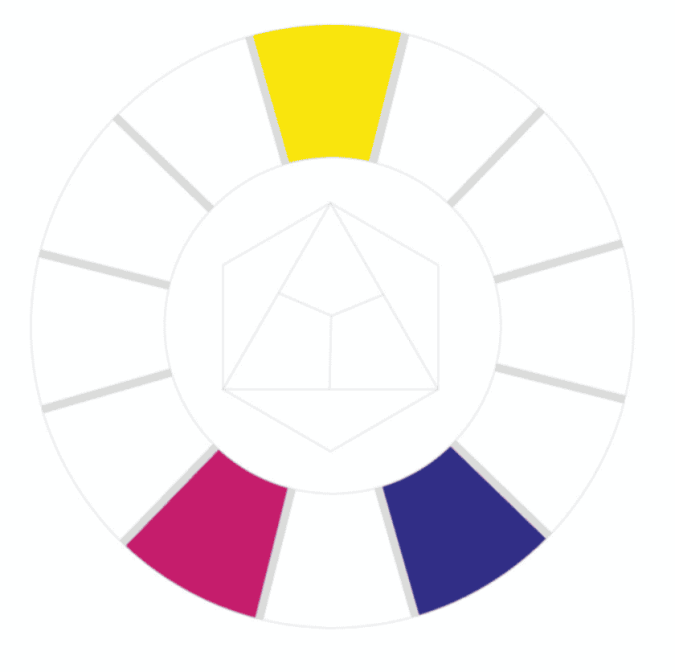
Split complementary
Choose one color (yellow) and pair it with the two colors next to its opposite (blue). This gives you contrast without tension. For example, if your school color is yellow, balance it with pops of magenta and violet.
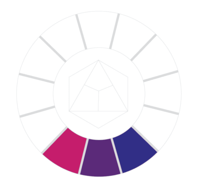
Analogous colors
These sit next to each other on the wheel and are generally harmonious and soothing. If you’re getting started with color, use an analogous palette to determine your dominant, supporting, and accent colors.
It’s easy to look at these and think you’re limited to three. Using varying tints and shades for value contrast will expand your palette.
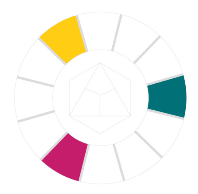
Triadic colors
Triadic schemes use three evenly spaced colors on the wheel. We see this with the primary colors. Now shift over, you have the ultimate retro palette.
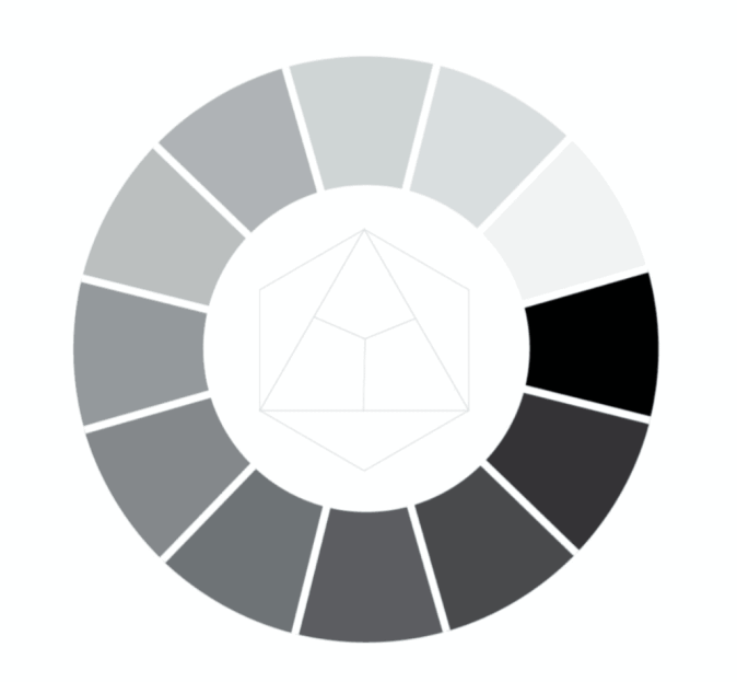
Monochromatic and grayscale
One color, many values: Monochromatic palettes have so much potential. Purple can have varying degrees of school spirit, while black is sleek and modern. They create contrast, demonstrate intensity, and serve as a base to add accents for emphasis.
Warm vs. cool colors
Warm and cool colors affect how your pages feel emotionally. Look at the two athletic examples above. You can feel the difference. In one, you're sweating with the team and on your feet. In the other, you're maintaining what's left of your voice, sipping cocoa under a blanket with your best friend.
Likewise, use color to determine how the student body will experience your verbal theme.
Putting it all together
Here’s how to apply color theory to your yearbook:
- Pick a palette early. Choose up to five colors that support your theme and stick with them. Put them in your style guide.
- Use color to organize. You could assign colors to sections, use colors as the backgrounds to modules or pull quotes, or with your headline font to show points of entry.
- Make color intentional. “Don’t decorate… design” is every design teacher’s go-to for a reason. Be intentional and ask, “What mood am I trying to create?” “What color harmony supports that?” “Why isn’t this working?”
- Check accessibility. Make sure the text has enough contrast from its background.
- Balance bold and neutral. Too much color can overwhelm. Whitespace will always be your friend.
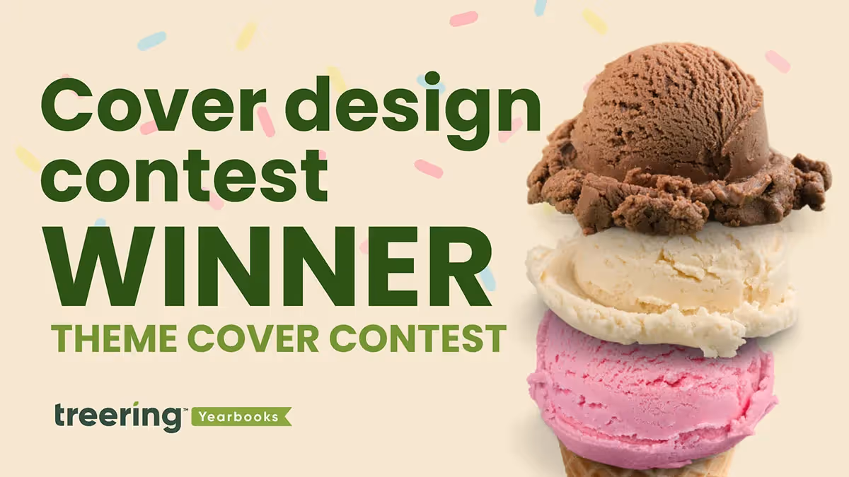
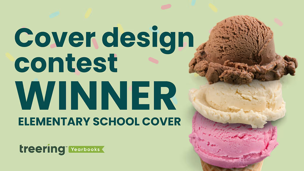
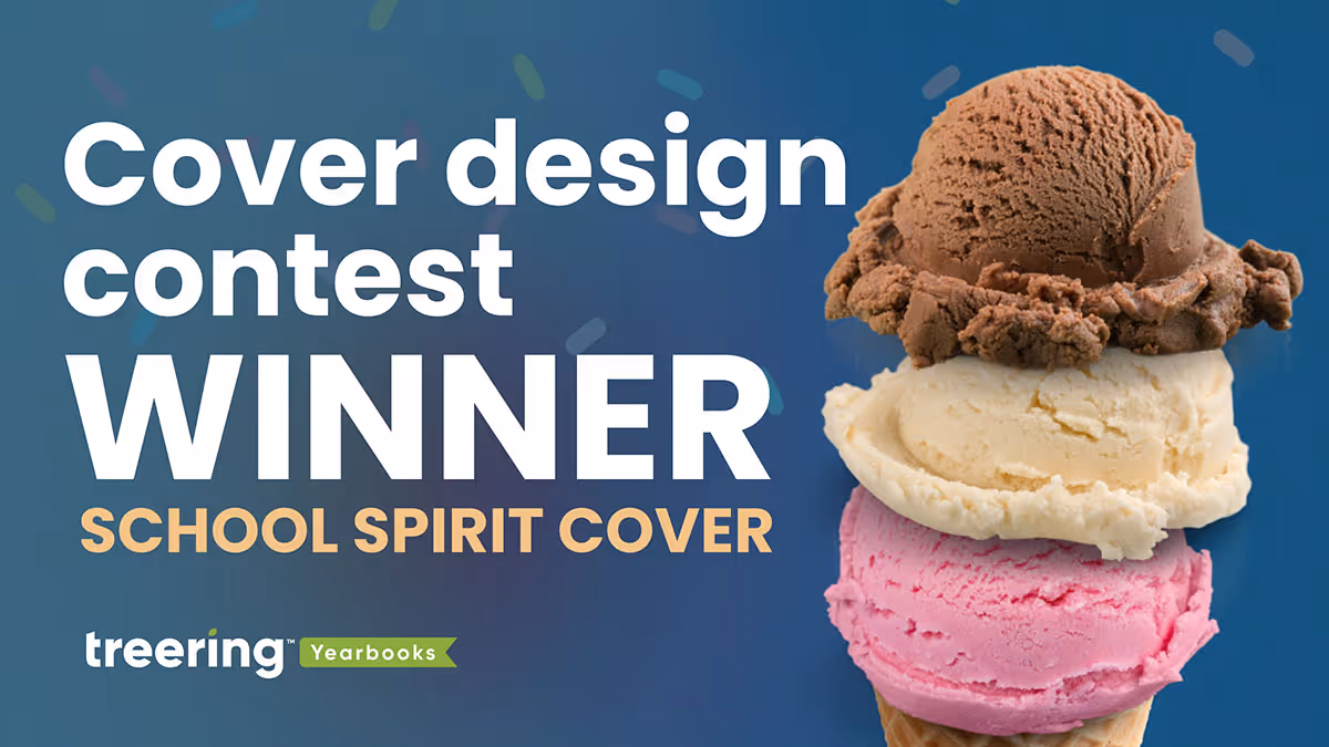
2025 Theme cover winners
In Treering’s inaugural Cover Design Contest, which—if we’re being real—was three concurrent contests, schools submitted their covers to one of three categories:
- School Spirit – mascots, school colors, and anything else that shows off your community
- Theme Development – an introduction to your visual and verbal theme
- Elementary Student Art – original art by K-6 students
Our team explored over 300 submissions, and the ones that stood out introduced their theme on the front and back cover, then expanded it inside throughout the book. Each of the themes below are specific to the time and place in which they exist. While the concept may work for the school across town, the execution would not.
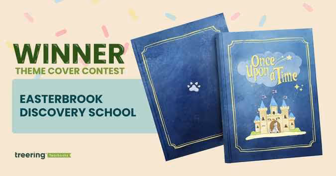
Grand Prize Winner: Easterbrook Discovery School, San Jose, CA
Theme: Once Upon a Time
This year was extra special. It’s EDS’ 20th anniversary and the tenth year in its building. These once in a lifetime moments became an obvious connection for the yearbook theme.
Pre-pandemic, a middle school yearbook club produced the book. The PTO wanted to continue to showcase student perspectives with a cover contest. “It celebrates creativity, individuality, and the shared ownership that makes our yearbook and our school so special,” said Bai-Lim.
This year, they gave little guidance: “Your design should relate to the ‘Once Upon a Time’ theme (e.g. fairy tales, dragons, fairies, wizards, enchanted creatures, etc.).” The faculty and staff chose the winning cover in an anonymous vote.
Winner Helena Kao created a design rich in symbolism:
- Castle: community, teachers, and parents that made our school a story worth telling
- Bricks: depicted fundraisers, music concerts, and field trips that were the building blocks to a safe and welcoming space for students to learn and grow
- Flags: the husky spirit that defines EDS
- Closed door: an end of a chapter for the graduating class of 2025
- Howling Husky: singing and celebrating the school it proudly represents
The cover art contest led to another “once” moment: ninety pieces of student art throughout the yearbook. “Each piece felt like part of the story of the school year,” said Bai-Lim, “and we didn’t want to leave that out.”
Bai-Lim’s team used a Treering vintage blue background, various story-inspired borders, and the lunchbox font for titles. She said, “Treering made it so easy to bring our ideas to life.”
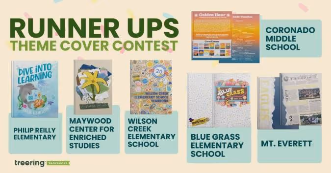
The final five six
Blue Grass Elementary School, Knoxville, TN
Theme: A School of Pure Imagination
The sweet cover made us melt. (It’s a contest for a back to school ice cream bash with cool puns, how could we not go there?) What’s more, is the yearbook theme and the school’s theme were one.
The team at Blue Grass used “a school of pure imagination” to guide their year. It was a “perfect match for capturing the magic, curiosity, and creativity that define our school community,” yearbook chair Becky O’Hatnick said.
She and her team of parent volunteers sprinkled each page with “candy-colored hues” and created titles on candy wrappers and golden tickets.
“From cover to cover, our yearbook is a vibrant celebration of childhood wonder and the boundless possibilities of imagination,” O’Hatnick said.
Coronado Middle School, Coronado, CA
Theme: Golden Hour
This coastal school embraced their SoCal vibe by using the colors of the golden hour to progress through the book. The students studied the sun, and used it for theme copy: “At the end of each day, and each Golden Hour, the sun must set. This is an opportunity to begin anew, never forgetting the last chapter, but anticipating the beauty of the next.”
“The edges of the book had a gradient,” adviser Heidi Frampton said, “so that as you flipped through the book you would see the sunset colors.”
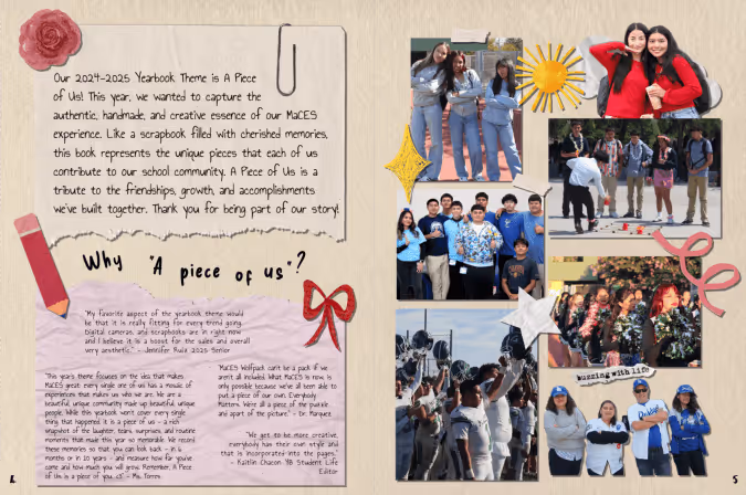
Maywood Center for Enriched Studies, Maywood, CA
Theme: A Piece of Us
Every single one of us has a mosaic of experiences that makes us who we are,” adviser Nora Torres said. Her team built on that concept by piecing together textures and colors to create the layered cover. The more you look at it, the more details emerge.
They brought their theme into the book by using graphic pieces, such as scrap paper, tape, and cut-out letters to accent the content. Divider pages, especially, looked as if they were hand-designed. To make it even more personal, the yearbook staff added “yerd* doodles” throughout the book.
*Yerd = yearbook nerd
Mt. Everett Regional School, Sheffield, MA
Theme: Ripping Through Tradition
Students chose to blend nostalgia and tech by using newspaper graphics at an angle to chronicle their year. It’s a “blend of past, present, and future,” said adviser Kari Giordano.
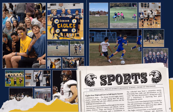
“This theme visually represented the senior class ‘shredding expectations,’” said Giordano, “and boldly stepping into the next phase of their lives.”
Philip Reilly Elementary, Mission Viejo, CA
Theme: Dive Into Learning
Yearbook chair Kristin Keller said she “created an underwater world where our theme could truly swim.”
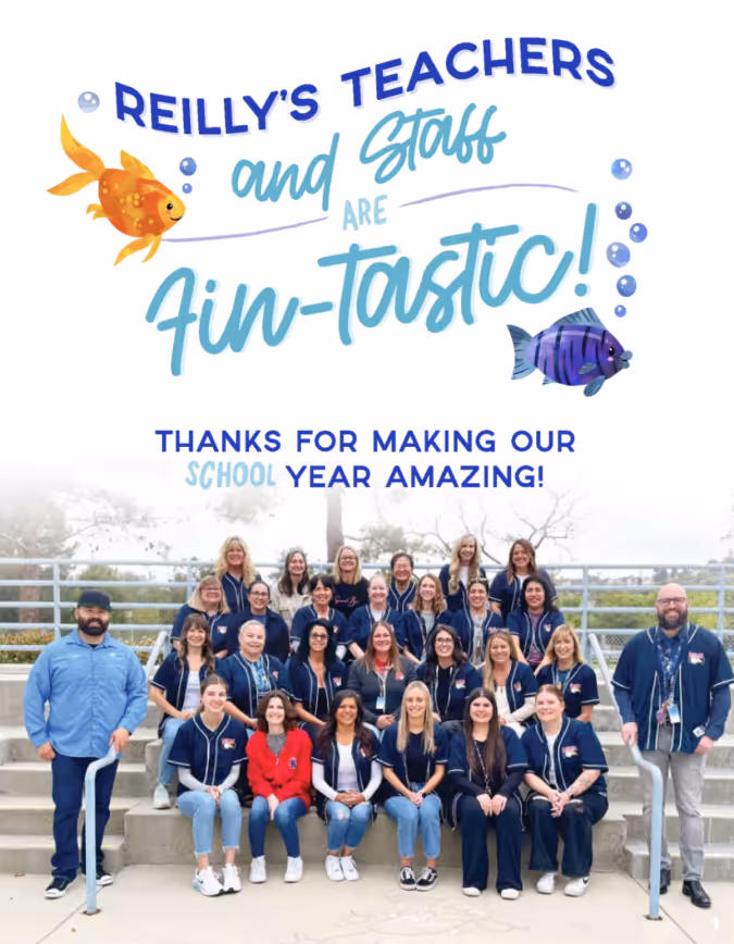
From using circular photos as bubbles to adding sea-sational puns, her designs were focused. Keller used design hierarchy and contrast to keep each afloat in a sea of color.
Wilson Creek Elementary School, Duluth, GA
Theme: Wildcats Stick Together
At first glance, this cover was familiar. Then, we looked closer.
“This hybrid theme enhances the Treering-designed theme ‘Stick Together’ with totally unique Wilson Creek graphics and vibes that show off how Wilson Creek Wildcats learn, live, and laugh,” said yearbook co-chair Holly McCallum.
She designed the sticker pack to include interactions of the wildcat, WCES, and their anniversary crest. The brown paper background takes us back to the first day of school, when you’d cover your textbooks with grocery sacks. Considering this is Wilson Creek’s 20th anniversary, it’s an emotive design decision.
McCallum also added frames to photos to make them look like stickers and she added positive messages “to emphasize the creative spirit and collaborative dynamic” of her school community.
2025 Elementary student art cover winners
In Treering’s inaugural Cover Design Contest, which—if we’re being real—was three concurrent contests, schools submitted their covers to one of three categories:
- School Spirit – mascots, school colors, and anything else that shows off your community
- Theme Development – an introduction to your visual and verbal theme
- Elementary Student Art – original art by K-6 students
Students created original yearbook covers using paint, AI, colored pencils, crayons, mixed media, digital media, and pen and ink. Yearbook committees gave prompts that were open-ended, fixed, and everything in between. While many submissions were the result of a yearbook cover art contest, others were collaborative projects. All were steeped in the tradition of promoting student perspectives and community.
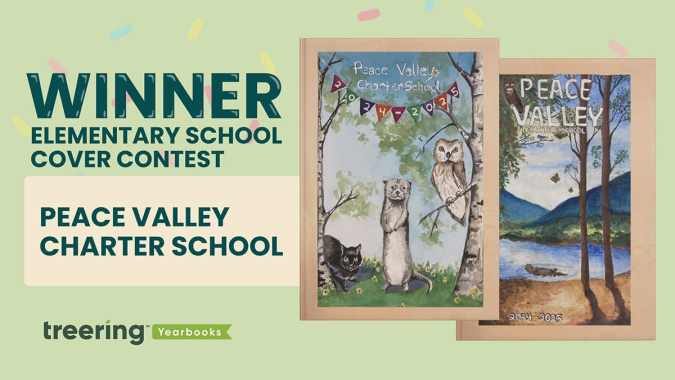
Grand prize winner: Peace Valley Charter School, Boise, ID
“Waldorf schools instill a deep respect for the natural world, fellow human beings, and the spiritual elements in all beings,” said 6th-grade teacher Nichole Murray, whose students compete annually in the yearbook cover contest.
Murray, PCVS dad Jason Ropp, and yearbook coordinator Gigi Murfitt display the entries in the hallways so all students can see them and begin to dream ahead for their chance in the cover contest. PCVS teachers choose the winners, and first and second place go on the outside cover. All cover contest submissions appear inside the book.
“The elements of nature are expressed, and our mascot, the otter, symbolizes intelligence, playfulness, resilience, and adaptability,” they said.
Both art pieces caught the judges' attention because they used similar colors and exceptional lighting–one judge kept exclaiming, “The shadows!”
The. Shadows.
The cover art introduces outsiders to the Waldorf philosophy, especially how the art curriculum helps nurture imagination, emotional intelligence, and a well-rounded intellect.
“Our mascot, the otter, symbolizes intelligence, playfulness, resilience, and adaptability,” Murray said.
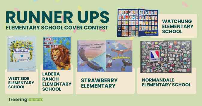
The final five
Ladera Ranch Elementary School, Ladera Ranch, CA
Fifth grader Fiona Martin captivated us with the color explosion and detail on her cover design. PTA president Joya Celik said the yearbook team at LRES asked the students to create a design incorporating their mascot “that reflected courage, perseverance, and attaining [their] goals.”
Their 2024-2025 school theme was “Go for the Gold.” Martin surely did just that.
Normandale Elementary School, Edina, MN
Yearbook team leads Lauren Dickerson and Becky Sertich created a collaborative project for 5th-grade students. Taking their inspiration from water bottles, Chromebooks, and everything else tweens touch, they asked students to create their own “sticker” design.
They “scanned and edited [each submission] to add a white border (like a sticker) and to make the background transparent so the ‘stickers’ could be arranged on the cover like clip-art.”
The result? An on-trend, completely original yearbook cover that shows the personalities and priorities of promoting students.
Strawberry Elementary, Santa Rosa, CA
This one is also collaborative: the front and back covers are creations from 6th graders and the local high school (shout out Sonoma Academy in Santa Rosa) helped put it all together. The latter used AI design tools to expand the front cover art to wrap around to the back. On the back, they also created a composite of art.
“The high school students had originally envisioned a variety of student strawberries in the grass and eagles in the sky for this cover design,” yearbook coordinator Pamela Vincent said. “But [a] 6th grade student convinced them that one of the eagles could be arranged to carry a strawberry-filled basket.”
“In total, seven high school students and 11 elementary school students collaborated to make this cover a reality,” Vincent said.
Watchung Elementary School, Middlesex, NJ
Wrap-around cover, check. Multiple students’ art, check. This cover ticked all the boxes, and once we learned about the five-week process to create each self-portrait, we were even more in awe of what a PK-3 school produced.
“Students are placed in Polaroid frames to remind the third graders that no matter how much time goes by, their 3rd grade memories will remain the same,” Librarian Anne Erchicks said.
West Side Elementary School, Marietta, GA
The team at WSES made their 75th anniversary book an homage to late Principal Reid Brown's first yearbook theme. To convey “Shine Bright like a Diamond and Be the Best Bee You Can Be,” each student from kindergarten through 5th grade created their own bee and drew a diamond.
“Our yearbook team voted on using student art as the cover,” said yearbook coordinator Shelley Strack. “We also used the additional bees and diamonds throughout the yearbook as graphics.”
Strack and her team created contemporary art to celebrate Brown’s message. “I loved the use of new and old as a part of our yearbook,” she said.
2025 School spirit cover winners
In Treering’s inaugural Cover Design Contest, which—if we’re being real—was three concurrent contests, schools submitted their covers to one of three categories:
- School Spirit – mascots, school colors, and anything else that shows off your community
- Theme Development – an introduction to your visual and verbal theme
- Elementary Student Art – original art by K-6 students
We said, “School,” you said, “Spirit.” Pride in your community shone through on every cover.
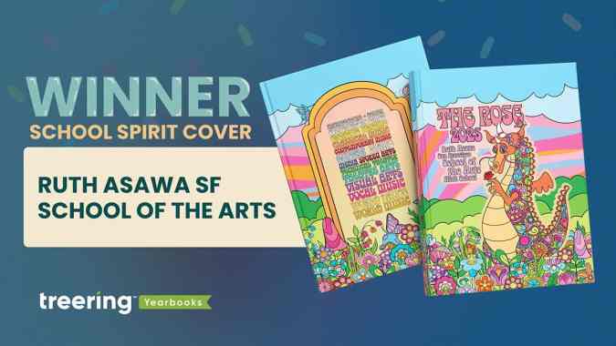
Grand prize winner: Ruth Asawa San Francisco School of the Arts, San Francisco, CA
Mascot: Rainbow dragon
School colors: 15 colors representing 15 art departments
“Each of the dragon's colors represents one of the school's 15 arts departments. Those colors are carried through the rest of the design, appearing in the colorful garden that spans the bottom of the front and back cover, and in the text on the back cover where each department's name is written in its unique color,” said adviser Jeff Castleman, who also teaches drawing, painting, photography, and computer art.
This cover illustrates the adage, “Know the [design] rules, and break them.” Generally, we’d encourage a yearbook creator to avoid using 15 colors. Not Asawa Arts.
They grouped warm colors for the sunset-inspired swirls, sandwiched between greens as grasses and blues in the skies. Each piece of flora has the base of the blues or pinks with pops of contrasting colors. Black lines hem it in.
A group of eight yearbook club students collaborated on the original illustration. The lead designers, both seniors, at Asawa Arts’ yearbook club developed the visual identity of the yearbook. They went from pencil sketches to creating their own computer-based line art. Six supporting designers (all juniors) filled it in with flowers, leaves, mushrooms, and butterflies.
On the spine and in the dragon’s hands are roses. “The rainbow dragon symbolizes our school spirit,” Castleman said, “and the rose it holds represents our guiding principles.”
The acronym representing Respect, Openness, Safety, and Engagement is part of the campus as much as it is part of the culture.
Castleman appreciated the flexibility of working with his students to create the vision and fully customize the yearbook cover. He said each year, the yearbook team re-imagines the dragon, giving it a different feel, from East Asian and Medieval to this year’s psychedelic interpretation.
“We think of [the cover] as the crowning jewel on a bespoke book,” Castleman said.
Castleman's team earned a Treering-sponsored back-to-school ice cream bash for their campus.
The final five
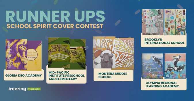
Brooklyn International School, Brooklyn, NY
Mascot: none
“Our school is a very tight community as our students come from many backgrounds trying to achieve the American Dream, but not forgetting their roots,” Norma Gaytan said.
Gaytan’s students represented their classmates with flags and artifacts from their home countries.
Gloria Deo Academy, Springfield, MO
Mascot: Lion
This is the cover we expected: school colors and a mascot boldly proclaiming school spirit. The texture in the mane and near-watermark incarnations of the lion on the back adds texture.
Mid-Pacific Institute Preschool and Elementary, Honolulu, HI
Mascot: Pueo (Hawaiian Owl)
The drone photo in honor of Mid-Pacific’s 20th anniversary is impressive enough. We loved the before and after images.
Adviser Abbey said, “The students learned about how to use a grid to scale an image, practicing in art. We then applied the math to create a giant grid on our courtyard and replicated our school mascot with field paint.”
Montera Middle School, Oakland, CA
Mascot: Toro
Student art always holds a special place in our hearts. Montera’s cover art extended from the front to the back cover, making a bold statement of school spirit.
Olympia Regional Learning Academy, Olympia, WA
Mascot: Orca
The symbolism in the student art evokes powerful sentiments of school spirit. Both contest winners captured the essence of the K-12 campus’ mentoring ethos. On the front, a mother and baby orca represent the cooperative role ORLA provides.
“We take our cooperative role with the families very seriously and we could not have the kind of school or kind of students we have without the role the caregivers provide, both at home and at our school,” adviser Rachel McKaughan said.
“The back cover also represents the playful spirit we have at the school with our many hands-on electives, she said, “where students are able to discover and express many different talents.”
From each submission, we learned school spirit is more than a sports team or school song steeped in tradition. It is comprised of community features: shared values and overarching identity. Thank you to the 300+ schools that shared their story with us.
Yearbook hero Kirsten Megaro tells a complete story
Treering Yearbook Heroes is a monthly feature focusing on yearbook tips and tricks.
In our first-ever parent contest, Treering Yearbooks asked parents to capture and share their child’s unique POV. Homeschool mom Kirsten Megaro from Netcong, NJ created a spread to celebrate the growth in all areas of her three kids' lives: educational accomplishments, deepening friendships and family relationships, creative projects, and current hobbies and activities.

How did you decide what to include on your custom pages?
Our homeschool co-op offers a mix of core and extracurricular classes. We love how our yearbook documents the classes and field trips we enjoy with our group each year. The custom pages allow us to see a wider view of our year.
I like to include a casual portrait of each kid from the year as a focal point, then use larger text boxes to give an overview of the main activities we participated in during the year. I fill in the rest of the spread with some of our favorite photos with captions to share the accomplishments they had, hobbies they pursued, important people in our lives, and field trips we took throughout the year.
The judges loved the color scheme as well as the repeating elements of the rounded rectangles.
I love playing around with layout: moving pictures, adding frames, making it organized, but just a little quirky too.
How do your kids help tell their stories?
We take so many pictures that it’s hard to narrow them down. I usually start by choosing my favorites that give a good overview of our year, then ask my kids what information and pictures they want to include to remember for the future.
What advice would you give to another parent who is just getting started?
Start simple: use a template for your layout—there are a lot of great options! Drop your pictures in and add a few captions. Add a creative touch here or there to start, and each year, you’ll get more and more confident and capable of showing your personality and style through your pages.
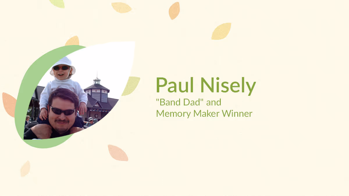
Yearbook hero Paul Nisely made us cry
Treering Yearbook Heroes is a monthly feature focusing on yearbook tips and tricks.
In our first-ever parent contest, Treering Yearbooks asked parents to capture and share their child’s unique POV. Self-described Band Dad Paul Nisely from Charlotte, NC entered the senior tribute he created for his son, Jason.

Paul featured his son’s involvement as a trumpet player in both the marching band and the school’s band as well as the friendships he’s built and maintained throughout 9-12 grade. On the right-facing page, he created the show-stopper that had us all choked up.
How did you decide what to include on your custom pages?
I have been taking a first day of school photo of my son in the same spot in front of our house every year since kindergarten and wanted those memories on one page. I have seen this done many times before.
In addition to seeing the changes in your child, you can also see the changes in the background scenery. We had to remove the brick edging because it was a fire ant nest which we realized after a photo. The different hairstyles, clothes, and backpacks show how much he has changed and how quickly the years go by. Every time I look at that page it makes me tear up.
Paul, let me tell you, there was a lot of emotion from the parents on the panel after seeing your spread. A reverent hush permeated the meeting, and then we read your story.
I love telling a story and getting emotional reactions with my photos. I was a newspaper photographer and went to school for photography and absolutely love seeing “visual moments” and documenting them. When the marching band season is finished I love putting together the photo book for that season. Even though my son is graduating I have already told the band directors I would love to keep taking photos of the band and making more keepsake photo books for the kids and their families.
Since you’re also a professional photographer, will you share some tips?
Take a lot of photos! You can’t run out of film: it's all digital now. Be there for the moments that are important for your child and capture them. Be patient with your child and be patient when taking photos. Then tell a story with those photos.
8 things to include in your yearbook
Scroll through your yearbook ladder and try not to panic at page after page of emptiness. To help with planning, we compiled this list with the understanding that you would have the meat and potatoes of a yearbook:
New at this? Pick one or two to include in this year’s yearbook. As your tenure as an adviser grows, so can your repertoire of things to include.
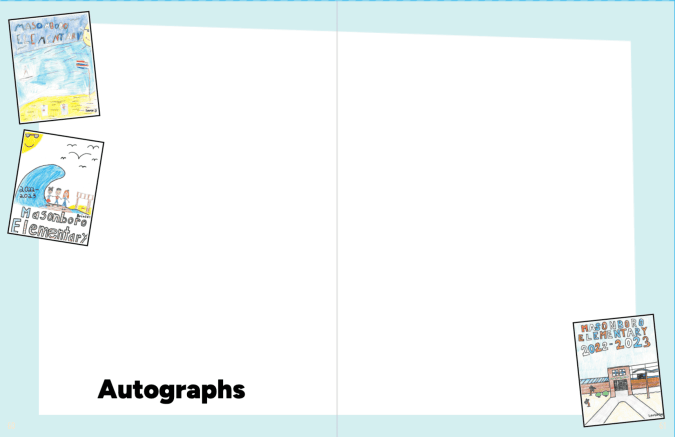
1. Autograph space
This is why we throw yearbook distribution parties. It’s why we wait until the last vote is counted in the ASB election and last ribbon is awarded at field day. Three weeks after clicking “I’m Ready to Print,” boxes of books magically show up.
Autograph pages are easy to include in your yearbook: you use a pre-made template or design your own. It doesn’t have to be fancy.
2. Table of contents
This is the most underrated spread in the book, a table of contents is the must-have launch pad for the reference book that is your school annual. It’s also something that can take a few clicks to create, if you’re using a Treering theme.
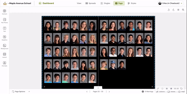
3. Collage layouts
Many times, we see upwards of 60 photos slapped on a spread with no layout structure. The number of students covered is overshadowed by a chaotic layout.
PSA: Just because Treering offers layouts with up to 65 photos, doesn’t mean you should use them. Every student should be recognizable. Aim for their faces to be the size of a dime.
4. Superlatives
Superlatives—is Greg Heffley the only one who calls them “class favorites?”—are yearbook awards based on student surveys. These “Most Likely to…” awards highlight standouts.
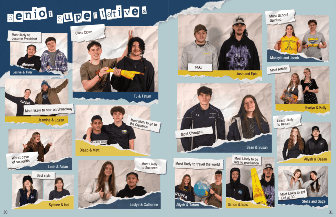
Check out our list of 100 superlatives focused on creativity, character, and community contributions.
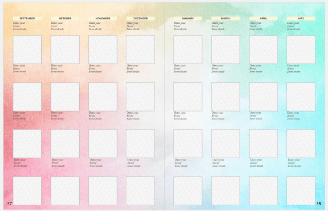
5. Year-in-review spread
Unless your yearbook is chronological, including a year-in-review spread is a way to increase storytelling. It gives a holistic overview of the year, both in and out of school.
School-level
A designated school year-in-review spread can feature images from events throughout the year, giving an overview of the activities and achievements across campus. Many yearbook creators love to use them for photos that may not have “fit” anywhere else or as a way to cover different students from saturated events pages.
We adapted it. Search "calendar" under "all page templates" to include this in your yearbook.
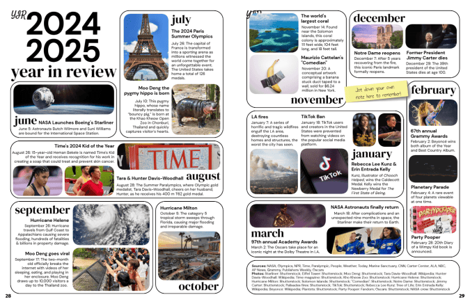
World-level
Some schools include what happens beyond school walls on a year-in-review spread. To do this quickly, use Treering’s pre-designed one.
Yearbook classes and clubs that want to create their own should
Keep in mind: if your year-in-review pages include celebrities, logos, photos someone on your staff did not capture, even in educational yearbooks, you may run the risk of copyright. The Student Press Law Center has a digestible guide on fair use for student media.
6. Storytelling photos
Both classroom moments and hallway hangouts show student life on campus. It’s important to include candids, academic photos, and even lunchtime snaps to balance posed portraits.
7. Content on portrait pages
Another way to break up posed portraits is to include content on portrait pages.
Shrinking your portraits to free up space for storytelling photos or even feature coverage, deepens your coverage and adds value to class pages.
8. Stories and captions
This is last on the list, not least on the list. Regulars to the blog have seen this charge before: If there is no writing in your yearbook, add captions.
Master them. Then, include expanded captions. Then, body copy.
No matter your team size, you can include extras in the yearbook that elevate it beyond a photo album and make the difference between a book that gets browsed and one that’s cherished.
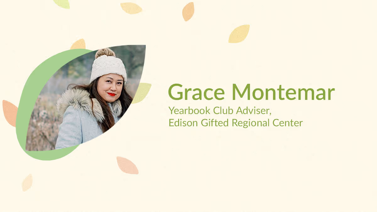
Yearbook hero Grace Montemar's show-stopping design
Treering Yearbook Heroes is a monthly feature focusing on yearbook tips and tricks.
In March, Treering Yearbooks announced its 2022 #TreeringMemoriesMatter Design Contest for yearbook advisers, coordinators, and editors to share their unique perspectives from their campus community. It’s time to meet the winners and glean their best practices for yearbook spread design.
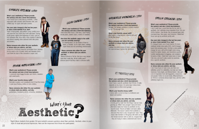
Grace Montemar is the Yearbook Club Adviser from Edison Regional Gifted Center in Chicago, IL. Her team earned first place in the middle school division for their “Aesthetic” spread. The reporting and design distinguished this spread.
Tell us about this show-stopper.
While we like to include several recurring spreads that appear in our school’s yearbook each year, we still like to introduce a few new features as well. This fresh feature allowed Yearbook Club to spotlight classmates from various grades whose fashion sense stood out from the crowd. The students who were invited to participate enjoyed answering a brief questionnaire that helped to illustrate their distinctive style.
How does Edison RGC design the book?
I typically like starting with a general template but then customizing it to suit the needs of the specific spread. Some of my yearbook students prefer creating a layout from scratch, which takes much longer. But if they’re committed to doing it this way (and time allows for it), then it’s totally fine.
I also try to manage expectations upfront so they understand that there will usually be a lot of polishing involved before their spread is fully ready for publishing in the yearbook. One thing that my yearbook students love is seeing their names attached to their work. It gives them a sense of pride to see their byline displaying their name and grade on any spreads that they’re involved in.
What does your role look like as a club adviser?
My responsibilities include recruiting and training the 6th-8th graders who join Yearbook Club, running the weekly meetings, empowering the students to help build the ladder and decide content, art directing them in designing their layouts, and helping them to proofread, edit, and write copy.
I also handle the marketing aspects––sending announcements to key channels for sharing with the intent of promoting sales with parents, as well as encouraging photo submissions.
How do you gather photos?
Pre-pandemic, the majority of photos were taken by myself, and/or I recruited parents who had an eye for photography to cover events that I couldn’t attend. With in-person events slowly starting to happen this school year, I’ve been able to resume taking some photos but we’re still relying more on community submissions than we have in past years. In order to keep the submissions coming, we periodically request specific photos throughout the year (to avoid receiving an onslaught of images too late in the production timeline).
What advice would you give to another person who is just getting started?
Congrats on accepting your role with the yearbook! It can feel overwhelming to take on this endeavor but you’ll do just fine. Here are some tips to help you:
- Take things one step at a time––but don’t wait. If you work on the yearbook little by little, regularly, and continuously, it’ll be much easier to produce, as opposed to cramming and rushing everything all at once at the end.
- Ask for help from your community when you need it. Need more photo submissions? Be sure to ask for help from the room parents and PTO in spreading the word. Still trying to recruit students? Ask for help from the principal or certain teachers in drumming up interest. You’d be surprised who’s willing to help (and how) if you just ask.

Traditional vs. trendy
When beginning to develop your yearbook theme, the choice of a traditional or trendy theme determines the layout design and the overall feel of the book. Many see traditional and trendy as opposing ends of a design spectrum. We hope to show you how you can fuse them as you create your yearbook theme.
Traditional design
Traditional yearbooks can be timeless. Their design structure is safe and predictable, easing readers through each turn of the page. Their appeal is not limited to students: parents, teachers, and alumni also feel included.

When following traditional design, design elements such as consistency, repetition, alignment, and proximity bring beauty and order to the design. Everything has a place and a purpose.


Some may argue that traditional design takes away from creative freedom, and they opt for the opposite: a yearbook led by a visual trend.
Trendy design
Inspired by a new social media platform or pop culture movement, trendy yearbook themes can be the creative equivalent of a blank check. Graphics and layouts can be playful, dynamic, buzzworthy, or a combination of all three! The immediate response from the student body is reactive, in a good way, because a trendy theme is an in-the-moment one.
Beyond hashtag sensations, fashion and art trends may drive the visual concept. Retro, scrapbook, and organic yearbook themes capture the spirit of students. Each conceptually has an authentic vibe and pushes traditional design norms by being more aligned with a DIY ethos.
Cons of using a trendy yearbook theme
Because they are deeply connected with a visual concept, they may not be fully developed verbally, leaving the theme concept feeling unfinished. While trendy yearbook themes immediately connect with the student body, they may also quickly feel outdated.
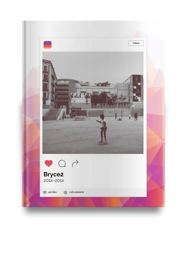
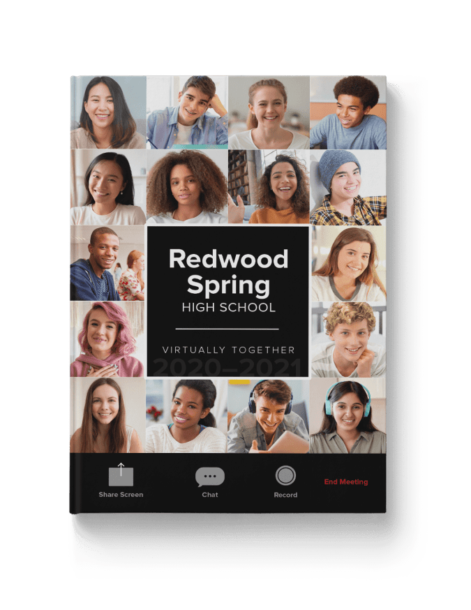
Take a look at these three tech-inspired Treering themes. Each captures a specific moment over the past ten years: the advent of "likes," virtual classrooms, and a glow up.

How to choose?
The best way to select a visual identity is to begin with the verbal. What story do you want to tell? Why?

Think about longevity and what value you want the yearbook to have in ten years or more. Determine if you want to create another volume in your school’s legacy or capture a specific moment.
Classic and current: a blended approach
A traditional book can feel dull with page after page of safe design. Conversely, a trendy book without proper hierarchy and balance feels chaotic. That’s why we advocate for trend-forward with timeless structure; it’s the Hannah Montana of yearbooks. Traditional design grounds the book, and trends bring it to life.
Ideas to blend traditional and trendy design:
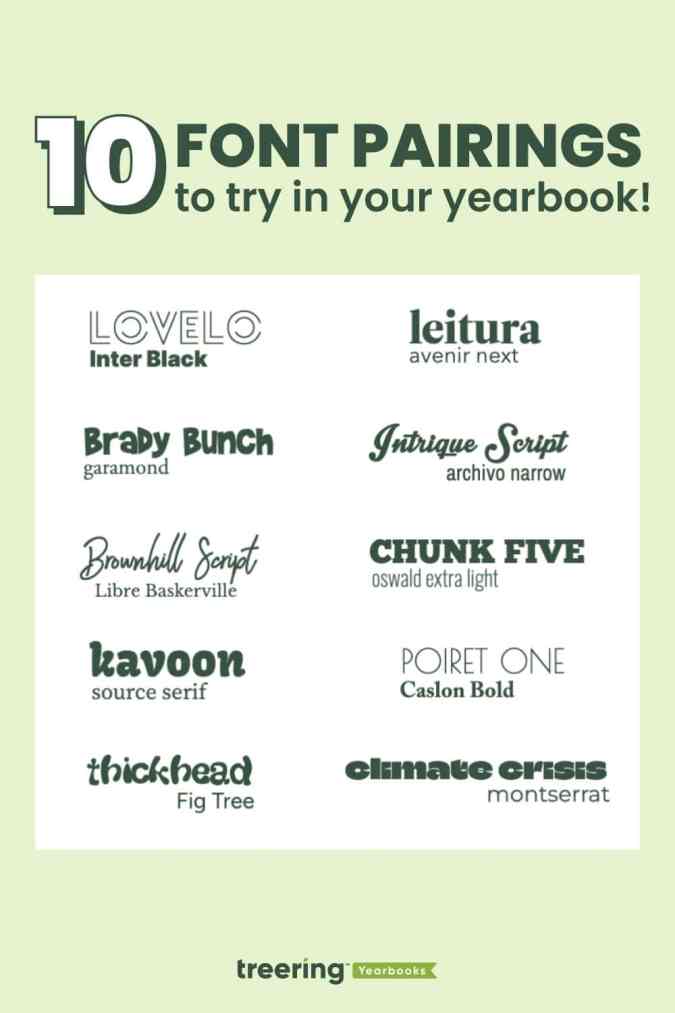
1. Font pairings: Use contrast to create your headlines
2. Color palette: Add a pop of color to a traditional color palette
3. Visual “hits”: Use up to three elements throughout the book to add variation
4. Showstopper spreads: Punctuate portrait pages with a highly visual spread
5. Trending treatment: Add a photo treatment to break up a traditional layout
Keep in mind, great design never goes out of style. And, when paired with quality captions and copy to tell the story of the year, that’s what makes your yearbook stand the test of time.