September 9, 2025
2
Min Read Time
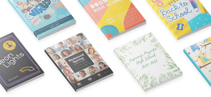
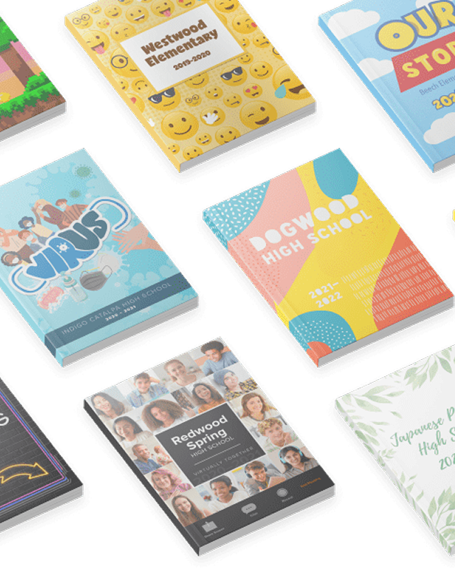
Ever flip through a yearbook and feel like every page was designed by a different person? (Spoiler alert: it probably was.) That’s what happens without a style guide. A yearbook style guide is your rulebook for keeping fonts, colors, and writing consistent so your book feels polished instead of patchwork. It sounds like a design hack, and in reality a yearbok style guide safeguards your theme's brand. Once it’s in place, your yearbook team can stop trying to remember what point the headline font is and get back to creating great coverage.
Think of it as a playbook and your staff training manual. Your style guide covers two big things:
With those basics locked down, your team won’t waste time asking, “Do captions need periods?” or “Which blue are we using again?"
This guide, encompassing design and writing, ensures a unified style while serving as a coaching tool for your team during the layout and design process. Beyond that, it acts as a visionary tool, allowing early development of a creative direction for your book. By providing clear instructions on elements like fonts and colors, the style guide liberates your team to focus on what truly matters, developing coverage ideas, capturing compelling photos and quotes, and crafting stellar layouts. Again, it’s the key to eliminating distractions and letting creativity flourish.
Often called the visual component of a yearbook theme, design is what people see. Here’s where yearbooks most often go off the rails:
If you’re going to do that, though, you need to cover all your bases and not leave room for interpretation. To do that, focus on locking down font choices, color choices, and how specific aspects of your layouts should look (like whether all photos need captions and, if you have a caption, what that looks like).
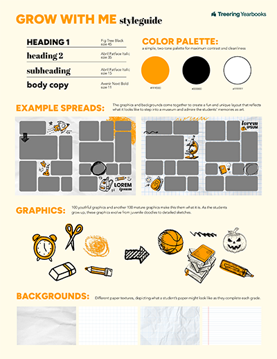
With hundreds of fonts from which to choose, resist the temptation to use more than three. Everyone has a preference (#TeamGaramond). Here’s the thing, though. Constantly changing them impacts your readers’ ability to comprehend what’s happening, according to science. Yearbook fonts should complement each other.
When you pick them, define their use:
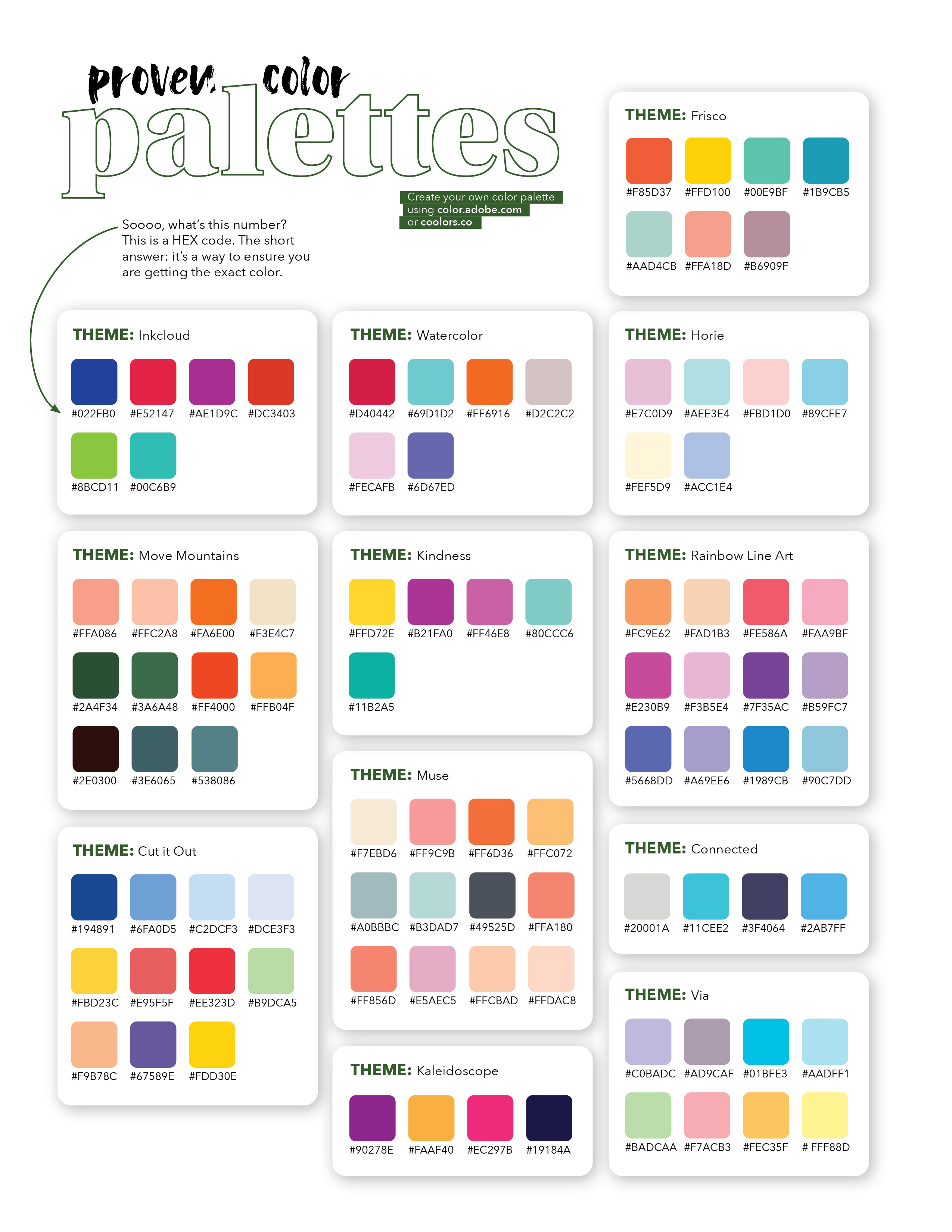
Focusing on readability is the first step to choosing font colors. The secondary objective will be using color to enchance the mood of your theme.
If that feels intimidating, using one of Treering’s 300+ themes gives you access to a proven color palette.
Design isn’t the only place things can get messy. Writing needs consistency too. Otherwise, your book will feel disjointed from page to page, like an awkward game of telephone. A few simple rules in your style guide will prevent that.
News sources, including yearbooks, use The AP Stylebook to govern writing mehcanics. Instead of investing excessive hours in an in-house style guide creation, we recommend leveraging the comprehensive AP Stylebook with minimal adjustments for your yearbook.
Instead, focus on tone, voice, using a simple outline. Ensure consistency by reviewing each section of copy against your agreed-upon style.
How should your yearbook sound? Fun and playful? Serious and academic? Pick one overall mood so your coverage feels intentional.
Think of voice as personality. Will your headlines be straightforward, such as "Basketball" or a little casual with some humor sprinkled in? Choose a lane and stay there.
Standardize how you list students’ grade levels. For example: Jordan Smith (11), Jordan Smith ’28, or Jordan Smith, a junior. Pick one format and apply it everywhere. These small choices add up to a polished, professional read.
Be careful here. What feels trendy now might be confusing in a few years, or even alienating to som students reading today. Stick to everyday language unless it’s universally understood.
Spending a few days on your style guide might not feel as exciting as brainstorming cover art or getting set up for photographing the Homecoming Court, but it’s the move that makes everything else easier. A solid style guide locks in your theme, keeps every page visually and verbally connected, and saves your team from endless “which font?” debates. Put in the effort up front, and you’ll walk away with a stronger theme, smoother workflow, and a yearbook that feels intentional from cover to close.