Design
Looking for inspiration, design tricks, how to make a great cover, promoting your yearbook and engaging your community?
Most recent

The one layout template you need
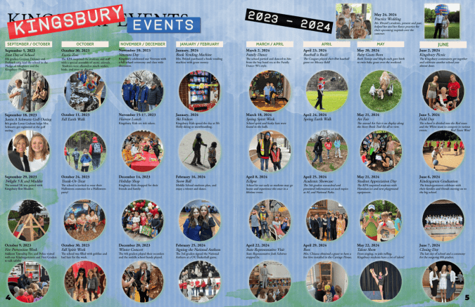
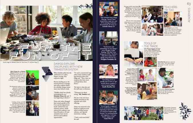
Yearbook coverage ideas might be our favorite topic: brainstorming ways to represent more students, resulting in a more authentic narrative of the school year. It could also mean more photos, interviews, and work for you. After a colleague shared Kingsbury Country Day School’s yearbook, a lightbulb went off. Yearbook coordinator Kara-Jane LaVoisne created the perfect layout that includes over 60 students, highlighting their impact and participation in school events.
Why we love this template
This spread packs a punch because it covers a large span of time in little space. It covers 24% of the school across two pages. It showcases events that would not be covered elsewhere. This template is also well-designed: it’s clean and has multiple reader entry points.
Home for smaller events
Oftentimes, we have several photos that don’t fit on a larger spread. This is especially common in books that do not take advantage of modular design. LaVoisne took advantage of those moments to create a means to include them.
Versatility
While LaVoisne used this template for a school-specific year-in-review, you can use it once per section or season. For example:
- Fall, winter, and spring PTA or ASB events
- An overview of the sports seasons
- Semester rundown of student life
If you’re feeling ambitious and have the content, an hour-by-hour review of a major school event such as the talent show or homecoming weekend could be a showstopper spread for your yearbook.

What’s most important: your yearbook team celebrates the people in your campus community. This layout is just one way to cover more students in your yearbook. For more creative yearbook coverage inspiration, check out:
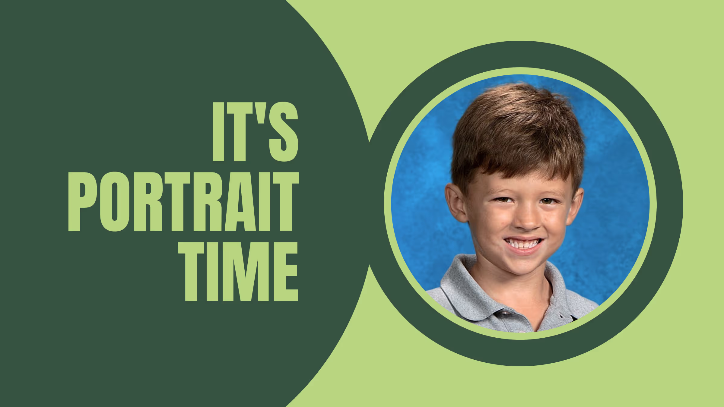
Portrait perfection for your yearbook
Yearbook portraits comprise up to 40% of your book. Pause and contemplate that for a sec: row after row of awkward head tilts and half smiles with the same speckled background your mom had in the 70s fill the bulk of your pages. If you want to change up your layout and use the space to add additional content and cover even more students, we have a blog for that. This one, however, will help you nail the core of your people section.
Work with your photographer
If you’re not the picture day coordinator (lucky!), meet your school photographer and find out when you can expect to get access to your portraits. The two-to-three weeks between makeup day and when proofs arrive should be a part of your workflow. Spend that time prepping:
- An accurate roster
- Fall event yearbook spreads
- Poll, survey, and academics content you will incorporate in your portrait section
Extra credit: learn the how, what, and why of portrait files in the Treering Help Center.
Portrait pages: faster than a cup of coffee?

Treering’s engineers know we have a diverse group of users, so they included automation—such as portrait autoflow—in the arsenal and DIY features. Absent and new students can be flowed in after the fact, and your portrait pages will automatically re-alphabetize. What a relief!

PDF proofs for portrait pages
Editors tell us the secret to an accurate portrait section is utilizing the free PDF proofs in your editor dashboard. Some of the ways schools check names are:
- Distribute proofs to classroom teachers to ensure all their class is pictured
- Post PDF proofs in the lunch room so students can sign off on their names and grades
- Work with school administration to comb through portrait proofs and match them to the school’s database
- Share PDFs proofs at a PTA/PTG/PTO meeting for parents to check (this is also a hot marketing tip)
The more eyes that you have checking the spelling of names and making sure that the photo and name match up correctly the better.

Including a diverse set of holidays and celebrations in the yearbook
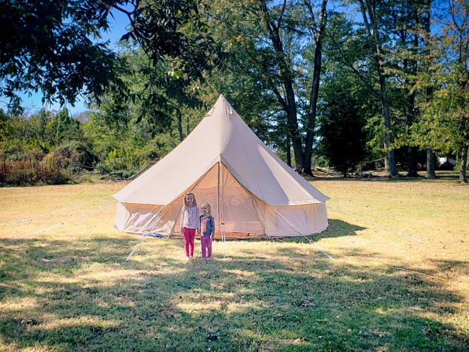
It all started with a yurt. A mom on campus posted a photo of her daughters in front of their temporary home in a field. As a part of their Sukkot observance, they lived, ate, and gave thanks in the yurt for nearly a week. After asking around, three other families on campus celebrated similarly. This sparked something in our yearbook program: who else lives a life about which we know little? (Answer: everyone!) And this became the catalyst to broadening the scope of our off-campus student life coverage. Read on for tips on inclusive coverage for diverse holidays and celebrations that reflect the individuals in your halls.
Make celebrations individualized
When we work with our students to learn from one another, we model and facilitate courageous conversations. Many of us parents grew up with the adage: politics and religion never make for polite conversation. By focusing your interviews on the individual—versus the religious or cultural practice—you will see it through his/her eyes.
That said, it is never one student’s job to be the “ambassador” for their faith or home country. That’s why we prepared this list of questions to focus on the individual’s celebration. (Just think about how even members of your extended family celebrate birthdays differently!) The narrative that will unfold is about the student or staff member rather than a book report on the celebration. Avoid comparing or contrasting.
- What does [celebration] mean to you?
- What traditions does your family have?
- What food do you eat on [celebration]? What ingredients make it special?
- How do you prepare for [celebration]?
- What music makes it special for you? Why?
Diverse coverage ideas:
Symbols spreads
Ideally, you’d have photographs of the decor that surrounds your students during the season. If that isn’t possible, use some stock images and position pull quotes of students describing how they use them.

Mini-modules
Re-enactments of major events, such as Eid, that happen at a student’s place of worship can focus on the process, such as the challenges of memorizing lines or balancing rehearsals with school work. Lunar New Year festivals are another area to cover. Ask students about music, food, and decorations.
Winter or spring “specials”
Plan ahead for one of the holiday seasons by interviewing students about their celebrations using the questions above.
Spring hosts Easter, Holi, Passover, Ramadan, and Vesak. Fall and winter are the seasons for Bodhi Day, Christmas, Diwali, Kwanzaa, Hanukkah, and Thanksgiving. (Please note, these are in alphabetical order, by season, not chronological as some days change because they are on a lunar calendar, not our American solar calendar.)
Research first
There’s an iconic episode from The Office, “Diwali” that gives us a picture of what could go wrong (and oh-so-right). In typical Michael Scott fashion, he fills a meeting with inaccuracy, and his actions and lack of truth impact those around him. Moral of the story: be Dwight.

As you prepare to extend coverage to include diverse holidays and celebrations, do a brief study of the symbols and history of the event. These are great classroom opportunities to brainstorm questions and talking points. You can even give a few non-examples to help students filter.
We’ll leave you with this bonus fact: Cinco de Mayo is not Mexican Independence Day. It’s not even a national holiday in Mexico.
244 title ideas for your yearbook (and tips for writing your own)
People put a lot of thought into naming their children (and even their pets). Well, this yearbook is your baby, so you want to give it a name that lives up to its content. We’ve put together some tips for how to get the brain juices flowing when it comes to choosing your title, and also some great title ideas we’ve come across over the years.
Set some guardrails
The number of yearbook title ideas rivals the number of fish in the sea, so it helps to narrow your sights before you cast the net. One thing that helps is to pull the yearbooks from the last five years and take note of their titles.
You should also decide on the tone. Some like yearbook titles to be inspirational, while others like to provide a nod to the overall theme. And for some, being straightforward works best. Regardless, it’s helpful to set the scene in your mind so you can measure your options against your expectations.
Different approaches to yearbook titles
There are a few different routes to take when pursuing a title:
- Tie it to your School. You can use the school’s name, colors, mascot, or location as a jumping off point.
- Time-Specific Title. Make a reference to this current point in time, by calling out the year, referencing a sign of the times like sustainability or social media, or by using a current song lyric or movie quote.
- Timeless Titles. These ideas capture the overall intention of a yearbook by speaking to nostalgia, memories, and the passage of time.
Whether you build on your school’s spirit or pay tribute to the collection of memories within, your yearbook’s title should capture the essence of your book and give the reader a sense of the journey to come. Select a few ideas and try them on for size. Share them with your committee and gather some feedback. After you let them marinate, you’ll find that one perfect idea, and it will practically jump onto the cover itself.
Yearbook title ideas
Interested in a few examples? We’ve compiled several options from the types of covers mentioned above. Feel free to poke around, and take whatever inspiration this list offers.
School-Inspired: Mascots
- The Year of the {School Mascot}
- The Shine of the {School Mascot}
- From the {School Mascot}’s Den
- The Eye of the {School Mascot}
- This is {School Mascot}Country
- {School Mascot} Territory
- {School Mascot} Pride
- In Our Hearts | On Our Sleeves
- Peace Love & {School Mascot}
- Keep Calm & {School Mascot} On
School-Inspired: Colors
- {School Color} Memories
- Seasons of {School Color}
- Seeing {School Color}
- A Splash Of {School Color}
- Better In {School Color}
- In Color
- Color Commentary
- Showing Our True Colors
- Showing Off Our Colors
- {School Name} In Color
- Life In {School Color}
- These Colors Don't Run
- More Colorful Together
- In Living Color
School-Inspired: Location
- From the Heart of the Rockies
- From the Desk of {School Name}
- {School Name} Presents…
- United States of {School Name}
- {School Name} Is Buzzing
- If These Walls Could Talk
- The Writing On The Wall
- Inside {School Name}
Time-Specific: The Year
- 202X Voices
- We Are #202X
- 20/20 Vision
- The Stars of 202X
- Reward: 202X
- Rocking 202X
Time-Specific: Pop Culture
- The Pensieve
- Snapped
- Blank Space
- 100% Home-Grown, Farm-Fresh {School Name} Memories
- See You Again
- The {School Mascot}: Age of {School Name}
- Reduce, Reuse, Remember
- #No Filter
- Picture This
- Instant Reply
- Filtered
- Catching Fire
- 201X-202X: A Lot To Like
Evergreen: Nostalgia
- Encore
- No Place Like Home
- Total Recall
- Sand Through the Hourglass
- Good Times
- Wouldn’t Change a Thing
- Wrapped Up
- Old Stories
- A Time To Remember
- As Time Goes By
- A Picture In Time
- A Year In Review
- Reflections
- Sands Of Time
- A Point Of View
- A Look Back
- Always and Forever
- Anthology
Evergreen: In the Moment
- It’s Our Time
- Viva la Vida
- Time of Our Lives
- Perspectives
- Meanwhile
- More Than Words
- Side by Side, Hand in Hand
- Nothing But the Truth
- Scratching the Surface
- Our Year
- Highlights
- Living The Dream
- This Is It
- Profiles
- A Closer Look
Evergreen: The Future
- A Future So Bright
- New Traditions
- A New Day
- Bright Futures
- Finding Our Way
- New Takes | Old Traditions
- Unlocking The Future
- Endless Memories
- Into The Future
- The Road to Tomorrow
- Make Your Mark
- Chapter Infinity
- Gateway
- No Turning Back
- Take a Chance
- The Best is Yet To Come
Evergreen: Showbiz
- Welcome To The Show
- Under The Big Top
- The Main Event
- In Lights
- Headliners
- Bright Lights
- Behind The Scenes
- Action!
- Showstoppers
- A Fresh Take
- All Stars
- Stars of {School Name}
Evergreen: Social Media
- Leaving Our Mark on the World
- [Year] Notifications
- Follow Us
- Shareworthy
- For the Likes
- #NoFilter
Evergreen: Documentary
- Write It Down
- For All To See
- A Blank Slate
- The Whole Picture
- Our Story To Tell
- Put It In Ink
- Not Just Another Year
- Take Note
- A Year In Pictures
- Words Aren't Enough
- A Look Inside
- A Story All Our Own
- Quoted
- (Re)Writing History
- Another Chapter
- Newsworthy
- Headlines
- Signed Sealed Delivered
- Memories: Delivered
- Noted
- Pass It On
Evergreen: Technology
- A Bright Idea
- Keyed Up
- Wired For Success
- Pushing Buttons
- Always On
- Press Play
- Plugged In
- What Makes Us Tick
Evergreen: Nature
- Rising & Shining
- Where The Grass Is Greener
- Life's A Beach
- Riding The Wave
- On The Vine
- In Bloom
- Roots
- Planting A Seed
- Watching {School Name} Grow
- Out of Our Shells
- In a Nutshell
- What's the Buzz?
Evergreen: Journeys
- The Road Less Traveled
- Off The Beaten Path
- Over The Hills & ...
- {School Name} Marks The Spot
- In Flight
- Expanding Our Horizons
- New Views
- Out Of This World
- Unchartered Territories
- Horizons
- Setting Sail
- The Sky’s The Limit
- Going Places
- Have Education Will Travel
- Beyond The Shore
- A Bigger World
- Headed In The Right Direction
- Onward & Upward
Evergreen: Adventure
- Amazing Adventures
- Tall Tales
- A Wild Year
- {School Name}'s Safari
- The Sights We've Seen
- The Amazing Adventures Of 2016
- Super {School Mascot}
- The Incredible Story Of {School Name}
- Oh, the Places We've Been!
- {School Name} Superheroes
- Our Heroes
Evergreen: Inspirational
- Better Than Ever
- Naturally Awesome
- Loud & Proud
- Dream It | Do It
- Shooting For The Stars
- Be Happy
- What A Wonderful World
- How Sweet It Is
Evergreen: Success
- Whatever It Takes
- Tricks Of The Trade
- Pulling It All Together
- It's How You Play
- A Whole New Game
- A Streak of Good Luck
- Wired For Success
- Coming Up Aces
Evergreen: Building
- Blueprints for the Future
- A Year of Building
- Building Towards the Future
- Planning Ahead
- Future Plans
- Blueprints for Life
- Blueprints
- Just Like We Drew It Up
- Dreaming Big
- Towering Memories
- Skylines
Evergreen: Individuality
- Express Yourself
- Expressing Ourselves
- Individuals Together
- Just Like This
- Formalities Aside
Evergreen: Community
- It Takes All Of Us
- How We've Grown
- Coming Together
- Putting It All Together
- Pieces Of The Whole
- Parts Of A Whole
- Done Our Way
- What Makes Us
- Who We Are
Evergreen: Creativity
- Hand-Drawn
- Breaking The Mold
- Drawing It Out
- An Artful Year
- Painting A Picture
- A Colorful Take
- Paint The Town
- Strokes of Genius
- A Picture Of Success
- The Fabric of Our Year
- Tightly Knit
- Painting Memories
- Focus
- A Different Perspective

Anatomy of an elementary school yearbook
This is the time of year when all those shared photo folders are filling and your spreads are mostly blank. It’s time to build the book. And if you don’t know where to start, check out a sample yearbook ladder to see how one of our Treering schools organizes its book.
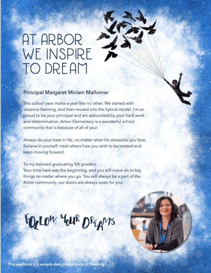
Principal’s letter
Some of the best advice I ever received on principal letters came from a veteran adviser: “Connect to the theme.” The yearbook theme serves as the unifier between all the clubs, activities, sports, and classes that take place throughout the year. So it makes sense that, as the leader of the school, the principal’s message both unifies and sets the stage for that theme. Incorporating the theme is a way to also recognize the hard work of your yearbook team and a subtle show of support.
When meeting with your principal, communicate:
Depending on your relationship with your principal, you may be able to present a first draft for him/her to finesse. Generally speaking, the principal’s letter appears at the opening or closing of the book or in the staff section.
Classroom photos
Photographs of students working in the classroom give a true portrait of their day. (Lame pun intended.) American students spend roughly a quarter of their day in school. Let’s showcase their contributions and celebrate their achievements.
Elementary school events
Fundraisers, dances, parades–oh my! These all-school events showcasing your student body's unity are must-haves for your yearbook, as are the class distinctions: 5th/6th grade trip, 100th Day of school, faculty vs. parents soccer game, reading buddies, etc.
Don’t feel like you have to devote a double-page spread to each! One spread can feature all the class parties, and another the fundraisers.
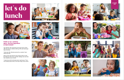
Candids/Lunch
Just as the academics photos are valuable, so are the in-between moments when students are at lunch or during transition periods. Playgrounds and lunchrooms are daily photos ops for volunteers and teachers to snap these carefree moments. You may want to include photo collages between grades (i.e. upper and lower school recess and lunch) or as the perimeter for autograph pages.
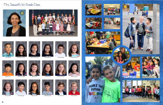
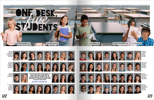
Portraits
Much of your elementary school yearbook will be portraits–these tend to take up an average of 40% of the book! You can organize these:
- By grade and feature some fun facts about each group (e.g. miles run at the Jogathon)
- By grade and teacher with classroom candids sprinkled in
Heads up: this is where you want to be extra diligent with your proofreading strategy. We suggest handing out your PDF proofs to each teacher to approve or hanging them in a conspicuous place to make sure names and classes are correct.
Extra ideas for your elementary school yearbook
Table of contents
In an elementary school book of 20 pages, will you need a table of contents? Probably not. If you want to help guide your readers, add a small one to your title page. Larger books should divide themselves into sections. A table of contents is a great place to drop in some extra photos of students.
Special recognition for promoting students
Parents love bragging about their children. (Present company included!) If they are not adding copious custom pages, they may appreciate the opportunity for a recognition ad. You'll appreciate the opportunity to raise some additional funds for your program.
Because you know your elementary school community best, you know what they will want in the yearbook. We're here to help!

What is modular yearbook design?
Modular design for yearbooks is an approach to layout and design that emphasizes flexibility (just like your favorite yearbook company) and ease of content organization. Small, self-contained modules include photos, copy, and other theme content. With multiple reader entry points, a modular layout contains three or more, each telling a different story.

Four modular layout ideas
Because modular design has many interpretations and applications, we pulled together four different looks.
Idea 1: let your story be your guide
This spread covers the middle school schedule, media program, study habits, and electives in six modules. There is a large amount of copy beyond the feature story and a quote "sidebar" running down the middle of the spread.
Idea 2: give the whole picture
This varied collection of mods includes a quote package, personality profile, election results, and event coverage. In a chronological yearbook, such as this, modular layouts help organize myriad stories on a single spread.
Idea 3: start small

Not only did the six polls reveal more about the faculty, but the yearbook editors added quotes and cutouts to teach us more. Adding a mod to the people or reference section is one way to add voices to an otherwise flat section.
Idea 4: drag and drop
Low on copy, high on images, this sample spread with four modules provides ample space to detail aspects of art creation. As-is, this layout is available with the others in the Maximalist theme under layout and design for Treering Yearbooks editors. Other modular themes include Tropical Chronicles and Tied Together.
Layout tools and tips
Treering Yearbooks' built-in tools to help you create your own layouts and modify ours in a few clicks.

Treering design school in under 18 minutes.
Pros and cons of mods
While modular design increases coverage opportunities, it takes more planning from your editorial team.
Pro: coverage
Devoting a spread to one topic limits the coverage to one group. Opening up a sidebar or two increases your possibilities to tell more of the year.
Pro: collaboration
On larger teams, modular design facilitates collaboration among a team of yearbook contributors. Section editors can distribute interview and photography assignments by topic.
A quick note for advisers: assigning module topics is also a way to combat the “I have nothing to do” line that tends to get tossed around the newsroom.
Pro: consistency
Recurring modules maintain a consistent look and feel throughout the yearbook, which strengthens the theme and overall design.
Con: planning
Frankly, some content may not neatly fit into modular structures. It’s fetch. And if not managed carefully, modular design may lead to overusing the same design elements. There’s a fine line between consistency and monotony.
Yearbook module ideas
The most popular yearbook mods tend to be sidebars with a question-and-answer format. If you want to add something new to your yearbook layouts this year, this is one way to increase coverage and develop open-ended questions.
Consider building in these additional modules:
- This or that: fashion, fandoms
- Matching: teachers with their first jobs, the shoe to the sport
- How-tos/step-by-step: prep for an inside and outside pirouette, outline a DBQ essay
- Flat lays: teachers’ desks, backpacks
- Essential gear: art kit, robotics team
- Timelines: getting ready for a school dance, fundraiser from start to finish
- Lists: five ways to welcome new students, 10 reasons people auditioned for the spring musical
This blog is adapted from Liz Thompson’s Design 201 session from TRL 23: Start Here. Thompson, a former high school yearbook adviser, serves as a customer success manager with Treering Yearbooks.

3 content ideas for portrait pages
When “outsiders” think of yearbooks, they imagine little beyond the portrait pages. They see the obligatory blue background and big grins that accompany a moment in time many of us, as students, dreaded. (C’mon, we all didn’t receive the Glamor Shots by Deb experience!) Since this is a part of students’ permanent record, it's a necessary component. It is a part of the historical record of the school year. It’s also not our students’ favorite. Long ago, this adviser decided to decrease the size of yearbook portraits, while increasing specialized content. Here are three ideas to break up your portrait pages by adding rich, personal content.
1. By the numbers
Use stats and surveys to provide a quantifiable portrait of the students pictured on your pages. Begin by understanding what is important to your students and then ask questions. For example, if your school’s focus is on health and wellness, break down how students and staff contribute to that goal by including content such as
Pair the numbers with photographs of students engaging in the activities and quotes for an even more personal approach. What does it mean to be a part of a community so encouraging of physical activity? How do students balance their school work with tournaments and performances?

2. Keep content class-y
Grade spreads in your portrait section are ideal for academics or class-specific coverage. Highlight the unifying aspects of school life, such as class trips or advisory periods, and then ask students about their individual experiences with each. Grade sections could also include:
3. Get personal with portraits
Personality profiles and student life modules both create opportunities for an inclusive yearbook by targeting lesser known students or students with interests outside school-sponsored arts and athletics. These content modules add voices to the portrait section of your yearbook!

Take advantage of the additional space you'll create by shrinking portraits to pull out more content from your student body.

Never yearbook alone
This is the heart of Treering’s Yearbook Club webinars. Teachers looking for classroom support and parent volunteers looking for a launch pad can find resources and how-tos throughout the school year at no cost.
Synchronous instruction
If you don’t speak teacher-ese (or don’t care to on your prep period), this just means it’s live. This real-time interaction means attendees receive instant responses to their questions. (Full disclosure: occasionally, we divert from the script because the group’s needs demand it.)
Direct access to expertise
See what happens when you bring together staff members from product knowledge, marketing, and community advocacy. No PowerPoint slides. No hypotheticals. All yearbook.
We believe in show and tell
Starting at Treering.com, every webinar shows you how to create, get inspiration, and receive help. We show you how to customize your styles and settings, find marketing materials, and maximize the automations in Treering’s yearbook builder.

Each month, new advisers can join a Getting Started webinar to get an overview of the design and print process. As you progress through your yearbook journey other webinars are available, including Treering Live, our flagship virtual yearbooking event and topical sessions on portrait, advanced design, and theme development.
Your yearbook your way
Yearbook creation isn’t a one-size-fits-all process. Neither are Yearbook Club webinars. We’ll show you all your options to make your yearbook represent your population, from changing up backgrounds to creating custom word art.
The Yearbook Club team releases new Tip Tuesday videos each week on YouTube.
Community
Call it networking, if that’s your thing. In the live chat, attendees exchange ideas and strategies.
On a personal note, I’ve met some yearbook advisers in the chat who have become contributors to this blog, and I’d like to think lifelong friends. We celebrate professional and personal milestones together. Occasionally, family pics pop into my inbox, or we text a timely yearbook meme.
No one else understands what being a yearbook coordinator is like outside this small world. I’m going to seek support from those who do.
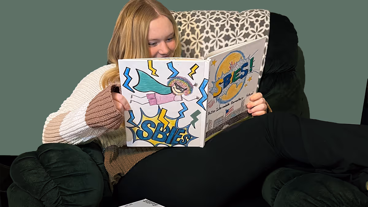
Creating custom yearbook covers with student art
It’s fall, and we’re all going crazy about yearbook themes. After your team decides on the collective story to tell, consider how you will communicate it visually. If you haven’t yet, use student art on the yearbook cover to celebrate and showcase the diverse talents of the student body. It adds a unique, only-on-our-campus touch, which we love. After all, customization is our thing.
Custom cover advice from the pros
The Treering Design Team helps roughly 200 schools annually with their cover issues. The biggest piece of advice: make sure you have enough bleed. This keeps art from being cut off in the scanning process. We always say to get those printed proofs ordered early; this is one more reason.
They also suggest advisers understand the technical requirements so your art prints sharply and vibrantly:
- Scan the page at 300 DPI or higher
- Save it as a JPG or PNG
- Upload the image to Treering as a photo
Ideas for gathering student art
Student art is that simple: it’s art from students. Whether you source it through an intra-campus partnership or create a school-wide drive, the goal is to achieve a personal, unique-to-us impact.
Cover collaborations
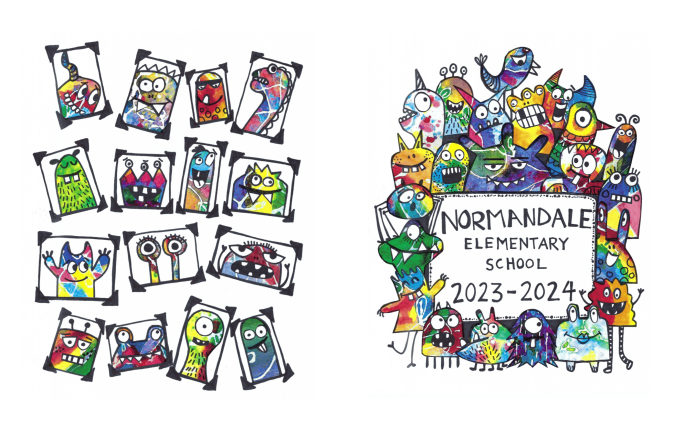
Class projects, such as collaborations with art teachers, get students outside the yearbook room involved. (And really, this is marketing gold: you’re building a relationship with a group who are now stakeholders in your final project.)
Yearbook volunteer Lauren D. shared how they went from classroom to yearbook cover with an art project at Normandale Elementary. The art teacher used batik patterns made by her students into creatures for their yearbook cover.

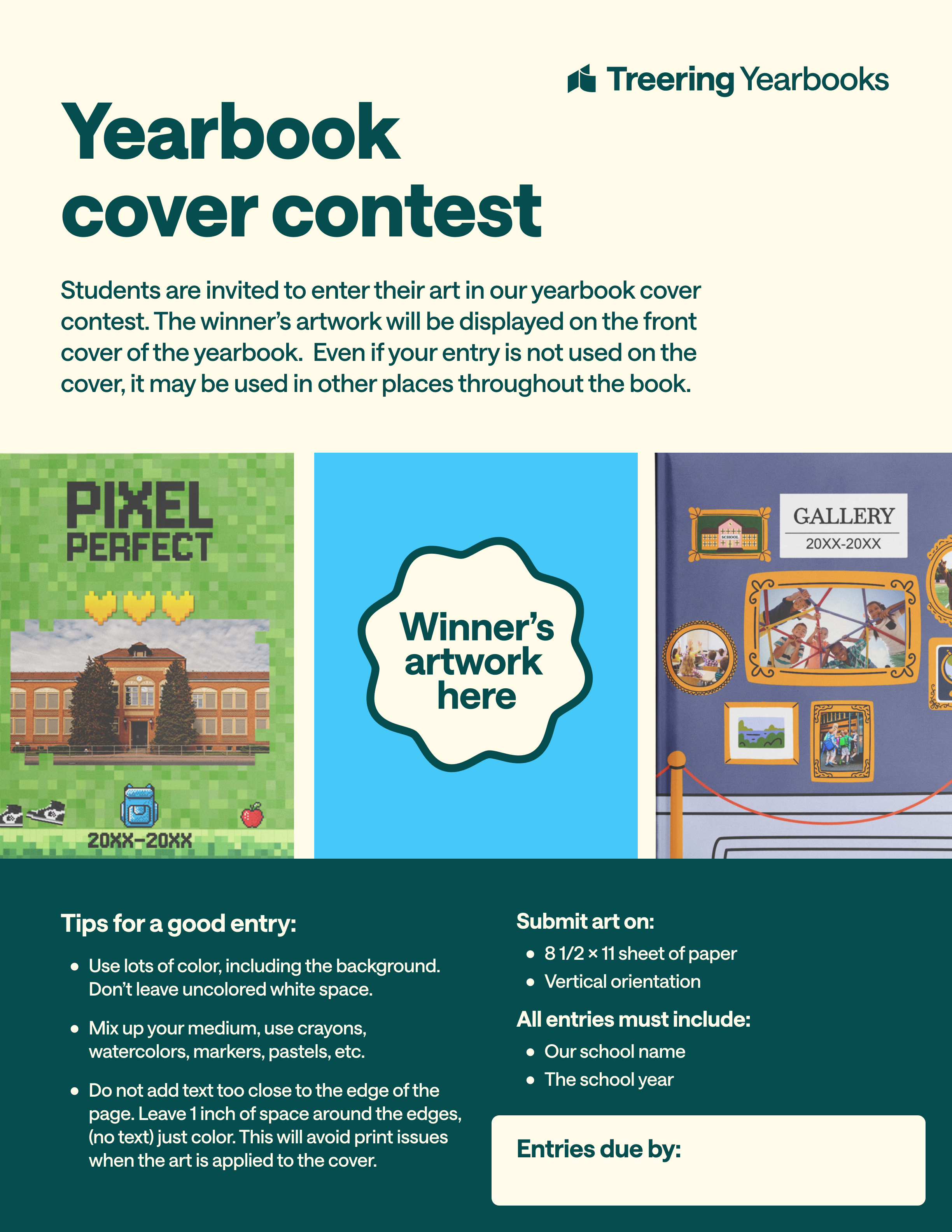
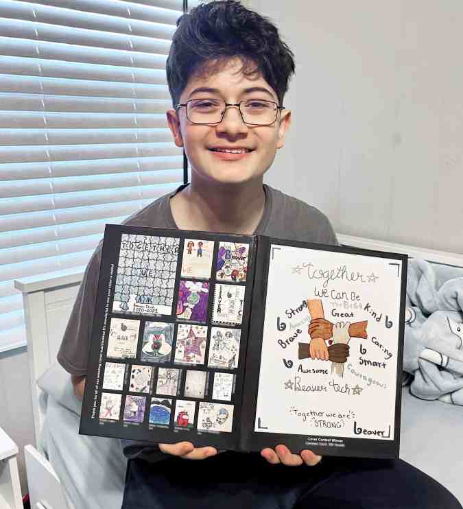
How to do a yearbook cover art contest
“I believe that students should be the driving force behind the yearbook's design,” said yearbook Adviser Julie R. She uses a cover contest to showcase student art. She asks students to use school colors and to “represent what learning and school look like to them.” Her yearbook team looks through the submissions and selects the one that most authentically captures the year.

If you share Julie’s POV and want to do your own contest, you’ll want to communicate the following:
- Dates for the contest: submission window, evaluation period, and announcement of the winner(s)
- Art requirements: paper size and orientation, medium, required elements (e.g., school motto)
- Judging criteria
- If you have any grade or class restrictions (some schools hold the contest with the highest grade or limit it to students in the art program)
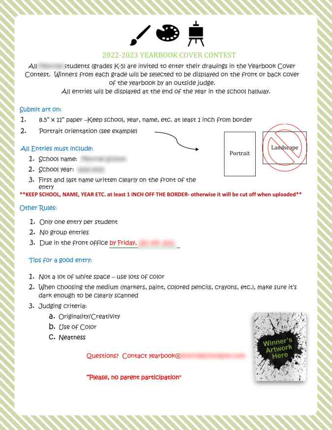
Explain the contest rules in advance to avoid unnecessary tears, hurt feelings, and frustration. Depending on the number of entries received, all can be included in the yearbook. Check out how these schools integrated their runners-up.
Student art on the front and back cover
This is the most popular approach: the winner on the front and runners-up on the back.
Student art throughout the book
Think about it: if you asked students to represent your verbal theme through their submissions, why wouldn’t you use their interpretations throughout the book?
Tag us on social media (Facebook, Instagram, TikTok, X) to show us how you use student talent to foster pride in your school community.

Creating a yearbook style guide: advice to follow
Ever flip through a yearbook and feel like every page was designed by a different person? (Spoiler alert: it probably was.) That’s what happens without a style guide. A yearbook style guide is your rulebook for keeping fonts, colors, and writing consistent so your book feels polished instead of patchwork. It sounds like a design hack, and in reality a yearbok style guide safeguards your theme's brand. Once it’s in place, your yearbook team can stop trying to remember what point the headline font is and get back to creating great coverage.
Wait, what is a yearbook style guide?
Think of it as a playbook and your staff training manual. Your style guide covers two big things:
- Visual theme: fonts, colors, and graphic
- Verbal theme: tone, voice, how you list names and grades
With those basics locked down, your team won’t waste time asking, “Do captions need periods?” or “Which blue are we using again?"
This guide, encompassing design and writing, ensures a unified style while serving as a coaching tool for your team during the layout and design process. Beyond that, it acts as a visionary tool, allowing early development of a creative direction for your book. By providing clear instructions on elements like fonts and colors, the style guide liberates your team to focus on what truly matters, developing coverage ideas, capturing compelling photos and quotes, and crafting stellar layouts. Again, it’s the key to eliminating distractions and letting creativity flourish.
Design: the visual part of your style guide
Often called the visual component of a yearbook theme, design is what people see. Here’s where yearbooks most often go off the rails:
- Fonts
- Color palette
If you’re going to do that, though, you need to cover all your bases and not leave room for interpretation. To do that, focus on locking down font choices, color choices, and how specific aspects of your layouts should look (like whether all photos need captions and, if you have a caption, what that looks like).
Choosing a font palette
With hundreds of fonts from which to choose, resist the temptation to use more than three. Everyone has a preference (#TeamGaramond). Here’s the thing, though. Constantly changing them impacts your readers’ ability to comprehend what’s happening, according to science. Yearbook fonts should complement each other.
When you pick them, define their use:
- Headings and subheadings
- Body copy and captions
- Accents, such as folios, pull quotes

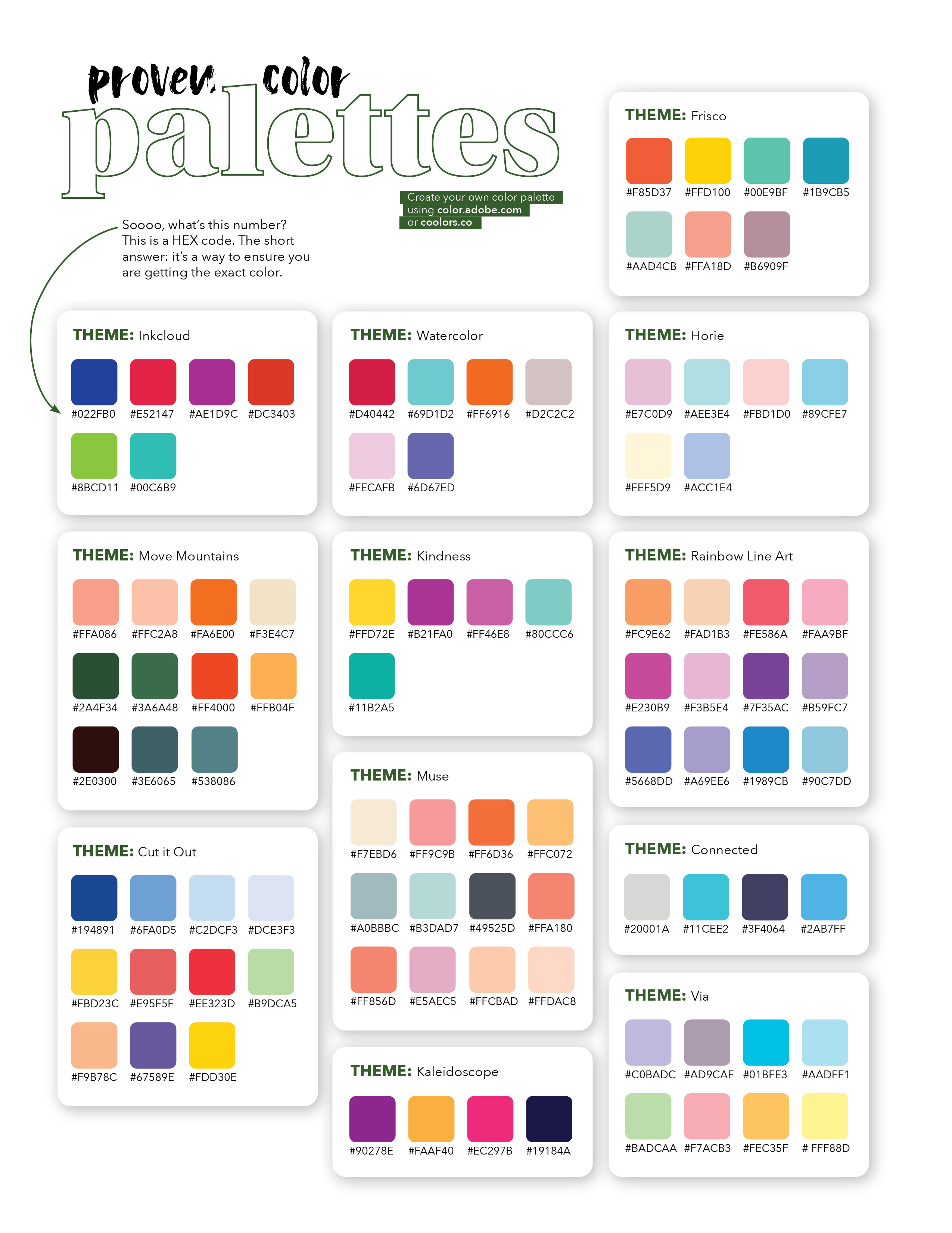
Choosing a color palette
Focusing on readability is the first step to choosing font colors. The secondary objective will be using color to enchance the mood of your theme.
If that feels intimidating, using one of Treering’s 300+ themes gives you access to a proven color palette.
Verbal: the second part of your style guide
Design isn’t the only place things can get messy. Writing needs consistency too. Otherwise, your book will feel disjointed from page to page, like an awkward game of telephone. A few simple rules in your style guide will prevent that.
News sources, including yearbooks, use The AP Stylebook to govern writing mehcanics. Instead of investing excessive hours in an in-house style guide creation, we recommend leveraging the comprehensive AP Stylebook with minimal adjustments for your yearbook.
Instead, focus on tone, voice, using a simple outline. Ensure consistency by reviewing each section of copy against your agreed-upon style.
Tone
How should your yearbook sound? Fun and playful? Serious and academic? Pick one overall mood so your coverage feels intentional.
Voice
Think of voice as personality. Will your headlines be straightforward, such as "Basketball" or a little casual with some humor sprinkled in? Choose a lane and stay there.
Names and grades
Standardize how you list students’ grade levels. For example: Jordan Smith (11), Jordan Smith ’28, or Jordan Smith, a junior. Pick one format and apply it everywhere. These small choices add up to a polished, professional read.
Slang
Be careful here. What feels trendy now might be confusing in a few years, or even alienating to som students reading today. Stick to everyday language unless it’s universally understood.
Spending a few days on your style guide might not feel as exciting as brainstorming cover art or getting set up for photographing the Homecoming Court, but it’s the move that makes everything else easier. A solid style guide locks in your theme, keeps every page visually and verbally connected, and saves your team from endless “which font?” debates. Put in the effort up front, and you’ll walk away with a stronger theme, smoother workflow, and a yearbook that feels intentional from cover to close.

Yearbook examples: why studying sample content is critical (& how to do it)
Some days, you’re so deep into the pages of your yearbook that you can’t figure out how to solve a problem staring you in the face. That’s when you need yearbook examples from other schools.
School yearbook examples can be the single best tool in your arsenal when it comes to helping you solve design problems, find fresh story ideas and layout treatments, and build a library of best practices. It’s one of the reasons Pinterest has become a super-hot resource for yearbook ideas.The problem with Pinterest (and any other “lookbook” approach), though, is that you’re never going to get a full yearbook. And you’re certainly never going to get it in print. Both those factors mean you’re missing out on a lot; namely, context and the ability to easily revisit.
Why not, then, build up a library of yearbook examples from a bunch of other schools? It’s a tried-and-true approach at some of the best school yearbook programs across the country, and it’s really easy to do on your own. You just need to know where to look and who to ask.Inside this post, we’ll walk you through the reasons you should be getting your hands on other schools’ yearbook examples and how you can go about doing it.
Why you should be getting your hands on school yearbook examples
We already hinted at the big reasons for grabbing yearbook samples from other schools, but let’s take a second to make it super clear. You can’t beat having a whole book, in all its context, right in front of you. Think about it: You don’t release your yearbook one spread at a time on Pinterest for your students, do you? Of course not. You give them the whole thing, in all its printed glory, because that’s what the yearbook is all about. Each page and spread builds on the other to create a story of the entire school year. While learning how other schools shape their yearbook’s narrative is reason enough to collect yearbook examples, there are others, too.
Let’s explore a few of them:
- Find new design ideas. It’s a lot easier to have your yearbook team work through design problems and find inspiration when you have some great examples sitting in the same room as with them. And we’re not just talking about spread designs. Other schools’ yearbooks can serve as a way to work through design issues related to everything, including mods, folios, and section breaks—with the added benefit of seeing how those designs complemented theme development, were used as templates throughout the book, etc..
- Spot trends that fit your book. A new yearbook trend seems to pop up every year. Keeping track of them can be hard, and figuring out which ones are best for your yearbook can be even harder. It’s easier to spot them—and know which ones you like—when you have a library full yearbook samples from other schools.
- Identify story angles and themes. You might not know the students featured in other schools’ yearbooks, but that doesn’t matter much. They can still be a goldmine for identifying story angles, themes, and everything else that goes into shaping your yearbook’s narrative. Granted, you won’t use this stuff verbatim, but it’ll help you and your team look at your yearbook a little differently.
- Develop best practices. If you’re lucky enough to collect a bunch of yearbook samples that your team aspires to recreate, you’ve just found the ultimate resource for developing best practices. Gather those books, ask students to find commonalities among key aspects of the yearbook, and list them out. Use that as your guide for creating your own, best-of-the-best yearbook.
- Create new takes on old features. Some features, like table of contents and superlatives, are practically synonymous with the yearbook. But that doesn’t mean they need to be treated like status quo. In fact, a lot of schools have stopped doing that. Using your library of yearbooks as examples, you can find those refreshing approaches and draw inspiration to create your own.
- Practice critiques without hurting feelings. Teaching your yearbook team how to conduct critiques is important, but it’s not always easy when the only yearbook you have on hand is your own. It can be hard to be honest when you’re worried about insulting your friend’s work, and having yearbook samples can ease that tension and give everyone a safe place from which to practice critiques. Do that, and the actual critiques your team does will be that much easier and that much more effective.
If these reasons aren’t enough, well, here’s one more for you: Collecting yearbook examples can connect you with other yearbook advisers, volunteers, and students you would have never otherwise met. Those connections, which could become totally awesome friendships or just people to give you advice and listen to your yearbook problems, can be worth more than any of the other reasons listed above.
How to get yearbook examples from other schools
So, here’s how you can actually get your hands on yearbook samples from other schools:
- PTA/PTSA Meetings: Every PTA and PTSA is full of involved, invested parents. Some even create the yearbook. Start asking around at county-level or regional-level meetings to build yearbook connections and swap books with other schools in your area. Even if the PTA or PTSA doesn’t run the yearbook, they’ll be able to connect you to the person at the school who does.
- Principal Groups: Most principals meet in groups, whether it’s part of a school district’s requirements or a professional development opportunity. Before they go to their next meetup, have your principal ask his or her existing connections to bring a copy of their schools’ yearbooks, so you can have them. It’s an easy way to collect a bunch all at once. (Just be sure to give your principal enough books that he or she can return the favor.)
- State Associations: While most yearbook advisers likely know JEA and NSPA, the national scale of those organizations might be intimidating to some. Instead, look to your local scholastic journalism associations at the state level. These organizations can be less intimidating, and are focused solely on your helping schools in your state. Check out this list to find your state organization.
- Social Media: You’d probably be surprised at how many friends and family can be in a position to help you. And how many other people out there would be willing to help. Put out a request on Facebook or Twitter, and you’re likely to get dozens of offers for help. And don’t forget about LinkedIn. Nearly 6,000 people list themselves there as being elementary, middle, and high school yearbook advisers and volunteers.
Getting great yearbook examples for your yearbook team isn’t hard. You just need to know where to look and who to ask. Start following our tips, and you’ll quickly build a library of books that’ll help you solve design problems, find inspiration, and create a better book overall.
5 tips to help you find your yearbook theme
Whether you're scrambling at the end of the year, or trying to decide at the beginning of the year, coming up with a yearbook theme is tough. How do you come up with the title of a book that hasn’t been written? You can play it safe and gather everyone’s feedback to eventually land on a yearbook theme that everyone hates the least, or you can choose for the group, and face criticism--but no help--for your idea. Let’s be real, neither option sounds fun. I interviewed different yearbook editors to try and gather some advice to help you get started.
Here are 5 questions to ask yourself, followed by 5 thought-provoking theme ideas to inspire creativity.
5 questions:
Why should you run a yearbook cover contest?
Academic goals are of course the primary focus at school, but consider asking the students to layout SMART (specific, measurable, action, reasonable, time) goals at the beginning of the year. Come the end of the year they can go through a self evaluation that will lend itself nicely to the story of your yearbook. Goals could be long or short term. I remember having goals to read a certain number of books throughout the school year as well as trying to make it through a day without doodling on my hands/arms/legs.
What’s popular with your students this year?
From movies to music, snacks to snapchat, pop-culture can be a great way to get some inspiration for your theme. The benefit to using a theme centered on pop culture is it adds an extra layer of nostalgia beyond your photo and story memories. The down-side, well as a child of the ‘80’s I can honestly say the photo of me with 5 foot tall bangs and fanny pack was embarrassing enough, not sure I need to be reminded of the countless hours lost to New Kids and Nintendo.
How are your student’s different from others?
This might seem like a difficult question, but ask your students. They will typically know what makes their school “better” than the rival neighboring school. Growing up most of my classmates lived on a lake, because of this we were all about the water sports. We knew how to waterski off the dock, build pyramids, and wakeboard. We would have loved to see this represented in the theme of our yearbook, as it was unique to our school. You don’t need to limit yourself by the schools colors, the yearbook should tell the story of one moment in time and school colors are not unique to one year.
What issues are student’s passionate about?
Pop culture changes year-over-year and with that children become passionate about different issues facing the world today. Similar to Michael Jackson and Free Willy raising awareness on preserving and protecting the ocean and its inhabitants, today children are talking about climate change and fact checking. Lucky for them they will never understand the frustrations of the card catalog now that Alexa can answer just about all their questions. Consider what issues students are talking about in class and how they are learning to make a positive impact in our future.
Who are your student’s role models?
You might be surprised; kids today are #woke. Gone are the days where Micheal Jordan and Madonna served as the role models of youth. Kids today are looking up to people like Elon Musk and Ruth Bader Ginsberg. They are not just aware of what’s happening in the world, but they are choosing their role models wisely.
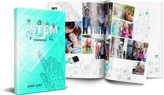
Now that you’ve asked yourself a few questions, I thought I’d share some brand new themes that might get you on the road to something truly unique for your yearbook. Below are 5 fresh themes for you to consider for your tribe.
5 theme ideas:
Fingerpaint
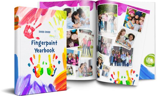
This theme captures the spirit of imagination, similar to Harold and his purple crayon, each student has the ability to draw whatever they might need, leaving their unique handprints behind as a reminder of what they have achieved.
STEM
Early learning experiences in Science, Technology, Engineering and Mathematics (STEM) are critical in preparing elementary school students for STEM learning in middle and high school, as well as for future careers in STEM-related fields. This theme talks to more than just the tech culture our children live in, but how schools are more focused now than ever in bringing STEM to the forefront of learning.
J[our]ney

With multiple different color options, this is a classic, bold, choice for a yearbook tribe wanting to add some graphic texture to their book. It’s sentimental in begging the question, “What does the school care about for the year?” There are many ways to play with this theme. Consider some wordplay:
- Y[our] goals
- Enc[our]agement
- N[our]ishment
- Study h[our]
- Y[our] story
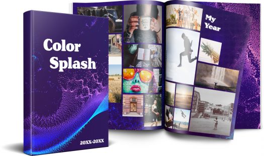
Color splash
It’s subtle yet elegant in the movement of the dots first flowing together then breaking off to find their own individual path, but not before first making a splash. This yearbook theme would be best for books that are text heavy, given the words will pop on the purple background, and there isn’t a lot of distracting artwork.
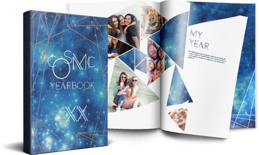
Cosmic
The applications of this theme reach to infinity and beyond. From the single star that shines bright to the entire constellation of stars, our students are pushing the boundaries of learning to their outer limits.Each yearbook tells the story of just one year, whether your theme is how power corrupts, as in J.R.R. Tolkien’s Lord of the Rings, or love and loss as in Nicholas Sparks’ The Notebook, (I genuinely hope those aren’t actually your themes) these ideas should help you get started. If you are looking for more inspiration, check out this handy theme generator, it might get you and your yearbook tribe a bit further on your journey.