July 22, 2025
2
Min Read Time

Color is more than decoration: it’s a communication tool. In a yearbook, color helps reinforce the mood of each section, creates visual hierarchy, and supports your theme. Understanding the basics of color theory enables you to make design choices that are intentional and effective, not just trendy. (If trendy design is your thing, head over to this blog.)
I can’t emphasize this enough: color is a complement to content. The right combination can make your theme feel energetic, calm, serious, or playful. Understanding how color affects emotions will affect your readers’ experiences.
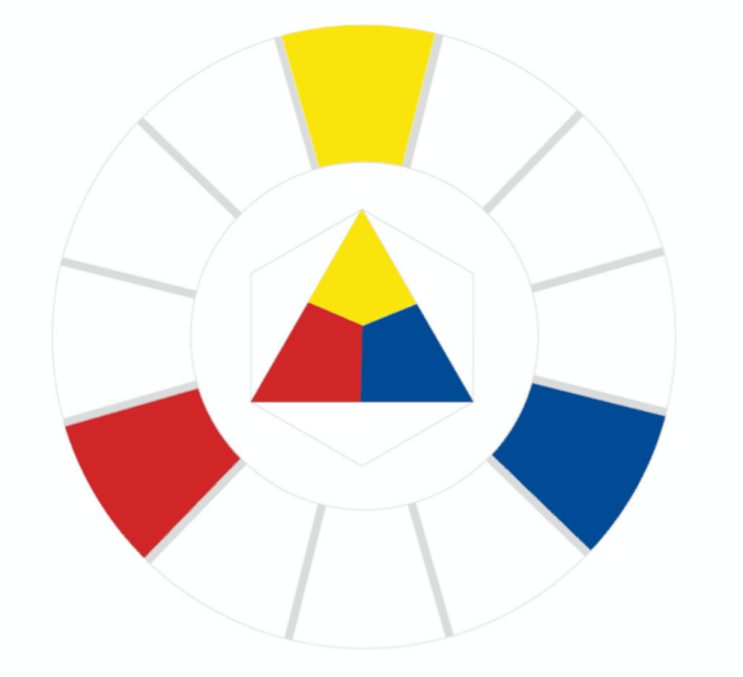
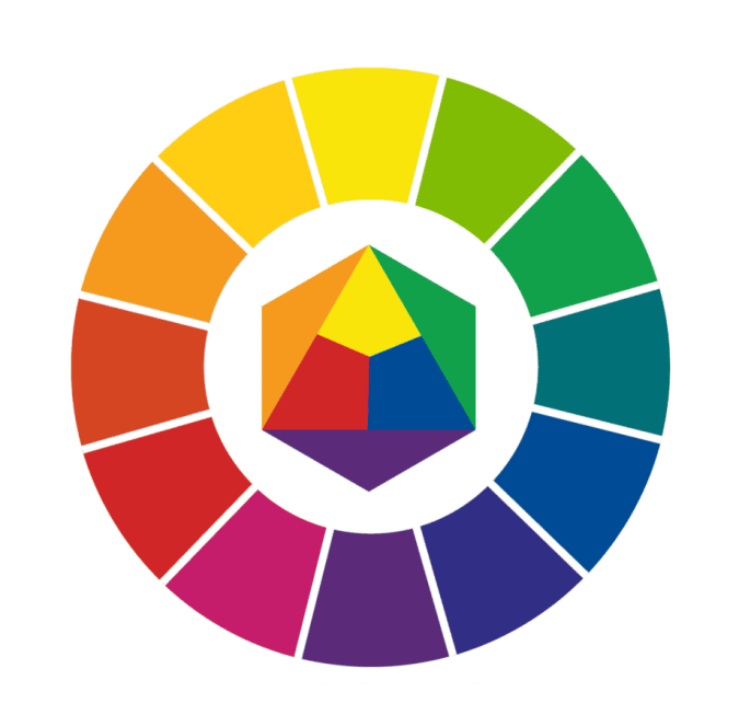
Red, yellow, and blue are the OG trio. As you learned in elementary school, you can’t make them by mixing other colors, and they can be combined to create every other hue. A section opener with a bold red or yellow background can instantly grab attention—just keep your type simple so it’s still readable.

Orange, green, and purple come from mixing two primaries. Secondary colors are a safe way to add contrast to pages without them looking too loud.
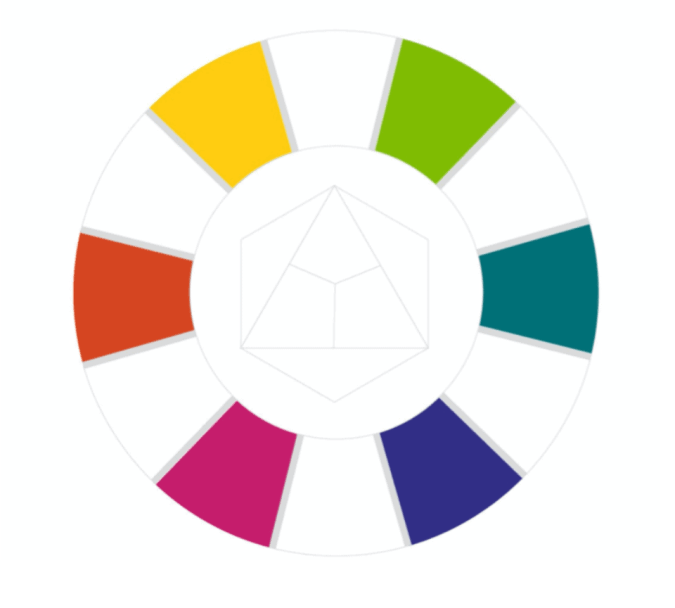
Mix a primary with a neighboring secondary and you’ll get shades like yellow-orange or blue-violet. These in-between shades are perfect for customizing your theme. For example, swap standard blue for blue-green to make a traditional palette feel more modern.
Color harmony is about choosing combinations that are pleasing to the eye, and useful to you, the designer. Whether you’re creating a visual flow across a spread or building a full-book palette, these harmonies keep your pages cohesive.
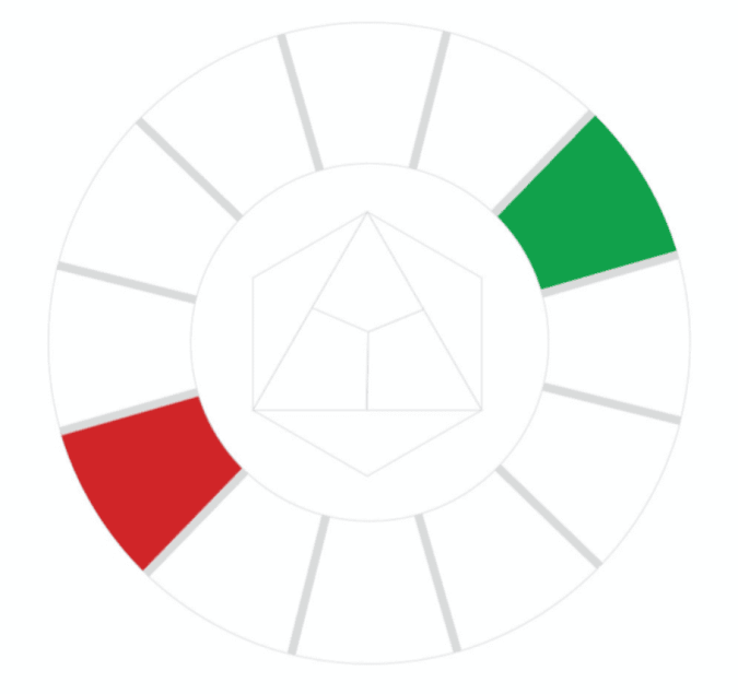
These are opposites on the color wheel, like blue and orange or red and green. They create strong contrast. Use complementary color accents for headlines, callouts, or graphic elements.
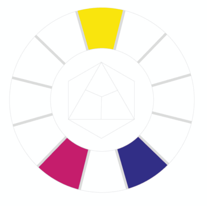
Choose one color (yellow) and pair it with the two colors next to its opposite (blue). This gives you contrast without tension. For example, if your school color is yellow, balance it with pops of magenta and violet.
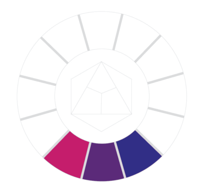
These sit next to each other on the wheel and are generally harmonious and soothing. If you’re getting started with color, use an analogous palette to determine your dominant, supporting, and accent colors.
It’s easy to look at these and think you’re limited to three. Using varying tints and shades for value contrast will expand your palette.
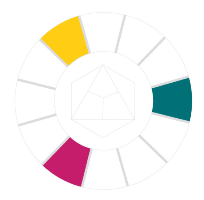
Triadic schemes use three evenly spaced colors on the wheel. We see this with the primary colors. Now shift over, you have the ultimate retro palette.
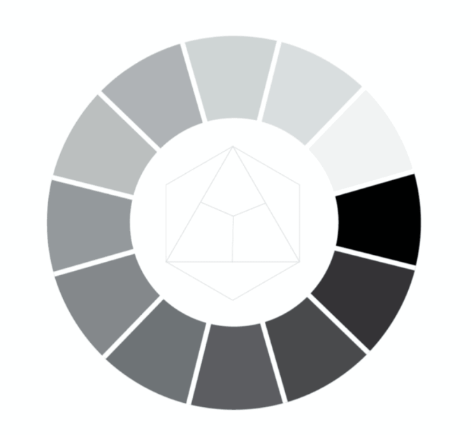
One color, many values: Monochromatic palettes have so much potential. Purple can have varying degrees of school spirit, while black is sleek and modern. They create contrast, demonstrate intensity, and serve as a base to add accents for emphasis.
Warm and cool colors affect how your pages feel emotionally. Look at the two athletic examples above. You can feel the difference. In one, you're sweating with the team and on your feet. In the other, you're maintaining what's left of your voice, sipping cocoa under a blanket with your best friend.
Likewise, use color to determine how the student body will experience your verbal theme.
Here’s how to apply color theory to your yearbook: