
July 8, 2025
2
Min Read Time
In Treering’s inaugural Cover Design Contest, which—if we’re being real—was three concurrent contests, schools submitted their covers to one of three categories:
Our team explored over 300 submissions, and the ones that stood out introduced their theme on the front and back cover, then expanded it inside throughout the book. Each of the themes below are specific to the time and place in which they exist. While the concept may work for the school across town, the execution would not.
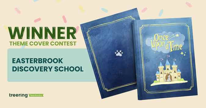
Theme: Once Upon a Time
This year was extra special. It’s EDS’ 20th anniversary and the tenth year in its building. These once in a lifetime moments became an obvious connection for the yearbook theme.
Pre-pandemic, a middle school yearbook club produced the book. The PTO wanted to continue to showcase student perspectives with a cover contest. “It celebrates creativity, individuality, and the shared ownership that makes our yearbook and our school so special,” said Bai-Lim.
This year, they gave little guidance: “Your design should relate to the ‘Once Upon a Time’ theme (e.g. fairy tales, dragons, fairies, wizards, enchanted creatures, etc.).” The faculty and staff chose the winning cover in an anonymous vote.
Winner Helena Kao created a design rich in symbolism:
The cover art contest led to another “once” moment: ninety pieces of student art throughout the yearbook. “Each piece felt like part of the story of the school year,” said Bai-Lim, “and we didn’t want to leave that out.”
Bai-Lim’s team used a Treering vintage blue background, various story-inspired borders, and the lunchbox font for titles. She said, “Treering made it so easy to bring our ideas to life.”
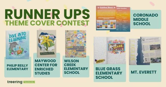
Theme: A School of Pure Imagination
The sweet cover made us melt. (It’s a contest for a back to school ice cream bash with cool puns, how could we not go there?) What’s more, is the yearbook theme and the school’s theme were one.
The team at Blue Grass used “a school of pure imagination” to guide their year. It was a “perfect match for capturing the magic, curiosity, and creativity that define our school community,” yearbook chair Becky O’Hatnick said.
She and her team of parent volunteers sprinkled each page with “candy-colored hues” and created titles on candy wrappers and golden tickets.
“From cover to cover, our yearbook is a vibrant celebration of childhood wonder and the boundless possibilities of imagination,” O’Hatnick said.
Theme: Golden Hour
This coastal school embraced their SoCal vibe by using the colors of the golden hour to progress through the book. The students studied the sun, and used it for theme copy: “At the end of each day, and each Golden Hour, the sun must set. This is an opportunity to begin anew, never forgetting the last chapter, but anticipating the beauty of the next.”
“The edges of the book had a gradient,” adviser Heidi Frampton said, “so that as you flipped through the book you would see the sunset colors.”
Theme: A Piece of Us
Every single one of us has a mosaic of experiences that makes us who we are,” adviser Nora Torres said. Her team built on that concept by piecing together textures and colors to create the layered cover. The more you look at it, the more details emerge.
They brought their theme into the book by using graphic pieces, such as scrap paper, tape, and cut-out letters to accent the content. Divider pages, especially, looked as if they were hand-designed. To make it even more personal, the yearbook staff added “yerd* doodles” throughout the book.
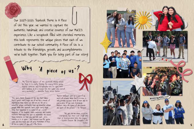
*Yerd = yearbook nerd
Theme: Ripping Through Tradition
Students chose to blend nostalgia and tech by using newspaper graphics at an angle to chronicle their year. It’s a “blend of past, present, and future,” said adviser Kari Giordano.
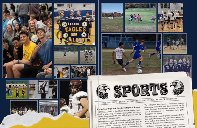
“This theme visually represented the senior class ‘shredding expectations,’” said Giordano, “and boldly stepping into the next phase of their lives.”
Theme: Dive Into Learning
Yearbook chair Kristin Keller said she “created an underwater world where our theme could truly swim.”
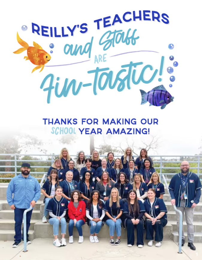
From using circular photos as bubbles to adding sea-sational puns, her designs were focused. Keller used design hierarchy and contrast to keep each afloat in a sea of color.
Theme: Wildcats Stick Together
At first glance, this cover was familiar. Then, we looked closer.
“This hybrid theme enhances the Treering-designed theme ‘Stick Together’ with totally unique Wilson Creek graphics and vibes that show off how Wilson Creek Wildcats learn, live, and laugh,” said yearbook co-chair Holly McCallum.
She designed the sticker pack to include interactions of the wildcat, WCES, and their anniversary crest. The brown paper background takes us back to the first day of school, when you’d cover your textbooks with grocery sacks. Considering this is Wilson Creek’s 20th anniversary, it’s an emotive design decision.
McCallum also added frames to photos to make them look like stickers and she added positive messages “to emphasize the creative spirit and collaborative dynamic” of her school community.