March 27, 2025
2
Min Read Time
Nowhere in yearbook design can a series of small or minor changes add up to create a dramatic difference as easily as yearbook fonts. Really, it’s true. Science says so: A Microsoft researcher and MIT professor found in two different studies that good typography can make a person feel better while reading and can actually make them think they’re reading for shorter amounts of time. Moral of the story? Pay attention to your yearbook fonts. Your readers will be happier, and they’ll spend more time with their yearbooks.
In this all-purpose guide, we’ll introduce you to the basics of fonts and typography, how to create a font strategy for your yearbook (which includes picking yearbook fonts, pairing them, and setting their size), and how to make the yearbook fonts you choose look great on your pages.
In addition to making us feel what we are reading, fonts can actually speed up—or slow down—how quickly you can read. Science has our backs once again.
Readability is an important factor when setting your yearbook style guide. On printed paper—like yearbooks—the fastest, easiest-to-read fonts are usually serifs. On computer screens, like on this blog, the fastest, easiest-to-read fonts are usually sans serifs.
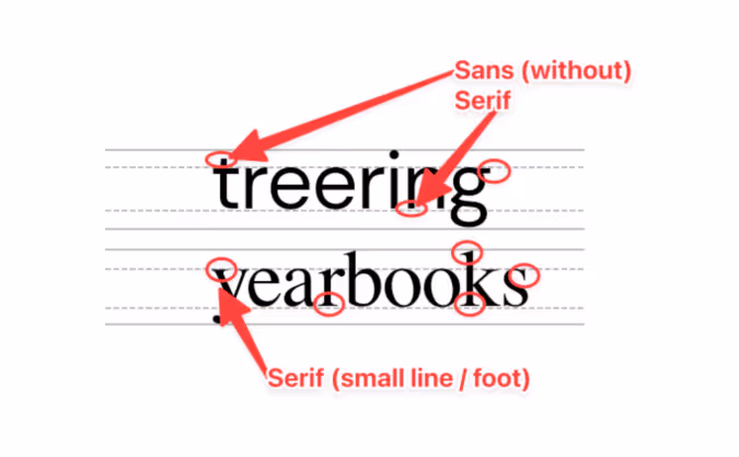
Sans serif fonts are different from serif fonts in that they don’t have decorative elements at the end of the strokes.
Sans serifs are more commonly used online and in digital projects since they’re easier to read on computer screens. Because so many people read on computer—and phone—screens, though, sans serifs are more familiar to readers and growing more popular in print. They’re also considered to be a little hipper than a serif.
Some of the most common sans serif fonts include:
There are, of course, some other fonts, like scripts and decorative fonts. While they can be plenty attractive, they’re often not great for legibility—especially in large blocks of text. If you’re planning to use something a little different, it’s best to reserve those scripts and decorative fonts for headlines and your folio.
Serif fonts have small, decorative elements at the end of the strokes on the letters. They’re more legible at smaller point sizes and are generally considered more conservative (think newspapers and academic journals). Like we mentioned above, they’re also easier to read on a printed page.
Some of the most common serif fonts include:
We already mentioned that fonts can change a reader’s mood, make text easier to comprehend, and speed up the process of actually reading while making it more enjoyable.
To do that, ask yourself these questions:
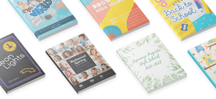
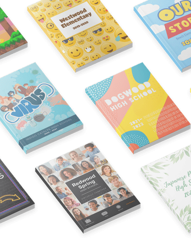
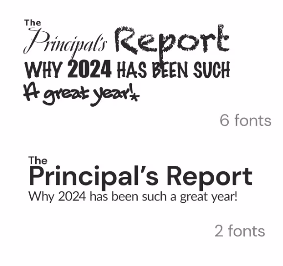
The answers will give you a strategy for your yearbook fonts, something that will help you cut down your potential choices to something more manageable. With thousands of fonts in existence, and hundreds in the Treering app, it’s easy to get overwhelmed. Your total number of yearbook fonts should pretty much always be two, and shouldn’t really exceed three.
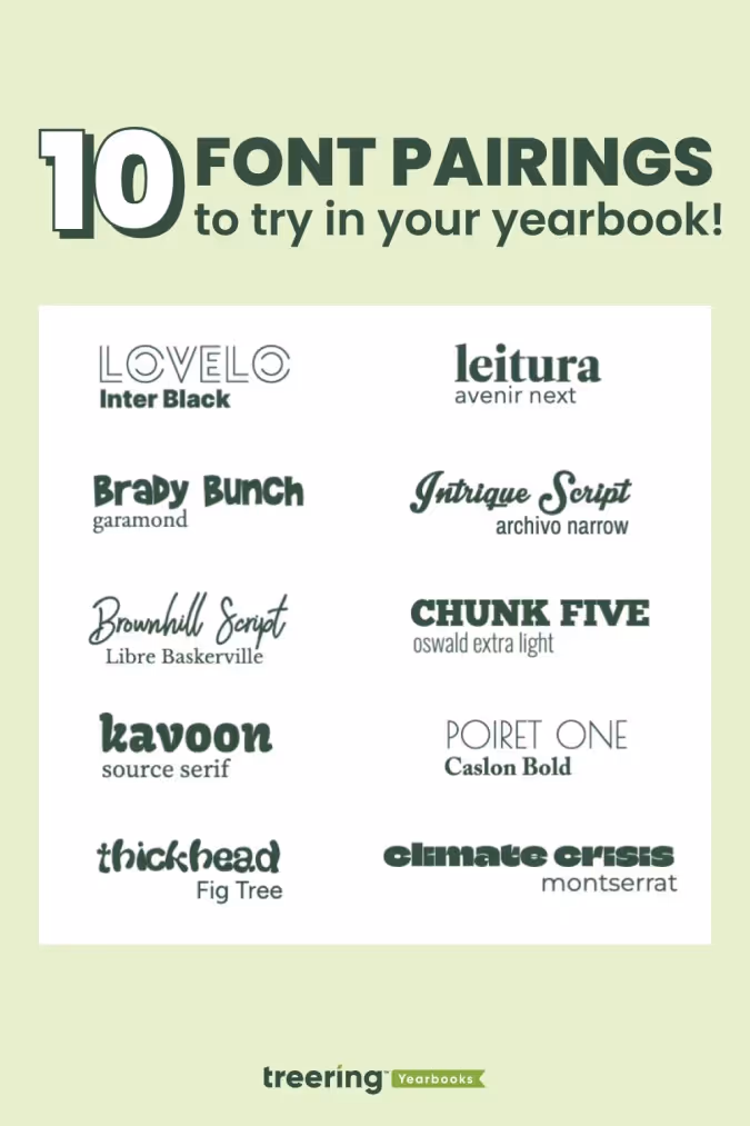
Consistency is key for a balanced yearbook. Fonts are no exception. It’s better to use a couple of (literally two) well-chosen fonts than to have so many that they distract from your design. By limiting your yearbook to two (max three) fonts and assigning them distinct roles, you establish a precedent.
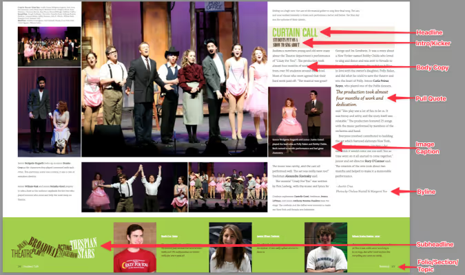
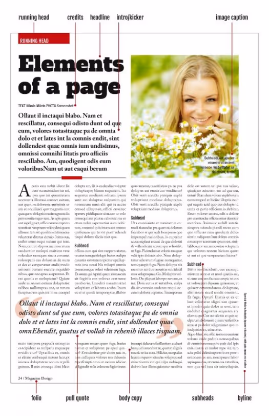
Create a style guide where you’ll be using the fonts you end up choosing. Your style guide should include every printed element of your yearbook like headlines, sub-headlines, body copy, photo captions, pull quotes, and page numbers. Once you’ve listed out everything, you’ll want to bucket these items into two groups:
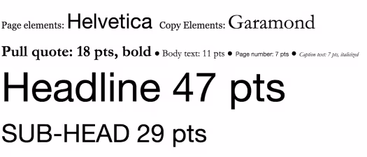
Historically, serif fonts have been used for copy elements, because they’re more legible in large bodies of text. (This adviser loves Garamond.) Sans-serif and decorative fonts, on the other hand, have historically been used for theme elements, since they’re generally considered to be more flexible.
If you’re to follow those historical queues, your font palette may look something like this:
Two things to note here:
When someone opens the book and focuses on a message, they’ll know what a headline is going to look like and what a caption is going to look like. They don’t need to think. Consistency allows your message to get right to the reader without distraction.
Because your yearbook fonts can vary in legibility so much, you’ll want to determine a set of sizes that work best for the fonts you pick—and for your readers. Do that by setting a scale.
A font scale is an organized approach to increasing or reducing your font size, based on where that font is going. It’s easy to do, and once it’s set up, it’ll save you a ton of time.
To create one:
At this point, you’ve got a fully developed yearbook font strategy. Document it somewhere. That way, your team will have access to it when designing pages.
The cool thing about yearbook fonts is that you can slightly manipulate the way you use them to create a variety of different looks.
One of the easiest, and most impactful, ways to create different looks is to play with your font’s justification. Justification is basically a fancy term for how you align your text.
There are a few different ways you can align text and different reasons why you might choose one style over another:
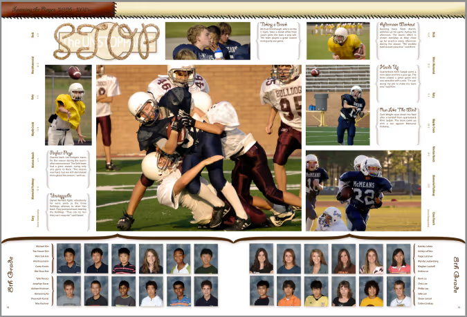
Here’s an example of a page that features just about all of them:
Accenting your text
One of the best ways to make your text stand out (without switching fonts) is to punch it up with accents. You can use drop caps, accent them with graphic elements like highlighting, and stack your text to create more compelling visuals.
Here are a few headline examples to help you visualize the possibilities.
Drop cap
Highlighting text
Stacking your text
Remember, fonts impact the way people feel when they’re reading your yearbook, so have fun selecting the right ones!