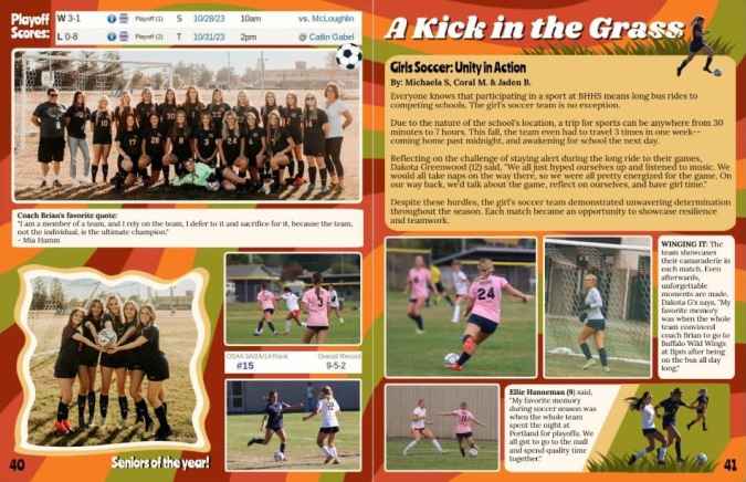
April 2, 2024
2
Min Read Time
The 2024 Design Contest Winners are the most diverse collection to date.
“Every year, our editors craft spreads that wow and inspire our judging staff.” said Marketing Manager Megan P.
With nearly 50 creatives combing through the submissions, each looked for their ideal. Purists advocated for hierarchy and balance, journalists dug through each piece of copy for the stories, graphic designers sought out-of-the-box applications, and empaths soaked in every moment. The three winners for each category are below, plus some favorites we had to showcase.
Solo yearbook coordinators hold a special place in our hearts; that’s why they have their own category. They tackle both administrative and creative tasks. They are the face and hands of their yearbook programs. And they shared some legendary spreads.
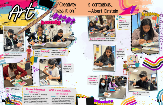
Arianna Fang displays an understanding of how repetition and consistency enhance design. Fang uses several colors in the swirls and accents. They all share a palette, bringing harmony. One judge called out the “pop” the palette brings to each page.
“I love the use of color and design throughout this spread,” a second judge said. “It immediately sucked me in and made me want to read the page.”
Her spread uses elements of art to showcase students at work. From photo frames that look like brushstrokes to the dotted stroke details on the edging of a few photos, there is a DIY aspect. She also repeats the purple accents as a wash and leopard spots in different levels of transparency, bringing balance.
“Even with all the elements on the pages, it has good movement and interest,” a judge said.
“Art is expressing ourselves,” Fang said. “And if you believe in the beauty of art, you can achieve wonders.”
We couldn’t agree more.

Karen Goodchild had us at her brilliant use of modular design. Her spread has a variety of stories, excellent hierarchy, and multiple reader entry points. Several judges called out the detail of students holding up the page numbers.
“This entry includes a lot [over 60] of students without overwhelming the spread,” a judge said.
A dark background could be problematic. Goodchild demonstrates mastery of contrast by ensuring all the copy is readable.
“I appreciate the balance of traditional yearbook content with fun graphics and content,” a judge said.

First day traditions at Westmont Junior High include red carpet and music on campus. “Our 6th graders are always nervous, and we make it welcoming for them,” Sabrina Reimann said.
This spread captures that energy.
The DIY look is a huge graphic design trend. It resonated with several judges who said, “The bulletin board vibes take me right back to the first day of school” and “This looks like my school yearbook.”
The layered effect helps the art and photos work together.
“It is a fantastic representation of what you can design with Treering's available background and graphic options,” a judge said.
While yearbook clubs and classes use teamwork to create their books, they do it while balancing delegation, learning communication, and trusting one another. The top three team collaborations had little in common stylistically. Where the won the hearts of the judges is in their storytelling.
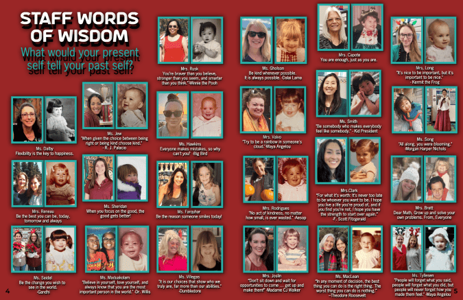
Many judges-slash-parents had an emotive reaction to seeing these role models and campus influencers on display in this way.
“Students are going to revisit these pages because not only are they able to see their teachers’ photos as a blast from the past, but their words are influential,” a judge said.
These “relatable” and “heartwarming” “pearls” (the judges’ words) are the result of the yearbook team’s efforts. They collected the quotes and photos, a labor-intensive task in itself, and organized them in the winning design with uniform sizing to keep such a content-rich spread from becoming cluttered.
Adviser Johnetta Maduakolam said, “It captures the essence of our school community from the past to the present.”

Ownership.
“None of the 22 students [in the yearbook program] actually chose to be there,” Adviser Carol Landers said, “Once we got the Treering software, the excitement kicked in, and kids started asking for jobs.”
Now look at them. From theme explanation and the colophon to the stats (hello, 86% in the yearbook 2x or more) and job descriptions, the team at North Star Academy used the space to educate others on their campus about the facets of yearbooking.
From a visual perspective, there’s so much more to love about this spread:

Our love of this spread stems from the fact that everything points back to the theme:
“I love the story that this spread is telling,” a judge said. “You can tell that the school is building and making a positive change for the students.”
The team at Northern took care to design each module to fit the content. For example, the timeline is a graphic quick read, and the first-day saga is a feature story with multiple perspectives. The photography is also diverse: action, headshots, groups, and in-progress views.
“It gives readers a great sense of this school’s big move,” another judge said.


The above slidwshow contains designs from: