Erikalinpayne
April 30, 2025
2
Min Read Time

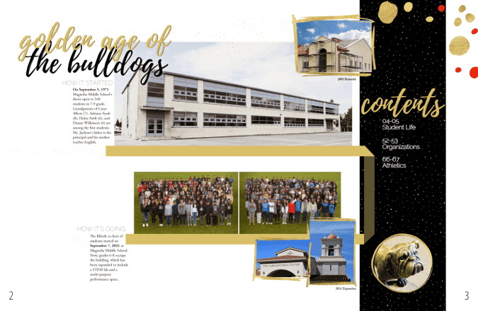
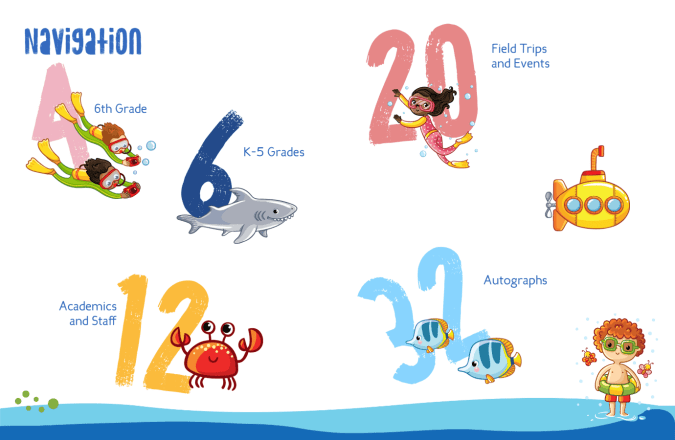
Form and function. A yearbook table of contents needs both. A well-designed one can make it easier for students and families to navigate, even in a smaller book. It’s another avenue to communicate your theme. And it’s also a layout worthy of those images that didn't make it elsewhere in the book.
Yes, especially, if you do not do an index. A table of contents is the proverbial road map or neon directional sign for your book. It’s also professional.
Normally, I’m not a proponent of “everyone else does it.” This is an exception. Yearbooks are reference books. Reference books have tables of contents. Therefore, yearbooks should have tables of contents. (Somewhere, my son’s logic teacher is smiling.)

If you're working on a smaller yearbook, here are a few additional things to keep in mind when designing your table of contents:
For larger yearbooks, consider the following:

It may be tempting to tackle this first since it spans the first few spreads of your yearbook. Wait! You may increase sections or move pages through the design process.

Because every detail counts when creating your epic school yearbook, there are a few ways to apply your theme to your yearbook’s table of contents.
1. Use Theme Colors: Incorporate theme colors into the layout for text, borders, or background elements.
2. Include Theme Graphics: Add graphics or illustrations related to your yearbook theme to enhance the visual appeal. This could be icons, symbols, or images representative of theme elements.
3. Custom Fonts: Choose fonts that complement your yearbook theme and use them consistently throughout your table of contents. This will help tie the design together and create a cohesive look and feel.
4. Creative Section Titles: Get creative with your section titles and use language that reflects your yearbook theme.
A well-designed table of contents is a requisite element of a school yearbook, helping to guide readers through the content and enhance their overall experience.