August 8, 2025
2
Min Read Time
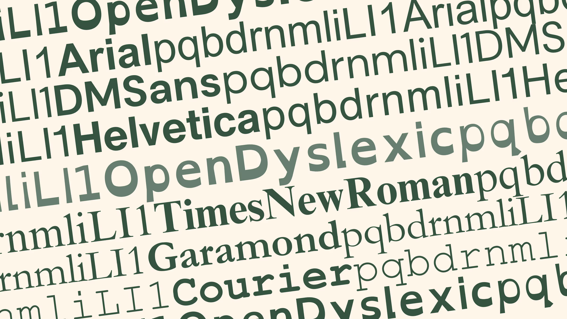
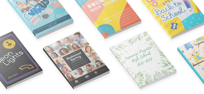
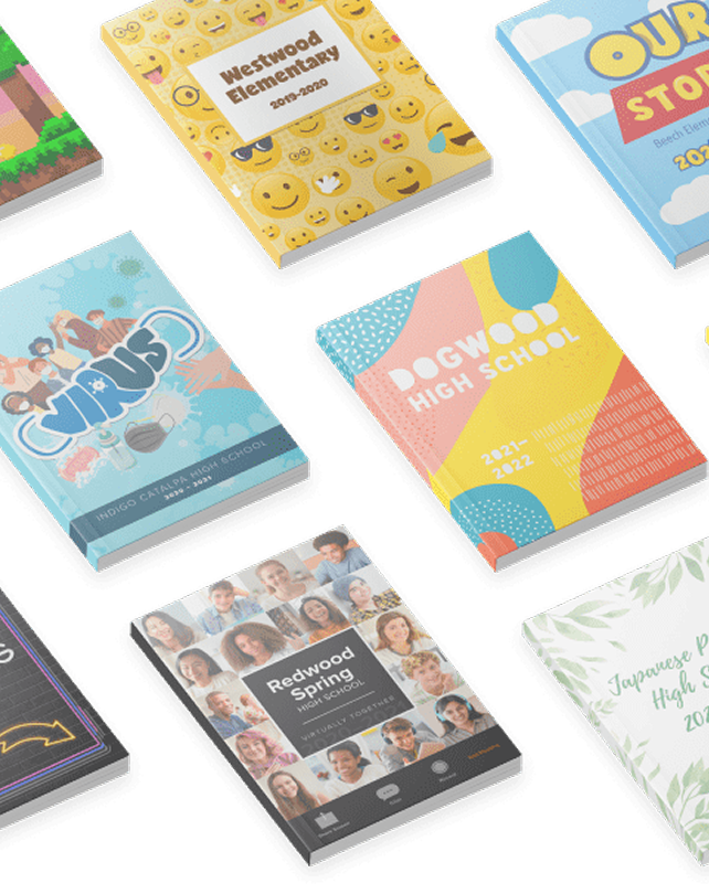
Fonts can be the Marsha Brady of the yearbook world. Overshadowed by epic theme packages and color palettes, the power of typography cannot stay silent. (In fact, the correct font can be louder than your graphics.) With 44 new fonts in the Treering catalog, you can share your story with boldness or a touch of whimsy. It can be focused or zany, handwritten or high-tech.
“Typography, like other design elements, evolves over time. Keeping up with current trends ensures that your designs feel fresh, relevant, and aligned with contemporary aesthetics,” Treering’s Director of Design, Allison V. said. “Typography also strongly impacts how a message is conveyed and perceived. More importantly, we listen to our users and try to accommodate their needs and wants. We often receive requests for fonts and appreciate the input from you.”
One such request came in the form of a text.

Since origin stories are a big deal in the superhero world, here is OpenDyslexic’s: app and game designer Abelardo “Abbie” Gonzalez developed the font in 2011 to help people with dyslexia improve their reading experience.
OpenDyslexic’s design addresses common challenges faced by many readers with dyslexia:

Because it’s an open-source font, it is freely available. You can even make it your web browser’s font.
The short answer: headlines and captions.
The British Dyslexia Association and the UX Movement established Dyslexia-Friendly Style Guides. Summed up, the following tips can increase the readability of your spreads:
As with anything, it is essential to note that while dyslexia-friendly fonts and design can be beneficial for some individuals, there is no one-size-fits-all solution for all learners. If possible, seek stakeholders' feedback during the design process to identify potential improvements.