Design
Looking for inspiration, design tricks, how to make a great cover, promoting your yearbook and engaging your community?
Most recent

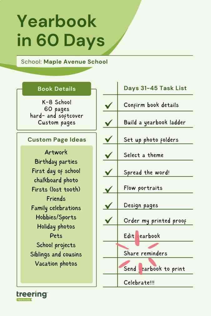
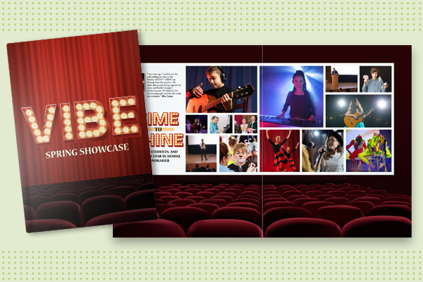
Yearbook in 60 days - part 3: yearbook design
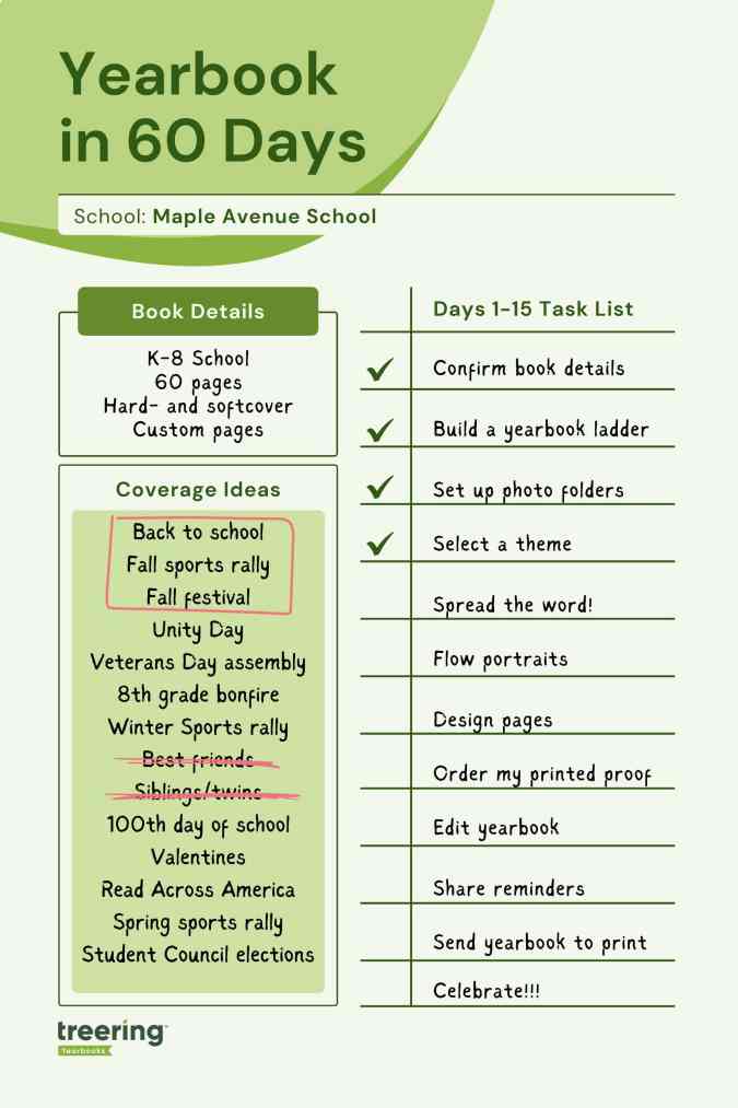
Two blogs ago, we began our journey to start and finish a yearbook in 60 days. From establishing a ladder and crowdsourcing structure to flowing portraits and adding in fall events, the first month yielded a near-complete yearbook. These next fifteen days of our adventure include proofing, promoting, and packing in spring events. All the resources you need are linked below (for help center articles, you will need to log in to the editor help center).
Yearbook (yes, it is a verb) along with us on Facebook, Instagram, and TikTok.
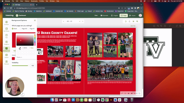
1. PDF proofing
Just because we are speeding through the yearbook creation process doesn’t mean we will be careless. Proofing tools such as downloadable PDFs and a free, physical cover-to-cover proof of your yearbook are free through Treering.
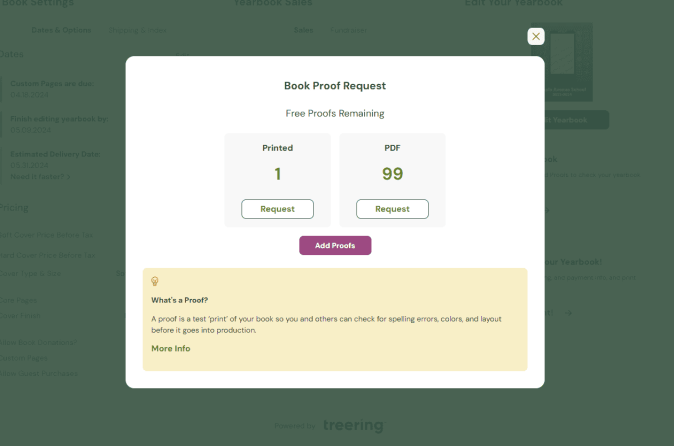
Let’s start with PDFs. English teachers everywhere will tell you errors that are missed on the screen often pop on paper. Read any copy (stories and captions) aloud to assess for tone and errors that digital proofing tools missed. These are low-resolution (the actual print file size might crash your computer), so you can download them quickly.
Use your PDF proofs to also
- Triple-check your portrait pages: correct spelling of names, the accurate placement of students and teachers in classes or grades
- Ensure faces aren’t lost on the edges (margins) or in the middle (gutter) of your spread
- Students are visible in the photos: sometimes, a photo box is the wrong size, and the faces are either huge or unrecognizably small. When possible, try to make all faces on a collage spread the same size.
- Show sneak peeks to your buyers - when parents see their child is in the book, they will buy the book!
Pro tip: use as many of your 99 PDF proofs as possible!
Yearbook editing resources
2. Design pages (spring/second semester events)
Last time, you learned two ways to design. Because the second semester is unfolding as you build your yearbook, it may be easier to collect photos. This is the time to evaluate those first semester spreads: if they are not full by now, combine events and re-allocate space.
Coverage resources
- Blog: Six Ideas to Fill Pages in Your Yearbook
- Article: Adding Pre-Designed Pages (You must login to the editor Help Center to view)
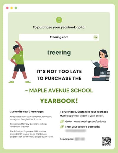
3. Purchase reminders
In these remaining 30 days, up your promotion game by doing at least one thing a week to share about the yearbook:
- Reach out after each school event with the appropriate photo share link and email
- Call or email parents of students who are in the book three times and have not purchased
- Have a contest: the grade or homeroom with the largest percentage of purchases earns extended recess
- Remind purchasers to customize their yearbooks (more on this next time)
- Ask campus influencers (ASB, PTA/PTO accounts, athletics) to hype the yearbook
- Have flyers at a school-wide event, such as the band showcase
Yearbook sales resources
- Google Slides: Customizable Flyers
- Article: Tools for Promoting Your Yearbook
- Blog: 5 Social Media Posts to Sell Yearbooks
4. Printed proof
Treering’s Marketing Manager Megan P. likes to say, “Works in progress welcome!” Because you need your printed proof in hand before your final deadline, order it now. It can take up to 18 business days for this yearbook freebie to arrive.
With portraits and fall events in the book, there is plenty to evaluate. Use your remaining PDFs for copy and photo edits.

Pro tip: When my printed proof arrives, I take a Sharpie and mark it up. Then, I use it as a tool to clean up each spread one by one.
Proofing resources
Yearbook with a friend
Involve a second or third set of eyes during the proofing process. Potential yearbook proofing heroes include:
- Front office staff (they know all the things)
- Student TAs
- The secretary of the parent group
- Coaches and club leaders
- A friend who owes you a solid
Next time, we’ll send the yearbook to print and prepare for distribution.
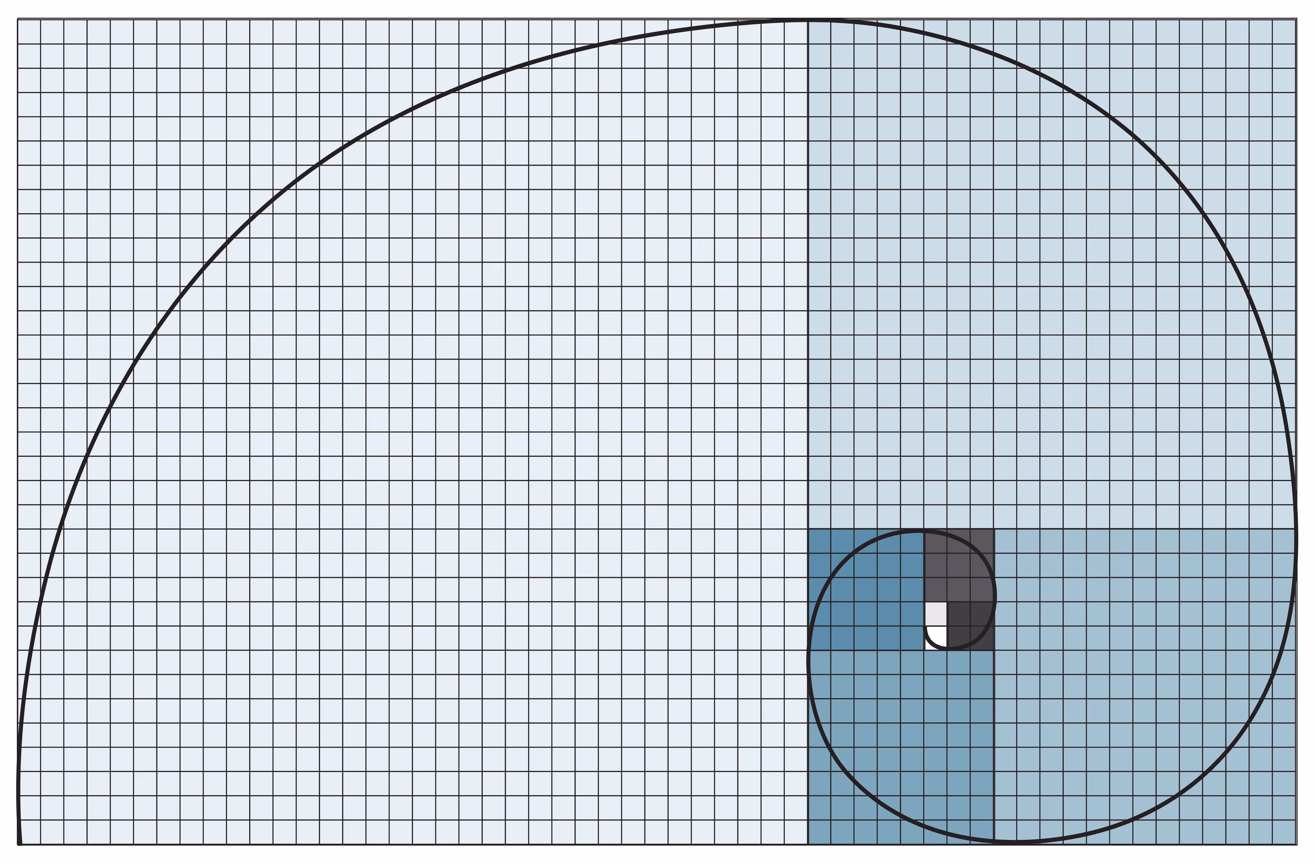
Yearbook design tips: the golden ratio
In Dan Brown’s popular book, The Da Vinci Code, Harvard Professor Robert Langdon sets out to solve secret codes and messages related to the golden ratio. While the book is a work of fiction, there is science to the importance of the golden ratio in design.
Rumor is the Egyptians used it to build the Pyramids, Leonardo Da Vinci himself was a scholar of its applications, and modern day financial markets create models around it. Designs built around the golden ratio are said to be the most pleasing to the eyes.
So, what exactly is the golden ratio, and how does it apply to yearbook design? Without completely getting bogged down in complicated math, think of it as a rectangle with length (side B) roughly one and a half (1.618) times the width (side A).
In an interview in Science Daily, Duke University professor, Adrian Bejan, explains why the golden ratio is so pervasive in art and design:
When you look at what so many people have been drawing and building, you see these proportions everywhere. It is well known that the eyes take in information more efficiently when they scan side-to-side, as opposed to up and down.
Bejan goes on to explain that animals have evolved their vision to scan for danger from side-to-side, or along a horizontal plane. Predators and danger typically come from behind or the sides and almost never from above or below.
As animals developed organs for vision, they minimized the danger from ahead and the sides.
If you’re interested in reading more about Bejan’s connections between nature and the golden ratio, he has a fascinating blog.
There is a lot of debate surrounding the exact science behind why we gravitate towards design that follows the golden ratio, but what is known, is that we do love it. And what’s most important to us is creating more pleasing design, right? Let’s talk about a few yearbook design tips incorporating the golden ratio.
Creating a rectangle
Let’s start with the easiest application: Building a rectangle. Choose the length of the rectangle’s short side. For this example, we’ll use 600 pixels. Now multiply 600 pixels by 1.618 to get a rectangle of 600 by 971 pixels. This rectangle follows the dimensions of the golden ratio.
Creating golden text ratios
You’ll want your headlines to be in proportion to your body copy. In order to follow the golden ratio, simply multiple 1.618 by your body text size. For example, if your text is size 10, your headline will be 10 times 1.618, or size 16.
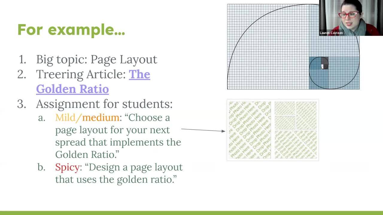
Fibonacci sequences
The simplest tool to creating design linked to the golden ration, is to use Fibonacci sequencing. Fibonacci sequences begin with 0 and 1. Add the previous two numbers together to get the next number in the sequence. 0,1,1,2,3,5,8,13,21…and so on. The image below is a good example of a creating Fibonacci sequence for page layout.
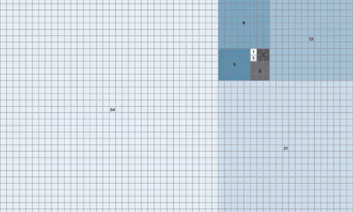
See how the page spread below, using Fibonacci sequencing, could create a very pleasing layout for your yearbook?

Yearbook in 60 days - part 1: yearbook quickstart
Two types of people start a yearbook towards the end of the school year: those handed the crown minutes ago, and those with hundreds of other tasks for the school and now have “free” time to begin one more. Creating a yearbook in 60 days is doable. Promise. We’re breaking it down for you in four parts, each with two weeks' worth of tasks and inspiration. Consider this your yearbook easy button.
Throughout the series, there will be resources for inspiration and help.
1. Confirm your book details
It’s tempting to jump into the glamorous yearbook tasks such as theme and design. There’s a little back-end work you need to do first for two reasons:
- Your dates will direct your workflow
- Your yearbook details determine the price of your yearbook
Dates
With Treering, you can change your dates at any time. Remember, your three-week turnaround begins once you hit Print Ready, and send your book to the printers.
For parents: custom pages deadline
Parents will see this date on their account, indicating when they should purchase the book or complete any customized pages. It doesn't impact the printing schedule.
Some parents {raises hand} need a little extra time and reminders to complete theirs. Treering recommends a cushion of about two weeks.
For editors: finish editing yearbook deadline and estimated delivery date
This is your one and only deadline for editing the book—and you set it! Select a date three weeks from when you want to distribute it.
You won’t be able to edit the delivery date directly. Treering automatically populates it by the date you choose for your deadline. If you need additional time to capture year-end events, no problem. Your three-week turnaround will align with your new deadline.
In part four, you’ll learn how to send your yearbook to print.
Pricing
The yearbook price will change in real time when you adjust the page count and cover finish. The best way to firm up your page count is to create a ladder (more on this below).
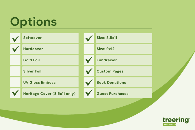
Shipping and index
Bulk shipping to the school is free. If you select this option, you choose how to receive your yearbooks:
- Sorted alphabetically
- Sorted by grade and then alphabetically
- Sorted by teacher and then alphabetically
Alternatively, many online or hybrid academies and schools electing to do a fall delivery choose the ship-to-home option. When parents order yearbooks, they also pay a flat rate shipping fee.
Book details resources
- Video: Chief editor dashboard
- Free Live Webinars: Treering’s Yearbook Club
2. Build a ladder
A ladder is a chart that represents the pages in a yearbook. It’s the industry-standard tool to help you stay organized. On it, you allocate a topic to each yearbook spread (that’s yearbook-ese for two facing pages).
Because yearbooks tell the story of the year, there isn’t a codified order to how things go. Typically, they include
- Academics: school distinctives, achievements, and activities
- Events: fundraisers, activities, performances, before- and after-school activities
- Organizations: clubs and teams
- People: student, staff, and faculty portraits
- Thematic content: larger books employ divider pages to separate sections
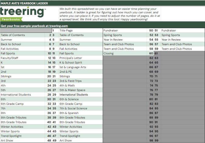
To build your ladder, look at the last few yearbooks and the latest school calendar.
- Brainstorm the non-negotiable events, sections (people, arts, sports), and yearbook traditions
- Brainstorm features, specials, and theme-related content
- Decide how you will organize the book
- Allocate spreads
We love doing this digitally because it can be fluid. If your page count is looking overwhelming because of time or budget, combine some topics. Remember to update your page count on your book details so it matches your plan.
Yearbook ladder resources
- Google Sheet: Yearbook ladder template
- Google Sheet: Example ladders (there’s a separate tab for elementary, middle, K-8, and high school examples)
3. Set up photo folders
The best photo organization tip I can give came from Yearbook Hero Katie Parish. She said to create folders to mirror your ladder. This way, you know you are collecting content for every single spread you planned. And spoiler alert, your design process will look like this.

By investing the time to set up folders this way, you can simplify your workflow. Just open the corresponding folder and click, drag, drop, and done!
In the video below, you’ll see how to add folders and set up crowdsourcing features. Notice the Art Show folder is Editor Only. This means only you, the editor, can place photos in this folder. After activating their accounts, parents will see the yellow “public” folders and be able to share. At any time, you can make a folder Editor Only and vice versa.
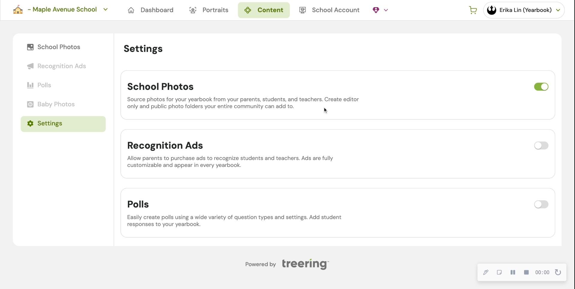
In Part Two, we will give you five strategies to fill those shared folders with content so you can build your pages.
4. Choose a whole-book look
The Styles menu is where it’s at: you can create font and photo presets, adjust your margins (#TeamMarginsOff), and select the theme for your yearbook. Because I have 60 days to create a yearbook, I am skipping all the customization options and selecting a pre-designed theme to give my yearbook a unified look.
For a cover-to-cover drag-and-drop experience, the design team recommends the following Treering themes:


Theme resources
- Google Slides: All Treering’s yearbook theme kits
- Blog Category: Theme ideas and inspiration
Remember, get to know your dashboard; it’s the first thing you see each time you log in. Part two of this series will outline the promotion tools built in the yearbook builder and start the design process.
Yearbook with a friend
You can also recruit team members to help you build and market the yearbook. With Treering, you can set permissions and assign pages to help delegate your workload. Additionally, parents, teachers, and students can help gather content and promote book sales.
Organization resources for yearbook teams

3 (but really 7) design elements to up your yearbook's visual appeal
Personal anecdote: In 1996, I joined my first yearbook staff. Shout out to Mr. Wayne Weightman who took a chance on a loud introvert and turned her into a creator. Fast forward a quarter-century (sheesh) and his yearbook design lessons are still impacting students—some of whom are now educators—and scores of creators.
The easiest element: spacing
One pica was the standard back in the day when orange wax pencils and cropping squares were the norms. Each spread was designed on grid paper measured in picas. Below is an example of one pica standard yearbook spacing. It's clean. It's traditional. It's fin
Contrast that with tight spacing. This is one-half pica (the design equivalent of red stilettos). Your spread just had a glow up.
The dominant element: hierarchy in yearbook design
Hierarchy tells our buyers what’s important, and for all you ELA teachers, it’s the outline of the spread. Spoiler alert: size matters.
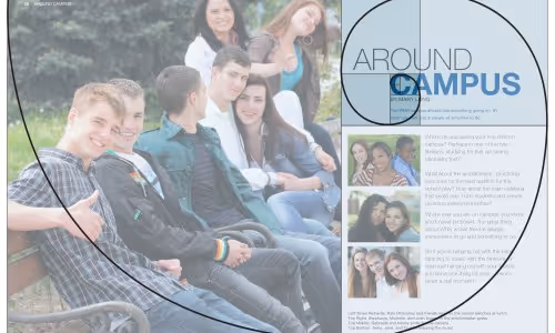
The yearbook design lesson here is to immediately attract your reader’s attention with a dominant image or module. Use the golden spiral to build off your dominant. Use this ready-made yearbook design lesson to help launch your discussion with your students.
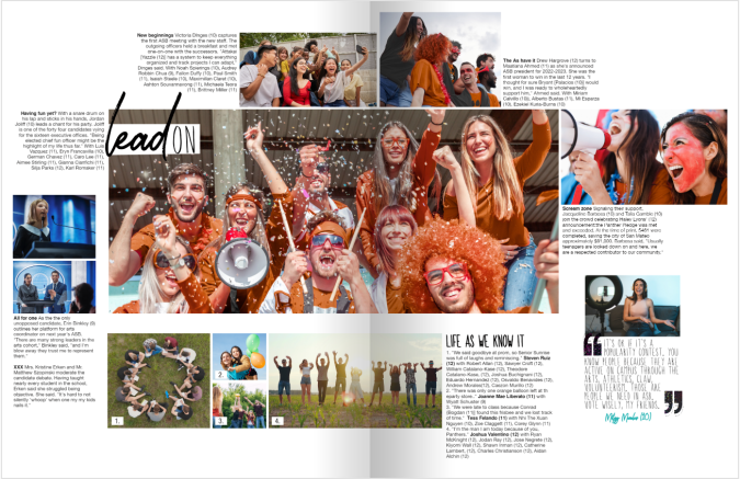
1. Photographs
The most interesting, story-telling, awe-inspiring photo should be dominant on your spread. Connect your headline to this image. You can build off your dominant photograph to fill your spread.
2. Headline
Advertising genius David Ogilvy said, “On the average, five times as many people read the headline as read the body copy. When you have written your headline, you have spent eighty cents out of your dollar.”
Since a headline is our entry point, it should connect yearbook buyers with the focus of the spread. Avoid “Football” when every photo pictures football–your buyers are smarter than that. If you must spell it out, use the folio. Appropriate puns, alliteration, and rhymes are literary techniques to use.
3. Body copy
My yearbook students once tried to 86 captions because “no one reads them.” Another Mr. Weightman yearbook lesson: “If they were worth reading, people would.” Ouch. (And true.)
Lessons centered around the art of open-ended questions made interviewing more of a conversation. Students would develop 10 questions and always end the interview with “Is there anything else I could have asked?”
Oh, and in case you’re wondering, people did read those captions.
If you’re just getting started, practice using anecdotal quotes to fill in captions and add detail. Captions should include facts and sensory details while identifying the subject of the photograph and their grade. More writing lessons abound in the Treering Yearbooks’ free curriculum.
The fun elements: the acronym you and your students will never forget
Shout out to another design influencer: Robin Williams (not the genie). She’s a proponent of contrast, repetition, alignment, and proximity—master these four things, and everything you touch will be design gold. (I’ll give you one second more to figure out the acronym.) Teach these design elements individually, then combine them for the ultimate yearbook design lesson.
Contrast
Pair a bold font with a condensed one. Use opposite sides of the color wheel. Get crazy with font size (within reason). These design elements teach your reader where to look, and when used in concert with hierarchy, tell your students’ stories in an easy-to-follow manner.
Other ways to create contrast include shape (horizontal vs. vertical) and weight (thick vs. thin).
Repetition
From cover to cover, your book should look cohesive. Every layout will not be the same. I repeat, every layout does not have to be the same! Colors, fonts, sizes, and design elements should be consistent throughout your book. Remember, your theme is the brand, and your book is the platform by which you will develop it.
Alignment
Design is intentional. On your yearbook spreads, align:
- Copy
- Photographs
- Quote packages
Proximity
Put the things that go together, together. This seems like a no-brainer, and yet, it’s a yearbook design lesson worth refreshing year after year.

Yearbook design lessons are something you can teach throughout the year. Pin your favorite ideas (or steal some of ours).
Six ideas to fill pages
Page count can be a dirty word in the yearbook industry. It’s how we compare programs or evaluate pricing. It's also how we wow our readers. Peppering in showstopper spreads breaks up the monotony of photo collages, portraits, and team photos. These pages also fill your yearbook with even more personal stories and unique-to-this-year happenings. (And if we're being honest, these last-minute ideas can help you increase coverage with ease.)
1. Interactive pages
Drop-in yearbook spreads, such as about me pages make it effortless to complete the year's story. You can customize the questions and prompts on these fully editable yearbook templates and give students even more space to share their POV on the year. If you don't have a spread to fill, consider adding a sidebar so students can react to campus happenings.
2. Spirit quiz
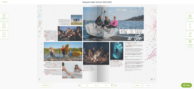
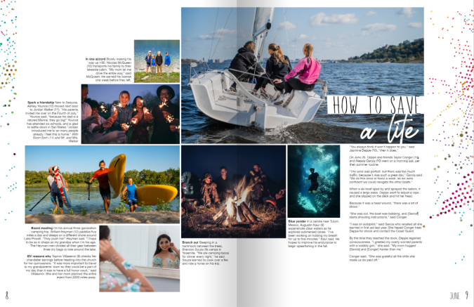
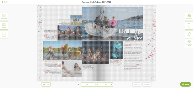
When Sequoia High School had over half a page to fill in their junior section, they added a teen magazine-style quiz. This spirit self-assessment featured eight additional students plus the school mascot while showing off what is uniquely Panther programming.
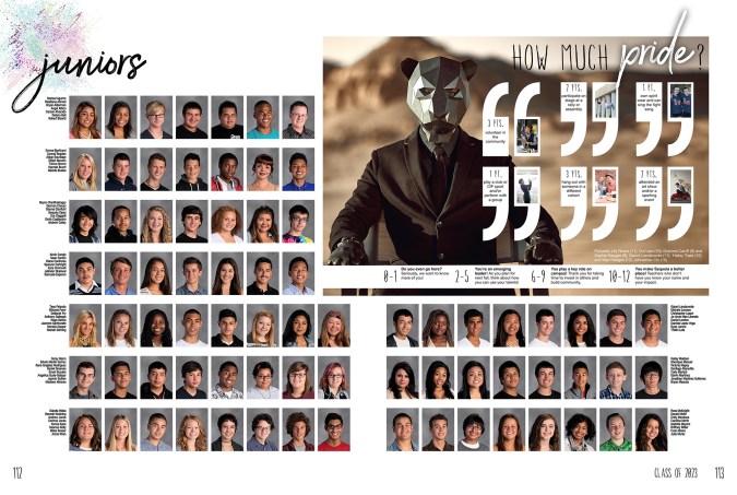
Make it your own
For your spirit quiz, determine which activities and behaviors define your student body and assign a point value. For example:
- Owning spirit wear +1
- Participating in a club +2
- Attending a musical or a sporting event +3
- Knowing the lyrics to the fight song or alma mater +3
- Serving the community+3
Use the scoring to affirm your community, even if it's a one or two. A simple "we want to know you more" will go far for students trying to find their way.
3. Then and now
We’ll save the yearbook-as-public-record soapbox for another blog. Know this: anniversary years are a great time to reflect on where your school community has been and where you are headed. Schools also use building projects, campus splits, and expansion projects to add reflective photos and copy to their yearbook pages. Does this sound overwhelming? A show-stopper spread in your theme copy or your people section is all you need.
In addition to featuring changes in the building, you can write about or share photographs from:
- Teachers and coaches who are alumni
- Current students of alumni
- Famous alumni (ICYMI: alumni are a huge resource)
- The local historical society
- Past yearbooks
- Blueprints
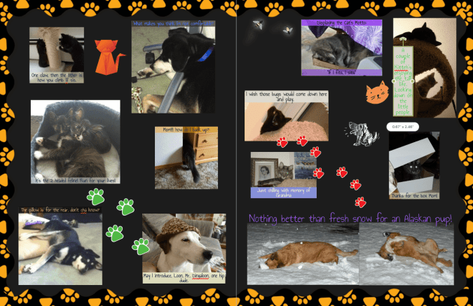
4. Pet spread
If you’re new to crowdsourcing, or in need of additional coverage, start with a pet spread. If we’ve learned anything from #caturday and #dogsofinstagram, it’s that sharing pet photos brings us joy and is a natural part of our culture. Case in point, when our design team asked the Treering staff to submit photos of their children and pets to use in sample spreads, the latter had nearly twice the submissions.
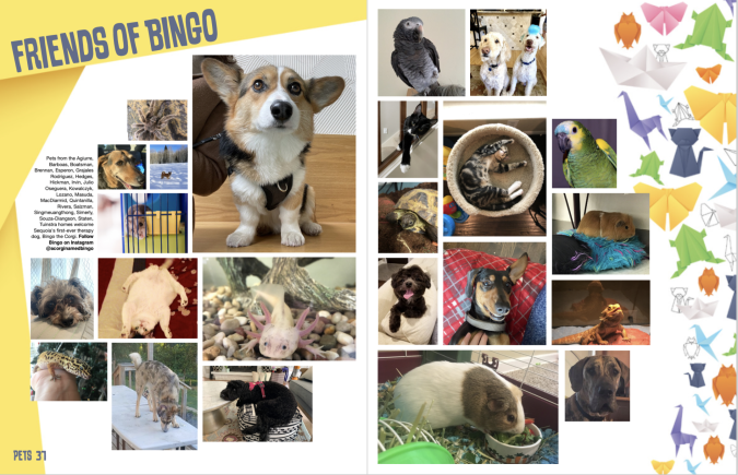
When your students crack their yearbooks open in five or 15 years, the sight of their furry, feathered, or scaly friend beside their artwork and activities truly captures a moment in time.
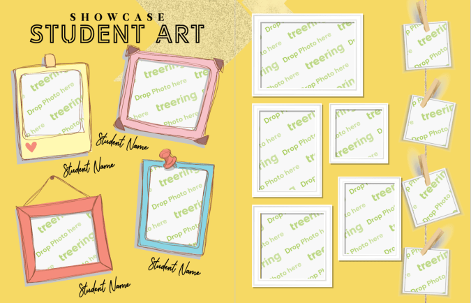
5. Art showcase pages
Student contributions extend beyond the field, club meetings, and stage. Those creative moments in the studio or during classroom art time belong on your yearbook pages. Also, like a pet spread, an art spread is a way to include those camera-shy students.
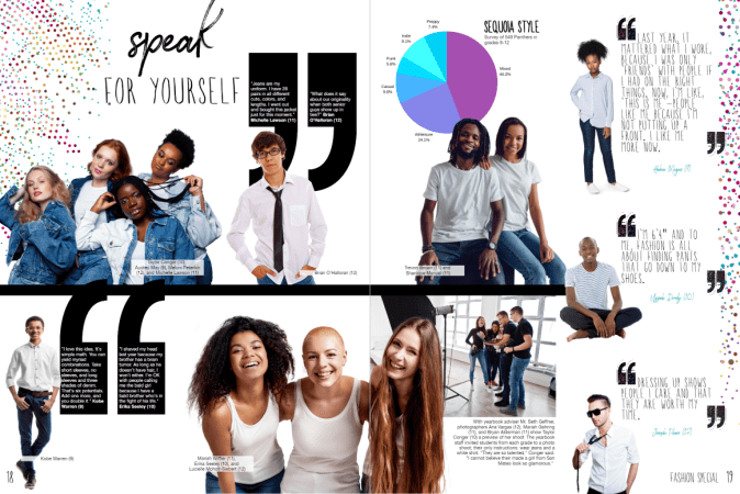
6. Fashion page
Expression isn’t limited to canvas and ink: Yearbook Hero Grace Montemar said her school included a fashion spread because it “allowed Yearbook Club to spotlight classmates from various grades whose fashion sense stood out from the crowd.” Featured students expressed their style and their inspiration with interviews.
We love how this school asked students from each grade level to come to the photoshoot in a white shirt and jeans.
Do you have more easy ideas to fill pages? Share them via social and tag us!

Teaching yearbook: graphic design
In my credential program, I missed the comprehensive graphic design, marketing, journalism, editing and proofreading, photojournalism, contract negotiation, and volunteer management track that would prepare me to be a yearbook educator. Over the years, an idea library on my classroom shelves slowly came about: other school's yearbooks, folders of magazine spreads worth emulating, Treering's Big Idea Book and Marketing Un-Stumped, plus gobs of digital files. If your yearbook advising journey is relatable, try these small changes that will make an impact on your book's visual look.
This blog was adapted from Yearbook Hero's Lauren Casteen's Teaching Yearbook: Graphic Design webinar. If you're interested in joining this professional community to grow your yearbook pedagogy or to score some PD hours, register for one of our free webinars on Zoom.
Graphic design self-analysis
On a scale of 1-5, how do you currently feel about teaching graphic design? Keep in mind teaching and doing are two different skill sets.
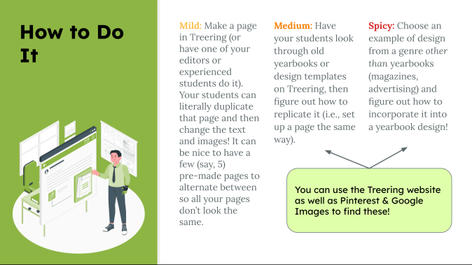
Mild, medium, or spicy?
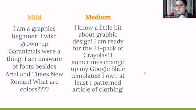
Below are some suggestions based on your self-reflection. This year, you may be Mild, and next year, you'll apply some of Casteen's tips and be Medium with a hint of Spicy.
Yearbook theme
A theme helps keep your yearbook unified so it doesn’t look like a different person did every page (even if they did).
A theme does a lot of the graphic design work for you: it's like giving your students fill-in-the-blank notes as opposed to having them copy them by hand.
Lauren Casteen
Mild
Choose a yearbook theme from Treering's Theme Gallery. Commit to it by using it for your whole book: each theme package includes layouts, backgrounds, and graphics you can mix and match. Using powerful tools such as auto page layout, you can create a beautiful book while learning.
When you're ready, move to Medium.
Medium
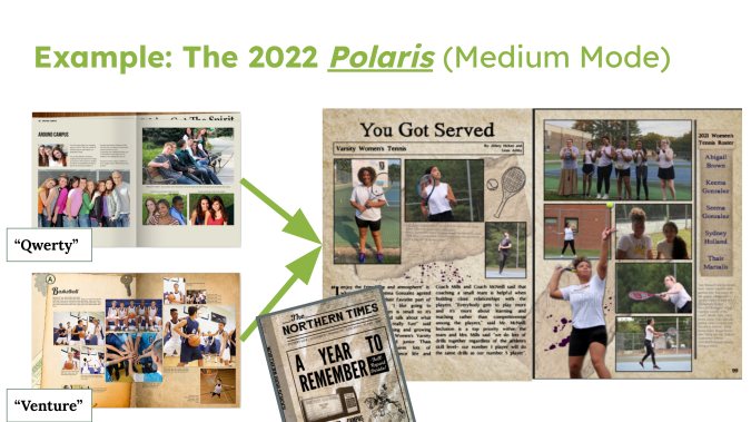
Casteen falls into the Medium category: she says they start with a Treering graphics package that supports the verbal theme, and then they adapt it. The 2022 Polaris team wanted a newspaper feel to go with "A Year to Remember." The staff blended QWERTY, which had a modern media feel, and Venture, which is filled with vintage items and textures, to create their book.
Spicy
You can design your own theme. Have students come up with a color palette using an online palette generator; use Treering’s font bank to match fonts. To build a unique look, consider including student drawings or artwork.

A style guide will help your designers remain focused. It will also help you, as an adviser, provide detailed feedback on how to improve the design. Here's Casteen's.
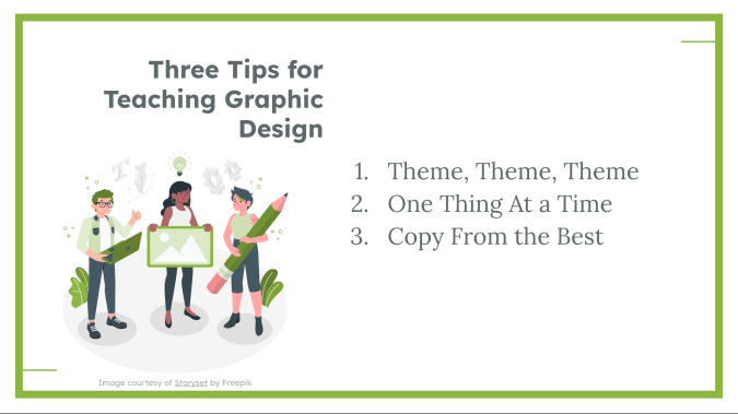
One graphic design concept at a time
Since graphic design is an entire professional field, and you could spend beyond four years in college studying it, there is entirely too much graphic theory and practice to complete in one semester or year of yearbook. By breaking it down, you can focus on what's essential for your team this year and build as you and your team grow. Here's how to do it:
Find the Golden Ratio blog and others on the design page of the blog.
Balancing first-year and returning yearbookers
If you have returners on your team, some of them may be Medium or Spicy, and that's OK. Now that you have some scaffolding, tailor your projects for your student by skill level.
You can revisit each topic each year with your returning staff members to make it more challenging. For example, maybe your newcomers are choosing a pre-made layout instead of doing it themselves, or maybe they are designing a layout for a module rather than an entire yearbook spread. Focusing on one specific skill at a time makes it easier for you as the teacher to differentiate.
Copy from the masters
The masters are "masters" for a reason. Whether it is a magazine ad or a social graphic, inspiration is out there. You can apply a photo treatment you saved from Pinterest on a divider page or emulate a car ad layout in your yearbook.
Get started in graphic design
Lastly, here are the action items from Casteen's session. Select one for your launch plan:
- Pick a theme if you haven’t (or maybe choose a few for your students to narrow down)
- Look through Treering blog articles to find a focus skill to teach
- Make yourself a Sandbox page and start playing around
- Find inspiration for a page to replicate
If you're interested in joining another of our working webinars, check out the entire Yearbook Club webinar schedule.

How to create interactive yearbook pages
Adding an interactive element to your yearbook pages can increase engagement and personalization in a culture measured by double taps and shares. Interactive yearbooks can have modules or spreads where students can record their ideas or engage with content. (And if you know anything about Treering, we’re all about making yearbooks as unique as your students.) Below are four ideas, from drag-and-drop solutions to those requiring a bit more delegation (wink) for your yearbook.
Interactive = personal
The most hands-off way to help others interact with your yearbook is Treering’s custom pages. These two free pages in every yearbook are prime real estate for artwork, celebrations, firsts (lost tooth, car, homerun, etc.), and what matters most to each family. Knowing they are creating a keepsake, many parents opt to add more pages.
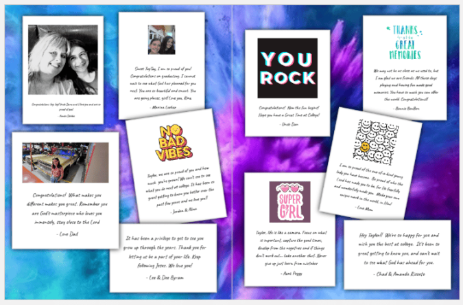
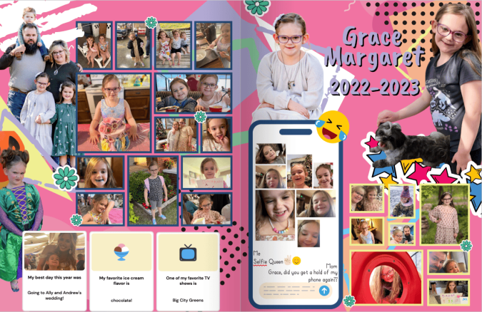
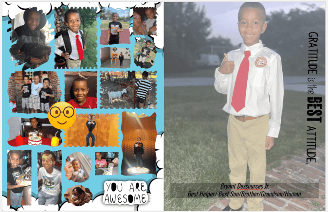
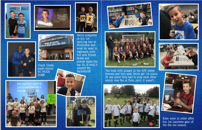
These custom page examples from the Treering team include non-school sports, pets, milestones, and family trips.
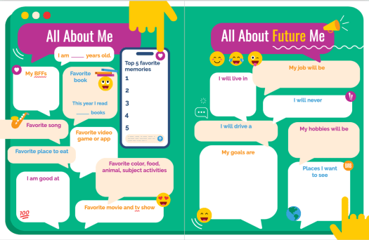
All about me pre-designed pages
While seeing all that our school community achieved in a year gives us the feels, adding opportunities for students to share their take captures a deeper moment in time. It shows students how they contribute to the whole with their unique take on the school year. Adding an All About Future Me component allows students to dream. (Moms, it also gives us something to read aloud at their graduation, “Yes, Erikson, you really did aspire to be an underwater ninja.”)

Pro tip: many Treering themes have these templates ready for you to drag onto a page.
Fill-in-the blank stories
Part 80s nostalgia, part English teacher ploy to get us to know our parts of speech, fill-in-the-blank stories can range from nonsensical to [fill in the blank]. 😉
We created one you can copy and paste for your yearbook.

Puzzles
Including puzzles in a yearbook enhances personalization because they can play with words, images, and situations unique to your campus, fostering a sense of ownership. Simultaneously, these activities bring additional engagement into the yearbook, making the publication more dynamic. You can choose to add content with words and pictures.
Word puzzles
Word searches, crossword puzzles, and the like add an entertaining interactive break from traditional pages. Additionally, for younger students, they can be a means to involve family members who may enjoy solving the puzzles with their child, creating another shared yearbook experience.
Include things in your puzzles such as school subjects and the
- Mascot
- School address (street and city)
- Special events or all-school activities
- Principal’s last name
- Names of clubs, teams, or electives
An online puzzle maker can help you customize an interactive puzzle.
People matching
More fun than a history quiz, a yearbook matching module is a way to use your interactive content to increase coverage. Answers can share a page with the colophon.
Match:
- Students to cars
- Baby photo to the students or teacher
- Teachers to their first job
- The cleat to the sport
- The fundraising total to the class
The easiest ask: pets.
Side note: maybe I should have titled this, “Gamify your yearbook.”
I spy
There are two takes on this:
1. Search for objects such as eight basketballs, 14 pencils, and five nets. These items already exist within a section or the yearbook as a whole; you're just asking the student body to take a closer look.
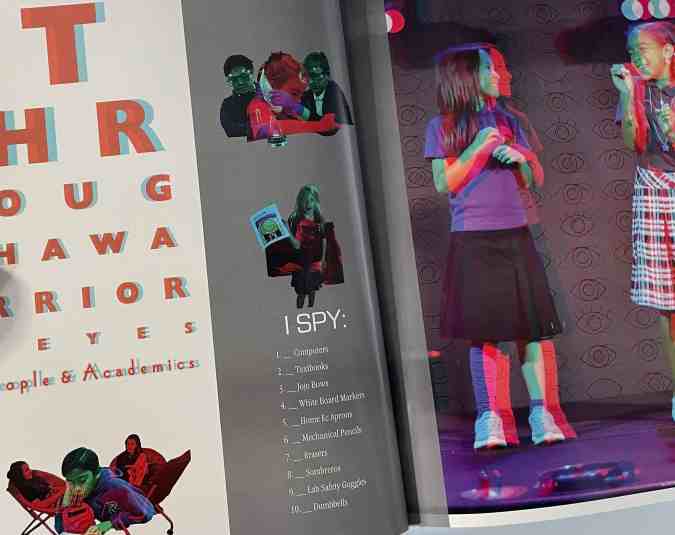
2. Find a person. This is the most labor-intensive: hide a COB of your mascot throughout the yearbook. (Yearbook Hero Katie Parish had a great take on this.)

Adding one or all four of these interactive yearbook page ideas gives students a place to reflect, share their “voice,” and foster a sense of community ownership of your collective narrative.

Why you need a yearbook ladder for your planning efforts
A yearbook ladder is a nice—and concise—chart representing the yearbook’s pages. Use it at the beginning of the year, and you’ll be able to better plan your book length, prioritize all the ideas you have for sections and stories, and determine what you have room to cover. Best yet, it doubles as a visual reminder of what your book is supposed to look like when it’s done. It’s basically one huge, visual post-it note.
When it comes to planning a yearbook, our favorite piece of advice for new yearbook advisers is this: Begin at the end.
Tweet
It might sound counterintuitive, but knowing where you want to go before you start will help you get to that end goal a little faster—and a little happier. You can achieve most of that by picking your deadline, theme, and coverage goals, but there is one tool that will get you the rest of the way.
It’s the yearbook ladder.
Here’s what one looks like:
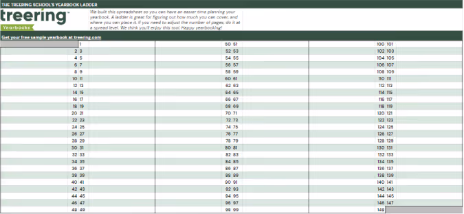
A ladder makes yearbook planning easier
Other yearbook planning tools, like project management spreadsheets, editorial calendars and deadline charts, might seem to do everything except make your morning coffee for you, but those tools miss a key element that yearbook ladders offer: a “big picture” view.
Have you ever struggled to remember where, exactly, your Halloween parade collage is set to go? Or how many pages you had reserved for prom night?
Your yearbook ladder will tell you right away.
Because a ladder can show you your book from the proverbial 50,000-foot view, you’ll never be more than a quick glance away from knowing where in your book you planned for each feature to go (and how much room you gave them).
The ladder is an especially useful device that can help you determine the layout and flow of the book, to make sure that you’re not forgetting anything, and to check and see that any multi-page features look as good as possible in the way they span the pages.
Tips for using a yearbook adder
To help you, we’ve compiled a quick list of things to do when you’re setting out to create your yearbook ladder:
- Start with last year’s book. Of course, you’re going to want to mix things up and try some new ideas, but there’s no reason to reinvent the wheel. Just move certain sections around based on your new theme and ideas. (If you didn’t have a book, or are trying a new type of coverage, start by listing everything you plan to cover.)
- Begin your ladder with your first page. Your first page on your ladder should be one that contains content. That means page one should be on the right side of the ladder, with no facing page. If you also list pages that don’t (or can’t) contain photos and text, you may confuse how many pages you actually need for your yearbook.
- Adjust as you go. You don’t want to mess with your plan too much, but the beauty of the ladder is that it can be easily rearranged to determine what looks and fits best. (That’s why we like our digital!) It’s a fluid document, so, if things change, you can easily adjust while still sticking to your original plan.
- Highlight pages on the ladder once they’re completed, and check them off once you’ve signed off those pages. Doing so will let you know exactly how close you are to finishing at all times.
- Teach others about the ladder. Even if you’re planning to control the document, you’ll want everyone to be familiar with how to read it. Ideas can flow better when people see everything laid out right in front of them.
Put your yearbook ladder to use
Yearbooks are usually designed in facing pages, also known as spreads, where you will have one “story” on each spread. Keep this in the back of your mind when planning your layout, so you can make sure the content on your pages flows as smoothly as possible.
If you find yourself with features that are one or three pages long, consider placing candid photos, quotes, or filler items on the opposite page to complement the feature. It’ll help keep each spread cohesive.
And you know a good tool to easily tell if you’re going to run into that issue, right? Of course you do. Grab a yearbook ladder and get to work. It’ll help you make an even better yearbook.

Gold yearbook themes
Adding a spot of gold is a growing yearbook trend. And we love it! While gold is a go-to accent for a 50th-anniversary book, use it to capture the spirit of 2024. See how easy it is to build a gold-themed yearbook with these design ideas and headlines.
Free whole-book looks and yearbook templates
You don’t have to begin with a blank book. Opting for a theme package is a time-saving alternative if crafting one from scratch seems overwhelming. These four golden packages by Treering Yearbooks below streamline the design process and are fully editable.


Gold foil yearbooks
Adding optional gold foil to the cover draws attention to specific elements like the school name or key theme graphics.
These two resources will help you begin:
Advice as good as gold
“A [Treering] theme does a lot of the graphic design work for you: it’s like giving your students fill-in-the-blank notes as opposed to having them copy them by hand,” said Yearbook Hero Lauren Casteen.
She and her team select one or two of Treering’s graphics packages and adapt them to tell the story of the year. They design layouts from scratch using the backgrounds, overlays, and other included visuals to build their style guide. Read more on Casteen’s approach to teaching design alongside using Treering here.
More than just a look
A visual theme becomes stronger when headlines connect content to create a story. Your gilded yearbook theme is more than a color scheme; it’s a clever play on the year (‘24) or a way to highlight a milestone (e.g., 50th anniversary). Here are some headlines to align your verbal and visual theme.

Headline ideas
A gold yearbook theme needs some golden headlines. We love browsing an idiom dictionary to create a list of headlines and spinoffs. Pro tip: an idiom dictionary is a great place to start with any theme.
- Worth its Weight in Gold
- Gold Mine of Information
- Heart of Gold
- Gold Standard
- Silence is Golden
- Golden Girls
- Gold Star(s)

Punny gold headlines
Puns, while a particular favorite of this adviser, are best used when peppered in. Using too many becomes like white noise and runs the risk of being unfunny. (The horror!) Remember, if one person doesn’t get it, chances are, many of your readers won’t–case in point: the Ponyboy Curtis reference above.
- Au-some
- Glitter of Speech
- Gold Feet - soccer or step team
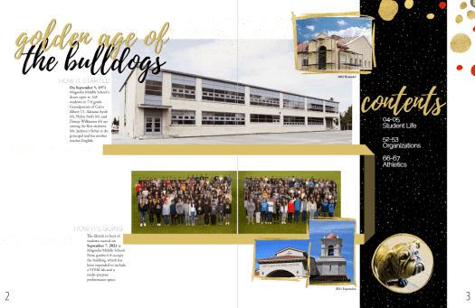
- Golden Age of the [mascot]
- Goal Diggers - volleyball
- If I Gold You That
- Thanks a Bullion
Headlines using synonyms
As with puns, too many Gold This and Gold That headlines diminish the luster. Brainstorm a list of synonyms to use, and then search your idiom dictionary for new nuggets.
- All that Glitters
- Rain or Shine
- Rise and Shine
- Sea to Shining Sea
- Shine On
- Shining Example
- Take a Shine to
Writing your own headlines
If a curated list is too much of an easy button, and you want to teach the process, here are five steps to craft a headline.
- Review the spread and sum up the coverage in a single sentence.
- List five keywords from the coverage.
- Look up idioms and/or puns incorporating those keywords and their synomyns. Compile a list of five to ten before moving on.
- Evaluate which headline idea achieves the goal of accuracy, clarity, and interest.
- Revise and rewrite until the answer is “yes” for all three.
To dig more into a goldmine of theme development, check out
10 reasons we're excited about TRL
Recreating the wheel is exhausting. Having Treering Live (TRL) experts provide all their tips and tricks saves time and energy and brings the fun back to yearbooking. (Yes, yearbook is a verb.) Treering tailored TRL for yearbook volunteers, educators, and aficionados of all levels, offering 18 sessions so you can engage with various aspects of the creative process. In anticipation, we compiled our top reasons TRL is the yearbook event of the season.
1. Leave with a road map
Figuring out how to get started when you're new to the school yearbook is daunting, especially when the person who used to do it is no longer at the school. Learn how to start and finish your yearbook.
Recommended sessions: I’m the Yearbook Coordinator… Now What? and Teaching Yearbook
2. Live event
Real-time sessions mean your questions get asked and answered promptly. Between the live Q&A during each session and the chat throughout, there are plenty of opportunities for shared learning.
Recommended sessions: Ask Us Anything with Treering’s Co-Founder Brady McCue and Keep, Change, Stop
3. Connecting with other advisers
Because two—or four hundred—heads are better than one, working together turns terrifying yearbook mountains into easy-to-approach small hills. TRL is not just about knowledge acquisition; it's about building connections within the yearbook community during National School Yearbook Week. You'll collaborate with fellow yearbook enthusiasts, sharing your triumphs, learning from your challenges, and forging bonds beyond these three days online.
Recommended sessions: Fundraising and Crowdsourcing and Social Media for Yearbook
4. Making a plan
From a ladder and coverage calendar to the next marketing campaign, you’re leaving TRL with concrete steps to make the best yearbook yet.
Recommended sessions: Getting Organized and Creating a Marketing Plan
5. Design inspiration
Yearbook Hero Lauren Casteen introduced us to mild, medium, and spicy design. Wherever you fall on this scale, you will gain an understanding of layout, typography, and color and how to go to the next level. You’ll also be able to help your yearbook team produce robust designs. Because, seriously, no one should yearbook alone.
Recommended sessions: Design 101 and Design 201
6. Three days of training
Joining TRL for one or all 18 sessions is a testament to your passion for preserving the memories and historical record of the school year, one page at a time.
7. cash
Kind of. Because we love a theme, there will be some sort of game in many sessions. Prizes include pizza parties, art supplies, and gift cards for coffee or Amazon.
8. 6+ hours of PD
Treering loves teachers. You’ll see learning outcomes in the session descriptions, and some of us, unabashedly, speak in teacher-ese. We know the importance of pro-grow opportunities. We know how annoying it is when someone reads their slides.
9. The Treering difference
Many schools consider changing their yearbook program and need to see Treering’s software firsthand. Busy schedules make it difficult, so we have four opportunities to dive in.
Recommended session: Live Demo
10. The journey isn’t over
In keeping with our game theme, your next winning move can take the form of weekly posts on the blog, monthly webinars, and 24/7 support with the Help Center. These myriad options allow flexibility in scheduling and enable you to revisit content or learn something new at your own pace.
Share your top moments during TRL: 23 by tagging us on social using @treering (Facebook and X) or @treeringcorp (Instagram and TikTok) using #trl23.

Yearbook design hierarchy
Design hierarchy of a yearbook spread refers to the arrangement of elements on a page in order of importance, with the most important element drawing immediate attention and receiving support from secondary and tertiary elements. When you apply these design principles, you are taking your readers on a journey across each yearbook spread by telling them where to begin and where to exit each spread through visual cues. Sound complicated? No worries, we'll break it down below.
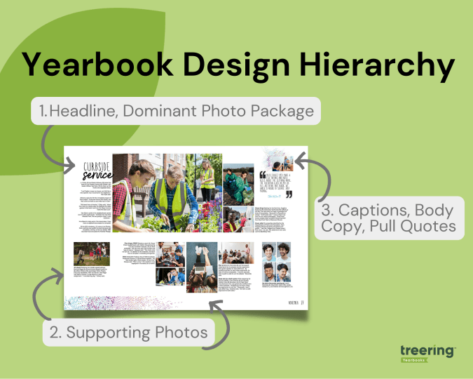
Dominant Elements
Think, "We're #1!" The dominant elements in yearbook hierarchy are headlines, the dominant photo package, and a subheadline. The dominant elements are just that: they dominate the most real estate on the spread. It's from them the rest of the content builds.
Headline
The headline is the most important element on a page and serves as a brief content summary. It should be attention-grabbing and provide an overview of the page's content.
Dominant Photo
This is self-explanatory: the largest photo on the spread is the dominant one. It draws the eye. It connects to the headline. It sets the tone for the entire spread. The best dominant photos are storytelling or action shots.
Subhead
The subhead is a secondary headline that provides more detail and context to the main headline. It can also be used to break up yearbook spreads into smaller sections, or modules.
Secondary Elements
Your secondary elements build from your dominant ones. Think of them as a great ensemble cast.
Photos
For most, photographs are the most important part of a yearbook. The individual images and their positioning on the spread can help further illustrate the page topic and make the page more visually appealing.
Quick tips:
- Eyes should look toward the center of the spread, not off the page
- Similar photos should be in proximity to one another
Tertiary Design Elements
If your headline and photographs did their job, readers will swoop in to enjoy your captions, copy, and extras.
Captions
These beauties provide context and information about the photos on a page, therefore they should be near their respective photograph. While they should be concise and well-written, it's easy to get cliche: "Tomás Bernal (7) enjoys his lunch." Start with the 5 Ws and then up your caption game by adding expanded captions.
Body Copy or Yearbook Stories
This is the main text on a page and provides the details and information about the subject being covered. It should be well-written, easy to read, and relevant to the headline and dominant topic of the spread. Often, when a dominant photo is of the storytelling variety, it will complement it and further explain its significance.
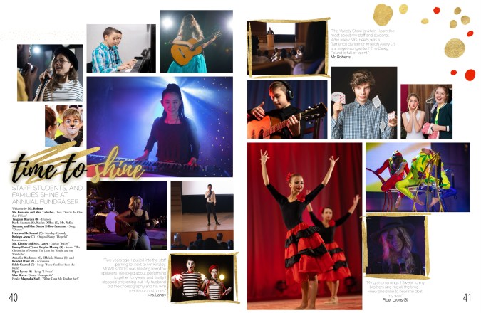
Sometimes, an "ident caption" will suffice. This is a list of names of students pictured, including their grade. In the middle school book below, the yearbook team used ident captions to outline the event program from the annual fundraiser.
Pull Quotes
Pull quotes are quotes from the body copy that are set off visually and used to highlight important or interesting information or one-off quotes from a student. They have both visual and verbal significance because they highlight the spread's topic with a unique POV. They can also add to the overall theme by bringing in theme elements.
Graphics and Design Elements
Like everything in yearbook design hierarchy, graphics and design elements, such as borders, backgrounds, and page numbers should be intentional. It's easy to get out of hand with Treering's graphics library, so that's why our design team cultivated 300-ish fully editable themes and color palettes for you. The purpose is to make the page more visually appealing and easier to navigate while telling the story of your year.

The hierarchy of a yearbook spread can vary depending on the page's content, and following this basic structure can help ensure that the page is well-organized and easy to read. If you're teaching yearbook or leading a club, use it
- As a checklist for students who are beginning to design
- For a scavenger hunt to see who can identify elements on a spread in a magazine or another school's yearbook
- To build your program by strengthening yearbook hierarchy in each design
23 yearbook hacks for 2023
Forget resolutions, it's time to get to work. Our staff brainstormed the top yearbook hacks you can use at any stage in the yearbook creation process and packed this blog with videos, how-tos, and examples. Use the quick links below if you need to jump to a specific area.
Yearbook design hacks
Designing a yearbook is much more than just putting pictures on pages. Intentionality, storytelling, and branding are included. The following time- and sanity-savers will help you progress in your role as editor, adviser, coordinator, or yearbook fan girl.
1. Auto layout
What if you could just drag the photos you want to use on a spread and they would magically be organized and re-sized? Voilà!

The best part? Everything is still fully editable, so if you need a starting point, you can continue to build your spreads with more photos and text, swap our images, and change the color of the elements.
2. Color picker
You can pull the exact color from any picture to add to your design. This builds the yearbook’s visual cohesiveness because you can pull from photos or graphics to create your custom palette.
3. Layers in design
Up your design by using layers to arrange photos, images, and text. In the examples below, you'll see graphic elements used as photo frames (movie night spread) and editable shapes used to organize content (table of contents). Using the forward and background tools in the options panel can help you arrange elements.


4. Custom pages
Schools are used to offering senior ads as a way to congratulate students. Treering schools take it a step further and allow every family to tell their story with two free custom pages (and the option to add even more).
5. Missing portrait hack
"Picture day is the easiest day of the year," said no adviser ever. As hard as we work to make it a flawless experience and to capture every student and staff member, perfect attendance is out of our control. One way we love to see people included in their respective sections is by flowing them in with this spirited touch.
6. Advanced portrait settings
Another hack for your people section is included with the advanced portrait settings. Subtitles are a simple way to add marks of distinction such as student activities and honors as well as staff department or job titles. Other advanced portrait settings include spacing and sizing options.

7. The magical shift key
Shift your process for aligning and rotating objects.

8. Printed proof
A printed proof is an exact copy of your yearbook, and every school gets one free. Use your printed proof to
9. Picking favorites—it's OK!
"Liking" graphics, backgrounds, and photos makes it easier to find them to add to yearbook spreads. To use your hand-picked collection in your book, filter by "My Likes" and "Team Likes" in the drop-down.

10. Pre-designed pages
Annually, Treering publishes elementary and middle/high school "Year in Review" and "Best of the Year" Pre-Designed yearbook spreads. These spreads include noteworthy highlights from pop culture and current events, and like all things Treering, these pages are editable so you can choose to replace the content with your own. Some communities prefer school or local election news, campus trends, or athletic records. Pre-Designed pages which include mention of our philanthropic partner, Sandy Hook Promise, are also available as well as about me, art gallery, and puzzle pages.
Get more people in the yearbook
The best practice for yearbook coverage is to ensure each student is in the yearbook three times. Think one photo in each section: portrait, classroom, and activity.
11. Crowdsourcing features
Treering’s crowdsourcing tools include integrations with Facebook, Instagram, and Google Drive as well as shared photo folders. Teachers, parents, and students can email photographs from their devices directly to event folders in your school account.
According to adviser Lauren Casteen, Yearbook Hero and leader of Treering’s Teaching Yearbook cohort, there are four reasons to crowdsource content:
12. Monitoring coverage
A big question we hear is, "Why would you want to tag student names when we're not doing an index?" Since our job as advisers is to cover all the students on campus, tagging is one way to track how many times students appear in the yearbook. It also helps you find out who is missing from your pages and craft strategies to include them.
13. Keyword tagging
By using keywords such as event names and topics (e.g. AP Lit), your search just became that much more powerful, and the English folder less intimidating to navigate.

14. Find Carmen San Diego
Tagging by student name helps you easily find students within your web of folders.

15. Polls
Create polls to give a snapshot of the student body's preferences. Treering's software even makes the graphs for you. Expand on this or that-style questions or multiple choice ones by interviewing a respondent for more detail. You may be surprised why your star soccer player is a cat dad.
Marketing tips
The second semester is when we see surges in book sales. Here are some hacks to get more yearbooks in more hands.
16. Free yearbook flyers
The price is right. So is the message.
17. Use your printed proof as social proof
Social proof is one way you can positively encourage others to support your program by buying a yearbook.
Hacks for yearbook advisers
All of the above definitely apply to yearbook advisers and coordinators, and here are few extras because you are our people.
18. Free webinars: Yearbook Club
A yearbook adviser PLC? Live yearbook training? Technology pro-grow? However you want to sell it to your admin, we have it. And it’s free.


19. Styles
By establishing photo and text styles early on, you create a cohesive look for your yearbook. Because the font library continues to grow, it's nice to set some limits, especially with emerging designers!
20. Portrait proofing with PDFs
Printing PDF proofs from the editor dashboard as soon as you get your portraits flowed is one quick way to ensure accuracy. Distribute them to the office staff and classroom or homeroom teachers for a double and triple check.
21. A list of evergreen content
Evergreen content for yearbooks is a collection of interview questions, infographic topics, and story ideas that can be used throughout the year. While we want to have a yearbook that reflects the current year and trends, having a timeless collection keeps your students working on interviews and photography and provides material to fill in on portrait pages, sports sections, and even in the index.
22. Supplemental books
Sometimes club sports, special events, and alumni need a little extra. You can still attach a fundraiser, take advantage of our free design software, and enjoy all the other perks of making a Treering book: no minimums and a three-week turnaround from the day you submit.
Treering’s printed books for family reunions, church or neighborhood directories, scout troops, sport associations (rodeo, mountain bike, cheerleading, gymnastics), 4-H, school auctions, cookbooks, performing arts studios, first responders, and more.
23. Yearbook hack central: Treering blog
(Shameless, we know!) We're glad you're here and hope you find more yearbook hacks by searching the blog or signing up for notifications when we post new content.