Design
Looking for inspiration, design tricks, how to make a great cover, promoting your yearbook and engaging your community?
Most recent
Winners of the 2022 #treeringmemoriesmatter contest
Treering Yearbooks is pleased to announce the winners of our 2022 #TreeringMemoriesMatter Design Contest. Yearbook editors from across the US submitted their favorite yearbook spreads from the 2021-2022 school year.
First place winners
Elementary school: Del Norte Heights Elementary School, El Paso, TX
The blended coverage of a teacher-organized remembrance ceremony of 9/11's 20th anniversary and a celebration of one of America's most popular children's books captured the "return to normalcy," Yearbook Coordinator, Elyse Hernandez said.
The Del Norte Team earned second place in our 2021 contest with their spread on face mask fashion.
"As we returned to our classrooms in person, students embraced the return to normalcy, and being able to create traditions and celebrate our students is one of the many facets that make Del Norte Heights an amazing learning center," Hernandez said. "That is why our Treering Memories really matter!"

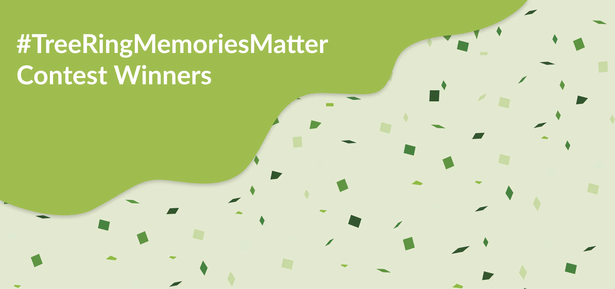
Middle school: Edison Regional Gifted Center, Chicago, IL
This show-stopper spread is a strong example of inclusivity and trends (hello botanical design and pop culture). Notice how each student has individualized interview questions. We also love that the cutouts aren't true COBs, which adds to the magazine feel.
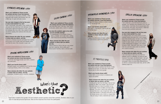
High School: Grandview High School, Grandview, WA
Student editor Jazmine Richey created this spread which incorporates both theme elements and the here-and-now of the campus: a state-tournament appearance, the return of fans in the stands, and a new building. We love the modular look.
"The [red] line represents not only the presence of the Red Line of Equity in our everyday lives but the beginning of the creation of traditions here at GHS," Lilly Kassinger, the student who nominated Richey's work, said.
And the QR code? It links to a highlight reel of the season.
Each of the first-place winners will share their tips and tricks in upcoming blogs.
Second place winners:
Elementary School: Lois Lenski Elementary, Littleton, CO

Middle School: Lennox Middle School, Inglewood, CA
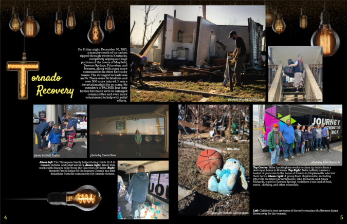
High School: Pennyroyal Area Christian Home Educators of Kentucky (PACHEK), Hopkinsville, KY
Third place winners
Elementary School: Orion Alternative and Mandarin Immersion, Redwood City, CA

Middle School: Mountain School, Soquel, CA

High School: Freedom High Magnet School, Albuquerque, NM
QR Code is a registered trademark of DENSO WAVE INCORPORATED.
2022 #TreeringMemoriesMatter Runners Up
Abington Friends School
Ardrey Kell Band Booster
Blue Ridge Academy
Bremerton High School
Cetronia Elementary School
Chateauguay Valley Regional
Chester W. Morrison Elementary
Christ Lutheran
Evergreen Valley High School
Gregory-Portland High School
Lakeside Christian School
Lyman High School
New Traditions
North Elementary School
Okaloosa Stem Academy
Orange County Classical Academy
Perry Lecompton Middle School
Premont I.S.D./Premont Collegiate High School/Premont Early College Academy
Presidio Middle School
Sky Ranch Middle
Southeast Academy High School
St. Cloud Christian school
St. Xavier Catholic School
The Learning Connection (TLC)
Thomas Rivera Elementary
Villagers
Virginia's Governor's School for the Arts
The judges, a panel of yearbook professionals, graphic designers, parents, and journalism educators, thank everyone who entered the 2022 #TreeringMemoriesMatter Design Contest.
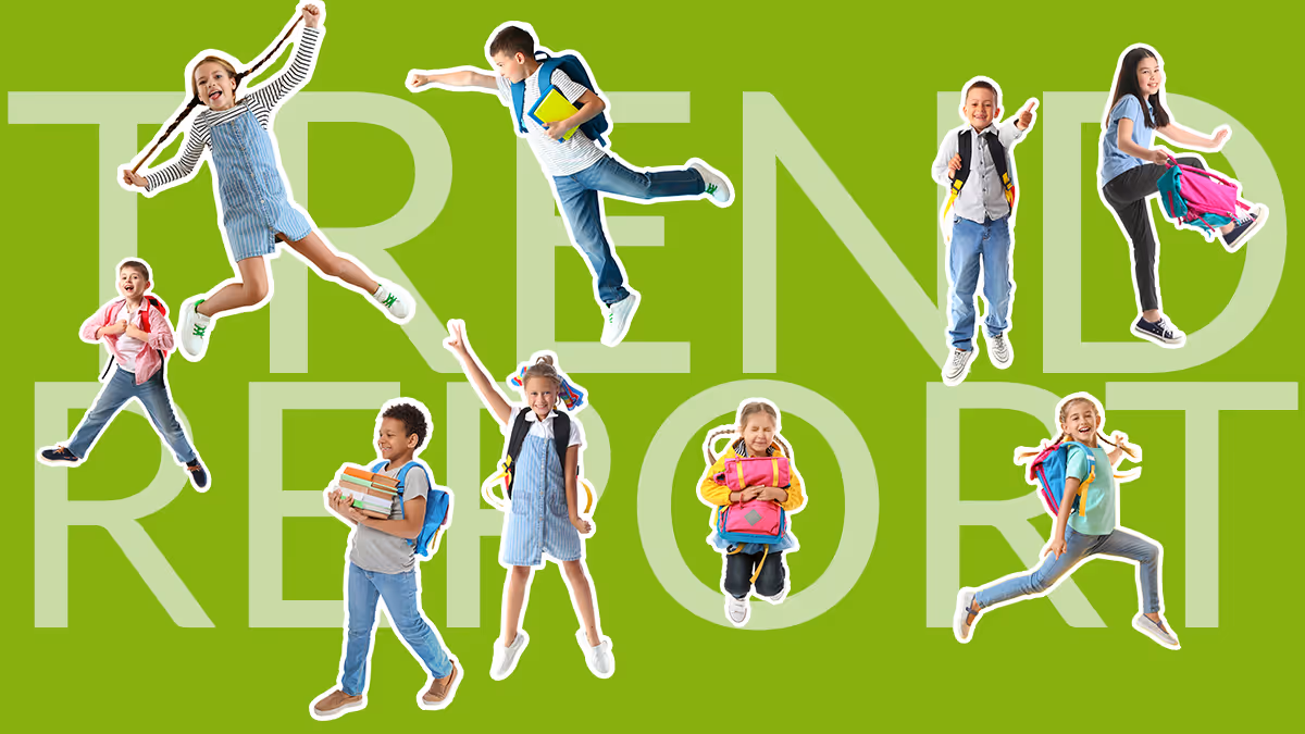
Year-end trend report
This is the time we often find ourselves reflecting on moments or trends that defined the year: countdowns dominate TV and radio, your Insta feed is filled with top nine collages, and influencers hype up-and-coming trends. Because the yearbook has the potential to be a campus influencer, below are just a couple of things to consider documenting in yours so students can look back and reminisce. It's easy to add trends and events that defined the year in the definitive archive of academia: your yearbook.
Current events
Add a trend timeline or spread so students can remember historic events, recall how most students chose to tuck in their t-shirts, or laugh at the social media craze during that time.
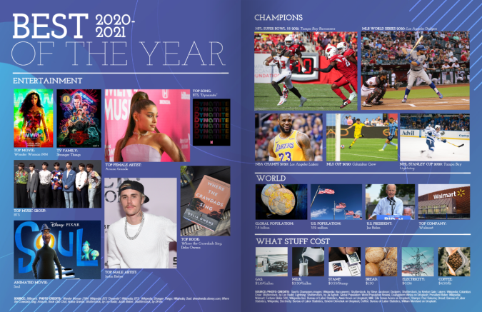
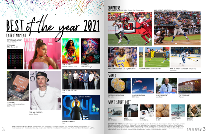
When it comes to including historic events to include in your school’s yearbook, it can be overwhelming about which ones to choose. When considering a year-defining moment, consider the impact it had on your local student body.
Natural disasters are also worth including in your year-end coverage. However, editors must do so while also keeping the sensitivity of the issue in mind. Did your school set up a donation drive to help victims of a tornado or hurricane that devastated another area of the country? Was your campus directly impacted?
Finding a local angle is a technique journalists often use when deciding how they plan to cover a specific event and it’s a tool yearbook editors can use as well. After all, you are a journalist who is documenting each school year!

Fashion trends
Historic moments aren’t the only element that defines a school year. Fashion is another key component that can help illustrate a certain time period as many students use this as an outlet to express themselves. To help determine the latest trends, a great first step is turning to Pinterest or Instagram. From there, have your yearbook staff find students who emulate some of those fads.
You could also assign an Outfit of the Day (#OOTD) photographer to capture students walking into school. Then, in your yearbook, you could feature seasonal styles. (Parents also love to submit these photos, so ask away!)
If you do a more traditional fashion spread, be sure to include:
- Mom jeans
- Chunky soled shoes, especially Dr. Martens
- White shoes
- Athletic gear
- Graphic Ts
- The return of the mullet
- Bucket hats (which we hear will be "out" come summer)
- Over-sized sweaters
- 90s style: neon, flannel, wide-legged pants
- Friendship bracelets
Social media trends
In addition to fashion, you can also consider incorporating social media trends that were popular over the past school year. Who knew TikTok would take off like it did? Remember when customizing your background and picking out songs for your MySpace page was all the rage? We do! Be sure to include some of the dances, trends, or popular songs students may be using on their own TikTok pages.

Students will love looking back at these memories 10 years from now, and their kids will love it even more!

2021-2022 yearbook theme trends
UPDATE: see 2023-2024 yearbook theme ideas. For more post-pandemic design trends, keep reading.
Using nostalgic designs, organic colors, and handmade elements, check out how you can harness the design and color trends for your 2021-2022 year(book) themes. The design world is unanimous: joy is back!
Treering has pre-released 15 new on-trend yearbook themes for 2021-2022! Log in to the app (for free) to see the full line of backgrounds, fonts, layouts, and artwork included in each theme to find some inspiration for your yearbook this year. Whether you're a Treering user or not, you can always look and use our ideas no matter who is your yearbook provider.
Trending now: new yearbook theme sneak peek
Check back in late August for the full collection of new themes joining the Treering catalog. In the meantime, check out our top on-trend themes below.

Our top five yearbook themes and trends
2022 yearbook theme design trend: nostalgia, color
Nostalgic design is synonymous with retro and vintage with the caveat it evokes emotion. Research shows pieces from the past produce positivity in the present! Pair nostalgic elements such as colors, fonts, and images with old school photos from past yearbooks for a complete blast from the past.
Get the look with Treering:
The 90s are back and with it memories of Lisa Frank binders, Zack Morris phones, and NSYNC songs. As you rock your acid wash jeans and baby doll Ts, check out the vibrant colors and iconic graphics in the Back to School yearbook theme that have as much pop as your fav boy band. Outdoorsy colors—think sunshine, spring water, and wildflowers—brighten up this design with drag-and-drop school supply artwork and backgrounds.

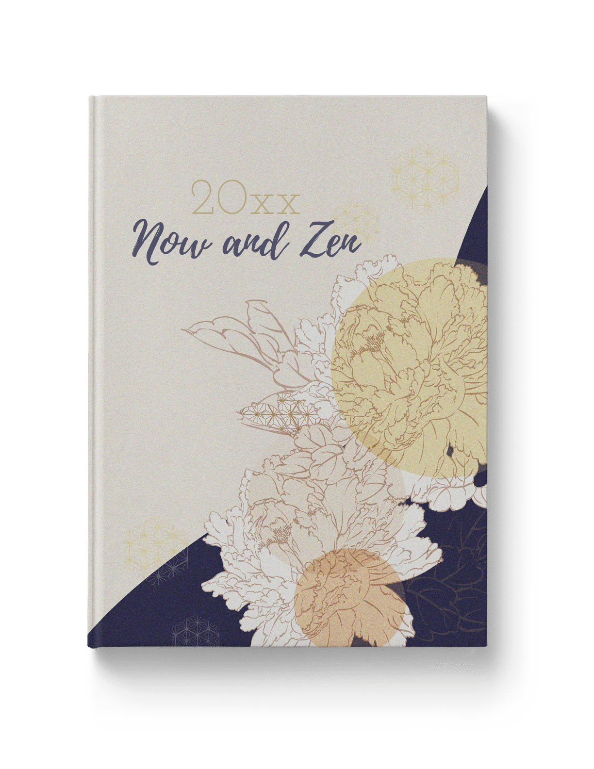
2022 yearbook theme design trend: organic, illustrative design
In a year when we’re going back-to-basics in the classroom, you can bring them into the yearbook room. Celebrating living things is a tenet of organic design. Flora and fauna pop up in many of the new themes for 2021-2022 (hint, hint).
Hand-drawn images and line art continue to dominate the illustrative graphic design trends. Outlines, line art textures, and freeform shapes get their inspiration from the natural world.
Get the look with Treering:
Now and Zen is an airy collection of crisp lines, layers, geometric shapes set in this yearbook theme's neutral color palette. Like flannel, this design trend is meant to be layered.
2022 yearbook theme design trend: nostalgia, symbols
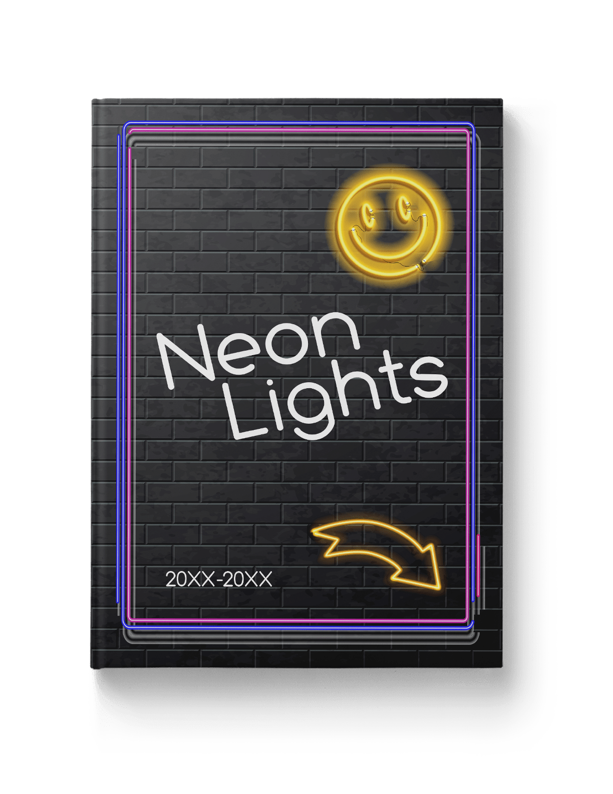
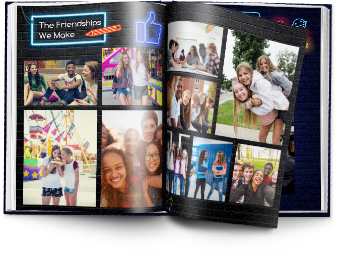
We’ve established nostalgia gives us all the feels. Neon’s century-long presence in the US conjures memories from riding in classic cars and drinking malts with grandparents to wearing Electric Youth perfume and sweating through skate nights.
Symbols can do the same. A thumbs up or a heart means you’re getting noticed. A border means READ ME! Arrows tell you to keep going because exciting things are forthcoming! And we all have our go-to emoji for wearing our feelings on our screens.
Get the look with Treering
We modernized the look of neon by adding emojis and icons you can use to divide academics, extracurricular, and personality pages. Because of this, Neon Lights is a complete theme package that will lighten the load for your yearbook team.
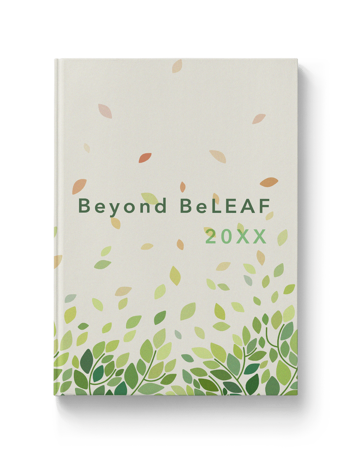
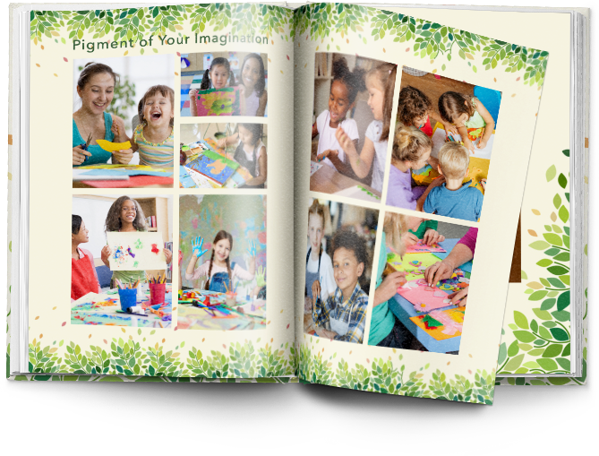
2022 yearbook theme design trend: organic, illustrative design
After a year inside, the outdoors are calling! Natural textures, shapes, and colors are hot in the interior, industrial, and graphic design. They soothe. While it may not be as sappy as the nostalgic design trend—see what we did there—being in nature boosts creativity and reduces stress. And we need those two things for a budding yearbook program!
Get the look with Treering
The Beyond BeLEAF yearbook theme has illustrative, organic shapes and neutral colors that echo Treering’s commitment to sustainable business practices (shameless plug, I know...). Leafy borders, overlays, and frames hug your photos.
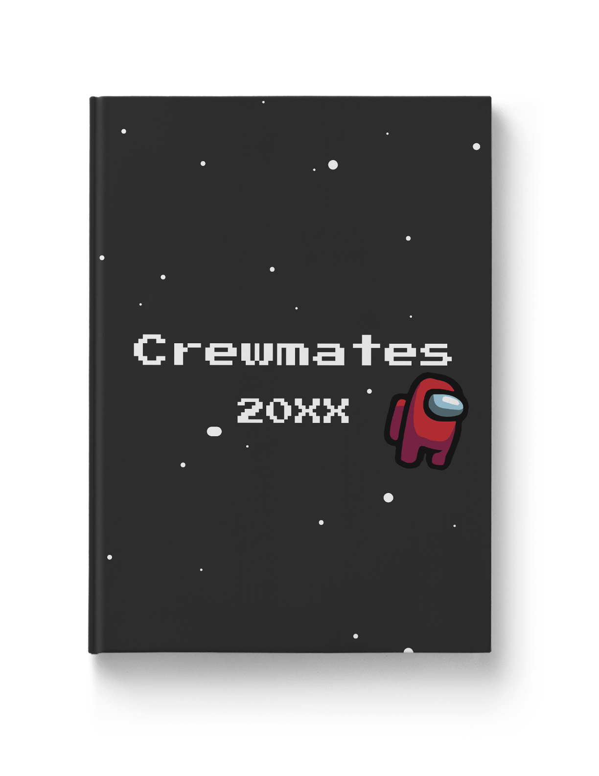
2022 Yearbook Theme Design Trend: Illustrative Design
The glory of illustrative design is its many manifestations: cartoon illustration picks up where the seriousness of the line art design trend leaves off. It’s whimsical and potentially nostalgic. It’s bold and bright. It’s fun and funky. If a playful yearbook theme aligns with your team’s vision, this is the trend to implement!
Get the look with Treering
By taking inspiration from popular games (that’s plural for a reason, people!), we created options for those who want their book to be timely, on-trend, and totally relatable to tweens. Start with the Crewmates theme, then Level Up.
If you'd like more help selecting a yearbook theme and design trend for your community this year, check out these five questions to ask your yearbook team.