February 21, 2023
2
Min Read Time

Design hierarchy of a yearbook spread refers to the arrangement of elements on a page in order of importance, with the most important element drawing immediate attention and receiving support from secondary and tertiary elements. When you apply these design principles, you are taking your readers on a journey across each yearbook spread by telling them where to begin and where to exit each spread through visual cues. Sound complicated? No worries, we'll break it down below.
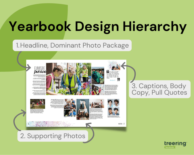
Think, "We're #1!" The dominant elements in yearbook hierarchy are headlines, the dominant photo package, and a subheadline. The dominant elements are just that: they dominate the most real estate on the spread. It's from them the rest of the content builds.
The headline is the most important element on a page and serves as a brief content summary. It should be attention-grabbing and provide an overview of the page's content.
This is self-explanatory: the largest photo on the spread is the dominant one. It draws the eye. It connects to the headline. It sets the tone for the entire spread. The best dominant photos are storytelling or action shots.
The subhead is a secondary headline that provides more detail and context to the main headline. It can also be used to break up yearbook spreads into smaller sections, or modules.
Your secondary elements build from your dominant ones. Think of them as a great ensemble cast.
For most, photographs are the most important part of a yearbook. The individual images and their positioning on the spread can help further illustrate the page topic and make the page more visually appealing.
Quick tips:
If your headline and photographs did their job, readers will swoop in to enjoy your captions, copy, and extras.
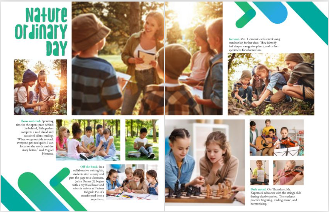
These beauties provide context and information about the photos on a page, therefore they should be near their respective photograph. While they should be concise and well-written, it's easy to get cliche: "Tomás Bernal (7) enjoys his lunch." Start with the 5 Ws and then up your caption game by adding expanded captions.
This is the main text on a page and provides the details and information about the subject being covered. It should be well-written, easy to read, and relevant to the headline and dominant topic of the spread. Often, when a dominant photo is of the storytelling variety, it will complement it and further explain its significance.
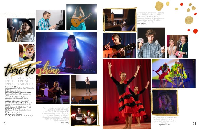
Sometimes, an "ident caption" will suffice. This is a list of names of students pictured, including their grade. In the middle school book below, the yearbook team used ident captions to outline the event program from the annual fundraiser.
Pull quotes are quotes from the body copy that are set off visually and used to highlight important or interesting information or one-off quotes from a student. They have both visual and verbal significance because they highlight the spread's topic with a unique POV. They can also add to the overall theme by bringing in theme elements.
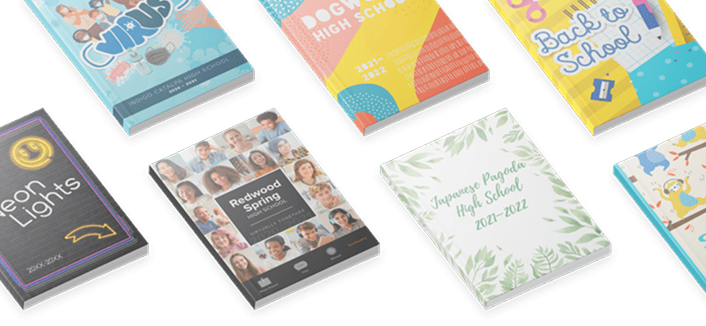
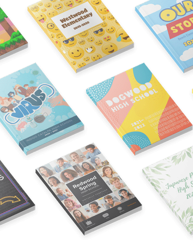
Like everything in yearbook design hierarchy, graphics and design elements, such as borders, backgrounds, and page numbers should be intentional. It's easy to get out of hand with Treering's graphics library, so that's why our design team cultivated 300-ish fully editable themes and color palettes for you. The purpose is to make the page more visually appealing and easier to navigate while telling the story of your year.
The hierarchy of a yearbook spread can vary depending on the page's content, and following this basic structure can help ensure that the page is well-organized and easy to read. If you're teaching yearbook or leading a club, use it