Most popular


Subscribe to our blog
Most recent
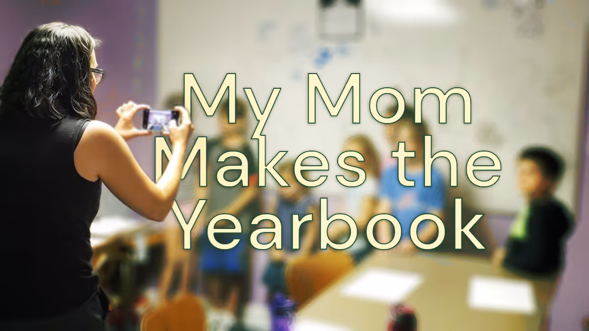
My mom makes the yearbook
Taking over this yearbook blog is a big deal for me: I don't remember a time without a yearbook. Now that I’m about to finish middle school and have eight yearbooks to look through, my appreciation for them leveled up. Yearbook moms (and dads) deserve our appreciation. If you are thinking about joining their ranks, know it impacts your kids and their friends.

My yearbook history
The oldest yearbook memory I have was when I tried to get as many signatures as possible in my book. My friends and I once had a competition to get the most. We’d ask everyone at lunch and during after-school care to sign ours. Because my mom ran the yearbook, I had an advantage with the older kids. They all knew her, and she’d talk about me in class.
Now, the signing part is more or less to show my kids one day that I did have friends. My school does its signing party in the summer. I look forward to it because I get to see all my friends again.
Before I started fourth grade, my family moved across the country. When I changed schools, yearbooks became even more important. They helped me remember my old friends. Since yearbooks capture memories of the school year, I use them to brag to my friends about doing things like scoring a touchdown or winning the science fair.
How my mom makes the yearbook
At my old school, my mom taught the yearbook class. The yearbook students were recognizable on campus. Now, my mom takes photos at school and recruits other moms. She then uploads them and puts them on pages. When it comes to design, she uses the pages to organize how events happen at school. Sometimes I get out all my books and look through them so I can remember.

Every year, she chooses a theme, and she doesn’t tell me what it is. At our school, it’s a surprise for the end of the year. No matter how much I beg, she won’t tell me. If the book was bland or the designs were scattered, it wouldn’t make much sense. I’m glad she puts time into making something that looks like the school year. Each one is different: 3D, like a journal, or even patriotic.


Having a yearbook mom
Now that my mom is making the yearbook as a volunteer instead of a teacher, she does all the work from home. Even though she constantly takes pictures of my friends and me in class or hanging out at recess, it feels good to know we will all be in the book. She knows us, and we can all relax (OK, I’m not always relaxed because she can sometimes be embarrassing).
Know it’s a good idea to be a yearbook mom (or dad). You’ll help more kids get in the book. You also get to help make something special that your kids and their friends will look at over and over.
Guest blogger Erikson (age 13) spends his time outside school cooking with his culinary team, serving as the 4-H teen leadership council vice president, and volunteering with Giant Cow Ministries. His Treering custom pages feature family vacations and 4-H achievements.
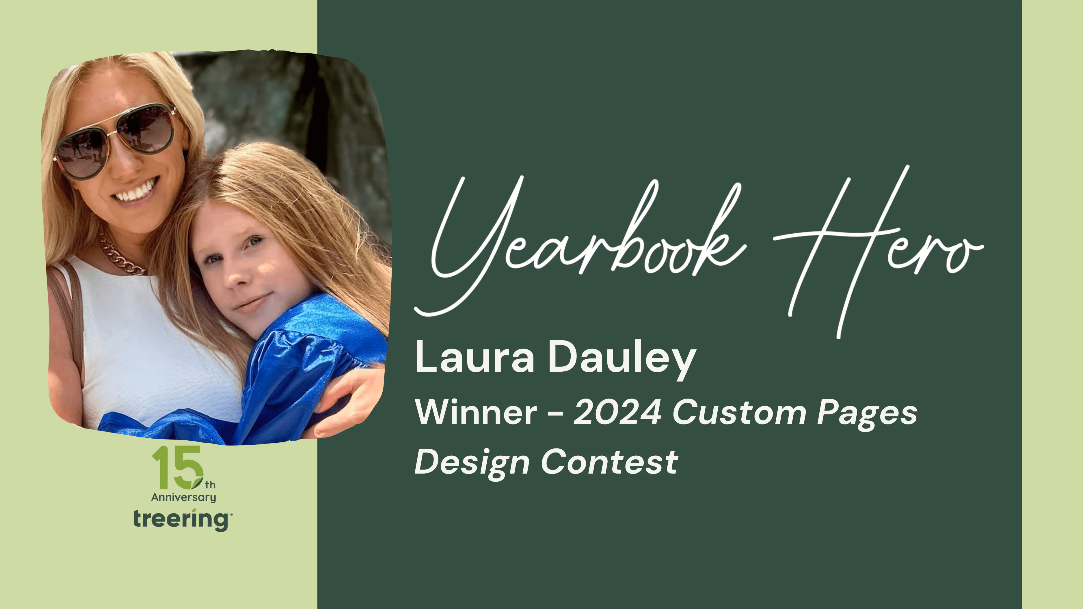
Yearbook Hero Laura Dauley’s winning design tips
Treering Yearbook Heroes is a monthly feature focusing on yearbook tips and tricks.
Every year, Laura Dauley writes her kids a letter. Part recap, part encouragement, these letters get tucked away in a treasured collection. This year, the mom-of-two switched things up and added it to the yearbook. And entered it in a design contest. And won said contest. We asked Dauley, as the K-8 division winner of the Memory Marvels 2024 Custom Page Design Contest, to share her tips for creating an authentic, memorable custom page design… that won’t embarrass.
How did you come up with your design?
Harper’s moving on to high school. I wanted to commemorate 11 years at the same school, from first days to playground memories. Digging through photos from the same time every year was emotional. I included our dogs and her brother, who’s been with her every step of the way, to remind her of all they shared.
It was a fine balance to not select a pic she wouldn’t be embarrassed over. There are many memories and experiences, so I also didn’t want it to be chaotic.
What does it mean for your daughter to have space dedicated to HER in her book?
What’s cooler than your eighth-grade yearbook?
This was in the context of something she was already excited about: her friends, and her memories. And I got to tack on to that. Only she had this. When they pass around the yearbooks, she has something special and unique. Her custom pages allowed me to make an emotional connection with her.
She also thought it was cool that her pages won. She’s always been proud of me making things for her along the way.
You’re a designer by trade. What advice do you have for parents getting started with their custom pages?
Less is more. Keep it simple. Focus first on what you want to feature and then add graphics. Don’t start with flashy, arbitrary graphics. Here’s the process for Harper’s custom pages:
- Images first
- Then the letter
- Then years, color scheme, and typefaces
It could be a daunting task. Even if you don’t know design, you can make a really cool page. I told all my friends to go online and start with the Treering templates. I was surprised with the flexibility and that I could create something from scratch.
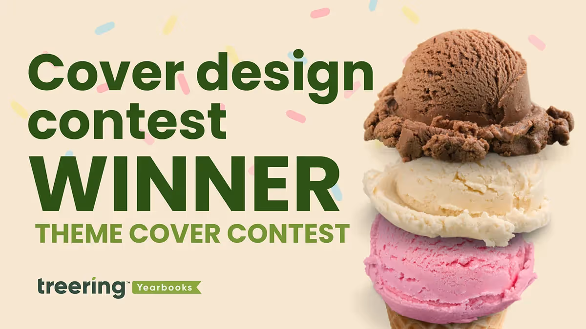
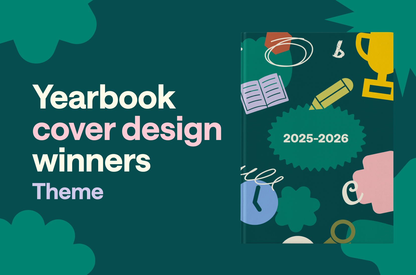
2025 Theme cover winners
In Treering’s inaugural Cover Design Contest, which—if we’re being real—was three concurrent contests, schools submitted their covers to one of three categories:
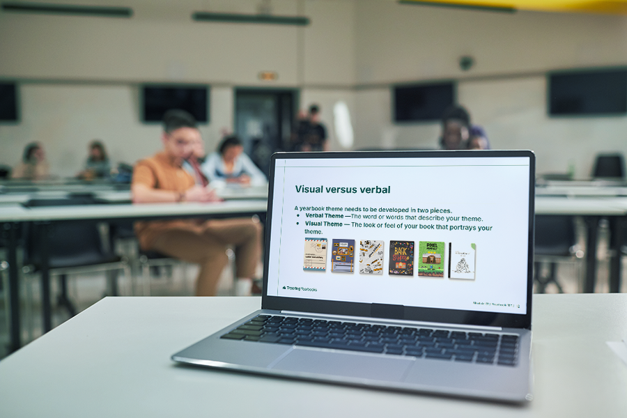
- School Spirit – mascots, school colors, and anything else that shows off your community
- Theme Development – an introduction to your visual and verbal theme
- Elementary Student Art – original art by K-6 students
Our team explored over 300 submissions, and the ones that stood out introduced their theme on the front and back cover, then expanded it inside throughout the book. Each of the themes below are specific to the time and place in which they exist. While the concept may work for the school across town, the execution would not.
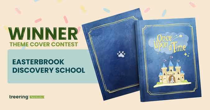
Grand Prize Winner: Easterbrook Discovery School, San Jose, CA
Theme: Once Upon a Time
This year was extra special. It’s EDS’ 20th anniversary and the tenth year in its building. These once in a lifetime moments became an obvious connection for the yearbook theme.
Pre-pandemic, a middle school yearbook club produced the book. The PTO wanted to continue to showcase student perspectives with a cover contest. “It celebrates creativity, individuality, and the shared ownership that makes our yearbook and our school so special,” said Bai-Lim.
This year, they gave little guidance: “Your design should relate to the ‘Once Upon a Time’ theme (e.g. fairy tales, dragons, fairies, wizards, enchanted creatures, etc.).” The faculty and staff chose the winning cover in an anonymous vote.
Winner Helena Kao created a design rich in symbolism:
- Castle: community, teachers, and parents that made our school a story worth telling
- Bricks: depicted fundraisers, music concerts, and field trips that were the building blocks to a safe and welcoming space for students to learn and grow
- Flags: the husky spirit that defines EDS
- Closed door: an end of a chapter for the graduating class of 2025
- Howling Husky: singing and celebrating the school it proudly represents
The cover art contest led to another “once” moment: ninety pieces of student art throughout the yearbook. “Each piece felt like part of the story of the school year,” said Bai-Lim, “and we didn’t want to leave that out.”
Bai-Lim’s team used a Treering vintage blue background, various story-inspired borders, and the lunchbox font for titles. She said, “Treering made it so easy to bring our ideas to life.”
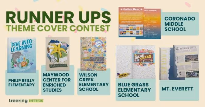
The final five six
Blue Grass Elementary School, Knoxville, TN
Theme: A School of Pure Imagination
The sweet cover made us melt. (It’s a contest for a back to school ice cream bash with cool puns, how could we not go there?) What’s more, is the yearbook theme and the school’s theme were one.
The team at Blue Grass used “a school of pure imagination” to guide their year. It was a “perfect match for capturing the magic, curiosity, and creativity that define our school community,” yearbook chair Becky O’Hatnick said.
She and her team of parent volunteers sprinkled each page with “candy-colored hues” and created titles on candy wrappers and golden tickets.
“From cover to cover, our yearbook is a vibrant celebration of childhood wonder and the boundless possibilities of imagination,” O’Hatnick said.
Coronado Middle School, Coronado, CA
Theme: Golden Hour
This coastal school embraced their SoCal vibe by using the colors of the golden hour to progress through the book. The students studied the sun, and used it for theme copy: “At the end of each day, and each Golden Hour, the sun must set. This is an opportunity to begin anew, never forgetting the last chapter, but anticipating the beauty of the next.”
“The edges of the book had a gradient,” adviser Heidi Frampton said, “so that as you flipped through the book you would see the sunset colors.”
Maywood Center for Enriched Studies, Maywood, CA
Theme: A Piece of Us
Every single one of us has a mosaic of experiences that makes us who we are,” adviser Nora Torres said. Her team built on that concept by piecing together textures and colors to create the layered cover. The more you look at it, the more details emerge.
They brought their theme into the book by using graphic pieces, such as scrap paper, tape, and cut-out letters to accent the content. Divider pages, especially, looked as if they were hand-designed. To make it even more personal, the yearbook staff added “yerd* doodles” throughout the book.
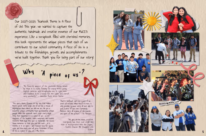
*Yerd = yearbook nerd
Mt. Everett Regional School, Sheffield, MA
Theme: Ripping Through Tradition
Students chose to blend nostalgia and tech by using newspaper graphics at an angle to chronicle their year. It’s a “blend of past, present, and future,” said adviser Kari Giordano.
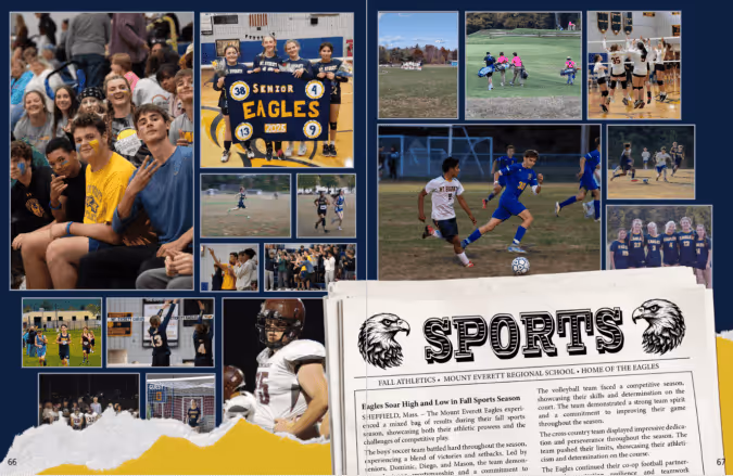
“This theme visually represented the senior class ‘shredding expectations,’” said Giordano, “and boldly stepping into the next phase of their lives.”
Philip Reilly Elementary, Mission Viejo, CA
Theme: Dive Into Learning
Yearbook chair Kristin Keller said she “created an underwater world where our theme could truly swim.”
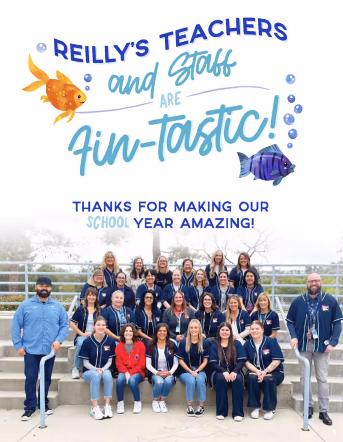
From using circular photos as bubbles to adding sea-sational puns, her designs were focused. Keller used design hierarchy and contrast to keep each afloat in a sea of color.
Wilson Creek Elementary School, Duluth, GA
Theme: Wildcats Stick Together
At first glance, this cover was familiar. Then, we looked closer.
“This hybrid theme enhances the Treering-designed theme ‘Stick Together’ with totally unique Wilson Creek graphics and vibes that show off how Wilson Creek Wildcats learn, live, and laugh,” said yearbook co-chair Holly McCallum.
She designed the sticker pack to include interactions of the wildcat, WCES, and their anniversary crest. The brown paper background takes us back to the first day of school, when you’d cover your textbooks with grocery sacks. Considering this is Wilson Creek’s 20th anniversary, it’s an emotive design decision.
McCallum also added frames to photos to make them look like stickers and she added positive messages “to emphasize the creative spirit and collaborative dynamic” of her school community.

65 academics headlines for yearbook
Your academics section needs stronger headlines. Agreed? The headline on each yearbook spread influences the reader's scanning behavior. (Read: it makes buyers look at your hard work.) When skimming a spread, the eye is naturally drawn to the headline first, and from there, it can guide the reader to other important elements such as subheadings, captions, and images. While headlines traditionally are larger text, additional design elements such as type treatments and mixed fonts help also set them apart. Below are the why, how-to, and 65 examples of headlines you can use in your yearbook.
How to write captivating headlines
It’s easy to drop football or science fair at the top of your yearbook spread. For those looking to up their writing game, crafting journalistic, punny, or thematic headlines can enhance your yearbook storytelling.
Not sure where to begin? Use some of the academics-centric headlines below to inspire or jumpstart your writing process.
STEM headlines
- Calculating the Memories
- Chart a Force
- [Mascots] Count Get Enough
- Easy as Pi
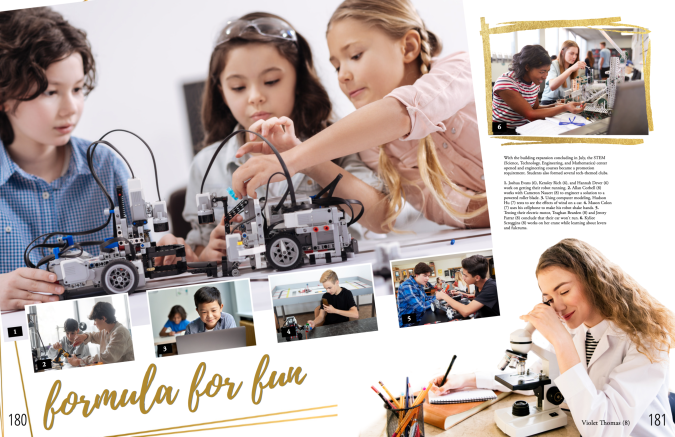
- Formula for Fun
- Here Comes the Sum
- In Our Prime
- Make Sum Noise
- Massing Around
- On this Equation
- Pi-ous Celebration
- Rule for Thought
- Square One: [Year]
- Squaring Is Caring
- The Final Equation
- The Sum of [Year]
- Up and Atom
- Write Angle
Humanities headlines
- Act your Page
- Anything Prose
- Blurb the Line
- Bookmark my Words
- Born and Read
- Bursting at the Themes
- Do the Myth
- Full Theme Ahead
- Get Booked On
- Go for Baroque
- Move in the Right Direction
- Plot it Down
- Prose and Cons
- A Rhyme a Dozen
- Setting Pretty
- Strike a Prose
- The Write Stuff
Arts headlines
- All Hands on Deco
- All Strings Considered
- Band New
- Band Over Backwards
- Bright of Passage
- Brush with Greatness
- Canvas of the Year
- Choral High Ground
- Emboss Level
- Face the Music
- Fair and Snare
- Fluid for Thought
- Hip Hop to It
- Horn to Fly
- Rhythm and Reflection
- Size the Day
- Soul in One
- The Stage is Set
Senior section headlines
- A Class Act
- A Degree of Fun
- From Student to Scholar
- Looking Grad-ulous
- Making Moves
- Onward and Upward
- Rising to the Challenge
- Stepping Into New Horizons
- Taking Flight (good for a bird mascot)
- The Final Exam
- The Final Lap of our Academic Race
- The Future Begins

How many pages do I need in the yearbook?
You’re planning for the school year: you chose a publishing partner, the yearbook team and curriculum are set, and the clock is ticking to the first day of school, better known as the first day of coverage. Are you feeling overwhelmed yet? (We hope not!) Determining your yearbook's page count is a quick win and a way to get the year(book) organized. Your school’s enrollment and your yearbook ladder are two ways most schools get set up. We’ll discuss the merits of both.
Use your enrollment to determine page count
Math lesson: there are 380 students on campus and you want to ensure three-times coverage. With an average of 12 photos on each spread (that’s two facing pages for those of you playing along at home), you’ll need about one spread for every 16-24 students. That breaks down to:
- 50 students or less: 32 pages
- 50-300 students: 40 pages
- 300-500 students: 64 pages
- 800-1000 students: 80 pages
- 1000+ students: 100-400 pages
While it’s nice to have a range, that’s a fairly impersonal method of guestimating your page count. It neglects the nuances, personality, and culture of your school. Let’s look at a second option for determining how many pages you need.
Why a yearbook ladder is win-win-win
A yearbook ladder is a chart that represents the pages in a yearbook. To build it, grab the last few years’ yearbooks, the latest school calendar, and your team.
- Brainstorm the non-negotiable events, sections (people, arts, sports), and yearbook traditions
- Brainstorm features, specials, and theme-related content
- Decide if you will organize the book chronologically, topically, or a blend of both
- Allocate spreads
We love doing this digitally because it can be fluid. If your page count is looking overwhelming because of time or budget, combine some topics. If it is underwhelming, return to number two: what additional, meaningful content will you add to your yearbook?
Remember, if you’re working with Treering, your page count is flexible; increase or decrease it at any time.
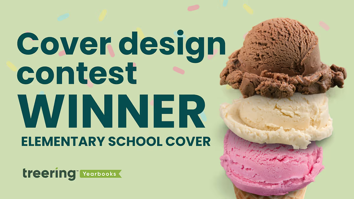
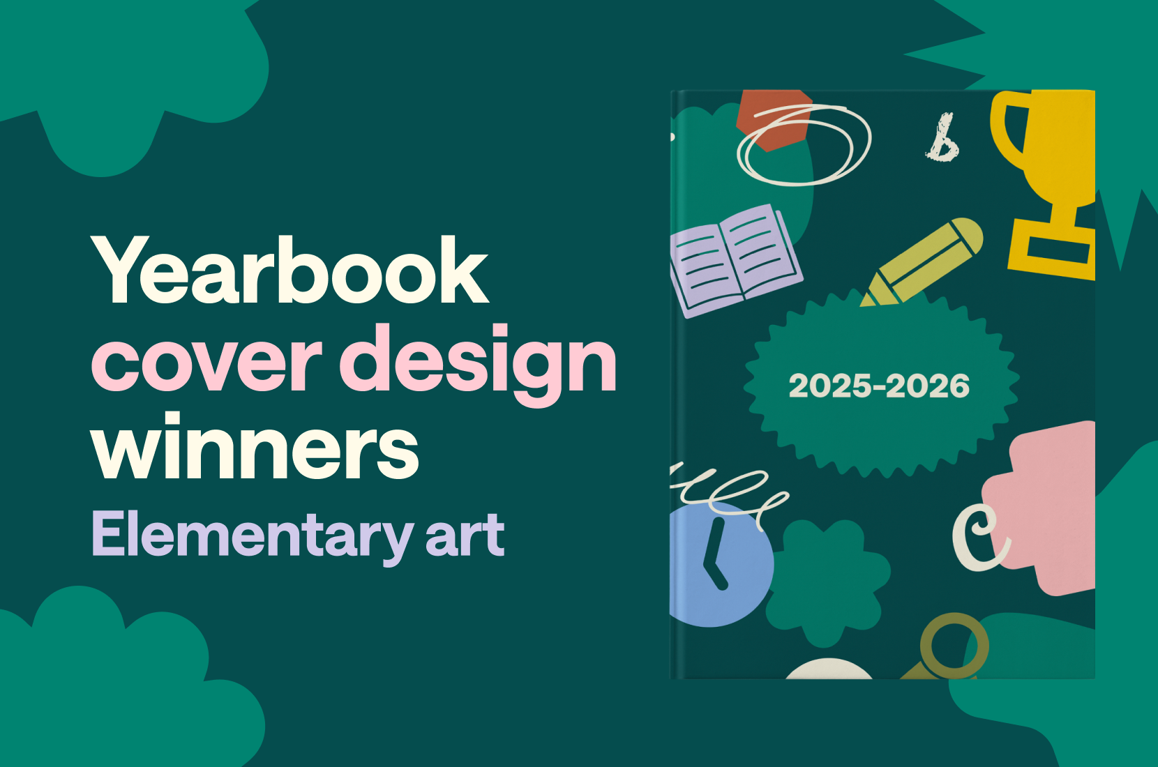
2025 Elementary student art cover winners
In Treering’s inaugural Cover Design Contest, which—if we’re being real—was three concurrent contests, schools submitted their covers to one of three categories:
- School Spirit – mascots, school colors, and anything else that shows off your community
- Theme Development – an introduction to your visual and verbal theme
- Elementary Student Art – original art by K-6 students
Students created original yearbook covers using paint, AI, colored pencils, crayons, mixed media, digital media, and pen and ink. Yearbook committees gave prompts that were open-ended, fixed, and everything in between. While many submissions were the result of a yearbook cover art contest, others were collaborative projects. All were steeped in the tradition of promoting student perspectives and community.
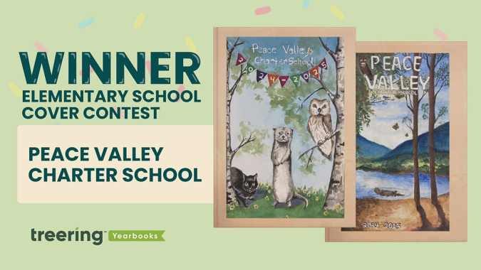
Grand prize winner: Peace Valley Charter School, Boise, ID
“Waldorf schools instill a deep respect for the natural world, fellow human beings, and the spiritual elements in all beings,” said 6th-grade teacher Nichole Murray, whose students compete annually in the yearbook cover contest.
Murray, PCVS dad Jason Ropp, and yearbook coordinator Gigi Murfitt display the entries in the hallways so all students can see them and begin to dream ahead for their chance in the cover contest. PCVS teachers choose the winners, and first and second place go on the outside cover. All cover contest submissions appear inside the book.
“The elements of nature are expressed, and our mascot, the otter, symbolizes intelligence, playfulness, resilience, and adaptability,” they said.
Both art pieces caught the judges' attention because they used similar colors and exceptional lighting–one judge kept exclaiming, “The shadows!”
The. Shadows.
The cover art introduces outsiders to the Waldorf philosophy, especially how the art curriculum helps nurture imagination, emotional intelligence, and a well-rounded intellect.
“Our mascot, the otter, symbolizes intelligence, playfulness, resilience, and adaptability,” Murray said.
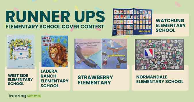
The final five
Ladera Ranch Elementary School, Ladera Ranch, CA
Fifth grader Fiona Martin captivated us with the color explosion and detail on her cover design. PTA president Joya Celik said the yearbook team at LRES asked the students to create a design incorporating their mascot “that reflected courage, perseverance, and attaining [their] goals.”
Their 2024-2025 school theme was “Go for the Gold.” Martin surely did just that.
Normandale Elementary School, Edina, MN
Yearbook team leads Lauren Dickerson and Becky Sertich created a collaborative project for 5th-grade students. Taking their inspiration from water bottles, Chromebooks, and everything else tweens touch, they asked students to create their own “sticker” design.
They “scanned and edited [each submission] to add a white border (like a sticker) and to make the background transparent so the ‘stickers’ could be arranged on the cover like clip-art.”
The result? An on-trend, completely original yearbook cover that shows the personalities and priorities of promoting students.
Strawberry Elementary, Santa Rosa, CA
This one is also collaborative: the front and back covers are creations from 6th graders and the local high school (shout out Sonoma Academy in Santa Rosa) helped put it all together. The latter used AI design tools to expand the front cover art to wrap around to the back. On the back, they also created a composite of art.
“The high school students had originally envisioned a variety of student strawberries in the grass and eagles in the sky for this cover design,” yearbook coordinator Pamela Vincent said. “But [a] 6th grade student convinced them that one of the eagles could be arranged to carry a strawberry-filled basket.”
“In total, seven high school students and 11 elementary school students collaborated to make this cover a reality,” Vincent said.
Watchung Elementary School, Middlesex, NJ
Wrap-around cover, check. Multiple students’ art, check. This cover ticked all the boxes, and once we learned about the five-week process to create each self-portrait, we were even more in awe of what a PK-3 school produced.
“Students are placed in Polaroid frames to remind the third graders that no matter how much time goes by, their 3rd grade memories will remain the same,” Librarian Anne Erchicks said.
West Side Elementary School, Marietta, GA
The team at WSES made their 75th anniversary book an homage to late Principal Reid Brown's first yearbook theme. To convey “Shine Bright like a Diamond and Be the Best Bee You Can Be,” each student from kindergarten through 5th grade created their own bee and drew a diamond.
“Our yearbook team voted on using student art as the cover,” said yearbook coordinator Shelley Strack. “We also used the additional bees and diamonds throughout the yearbook as graphics.”
Strack and her team created contemporary art to celebrate Brown’s message. “I loved the use of new and old as a part of our yearbook,” she said.

Rookie yearbooking: tips for the first-year adviser
Making a yearbook is unlike any other subject or volunteer committee. Yearbook coordinators/advisers/sponsors/heroes manage people and processes. They record history and achievements. They are marketers, photographers, designers, and party planners. And we're here to help. Consider this the first-year yearbook adviser guide to organization to help you however you scored the gig: if you showed up last to the PTA meeting or you are excited to use your background in journalism.
If you need to fast-track your yearbook journey, check out our four-part series Yearbook in 60 Days.
Understand your contract (*non-contract if you’re in the Treering community)
Expectation vs. reality is a powerful meme thing. We crafted this list of questions to help advisers choose a yearbook company. If one was chosen for you, use the list to clarify the relationship between your school and your publisher. To quote my mom, “They work for you.”
Treering doesn’t do contracts or order minimums. You tell us when your one deadline is.
Determine your page count
The best planning nugget this adviser received is to start with the end in mind. A yearbook ladder does just that. A ladder is a chart that represents the pages in a yearbook. Use it to allocate sections and page content.
Start with the last few years’ yearbooks, the latest school calendar, and your team.
- Brainstorm the non-negotiable events, sections (people, arts, sports), and yearbook traditions
- If relevant, brainstorm additional features, specials, and theme-related content
- Decide if you will organize the book chronologically, topically, or a blend of both
- Assign spreads to your team
We love doing this digitally because it can be fluid. Need inspo? Here are four sample ladders from other schools (use the tabs at the bottom to navigate between elementary, k-8, etc.).
Pro tip: If your page count is looking overwhelming because of time or budget, combine some topics. If it’s underwhelming, return to number two: what additional meaningful content will you add to your yearbook?
Gather content
Your ladder is worthless unless you can fill those pages. Harsh (and true). Here are three of our favorite resources to go from blank page to showstopping spread.
Pump your project
Many schools wait until the last minute to sell books. Starting sales when school begins builds momentum. These early sales fuel you as a first-year adviser. It also alleviates some of the last-minute pressure on parents already balancing the end-of-the-year activities.
From page count to promotion, these tips will help you stay organized as a first-year adviser. Happy yearbooking!
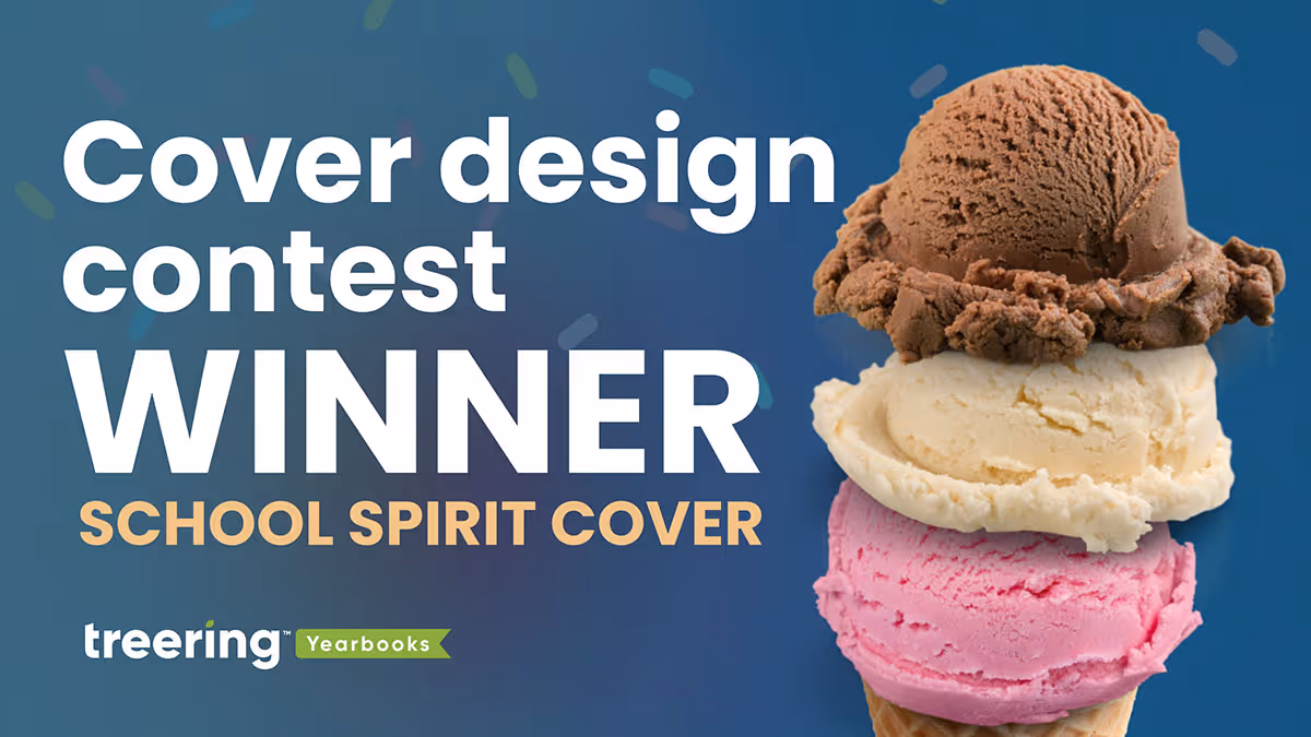
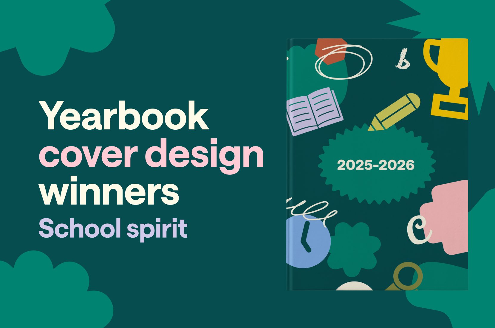
2025 School spirit cover winners
In Treering’s inaugural Cover Design Contest, which—if we’re being real—was three concurrent contests, schools submitted their covers to one of three categories:
- School Spirit – mascots, school colors, and anything else that shows off your community
- Theme Development – an introduction to your visual and verbal theme
- Elementary Student Art – original art by K-6 students
We said, “School,” you said, “Spirit.” Pride in your community shone through on every cover.
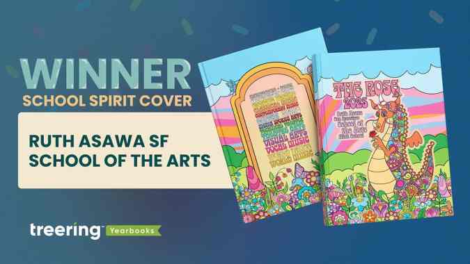
Grand prize winner: Ruth Asawa San Francisco School of the Arts, San Francisco, CA
Mascot: Rainbow dragon
School colors: 15 colors representing 15 art departments
“Each of the dragon's colors represents one of the school's 15 arts departments. Those colors are carried through the rest of the design, appearing in the colorful garden that spans the bottom of the front and back cover, and in the text on the back cover where each department's name is written in its unique color,” said adviser Jeff Castleman, who also teaches drawing, painting, photography, and computer art.
This cover illustrates the adage, “Know the [design] rules, and break them.” Generally, we’d encourage a yearbook creator to avoid using 15 colors. Not Asawa Arts.
They grouped warm colors for the sunset-inspired swirls, sandwiched between greens as grasses and blues in the skies. Each piece of flora has the base of the blues or pinks with pops of contrasting colors. Black lines hem it in.
A group of eight yearbook club students collaborated on the original illustration. The lead designers, both seniors, at Asawa Arts’ yearbook club developed the visual identity of the yearbook. They went from pencil sketches to creating their own computer-based line art. Six supporting designers (all juniors) filled it in with flowers, leaves, mushrooms, and butterflies.
On the spine and in the dragon’s hands are roses. “The rainbow dragon symbolizes our school spirit,” Castleman said, “and the rose it holds represents our guiding principles.”
The acronym representing Respect, Openness, Safety, and Engagement is part of the campus as much as it is part of the culture.
Castleman appreciated the flexibility of working with his students to create the vision and fully customize the yearbook cover. He said each year, the yearbook team re-imagines the dragon, giving it a different feel, from East Asian and Medieval to this year’s psychedelic interpretation.
“We think of [the cover] as the crowning jewel on a bespoke book,” Castleman said.
Castleman's team earned a Treering-sponsored back-to-school ice cream bash for their campus.
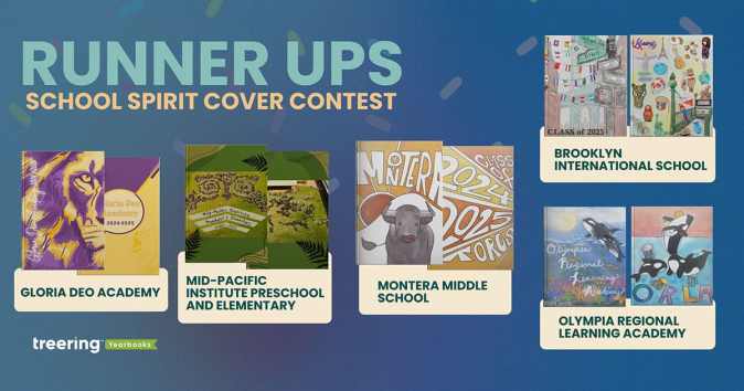
The final five
Brooklyn International School, Brooklyn, NY
Mascot: none
“Our school is a very tight community as our students come from many backgrounds trying to achieve the American Dream, but not forgetting their roots,” Norma Gaytan said.
Gaytan’s students represented their classmates with flags and artifacts from their home countries.
Gloria Deo Academy, Springfield, MO
Mascot: Lion
This is the cover we expected: school colors and a mascot boldly proclaiming school spirit. The texture in the mane and near-watermark incarnations of the lion on the back adds texture.
Mid-Pacific Institute Preschool and Elementary, Honolulu, HI
Mascot: Pueo (Hawaiian Owl)
The drone photo in honor of Mid-Pacific’s 20th anniversary is impressive enough. We loved the before and after images.
Adviser Abbey said, “The students learned about how to use a grid to scale an image, practicing in art. We then applied the math to create a giant grid on our courtyard and replicated our school mascot with field paint.”
Montera Middle School, Oakland, CA
Mascot: Toro
Student art always holds a special place in our hearts. Montera’s cover art extended from the front to the back cover, making a bold statement of school spirit.
Olympia Regional Learning Academy, Olympia, WA
Mascot: Orca
The symbolism in the student art evokes powerful sentiments of school spirit. Both contest winners captured the essence of the K-12 campus’ mentoring ethos. On the front, a mother and baby orca represent the cooperative role ORLA provides.
“We take our cooperative role with the families very seriously and we could not have the kind of school or kind of students we have without the role the caregivers provide, both at home and at our school,” adviser Rachel McKaughan said.
“The back cover also represents the playful spirit we have at the school with our many hands-on electives, she said, “where students are able to discover and express many different talents.”
From each submission, we learned school spirit is more than a sports team or school song steeped in tradition. It is comprised of community features: shared values and overarching identity. Thank you to the 300+ schools that shared their story with us.

This is the trick to a great yearbook principal message
When it comes to the yearbook principal message, there’s a trick we often see with the best ones:
Involvement from the yearbook adviser.
We know that might sound a little odd, since your principal is the head honcho, and, let’s face it, none of us like to tell our bosses what to do (#Awkward). But the trick to a really good yearbook principal message isn’t just to let your principal write whatever it is he or she feels like. It’s making sure you help shape that message.
Think about it: You’re the expert on the yearbook. You know the book’s theme, and how it’s being carried through on all the pages. Your principal doesn’t. That makes your viewpoint a good one for the principal to hear. Look, we know that every yearbook adviser is going to feel a different level of comfort when it comes to telling your principal what to write. If that’s not for you, there’s another way to help. Helping them how to shape what they want to say. And that’s what the rest of this post is about.
Read on, and we’ll explore the most important aspects to writing a good yearbook principal message.
6 tips for writing a better yearbook principal message
1. Start with a story.
Did you know that there’s science behind storytelling? Seriously. Our brain actually reacts differently when it receives information as plain ol’ data than it does when information is delivered in a story-like format. That doesn’t mean a principal’s message needs to start with “Once upon a time…”It simply means that using more adjectives, including metaphors and sharing personal anecdotes are techniques that help a message connect with the reader—so start your message with a story.
2. Connect to the theme.
There is a lot going on at your school, right? That’s exactly why your yearbook has a theme. The yearbook theme serves as the unifier between all the clubs, activities, sports and classes that take place throughout the year.So it makes sense that, as the leader of the school, your message both unifies and sets the stage for that theme. Plus, tapping into the theme is a way to recognize the hard work of your yearbook team -- and a subtle way of supporting them.
3. Write like you talk.
This is your principal's message, and it should sound like them. Don’t be afraid to let your personality shine.Avoid long words, formalities and clichés that wouldn’t be part of your vocabulary in everyday conversation. One of the benefits of keeping your language simple is that it will be easier for readers to remember and connect with your message. And that’s exactly what you want.
4. Show gratitude.
Remember to thank the people who worked really hard to make the yearbook—and the school year—amazing. This recognition of a job well done goes a long way, especially if you rely on a group of volunteers throughout the school year.
5. Be concise.
Attention spans are shorter than ever. For most people that means shorter than a goldfish.There’s a better chance that people will read your message if they can see that it won’t take much of their time.
6. Find an editor.
This is where you, the yearbook adviser, get to play a really big role again.Once your principal has created a message they're happy with, it's your turn to step in, and give it a good edit. Check for the other five tips, then proofread it. Doing so will ensure that their message is clear and error-free. It's the best way to make your principal's message stand out (and to save them unwanted embarrassment).Your yearbook principal message isn't just the responsibility of the principal. And it's not just letting your principal write whatever it is he or she feels like. You need to step in and help shape that message. If you use these tips, your principal will deliver his or her message better than they would have done on their own. And that'll make you a hero.
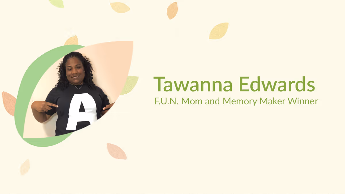
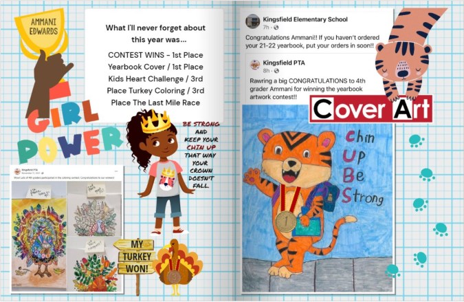
Yearbook hero Tawanna Edwards brought her a-game
Treering Yearbook Heroes is a monthly feature focusing on yearbook tips and tricks.
In our first-ever parent contest, Treering Yearbooks asked parents to capture and share their child’s unique POV. Elementary winner Tawanna Edwards from Cantonment, FL loves to play on words and used the first letter of her daughter Amani’s name to guide her design efforts.
We love how you organized your custom pages around your “A Moments.”
You’ve got to always bring your A-game! This year has been a year of many firsts and I created our custom pages to celebrate our activities, accomplishments, and accolades!
Talk us through each spread.
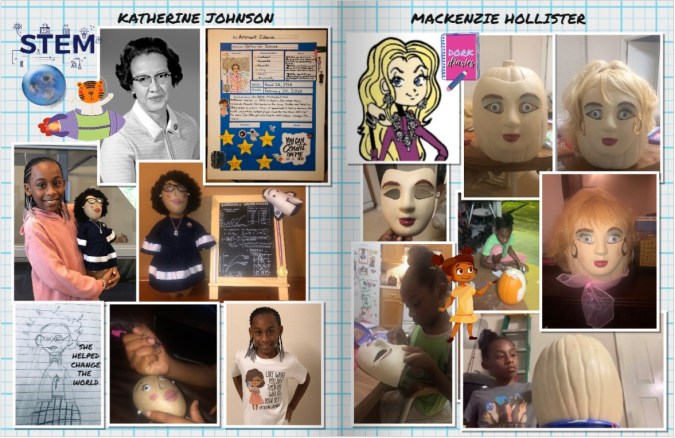
Activities: We have SO much fun participating in activities, whether it is schoolwide, or classroom-driven, Ammani wants to be a part of it all. A highlight has been the Bottle Biography Report on Katherine Johnson, a NASA mathematician who loved to count and helped change the world with numbers that soared astronauts to the moon and home safely. Ammani is great with her hands, and it has been amazing to see her little mind at work to create a masterpiece.
Accomplishments: We love our school and have cub pride in everything that we do! From spirit wear to fundraisers, we support every cause and do our part.
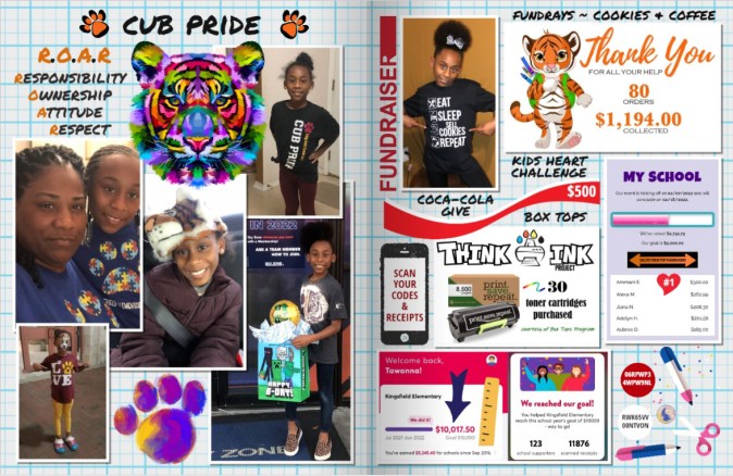
Accolades: Ammani has been on Cloud 9 with all her accomplishments, especially the yearbook cover contest, so we are embracing this accolade and sharing this moment with every student on the front cover of every yearbook this year.
Clearly, you had a plan for your custom pages–how do you begin to organize an amazing year like Amani’s?
Action speaks louder than words! Every picture chosen was "A Moment" that focused on what this year truly meant to us. Those actions captured the essence of success from many different angles.
I choose pictures of activities that Ammani is amped to be a part of and those that have us attached at the hip. Life is too short, so I try not to miss opportunities to show my support, whether it is Polka Dot Day coloring circles on her face or Running Club Relay with a 5K race and coming in LAST place.
What’s your favorite part about the process?
I am the Author! Being a quality engineer by day and a Treering page designer by night, I can create and give existence to anything my heart desires. The amazing part: I have access to graphics that look like me! Treering took the time to add that special touch to make me feel important, like I was part of the process.
What advice would you give to another mom who is just getting started?
Activate your creativity! Take the time to explore all options available to you before you customize: from backgrounds to layouts to text fonts to graphics.
Have F.U.N. (Fully Understand Newness). When I started this journey, I had no idea there was so much to choose from that I did not take the time to truly learn the process. It can be a bit overwhelming, but each year I learn something new that can be used to make my custom pages stand out better than the year before.
There is no right or wrong way to customize your pages… create your own F.U.N. (Find Ur Niche) and have fun at it!
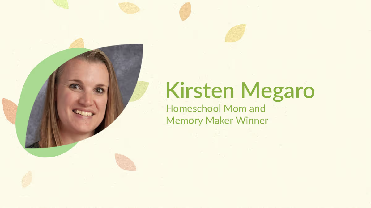
Yearbook hero Kirsten Megaro tells a complete story
Treering Yearbook Heroes is a monthly feature focusing on yearbook tips and tricks.
In our first-ever parent contest, Treering Yearbooks asked parents to capture and share their child’s unique POV. Homeschool mom Kirsten Megaro from Netcong, NJ created a spread to celebrate the growth in all areas of her three kids' lives: educational accomplishments, deepening friendships and family relationships, creative projects, and current hobbies and activities.

How did you decide what to include on your custom pages?
Our homeschool co-op offers a mix of core and extracurricular classes. We love how our yearbook documents the classes and field trips we enjoy with our group each year. The custom pages allow us to see a wider view of our year.
I like to include a casual portrait of each kid from the year as a focal point, then use larger text boxes to give an overview of the main activities we participated in during the year. I fill in the rest of the spread with some of our favorite photos with captions to share the accomplishments they had, hobbies they pursued, important people in our lives, and field trips we took throughout the year.
The judges loved the color scheme as well as the repeating elements of the rounded rectangles.
I love playing around with layout: moving pictures, adding frames, making it organized, but just a little quirky too.
How do your kids help tell their stories?
We take so many pictures that it’s hard to narrow them down. I usually start by choosing my favorites that give a good overview of our year, then ask my kids what information and pictures they want to include to remember for the future.
What advice would you give to another parent who is just getting started?
Start simple: use a template for your layout—there are a lot of great options! Drop your pictures in and add a few captions. Add a creative touch here or there to start, and each year, you’ll get more and more confident and capable of showing your personality and style through your pages.
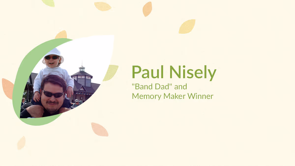
Yearbook hero Paul Nisely made us cry
Treering Yearbook Heroes is a monthly feature focusing on yearbook tips and tricks.
In our first-ever parent contest, Treering Yearbooks asked parents to capture and share their child’s unique POV. Self-described Band Dad Paul Nisely from Charlotte, NC entered the senior tribute he created for his son, Jason.

Paul featured his son’s involvement as a trumpet player in both the marching band and the school’s band as well as the friendships he’s built and maintained throughout 9-12 grade. On the right-facing page, he created the show-stopper that had us all choked up.
How did you decide what to include on your custom pages?
I have been taking a first day of school photo of my son in the same spot in front of our house every year since kindergarten and wanted those memories on one page. I have seen this done many times before.
In addition to seeing the changes in your child, you can also see the changes in the background scenery. We had to remove the brick edging because it was a fire ant nest which we realized after a photo. The different hairstyles, clothes, and backpacks show how much he has changed and how quickly the years go by. Every time I look at that page it makes me tear up.
Paul, let me tell you, there was a lot of emotion from the parents on the panel after seeing your spread. A reverent hush permeated the meeting, and then we read your story.
I love telling a story and getting emotional reactions with my photos. I was a newspaper photographer and went to school for photography and absolutely love seeing “visual moments” and documenting them. When the marching band season is finished I love putting together the photo book for that season. Even though my son is graduating I have already told the band directors I would love to keep taking photos of the band and making more keepsake photo books for the kids and their families.
Since you’re also a professional photographer, will you share some tips?
Take a lot of photos! You can’t run out of film: it's all digital now. Be there for the moments that are important for your child and capture them. Be patient with your child and be patient when taking photos. Then tell a story with those photos.