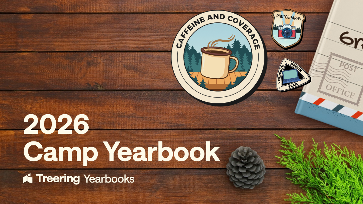
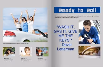
Most popular


Subscribe to our blog
Most recent
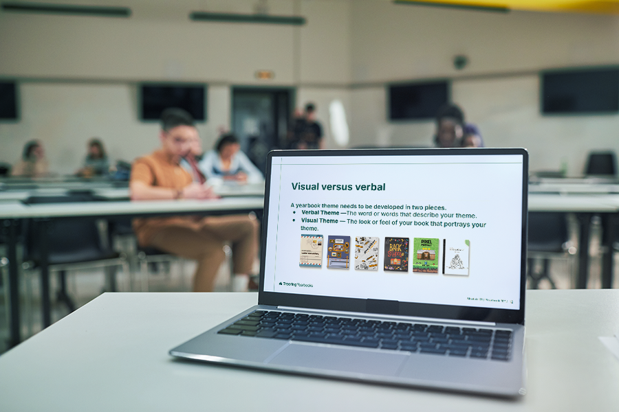
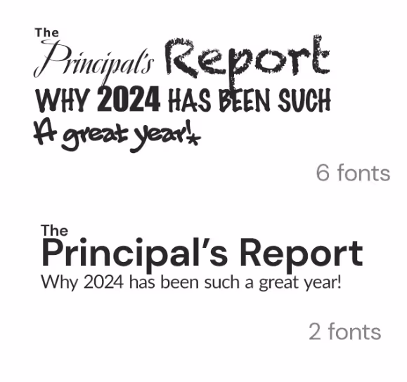
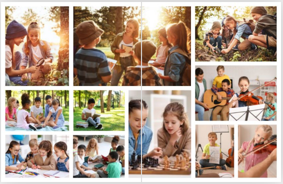
Use a style tile as your yearbook style guide
Templates and online inspiration can make creating your yearbook so much easier…except when they don’t fit the style you’re going for.
It might sound like a big problem, but it’s not. You can easily fix any of this with a yearbook style guide.
Here are three tips on how to keep yourself honest—and your yearbook style consistent—with the easiest style guide of them all: a style tile.
Apply your style tile to a template
Going into your spreads after they’re laid out and applying your style to each page works–but it’s not the cleanest option. What can save you time would be to apply the style to your templated page layouts before any content is added, and have each page start out styled correctly.
When to Use: Before you start creating content and sorting through your photos, you will probably have some templated layouts you’re going to use for your pages. These might be provided by your yearbook company, and can be a boon when it comes to organizing. But they can be a bit generic, which is why you want to use the style tile to apply your design elements to each page.
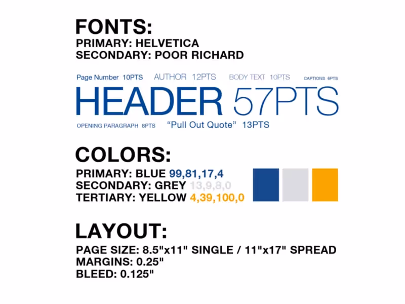
How to Use: Your template has space allotted for different elements like photos, an article, and pull quotes. Using your style tile, you can update the fonts and sizes, and figure out where to incorporate additional splashes of color that align with your pre-determined style choices.
Why: If you’re applying your style after the fact, it’s easy to miss a color or font or caption somewhere. It’s much better to give a template the style treatment and standardize the style elements before you add content. Also, if you apply your style tile to the template and don’t like the look you’ve created, it’s easy to switch up your style before you’re in too deep.
Apply Your Style Tile to Outside Inspiration
There is great inspiration everywhere, and some of our best yearbook ideas can grow from a spread, picture, or concept we’ve found online or in previous yearbooks. But if you just take an idea verbatim, its style will probably clash with the rest of your book–which is why you need to reach, once again, for that style tile.
When to Use: Say you find an amazing spread layout, but it doesn’t conform to your style. Well, it’s time to bust out your style tile and get to work making it fit. Make that inspiration your own, and tie it into the rest of your book.
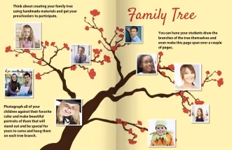
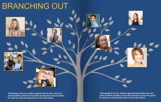
How to Use: In most cases, you will be off to a great start by swapping some colors and updating the fonts. For example, we found a great spin on a “family tree.” In order to make it work with the rest of our book, we switched our font and used a background graphic that matched our colors. With a few simple tweaks, it looks like it belongs with the rest of our yearbook.
Why: There are so many great ideas out there, but it can sometimes feel like fitting a round peg into a square hole. If you keep your style tile within reach while you’re surfing for inspiration, you will have a handy tool to help you visualize how something can work within the style of your yearbook.
Do a final run-through, style tile in hand
Before the book goes to print, you’re going to be doing multiple read-throughs, checking everything. Make sure design is one of those things you’re checking, and that consistency exists across all the pages of your book.

When to Use: You will want to proof the design on each page before your book goes to print. Style tile in hand, make one read-through just for style inconsistencies, just to be safe.
How to Use: Walk through your yearbook page by page with an eye on the style sheet. If something feels out of place, you can easily correct it by altering fonts or adding an additional color from your toolkit.
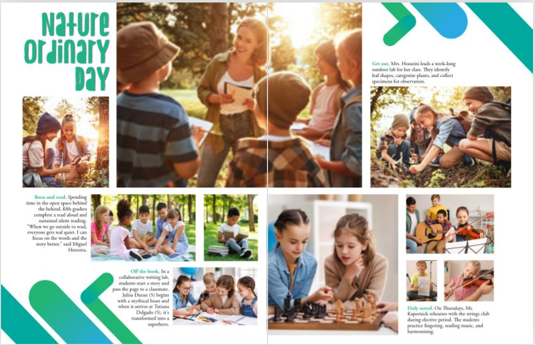
For example, as you assess the spread on the left, you would look at your style tile and determine the incorrect or missing elements. In this case, the size of the pull quote is gigantic and the font of your headline is different. This is easily fixed by correcting the font size, rearranging the content, and consulting your style tile for the correct headline font.
Why: There are a ton of things to look for when you are going through your final proof, so you need to take time to do individual run-throughs for each element, or something might get missed. For one read-through, keep your style tile close at hand, and hone in just on it. In doing so, you are making sure that the final design is consistent throughout your yearbook.
Style tiles keep your yearbook consistent
Using a style tile can help you stay consistent when customizing pre-designed templates and designing your own. What’s more, it’ll help you keep your design in check when you’re pulling inspiration from across the board. You’ve deliberately chosen each element of your yearbook’s style, from color to font, and your style tile will help that vision come to life by keeping a strong hold on your original intentions.

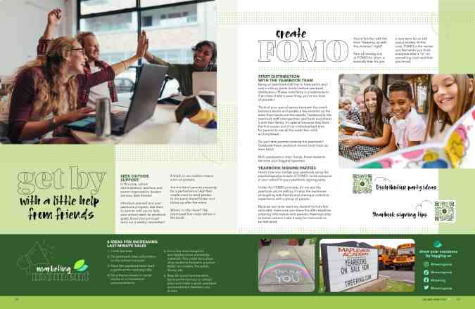
20 ideas for last-minute yearbook sales
Each unsold yearbook represents a missed opportunity for students to have a record of their memories from the school year and possibly is a financial burden for the school. There’s also the potential for frustration among the yearbook staff: it can be disheartening to see our efforts go unrewarded and their expectations unmet. It’s the final stretch, so we have last-minute yearbook sales ideas. Let’s turn things around together.
We interrupt this blog to remind you if you’re a Treering adviser, sales quotas don’t matter. We only print and ship what you pre-sell. And if someone wants to order a yearbook later, they can do that too.
Back to our regularly scheduled program.
Flash sales
FOMO is real. It’s one part urgency, it’s one part excitement. A brief, pervasive push for last-minute yearbook sales has a clear call to action: buy now. Here are four campaigns to jump-start the year-end push.
- Offer a limited-time incentive for students who purchase their yearbooks within the next week. This could be as simple as a popsicle party or an extra 10 minutes of recess for classes with the most participation.
- Create a countdown timer on your school's website or social media platforms to create a sense of urgency.
- Hold a "Flash Sale" where yearbooks are available at a discounted price for 48 hours. Only do this if you bump up the price year-round and never as good as your early bird pricing to mitigate complaints.
- If you use a publisher that requires an order minimum, create a sense of exclusivity by emphasizing that yearbooks are limited in quantity and may sell out quickly. If you have fewer than 25, advertise it.
“Extra” marketing ideas
Naming this section “labor-intensive” might be poor marketing. That said, these ideas aren’t drag-and-drop solutions like Treering. They do require work, and if your team is primed for action, start your project plan.
- Hold a raffle where every yearbook purchase enters the buyer into a drawing for a special prize.
- Partner with local restaurants or cafes to offer discounts or freebies with proof of yearbook purchase.
- Hold a competition among classes or grade levels to see which percentage buys the most yearbooks, with a prize for the winning group.
- Stir up excitement by revealing sneak peeks of the yearbook content on social media leading up to the deadline.
- Initiate a "Yearbook Ambassador" program where students can earn rewards for promoting yearbook sales to their peers.
- Cultivate a sense of nostalgia by sharing throwback photos from past yearbooks on social media.
- Host a scavenger hunt around the school where students can find clues that lead them to purchase their yearbooks.
- Create a "Yearbook Memories" playlist on a streaming platform and share it with the school community to promote yearbook sales.
- Develop a social media challenge where parents, teachers, and students can win prizes for sharing their favorite yearbook memories.
Events to boost last-minute yearbook sales
We’ve learned the value of in-person events. Paraphrasing from the Elle Woods playbook: events evoke emotions, emotions create memorable experiences, and memorable experiences make up a yearbook. Seeing others choose to attend a yearbook event provides social proof, reassuring potential yearbook buyers that their decision is valid and worthwhile. (Yes, we know it’s a no-brainer.)
- Invite every student on campus to the distribution and signing party.
- Set up a booth at all-school events, PTA meetings, and during lunchtime where people can purchase yearbooks on the spot.
- Create personalized advertisements featuring students and distribute them digitally or in print. Students want to know they are in the book. If you’re doing this at the elementary level, send the ad to mom.
- Create a video featuring highlights from the school year to show off a bit of what’s in the book.
- Hold a live Q&A session on social media where students and parents can ask questions about the yearbook and the ordering process.
- Host a custom pages webinar.
- Partner with the school's sports teams to promote yearbook sales at games and events.
- Create a themed photo booth at school events where students can take pictures to be included in the yearbook. If you are at a uniform school, use this to show how many uniform combinations you have.
These limited-time promotions, strategic competitions, social media campaigns, and release events aim to maximize participation so your hard work gets into more hands.
The forgotten art of making students smile: how one family's philosophy outlasted 75 years of technological revolution
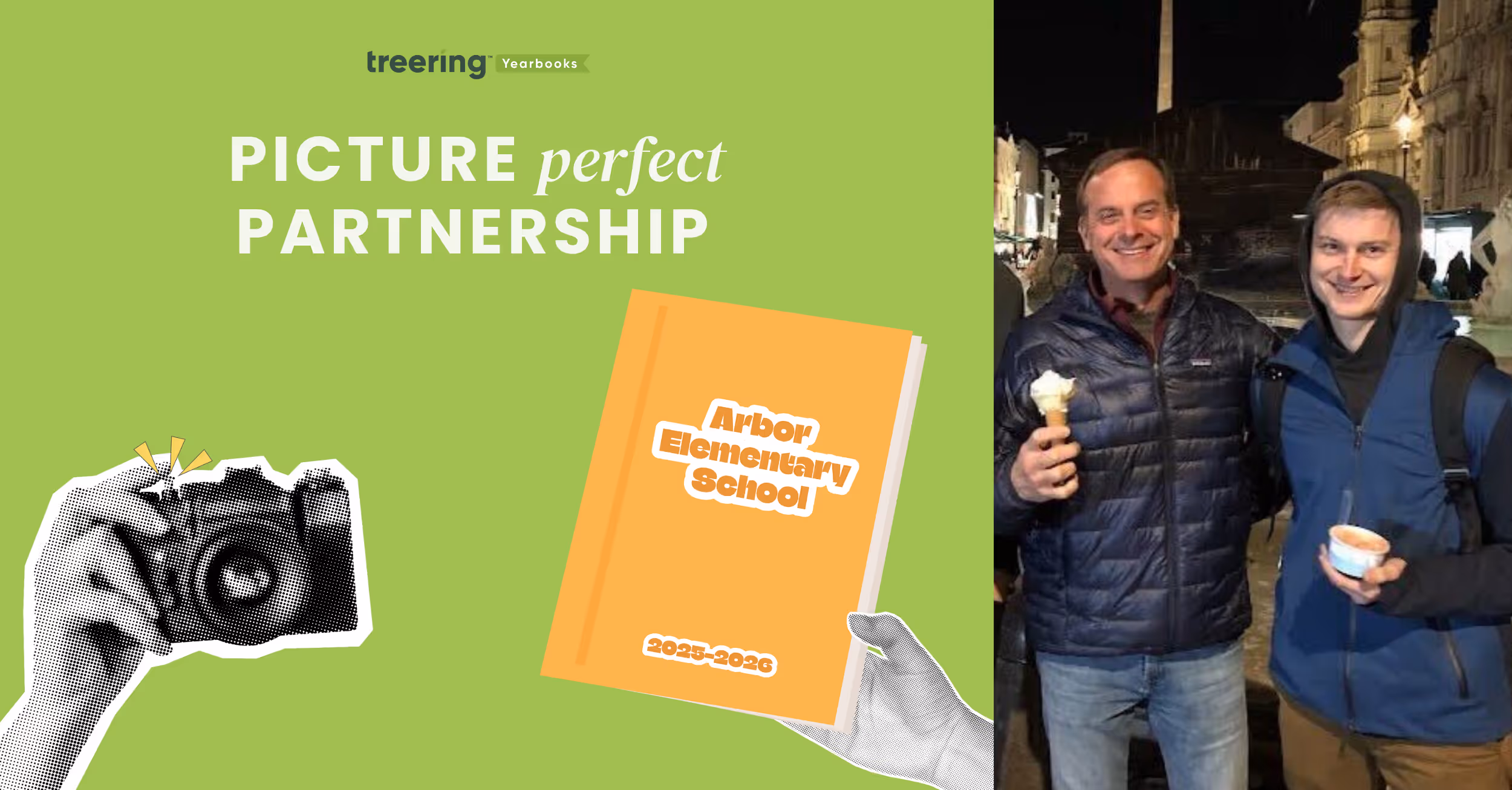
Editor's Note: Welcome to the inaugural profile in our special "Picture Perfect Partnerships" feature series. We'll spotlight the remarkable photographers who partner with us to create lasting memories for schools nationwide. Our first profile celebrates Van Gogh School Photographers, a family business that has captured student smiles in the Chicagoland area for over 75 years. We talked to President Jack Zucco (pictured above with son Michael) about his family’s legacy.
How did your family's school photography business begin, and what inspired your father's initial entry into this specialized field?
Van Gogh School Photographers was founded in 1947 by my father. He believed every student deserved a well-crafted, lasting memory of their school years. With a passion for photography and a commitment to excellent service, he set out to build a business that not only took pictures but also preserved cherished moments for families and schools alike.
What were the most significant challenges your family faced when establishing the business in 1947, and how did they overcome them?
Resources were limited, technology was far less advanced, and building a customer base from scratch was no small feat. My father had to earn the trust of schools one by one, going door-to-door to demonstrate the value of professional school photography. He overcame these hurdles by staying true to his core principles—offering reliable service, consistent quality, and a personal touch that set Van Gogh apart.
How has the business been passed down through the generations, and what traditions or values have remained consistent?
Each generation has brought new ideas and innovations, but the fundamental values—quality, professionalism, and a customer-first approach—have remained constant. Barrington, IL has been our headquarters for almost 50 years.
What significant changes or pivotal moments shaped your family business's evolution across three generations?
There have been several defining moments in our history. The transition from film to digital photography was a major shift, requiring new equipment, training, and processes. Another pivotal moment was expanding our services beyond just portraits to include yearbooks. Our 12-year partnership with Treering has been one of the most significant milestones, allowing schools to create personalized, on-demand yearbooks that give students and families a more meaningful way to preserve memories.
How have you personally contributed to or innovated within the family legacy since joining the business?
Since joining the business, I've focused on modernizing our operations, refining our photography process, and improving efficiency without sacrificing quality. I've also played a key role in expanding our yearbook services through our partnership with Treering.
Can you share a particularly meaningful school photography project that spans multiple generations of your family's work?
One of the most meaningful aspects has been capturing school portraits for multiple generations within the same families. There have been instances where we photographed a student and years later took their children's and even their grandchildren's school portraits. Seeing those families return to us decade after decade is incredibly rewarding.
How has your family maintained relationships with schools across generations, and what's been key to that longevity?
Our relationships with schools are built on trust, reliability, and a commitment to exceeding expectations. We don't just see ourselves as photographers—we are partners in helping schools create lasting memories. Personalized service, a 100% satisfaction guarantee, and our ability to adapt to schools' changing needs have been key factors in maintaining long-term partnerships.
What photography techniques or business practices have remained unchanged since your father's era?
While technology has evolved dramatically, core photography principles have remained unchanged. Proper lighting, professional posing, and attention to detail were as important in my father's time as today. The emphasis on customer service, reliability, and delivering a quality product has been constant throughout the decades. My father always believed in making sure every student left picture day feeling good about their experience—that philosophy still drives us today.

These yearbook photo tips will have your book looking better in two minutes or less
The easiest way to improve your yearbook photography is to spend two minutes editing your photos before you add them to your book. That’s because, in two minutes, you can make the two biggest improvements to any photo you have: composition and white balance.
It doesn’t matter if you or your staff purposely took the photo for use in the yearbook or if a parent snapped a shot on their phone and only gave it to you once you asked for help filling your book’s pages. If you spend one minute on each of these areas of improvement, you’ll have a yearbook photo that’s way, way better than the one you started with. We guarantee it.
In this blog post, we’ll walk you through why you should spend two minutes using these yearbook photo tips for composition and white balance, what you should think about before you make any changes, and how you can easily make those edits.
Why you should edit using these yearbook photo tips
The normal process for editing yearbook photos can be a total drain on your time. The results are worth it, because, well, let’s face it: not-so-great yearbook photography makes a yearbook seem not so great.
Great photos, on the other hand, can evoke emotion, tell a story, and captivate an audience—all at the same time. And sometimes, a photo needs a bit of editing to get there. Cropping your photos for better composition can eliminate distractions and correcting the color to improve white balance and lighting can help your photos stand out more.
Spend enough hours eking every last ounce of potential out of a photo, though, and you’re bound to wonder whether it’s all worth it.
If that’s you, or if you’re totally pressed for time, you never need to get to that point.
That’s because two of the quickest, easiest editing techniques you can use will get your photo more than 90% of the way to its full potential.
If you want to keep going for that final 10%, go right ahead.
But if you’re pressed for time or stressed about deadlines, crop your photo to improve its composition, use color correction to improve white balance, and move on to your next photo. Because, when you have hundreds of photos you want to add to your yearbook, 90% of full potential is pretty darn good.
What to think about before using our yearbook photo tips
Just using our two yearbook photo tips will give you great photos and save you a bunch of time. But you can always save more.
The trick lies in the old “work smarter, not harder” saying.
Here’s what you need to think about to save yourself even more time and sanity during your photo editing process:
- If your yearbook publishing software lets you crop your photos after you’ve added them to your pages, wait until then to take that step. Doing so will increase your flexibility when it comes to adjusting layouts on the fly.
- Start with an idea of how many photos you need for your book. This sounds daunting, but 1) it’s not, and 2) it’s super helpful to pre-plan and know what you need to make your pages awesome. If you’re using templates or master pages, this is a total breeze.
- Review the photos you have and start making two lists: likely to use, not likely to use. How you make these depends on how you organize your photos, but here’s one way that works for just about every scenario: Rename all “likely to use” photos with “a_” at the beginning of the file name and all “not likely to use” photos with “b_” at the beginning. That way, everything’s clearly labeled and, if you sort by name, your best photos show up first.
- Edit your “likely to use” photos. If you’ve got enough, your work is done. Sweet, right? If you’re still short some yearbook photos, you can go back through and find the best of the “not likely to use” photos or start hassling your school community to send you great photos.
If you’re cropping your photos before adding them to yearbook pages, you’ll also want to keep this in mind: You’ll need a variety of photo constraints and orientations.
Which is a perfect transition to…
Yearbook photo tip #1: composition
We’ve talked before about the three tips you should keep in mind when composing yearbook photos, but that doesn’t guarantee you’re always going to nail them. Or that people who are giving you pictures will, either.
Sometimes, the only way to save a yearbook photo is to crop it.
Take this before-and-after as an example:


There’s a lot of good stuff going on with the photo on the top: It’s well lit, the students’ faces are clear, and it’s easy to identify where they are.
The problem?
It’s the same one that haunts many yearbook photos: Drop it into a spread or collage and it’s not exactly going to be easy to identify these students. They were too far away from the camera when the photo was taken, and there’s just too much empty space around them.
You can solve that by tightening the composition. Notice how much more the two students fill the frame in the photo on the right?
That’s exactly what we’re going for.
When you’re cropping yearbook photos, keep these two tips in mind:
- Fill the Frame. What matters most in a yearbook photo is capturing the person or people who are the subjects. Make sure to keep the attention on them. As a photographer, the best way to do that is to get very, very close to your subject. If that didn’t happen, though, you can crop out the empty space surrounding your subjects.
- Use the Rule of Thirds. If the “rule of thirds” is a new yearbook term to you, it’s basically a guideline in photography that encourages a photographer to move the primary subject of the photograph away from the center. The easiest way to do this is to use a grid overlay function while cropping, and move your subject to one of the intersecting set of lines.
Of course, we’d be slacking in our advice if we didn’t mention that, no matter what, you should be cropping with a purpose. Or if you want to frame this advice slightly differently: Don’t crop for the sake of cropping. The new constraints for your photo should make your photo better or make your page layout better. If your photos are already great, and they look great in your layout, you can skip cropping.
Yearbook photo tip #2: white balance
Ever feel like your photos don’t really look like the breath-taking scenes you saw with your naked eye? We feel you.
Outside of cropping your photo, the easiest way to restore some of that magic is to make the colors of your yearbook photo more vivid and more lifelike. And you can do that by using the levels tool in your editing software.
To do that, though, you need to know some basics about that tool and histograms, the chart associated with it.
Here’s the crash course version:
A histogram is a graphical representation of your photo’s color distribution. The dark aspects of your photo are plotted on the left of the graph; the light aspects of the photo are plotted on the right. When you’re reading a histogram, you want to look for sharp peaks at either end of the scale. A sharp peak on the left side of the graph indicates underexposure, a peak on the right indicates overexposure.
When you’re looking to tweak the color composition of your photo, it’s those peaks you want to be looking for.
Here’s the quickest — and easiest — way to use a histogram to improve your photo’s color:
- Drag your black slider (located on the left of the histogram) to the right until the chart shows blacks being registered (or the beginning first upward slope).
- Then drag your white slider (located on the right of the histogram) to the left, until the chart shows no more whites being registered (or the end of the last downward slope).
These two steps take about a minute to complete, and the result is awesome. You’ll see an improvement in contrast, richer and deeper colors, and an enhanced lightness that reveals hidden aspects of photos that are obscured by overly bright areas.
Here’s an example:


Notice how the red in the stairs and the fire extinguisher really pops in the one on the bottom? It’s less muted and, since the reds are deeper, it makes the person on the stairs stand out more, as well. We dig this change.
And really, that’s it.
It doesn’t matter who takes the photos. If you can spare two minutes and follow these yearbook photo tips, you can make your photos so much better by improving composition and white balance.

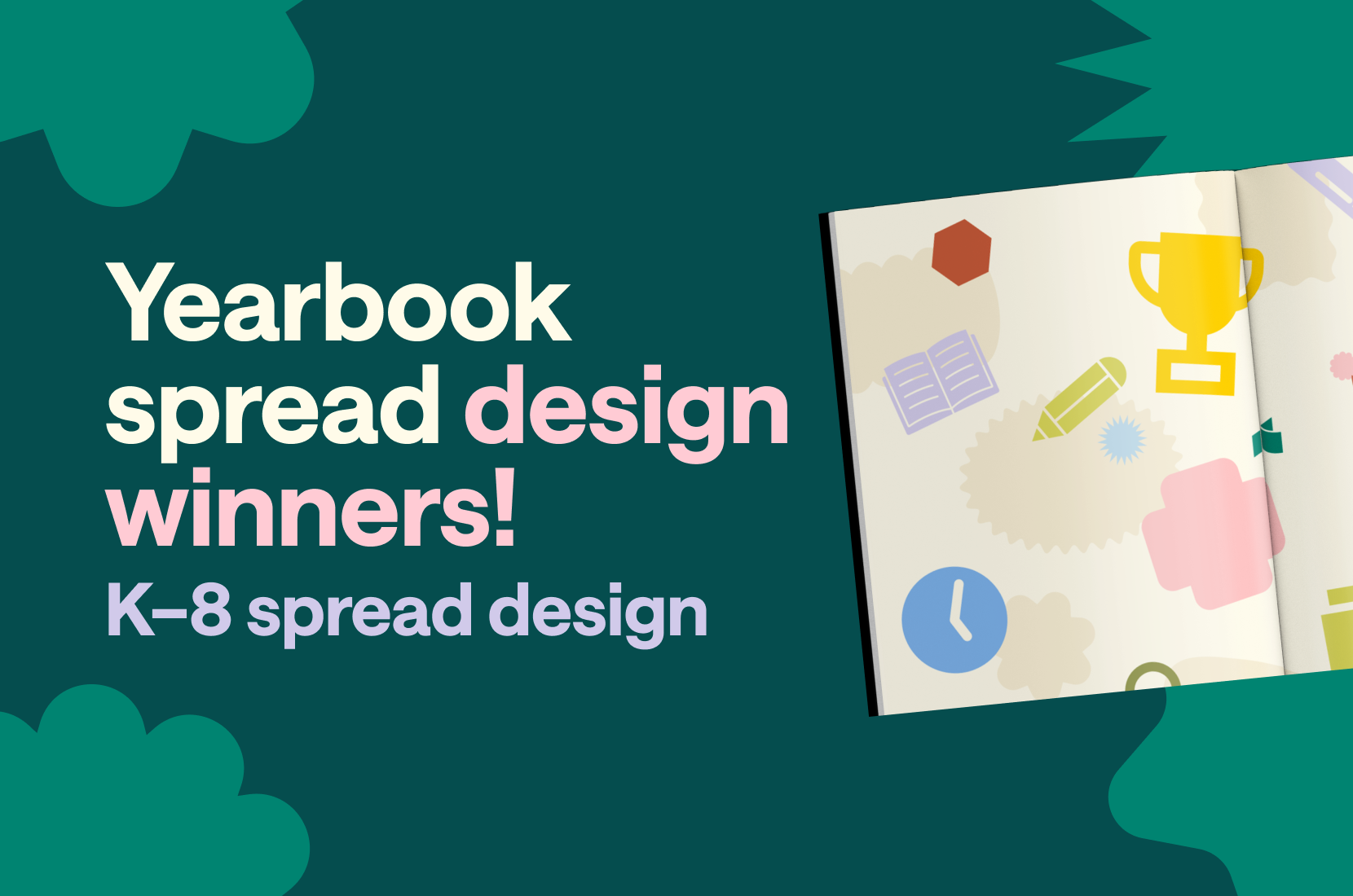
2025 custom page design contest
Your Kid. Your Design. Their Spotlight. Whether they’re sports MVPs, creative geniuses, or the kindest hearts around—we want to see it all! Share your Treering custom pages for a chance to win.
View the 2025 Custom Page Design Contest Winners
Entry period
The submission period is April 1-15, 2025. Submissions will close at 11:59 PM PDT.
Eligibility
Entrants must be 18 years or older and current members of a US Treering school for the 2024-2025 school year.
To participate, complete the submission form and include a screenshot of your favorite yearbook spread. A yearbook spread is two-facing pages. Incomplete entries will not be accepted.
Winner selection and notification
A panel of yearbook parents, journalism educators, and graphic designers will select the winners. Judging criteria include visual interest and originality.
We will notify all the winners via email and phone on Monday, April 22, 2025.
Prizes
One Grand Prize winner will receive a $500 Amazon gift card, and ten Runners Up will each receive a $50 Amazon gift card.

By Friday, May 2, winners will receive gift cards via the email provided in the form.
Release
By submitting your custom pages, you have verified the approval of others pictured, and you approve Treering to use your name, write-up, and school name for any marketing purposes, including but not limited to treering.com, social media, and mass media.
Contest FAQs
What are Treering's custom pages?
Treering’s custom pages are two pages that each family may choose to design. These two pages are printed only in their copy, and no one else's, making every yearbook unique.
Do I have to have social media to enter?
You do not need social media to enter our annual design contest. Simply upload a screenshot of your favorite spread from your computer or phone on the entry form.
How do I get a list of all the winners?
Treering will publish the winners on Tuesday, April 22, 2025, on the blog, Facebook, and Instagram.
Do I have to purchase a yearbook to enter?
No purchase is necessary to enter.
Where can I see past spread design contest winners for inspiration?
2023 Custom Page Design Contest Winners
2023 Custom Page Design Contest Winners
I already finished my pages. Can I still enter?
Any pages you created for the 2024-2025 school year are eligible.
I have a question that is unanswered here. Who do I ask?
We'll be happy to answer. Email marketing@treering.com
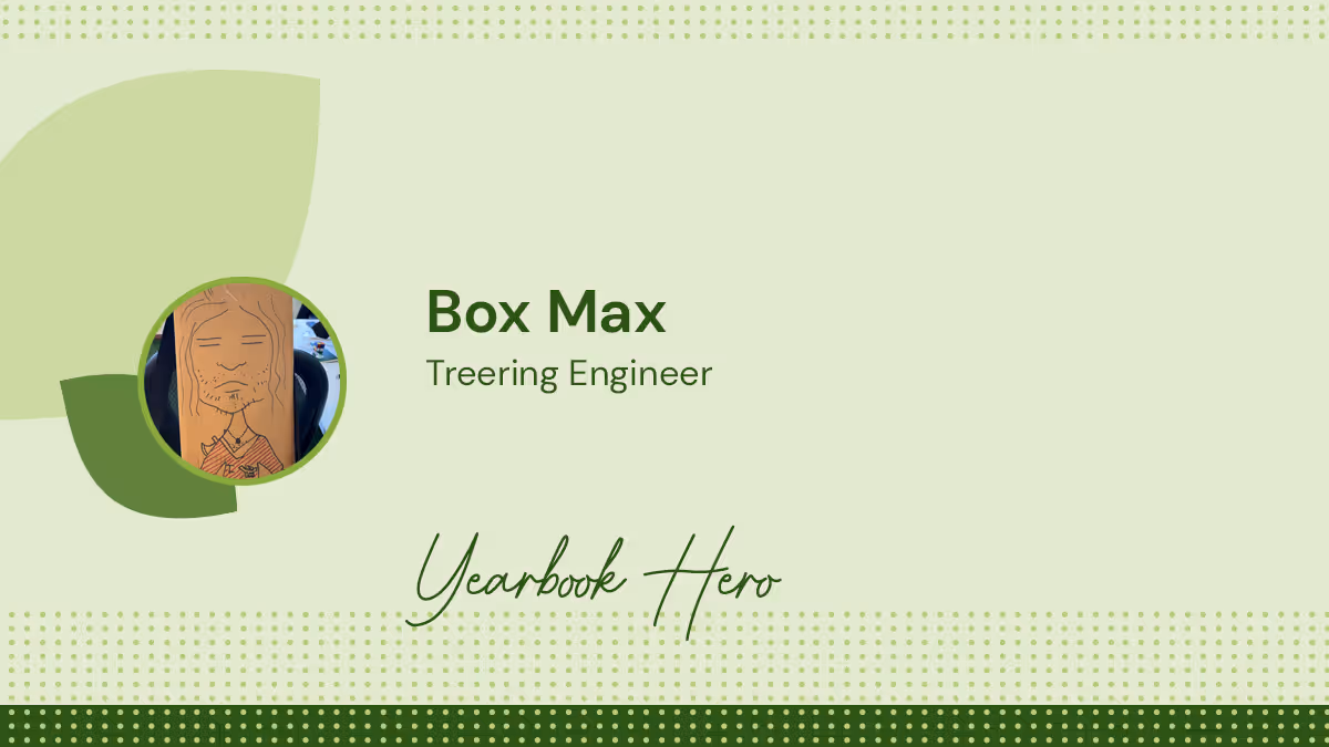
Yearbook Hero Box Max collaborates and listens
Treering Yearbook Heroes is a monthly feature focusing on yearbook tips and tricks.
Single-handedly holding down the office during the pandemic, Treering engineer Box Max is one of the most senior members of the engineering team. In honor of his fifth anniversary, we wanted to celebrate how he improves the yearbook creation process on the back end.
His teammates say he is the perfect collaborator during the debugging process because his listening skills help other engineers work through their problems. They explain the code, line by line, to Box Max and therein discover snafus. He doesn’t pass judgment, just attends.
Serving as the voice of restraint, he doesn’t commit to action quickly or make rash code decisions (which the support team appreciates). It’s this consistency and reliability that make him an exemplary employee.
He’s also trusted with trade secrets as Treering builds and improves our robust design platform that serves both technical and emerging designers. Tight-lipped, Box Max is trustworthy and the perfect person to hold Treering’s secrets.
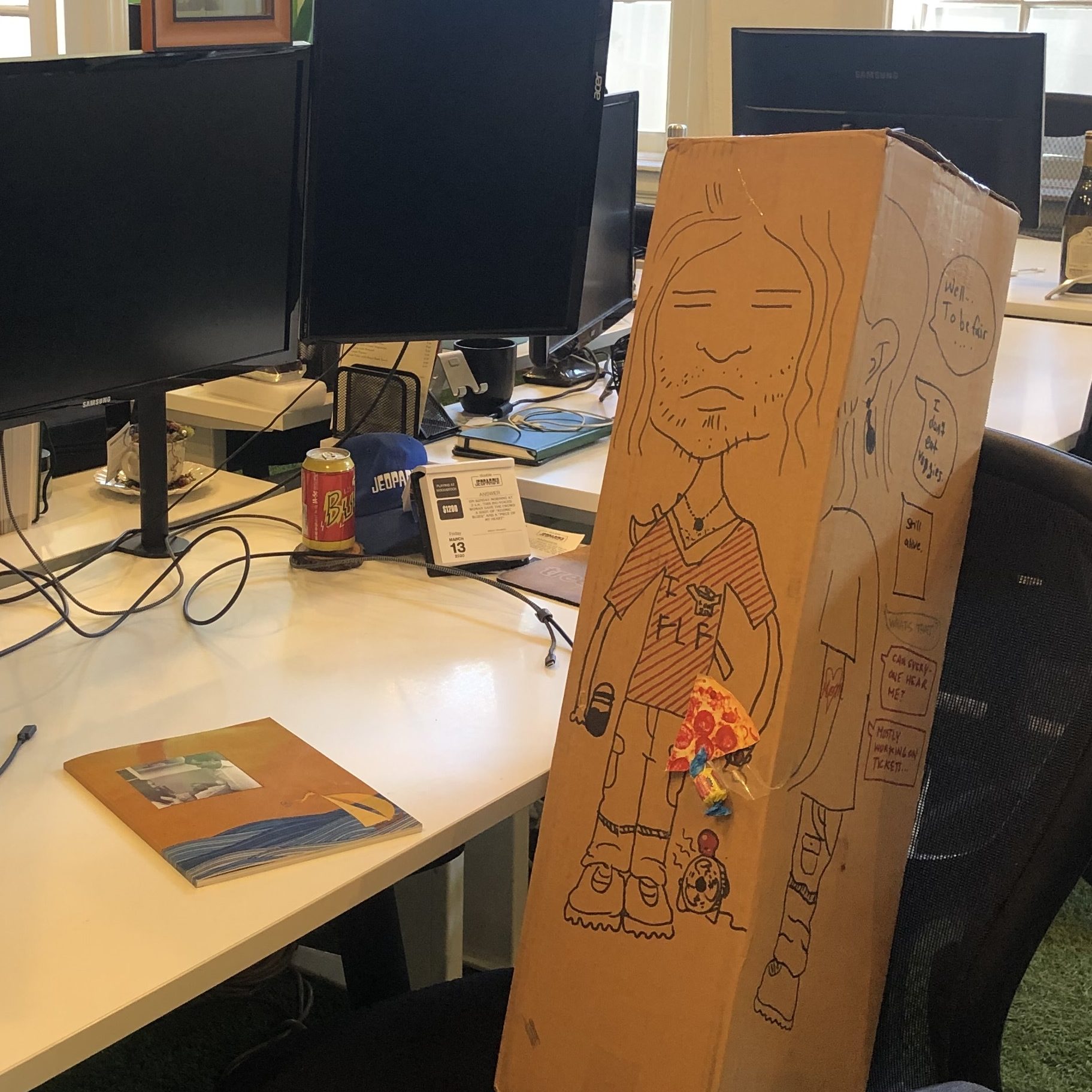
Happy April Fool’s Day from your friends at Treering!

Three yearbook colophon ideas
What is a colophon anyway? Publishers include this vital piece to record production notes and sometimes acknowledgments. Since your yearbook is a historical document, including a colophon adds professionalism to your publication. But it doesn’t have to be boring! Below are three examples of yearbook colophons that include theme details, shout-outs, and yearbook staffing information.
Essential components for your yearbook colophon
- Title of yearbook and theme information: include any behind the design information
- Book details: the number of pages, cover type, and paper weight
- Design specs: font names sizes and use cases
- Photography credits: Identify your portrait photographer, staff photographers, and any volunteer super parents who contributed
- Software tools: list which applications you used to build your book
- Publisher information: name of the publisher and the names of the publishing staff who helped
Thematic colophons


Both of these colophons leverage their themes (Stay Gold and Speak Life, respectively) with the headlines as well as the graphics. (The actual copy of their colophons is below for you to use.)
A bold colophon
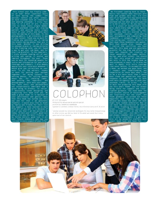
We love this one because it features the yearbook team, gives the book details in an easy-to-read format, and both editors have space to say thank you.
Yearbook colophon template
To create a quick colophon, copy and paste the following in your yearbook. Make it your own by giving behind-the-design details.
[Yearbook name] is produced by [School Name] in [City, State] and published by Treering Yearbooks in San Mateo, CA. The [hard- and/or softcover] yearbooks are [matte or glossy] finish [with upgraded embossing or foil]. The book's [number] pages are printed in full color on 100lb. sustainably sourced paper—the Treering standard. We used the Treering app for the layouts; [if applicable, list software used to make photo illustrations]. The theme art is [theme name from Treering] and [name] designed the cover. Headlines are [font and size] with subheadings in [font and size]. Body copy is [font and size]. [Photographer] took the school portraits and [parents, coaches, non-yearbook students] contributed [team, event, and/or candid] photos.
Yearbook Hero Chris Frost’s multisensory approach to memory keeping
Treering Yearbook Heroes is a monthly feature focusing on yearbook tips and tricks.
As a student 17 years ago, Chris Frost helped West Valley High School transition from orange cropping pencils to InDesign. He spent three years on the yearbook staff, and in his senior year became Editor in Chief. After working for guest relations at Disneyland, he returned to the Inland Empire as a SPED aid and moved into the activities assistant role he currently holds, splitting his time between ASB and yearbook.

Tell me how your students are creating more than just a visual book this year.
It started with an idea, really. They wanted to create a Spotify-themed yearbook and it was a reality instantly because Treering has the Wrapped theme.
It’s all about the music: on sports spreads, we have codes for athletes’ amp songs and instead of doing senior quotes, we are doing senior songs. Being able to capture a moment in a song connects those dots you don’t remember, such as the song the homecoming king and queen danced to. We are capturing that moment, so in 10, 20, 30 years students can really flashback. That’s the point of a yearbook.

Were you worried about some of the song submissions?
The team gave students parameters ahead of time. Since this is a school-published book, the standard requirement is it has to be appropriate without any foul language (radio edits only). Because it’s also a student publication, we want to maintain students’ freedom of expression.
What does your design process look like?
Our students are very independent: for example, last year, we used the Not a Diary theme and a graphic artist on campus created hand-drawn doodles throughout the yearbook. This theme resonated with students because of the nostalgia and emotion. It was healing after returning to campus from the shutdown.

The thing Billy [Valenzuela, yearbook adviser] and I enjoy about Treering’s software is you can use bits and pieces of the design library or use 100% pre-done. We are able to scaffold based on the individual yearbook students’ needs.
What other methods do you use for storytelling?
Treering’s custom pages give our students more ownership and control of their yearbook, and because we can review them before they go to print, it gave us the ease we weren’t going to randomly publish something sketchy. Some of the creativity that goes into yearbook production is passed on to students outside of the yearbook program.
How else does Treering help?
The biggest benefit to West Valley is we produce great yearbooks at a cost our kids can afford. We don’t have to increase the cost of the yearbook, and because of Treering, our book is $20-25 below other schools in the area, making it more accessible.
Yearbook is essentially carrying on and documenting the history of the school. The enormity of that task is what motivates our students. It’s important to create something that speaks to all students, not just one grade or one class.
West Valley was with another yearbook company for 30 years. Change became necessary when we could no longer pass on savings to our students. We would pre-sell 300-400 yearbooks and still be charged for overruns. We were storing books it cost $60-70 to produce despite selling ads and fundraising to meet the contract terms.
The relationship no longer benefited our school or the students.
When we couldn’t host a year-end pizza party for the yearbook team because there is $20 in the activities fund and a $2000 final bill, we said, “This isn’t working for us.”
It’s freeing now to have no order minimums and worries about over-shipments.
What advice would you give to someone just getting started as a yearbook adviser?
Let them struggle a little. This is one of the hardest lessons that I think we as advisers have to learn. Often we have the urge to swoop in and support our students when they start to get frustrated. This robs them of growth opportunities. Of course guide and suggest, but let them do the hard work of getting to the answer. Ultimately it will set them up for success in the future.
Yearbook fonts can make or break your yearbook design
Nowhere in yearbook design can a series of small or minor changes add up to create a dramatic difference as easily as yearbook fonts. Really, it’s true. Science says so: A Microsoft researcher and MIT professor found in two different studies that good typography can make a person feel better while reading and can actually make them think they’re reading for shorter amounts of time. Moral of the story? Pay attention to your yearbook fonts. Your readers will be happier, and they’ll spend more time with their yearbooks.
In this all-purpose guide, we’ll introduce you to the basics of fonts and typography, how to create a font strategy for your yearbook (which includes picking yearbook fonts, pairing them, and setting their size), and how to make the yearbook fonts you choose look great on your pages.
- The Basics of Yearbook Fonts
- How to Create Your Yearbook Font Strategy
- How to Make Your Yearbook Fonts Look Good on Page
The basics of yearbook fonts
In addition to making us feel what we are reading, fonts can actually speed up—or slow down—how quickly you can read. Science has our backs once again.
Readability is an important factor when setting your yearbook style guide. On printed paper—like yearbooks—the fastest, easiest-to-read fonts are usually serifs. On computer screens, like on this blog, the fastest, easiest-to-read fonts are usually sans serifs.
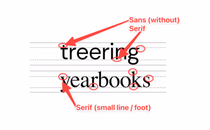
Sans serif fonts
Sans serif fonts are different from serif fonts in that they don’t have decorative elements at the end of the strokes.
Sans serifs are more commonly used online and in digital projects since they’re easier to read on computer screens. Because so many people read on computer—and phone—screens, though, sans serifs are more familiar to readers and growing more popular in print. They’re also considered to be a little hipper than a serif.
Some of the most common sans serif fonts include:
- Arial
- Helvetica (period)
- Calibri
- Open Sans
- Gill Sans
There are, of course, some other fonts, like scripts and decorative fonts. While they can be plenty attractive, they’re often not great for legibility—especially in large blocks of text. If you’re planning to use something a little different, it’s best to reserve those scripts and decorative fonts for headlines and your folio.
Serif fonts
Serif fonts have small, decorative elements at the end of the strokes on the letters. They’re more legible at smaller point sizes and are generally considered more conservative (think newspapers and academic journals). Like we mentioned above, they’re also easier to read on a printed page.
Some of the most common serif fonts include:
- Times New Roman
- Garamond
- Georgia
- Baskerville
- Cambria
How to create your yearbook font strategy
We already mentioned that fonts can change a reader’s mood, make text easier to comprehend, and speed up the process of actually reading while making it more enjoyable.
To do that, ask yourself these questions:
- How do you want people to feel when they’re reading your yearbook?
- Do you want your yearbook to look buttoned-up or trendy?
- Should the fonts you use be familiar to your readers?
- If you were to describe the look and feel of your designed yearbook pages, what words would you use?
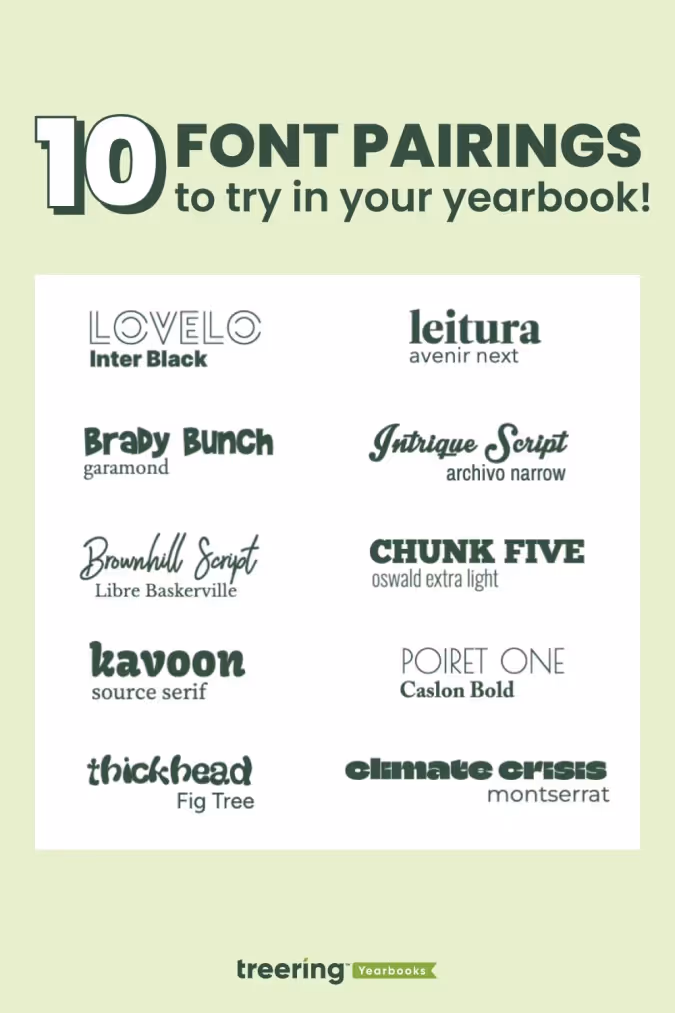
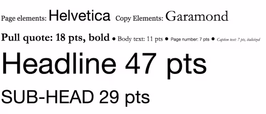
The answers will give you a strategy for your yearbook fonts, something that will help you cut down your potential choices to something more manageable. With thousands of fonts in existence, and hundreds in the Treering app, it’s easy to get overwhelmed. Your total number of yearbook fonts should pretty much always be two, and shouldn’t really exceed three.
How many fonts should I use in the yearbook?
Consistency is key for a balanced yearbook. Fonts are no exception. It’s better to use a couple of (literally two) well-chosen fonts than to have so many that they distract from your design. By limiting your yearbook to two (max three) fonts and assigning them distinct roles, you establish a precedent.
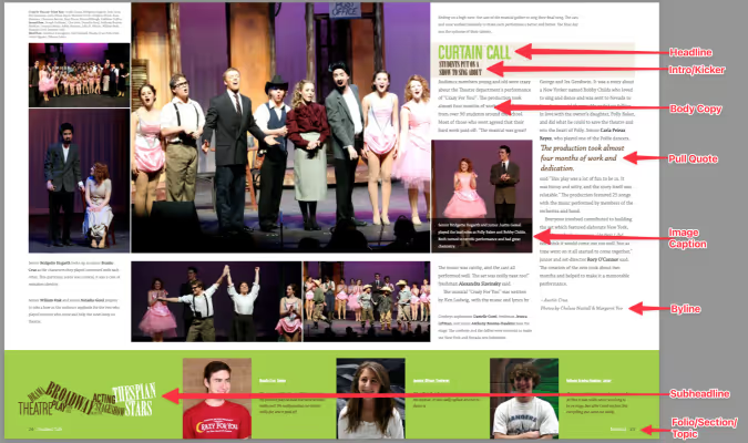
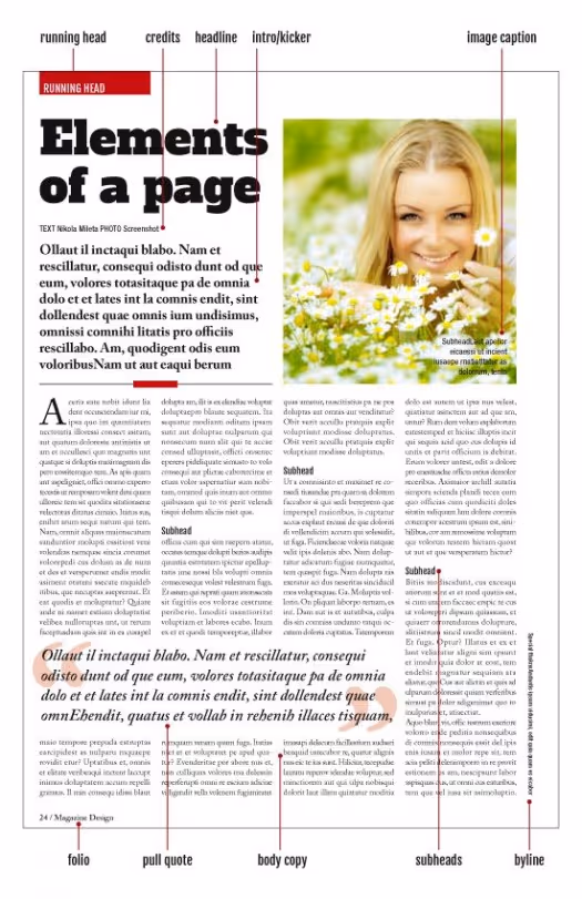
Create a style guide where you’ll be using the fonts you end up choosing. Your style guide should include every printed element of your yearbook like headlines, sub-headlines, body copy, photo captions, pull quotes, and page numbers. Once you’ve listed out everything, you’ll want to bucket these items into two groups:
- Theme elements: This is the group for headlines, sub-heads, and folio information (like page numbers, book title, and section title).
- Copy elements: This is the group for narrative text, photo captions, and pull quotes.
Historically, serif fonts have been used for copy elements, because they’re more legible in large bodies of text. (This adviser loves Garamond.) Sans-serif and decorative fonts, on the other hand, have historically been used for theme elements, since they’re generally considered to be more flexible.
If you’re to follow those historical queues, your font palette may look something like this:
Two things to note here:
- First, just because folks have historically chosen serifs for copy elements and sans serifs for page elements, that doesn’t mean you have to.
- Second, you probably noticed the font sizes here. The best way to determine the various size elements is to use a scale.
When someone opens the book and focuses on a message, they’ll know what a headline is going to look like and what a caption is going to look like. They don’t need to think. Consistency allows your message to get right to the reader without distraction.
Setting your font sizes
Because your yearbook fonts can vary in legibility so much, you’ll want to determine a set of sizes that work best for the fonts you pick—and for your readers. Do that by setting a scale.
A font scale is an organized approach to increasing or reducing your font size, based on where that font is going. It’s easy to do, and once it’s set up, it’ll save you a ton of time.
To create one:
- Pick what you consider your most important element. For the sake of an example, let’s say “body copy.”
- Find a font size that feels nice and legible. Rule of thumb: Something between 10 and 12 pts usually works best for body copy. We’ll split the difference and use 11 for this example.
- Multiply—and divide—that font size by a predetermined ratio to get the font sizes for your other elements. There are a lot of ratios that typographers and designers use when scaling fonts, but one of the oldest is the Golden Ratio (we’ve been crushing on it for a long time ourselves). The Golden Ratio roughly translates to 1.618. So, you’ll use that number to scale up—and down—until you find the right sizes for each of your elements.
At this point, you’ve got a fully developed yearbook font strategy. Document it somewhere. That way, your team will have access to it when designing pages.
How to make your yearbook fonts look good on page
The cool thing about yearbook fonts is that you can slightly manipulate the way you use them to create a variety of different looks.
Justifying your text
One of the easiest, and most impactful, ways to create different looks is to play with your font’s justification. Justification is basically a fancy term for how you align your text.
There are a few different ways you can align text and different reasons why you might choose one style over another:
- Left Align. Your text is flushed with the left-hand side of the margin. This is pretty much a default these days, since left-aligned tends to be easier to read, and has a reputation as being more modern.
- Center Align. Your text is in the center of your margin, so it’ll end up surrounded by a good amount of white space. This helps draw attention to your text, so you’ll want to use this when you have something you want the reader to focus on, like, say, a headline.
- Right Align. Your text is flushed with the right-hand side of the margin. Given the fact that readers read from left to right, a right-aligned font block has a distinctive look. Some might even say unnatural. But if you use it correctly, it’ll look great. Use it for a pull quote to separate that block of text from the rest of the page.
- Full Justification. Your text is aligned to both margins. It’s a very traditional look that’s still used in legal briefs, court decisions, and things like that. If you’re looking for something really buttoned-up, this would work well for you (especially if paired with a serif font). Beware, though: If you justify your text, you’ll probably end up with some weird spacing between words.
Here’s an example of a page that features just about all of them:
Accenting your text
One of the best ways to make your text stand out (without switching fonts) is to punch it up with accents. You can use drop caps, accent them with graphic elements like highlighting, and stack your text to create more compelling visuals.
Here are a few headline examples to help you visualize the possibilities.
Drop cap
Highlighting text
Stacking your text
Remember, fonts impact the way people feel when they’re reading your yearbook, so have fun selecting the right ones!
Why camera aperture is critical to taking good yearbook photos
If you’re a shutterbug like me, you’re always after the perfect yearbook photo. But perfect shots are relative to the elements and subjects we’re aiming at. If it’s a picturesque landscape in Yosemite National Park, we’ll want Bridalveil falls and all surrounding elements in focus. If it’s a ladybug perched on the petal of a yellow daisy, this time, we’ll want to draw the viewers attention to the insect’s red shape. And, like most yearbook photos, if it’s of a group of students, we’ll want to make sure all of their smiling faces are crisp and clear. When it comes to achieving these goals you’ll need to master depth of field. And you can only do it through use of your camera’s aperture.
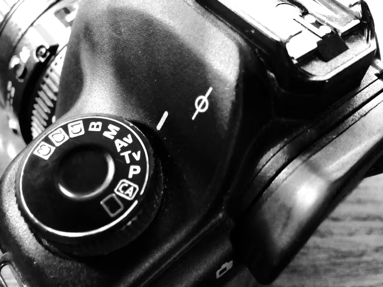
What is the aperture?
Simply put, the aperture is the physical opening in the lens that allows light to pass through. The wider the aperture opens, the more light can pass through. Want to know how to take yearbook photos, and for that matter, great ones? Master the aperture.
F-stops
Cameras measure their aperture settings in what are called f-stops, written f/1.4, f/8 and so on. You can typically find the maximum aperture marked on the lens itself. What’s important to remember, is that a camera’s f-stop setting shares an inverse relationship with the the width of the aperture opening. Huh? In a dark room, with low lighting, by setting your camera to f/2.8 or smaller, you’ll be creating a very wide aperture opening, thus letting a lot of light in. A smaller f-stop number equals larger aperture opening. Remember this inverse relationships as I’ll refer to f-stop numbers for the rest of the post.
Large f-stop numbers
There is something else that happens by using different f-stops, and sometimes with dramatic effects. Depth of field. In the image below, the f-stop is set at f/8. Some professionals call this the “sweet spot” because it is the aperture setting that provides the sharpest focus for a lens. Notice how all of the elements of the photograph are in focus?
Small f-Stop numbers
Now, let’s take it to the extreme by setting the camera on a wide open aperture setting (remember this means a small f-stop number). The photo below was taken by a lens with a maximum aperture setting of f/1.4. Notice how the baby’s eye is practically the only thing in focus, and that even her ear begins to “vanish”. This can create moody and dramatic effects with your photographs, especially for portraits or single elements.

Depth of field and the aesthetic quality of the blurred portions of photographs is such an important part of photography, that the Japanese have turned it into an art. They call it boke. Boke (BOH – KAY) focuses on the parts of a photograph that are not in the current plane of focus. We see these areas as blurry or hazy in the final work. The following photograph illustrates the beauty of Boke. Notice how the background almost appears to be painted due to its smooth texture?

3 tips for using aperture in your yearbook photos
Let’s cover a few technical applications of depth of field depending on the subject matter in your yearbook photos.
Portraits
Yearbook portraits are probably one of the most common yearbook photos your school will capture. You’ll want to follow some key rules of composition, being certain that you are filling the frame with faces, but you’ll also want to make sure that the critical element of the photograph is in focus: The face. When taking portraits of one person, you’ll have a lot of flexibility in choosing your aperture setting. Be sure to focus on the subject’s eyes when using a low f-stop number (f/5.6 or lower).
Yearbook setting shots
When taking photographs of the school grounds and building, or of events and activities with large gatherings of people, be sure to use an f-stop setting of f/8 – f/11. This will ensure that the focus of all the elements in the photograph are sharp.

Yearbook group photos
The great documentary photographer, Arthur Fellig, when asked how he was able to capture critical moments of rapidly changing events, simply replied “f/8 and be there.” When taking group photos, you’ll also want to use an f-stop number of f/8 or larger. That way, the faces of all of your subjects will be sharp. This will also allow you to focus on your composition.


7 yearbook mistakes to avoid
Avoid common yearbook mistakes with these tools and tiny changes to up your design and proofing game in the nth hour. Panicked, you shout, "Do I even have time to make changes?"
You'll make the time to avoid notoriety like this. 💚
1. “Unintended cropping”
Eeek: you created a legendary layout, and then, poof. A classmate vanished. Unintended cropping is a nice way to describe the disappearance of a student caused during printing and binding. So often we focus on proofing and editing yearbook copy, that we neglect our showstopping images.
How to proof photography
Take precautions with photos on the edge of each page: the gutter between facing pages and the bleed areas can be problematic. Double-check both.
Gutter Space: This is where the yearbook pages meet at the binding. Be mindful of the gutter when placing photos across spreads. Avoid the mistake of placing important elements, such as faces or text, too close to the gutter to ensure they are not "cropped" in the binding process.
Trim and Bleed Areas: If photos extend to the edge of the page, ensure they extend beyond the trim line (where the printer cut your pages) into the bleed area. This prevents white borders from appearing along the edges of the printed page due to slight shifts during trimming. Keep faces on the inside of the trim lines.
2. Poor photo quality
Another photo mistake has to do with our favorite extension of ourselves: our phones. Cell phone photos print beautifully in the yearbook when you follow these caveats:
- Since original images work best, set up shared folders so parents, students, and teachers can share directly. This ensures that the highest quality version of the photo is available for printing.
- Avoid destructive edits and filters; if you’re not using Lightroom, chances are, you’re ruining the photograph’s quality.
- Beware of texting photos, as some apps automatically reduce the file size.
Saying it loud for the people in the back:
- A screenshot is not a hi-res image.
- Your DSLR on auto will never get that volleyball in focus.
I feel better.
Built-in proofing tools
Treering warns you when your image may not print well while designing.

Your printed proof* is also the best guide. This allows you to identify any potential issues with image quality before officially going to print.
*A printed proof is just that: your yearbook as-is printed IRL so you can mark up mistakes, double-check contrast, and see your in-progress work. The best part: your Treering account includes one free.
3. The same kids over and over
And over. And over. Sometimes, it seems there are only two students on campus:
- The tri-sport athlete, who is also ASB president, the lead in the spring musical, a student ambassador, in eighty-five (OK, it just seems like it) AP classes, and works part-time as the PM custodian.
- The student whose name is on the roster.
Both are valuable members of the campus. The second is a little harder to find.
Creative yearbook coverage ideas for camera-shy students
Include more students (like #2 above) with modules dedicated to:
- Student spotlights and mini-feature stories
- Academics coverage through classroom candids
- Artwork and gallery spreads
- Quote bars
- Pet photos
4. MIA spring sports and events
We see it all the time in yearbook adviser groups: the woe of covering the final quarter of school with a traditional publisher. If your multi-year contract leaves you with no options, try:
- A spring supplement
- Creating photo slideshows and linking them via QR codes
How Do I Include Spring Events in the Yearbook?
With yearbook deadlines in February, a supplement used to be the only way end-of-the-year activities made it in the book. Technology changed that. With digital printing and a three-week turnaround, spring sports, ASB elections, and award ceremonies can be in the book.

Need even more time? Treering’s ship-to-home option eliminates the summer shuffle and back-to-school distribution.
5. Inconsistent formatting
Someone once told me if a bunch of yearbook advisers were in a room and our proofs fell on the ground, we should be able to rebuild our books just by the the design consistency. It’s a mistake to not have a cohesive look.
New to yearbooking? A templated solution may be the best. A Treering theme built with consistent formatting elements maintains uniformity across pages and sections.
Use the styles panel to establish guidelines for text (size, alignment, formatting) and images (border, effects) to ensure consistency. While you can have all the styles in the world (please don’t), make sure they are intentional.
When in doubt, use Garamond for body copy (8-point for captions, 6-point for portrait names). If it’s good enough for Harry Potter, it’s good enough for your yearbook.
6. Ignoring the principles of design
Piggybacking on formatting, we’ve all heard the adage, “Learn the rules, then break them.” The rules exist for a reason. (Did you read that in my teacher voice?)
Design 101
Designing from scratch? Start from the center and move out.
- Place your dominant photo. Contrast in photo size helps guide the reader.
- Build out related content. Captions help identify the subject of the photo and supporting images give the full event story.
- Add secondary content. Use pull quotes, interview bars, modules, and graphs to diversify your storytelling.
- Add theme visual elements. Everything should go back to your theme. Everything.
7. Costly yearbook overruns
Sales quotas and surprise boxes of “extra books” add up. The same digital printing that allows for a three-week turnaround also gives you peace of mind when it comes to ordering. Say goodbye to guesstimating in November what you’ll distribute in May. Treering only prints pre-paid orders. This way, every year is a sell-out year. Additionally, there’s no waste and no leftover books.
Yearbook mistakes occur in design and coverage, affecting the quality and reception of the final product. The simple changes above, including proofing, understanding how design affects the (no pun intended) whole picture, and using back-end tools that help–not hinder our process–you can elevate the overall vibe of your yearbook program.
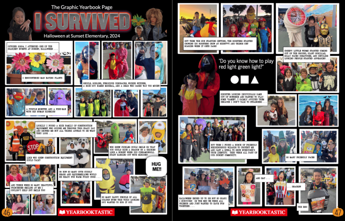
Winners of the 2025 spread design contest
We asked you to “show us what you got” and you understood the assignment. The diversity of subjects—portrait, divider, baby photo, staff, senior tributes, superlatives, arts, and athletics spreads—coupled with the styles, themes, and narratives left us inspired.
Thank you.
It sounds cliche to say it was tough to comb through hundreds of submissions, read your stories, and examine everything from how photos were cropped to how they balanced across the spread. But you delivered quite the challenge.
A panel of yearbook and design professionals, PTA parents, and journalists looked through every submission in a blind judging. They evaluated your submissions on:
- Layout design
- Storytelling
- Visual elements and their relevance to content
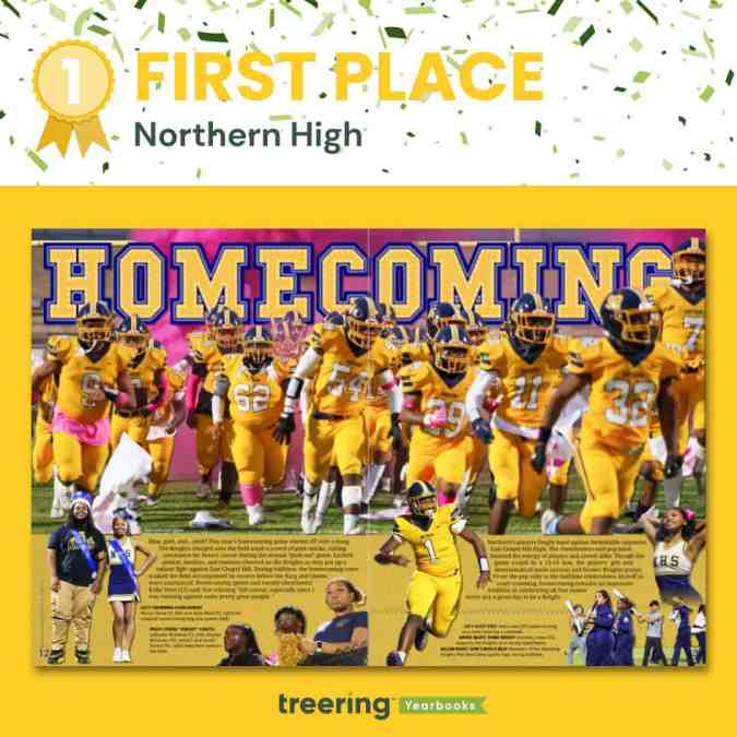
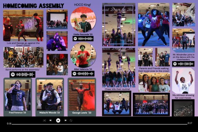
Grand prize winner: Northern High School, Durham, NC
Remember those prom dress-I’ll-know-when-I-see-it vibes? That was our impression of Northern High’s homecoming spread. It was unanimous. As soon as the panel saw this spread, “This is it.”
The “Polaris” staff at Northern High earned ten free yearbooks, a $500 Amazon gift card, and a $200 pizza party to enjoy as a staff.
“Our goal is twofold: To show that we are all part of our school community and school culture and to illustrate that there's more to us than meets the eye,” junior Nourriah Scott said.
Their yearbook theme, “All 'N' the Details," is both traditional (check out the classic typography) while adding modern design elements. Their theme goes beyond the visual and uses the narrative to showcase all aspects of an event.
“As the viewer travels through the spread,” Scott said, “they learn there's more to it: the court, the cheerleaders, the band, the crowd. Homecoming is just a single event in the course of an entire school year, and look how many people and parts of our school are involved in making it magical.”
Why we loved this design
The details emerge once you get beyond the wow factor from the colors. Homecoming is written in a font similar to a letterman’s jacket and, as the main entry point to the spread, is behind the football team. This is a student-first design.
Additionally, the use of COB (cut-out background) photos enhances the design. The yearbook team positioned the sharp edge in the gutter and used a gradient to fade out the other.
Design hierarchy also played a key role. The story crosses both pages, bolded ledes give the reader even more entry points, and candid photos highlight all the participant groups. They indeed are “All ‘N.”
Bonus: As a Title I school, the “Polaris” staff does not have access to Adobe or other paid design tools. They created their winning spread using the Treering yearbook builder and free, web-based photo editing tools.
Runners up
For hours, we had a solid 26 spreads on display and our panel highlighted the merits of each. When we returned to the original judging criteria, five emerged. In alphabetical order by school name, the following schools each earned three free yearbooks and a $50 Amazon gift card.
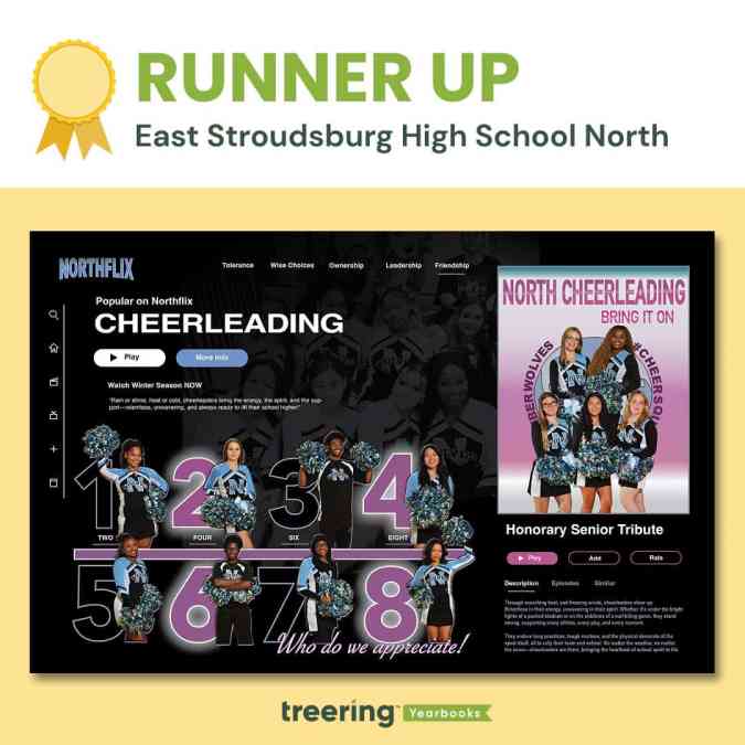
Finalist: East Stroudsburg High School North, Dingmans Ferry, PA
While this isn't the first time we've seen a streaming media look, it is one of the best iterations. The team at ESHSN used the cheer individual photos to create a movie poster on the right and recapped the season as the program description.
Across the top are the TWOLF values “intended to promote the application of knowledge, develop healthy identities and decision-making skills, achieve goals, manage emotions, show empathy, and establish healthy relationships,” Adviser Keisha Agard-Thomassine said.
Why we loved this design
One word: color. The school color is front and center in a spread centered around the spirit-makers. Timberwolf blue is used on the yearbook logo and as a button. The analogous purple makes it pop further.
“We beam with pride over here,” Agard-Thomassine said.
The subtle detail of the group photo in the background adds another layer of complexity to a bold and balanced spread.
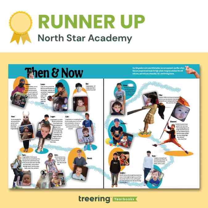
Finalist: North Star Academy, Redwood City, CA
Without seeing the entire book, you know there is a strong connection to theme: the aqua and goldenrod ovals and bold typeface are evidence of a solid style guide.
Adviser Carol Landers has a class of 30 students in grades 4-8 who help work on the book. She reserved this tribute to promoting students for herself.
Why we loved this design
Each eighth grader had their moment to shine with both a personality photo and a baby photo. Landers said parents contributed “photos of their students holding an object or pet or doing an activity that is important to [them].”
This highlights each student individually while using the promotion year 25 as the thread that connects them. Brilliant.
Landers employed a Google Form to solicit submissions from parents, and she’s planning ahead: “I just learned about Treering’s ‘secondary photo’ feature, so I look forward to trying that out next year.”
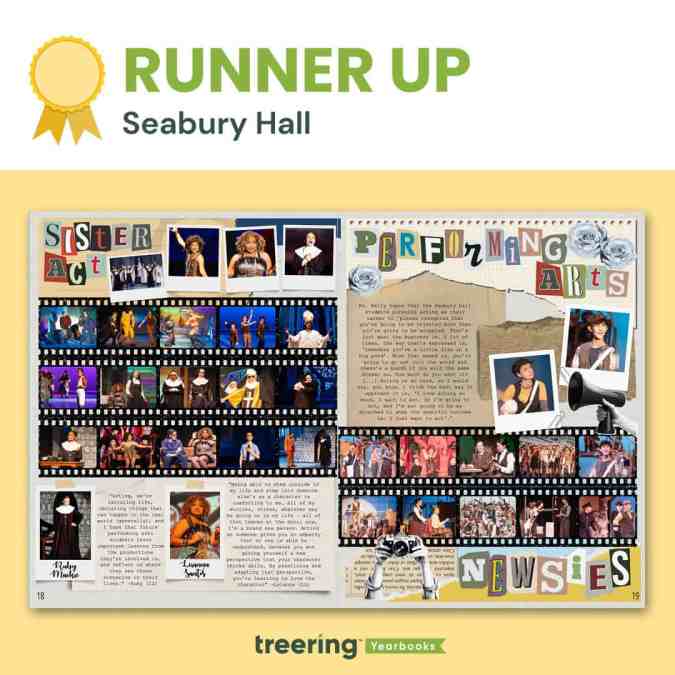
Finalist: Seabury Hall, Makawao, HI
“This spread is not just a collection of memories but a tribute to the dedication and creativity of Seabury Hall’s performing arts program,” designer Ethan Berry said, “preserving moments that will inspire future generations.”
Adviser Dakota Grossman is proud of Berry, a sophomore, who worked on this page solo. She said she helped in the brainstorming phase, and this is just one of his designs for Seabury Hall’s scrapbook-themed yearbook.
Why we loved this design
Grossman said, “[Berry] truly paid attention to every detail—there's meaning behind every photo, graphic, and sentence on that page.”
That intentionality appears in the second, third, and fourth looks: beyond the colors, layers, and texture are student voices, photos of the cast in action, and a passionate narrative from the program director.
Visually, it is stunning. The narrative is compelling.
We wholeheartedly echo Grossman’s pride in Berry.
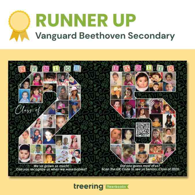
Finalist: Vanguard Beethoven Secondary, Pharr, TX
Bright, nostalgic, and playful, this spread is a showstopper. Baby photos capture the earliest moments of every senior’s journey, making this spread a heartfelt tribute.
Why we loved this design
Aguilar’s vision is to blend a traditional yearbook with a multimedia presentation for the 58 seniors on their growing campus.
“The plan was to scatter all senior baby pictures,” Aguilar said. “I took it to the next level and created a media slideshow and have a QR [code] for everyone to view.”
It’s an elevated take on a yearbook classic. And we’re here for it.
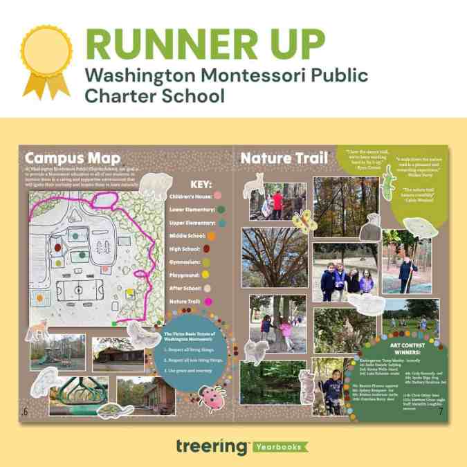
Finalist: Washington Montessori Public Charter School, Washington, NC
Senior Cadence Mallette’s creation could not go in any yearbook. This is uniquely WMPCS. She organized the yearbook team to capture student art, photos of the school and students interacting with their environment, student quotes, and a campus map. If that were a to-do list, it would look overwhelming.
Mallard made it work.
Why we loved this design
We loved the mixed-media approach to this spread. Students in grades kindergarten through 11 submitted animals that share their habitat with WMPCS. Seniors drew the school mascot, a bald eagle. The winners made it on the spread.
Adviser Meredith Loughlin said this approach “united our yearbook group members while connecting them with our local ecosystem.”
This focus on unity also made it a winner. Sometimes, K-12 communities create separate upper and lower school content. Mallette’s design gives us a picture of whole-school approach.
Honorable mentions
Because that’s not enough yearbook design inspiration, we want to call out these brilliant designs from elementary, middle, high, charter, and home schools.
Academy Days Co-op, Alliance Ouchi-O'Donovan 6-12 Complex, Alliance Renee and Meyer Luskin, Academy High School, Alma d'arte Charter High School, American Community School, Ancheta Academy, Assumption Catholic School, Atlanta Speech School - Stepping Stones, Atsa' Biya' A'ZH Community School, Auburn Hills Christian School, Avalon Middle School, Azle Christian School, Brush Middle School, Camas Connect Academy, Carencro High, CHESS Christian School, Chesterton Elementary School, City Garden School, Classical Conversations Folsom, Coconut Creek Elementary School, Cranberry Area High School, Cunha Intermediate School, Davis Intermediate School, Delhi High School, East Moline Early Learning Center, El Sobrante Christian School, El Tejon Middle School, Foothills Community Christian School, Fort Fairfield High School, Frank Bergman Elementary, Franklin Elementary School, Frederick Douglass High School, Frost ISD, Gate City Elementary, GEMS World Academy, Ghidotti Early College High School, Glencliff High School, Global Impact Academy, Global Impact Academy STEM High School, Heritage Christian School, Hilger Higher Learning, Hinsdale Elementary School, HomeWorks, HOPE Christian Academy, Indian Prairie Elementary School, John Glenn High School, Joyful Journey, Kennedy Middle School, Lakeside Christian School, Lakeside Elementary, Liberty Christian School, Maple Manor, Marfa, Marsh Grammar School, Martin J. Gottlieb Day School, Mary Morgan Elementary School, Maywood Center for Enriched Studies, Meiklejohn Elementary, Midland Elementary, Miraglia's Globetrotters, Mt. Everett Regional, NJWT New Jerusalem Worship Temple, North Bergen High School, O'Farrell Charter School, Options For Youth, Oxford Hills Comprehensive High School, Pinewood Intermediate, Pioneer Junior High, PRCES, Prune Hill Elementary, Quail Run Elementary, Rincon, University Marching Band, RISE HS, Rocky Mountain Classical Academy, Rocky Mountain Deaf School, Roseville Pathways, Ruth Batson Academy, Sacred Hearts School, Shatekon Elementary School, Shirley Hills Primary School, Smith Community Christian Co-Op, Soldier Hollow Charter School, Soldotna High School, South Orangetown Middle School, St. Jude Catholic School, Stratford Schools Fremont Boulevard, Stuart Paddock, Students On Academic Rise (S.O.A.R. High School), Swansea High Freshman Academy, Tandem Friends School, Tenor High School, Tenor High School | Cathedral Square Campus, TGU Granville, The Learning Connection (TLC), The Nova Center, Thomas J. McMahon Elementary School, Thomas Russell Middle School, Tri-County Homeschoolers, Victor H. Hexter Elementary, Vista del Mar, Wallace Elementary, Washington Middle School, Westlake Elementary, Westmont Jr. High School, Westside Global Awareness Magnet, Willett Elementary School