
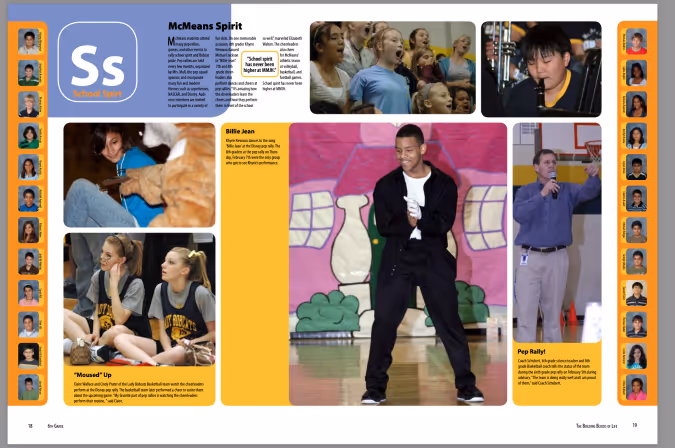
Most popular


Subscribe to our blog
Most recent

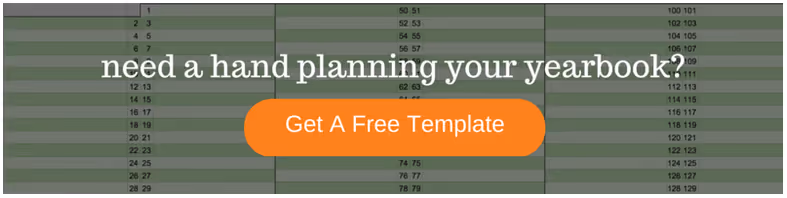
Yearbook staff application template: sign-up volunteers now!
A yearbook staff application might seem like an overly formal, entirely unnecessary step when recruiting students to help with the yearbook on a volunteer or after-school club. It’s not.
Sure, an after-school yearbook club creates a low-stakes environment for students to unleash their creative energy and to learn some awesome new skills, but it can also create problems: One, you could end up with more students than any sane adult could ever hope to manage; two, without a grade hanging over their heads, students could lose the motivation to finish their work. In some cases, you might end up dealing with both.
That’s why you need to use a yearbook staff application.
A yearbook staff application is essential to putting together a dedicated, enthusiastic team of student volunteers, and it lets you achieve four key things related to your yearbook recruitment and planning before you even have your first meeting:
- You identify the yearbook club roles you need, and how many people you need to fill them.
- You limit the size of the staff you need to complete the book.
- You attract students who are actually interested in doing the work needed for the yearbook.
- You find out what your students are good at and interested in before getting started.
Read the rest of this post, and you’ll know exactly when you should use a yearbook staff application and what to look for in student volunteers. The payoff? A yearbook staff that’s exactly the right size and that will stick around until it’s time to hand out the yearbooks.

When to Use a Yearbook Staff Application
In a perfect world, yearbook club would be an open door, where anyone who wants to participate could just walk in, take a seat at a computer and start plugging away at whatever needs to be done. But we know that can’t always be the case.
Here, then, are the times you’ll probably find yourself needing to use an application process as you recruit your students:
- Demand outweighs supply. As in you have too many students interested in the yearbook. We’ve seen this happen at schools where the yearbook is a big part of school culture. So many students are geeked up about the yearbook that it seems like nearly everyone at the school is itching to help make it. But if you have everyone help and there’s not enough work to really go around, you can end up with disgruntled group. Not fun.
- Eager starts end with empty seats. As in you have the right amount of students at the beginning of the year, but they drop off, one by one, until you’re left with a few dedicated (and soon to be overworked) students. If you’ve ever experienced this situation, you know how stressful it can be.
- Everything feels like a disorganized mess. As in you know what you need to get done—and you’ve got the students to help you—but you don’t know who’s going to do what or how anything’s going to get done. It’ll sort itself out, like it always does, but for a few days, maybe even weeks, it’s a nerve-wrecking beginning to yearbook club.
In these situations, a yearbook staff application can sort of serve as a bouncer at your open door.
You’re not necessarily using the application to weed through students and pick your dream team; you’re using it to find out who’s really into the yearbook and who isn’t. By giving students a little extra work up front, you’ll more easily find those students who are ready to do the work and you’ll more easily know which parts of the yearbook they want to help with.
Sure, it’ll reduce the number of student volunteers, but it’ll also increase the likelihood of you having a highly motivated team.
The 3 Things to Look for in Yearbook Staff Applications
Just because the yearbook staff application is serving as a “bouncer,” it doesn’t mean you should review them. There’s lots of good stuff in there, and it can help you better understand your students and their motivations for joining the club.
So, you should read them. And, when you do, look for these things:
Did they complete the application?
This is fairly basic, but check over the whole application to make sure it was actually completed.
If a student scoffs at the idea of applying to work on the yearbook, or they crumple and toss the application into a backpack abyss, what are the chances that they’d be a committed contributor?
Sure, you could have an incredible photographer in the building who shuns formalities like “applications” and “attendance” in the name of art. By and large, though, an application is a great way to gauge future commitment and get to know your staff.
How do they fit the puzzle?
You need a diverse yearbook committee. Roles you need to fill include (but are by no means limited to):
- Photographers
- Designers
- Sales & Marketing Pros (those kids tweeting in the hallway between classes are about to become your best friends)
- Editor(s), for written work and images
- Interviewers/journalists in training
- Jacks & Jills of all trades
These students are going to be the lifeblood of yearbook, and getting to know their strengths and weaknesses at the beginning of the year can save you major stress down the road.
On your application, make sure you create a space for students to designate any skills or interests they might have. It’s also helpful to ask students which skills they’d like to develop.
Not only does this help you get to know your staff: it give you an idea of the roles underclassmen could fill the following year, too.
Is yearbook a priority?
Students are spread pretty thin. With stuff like school work, sports, Pokemon Go, and part-time jobs and at-home chores, it can be hard to commit to another activity.
Your yearbook staff application should ask students to be honest with the amount of time they can give. Just because a kid is busy doesn’t mean he or she can’t contribute in a unique and useful way. By using the information provided on the application you can set realistic expectations on an individual basis, ensuring a well-rounded, happy staff.
Set the Tone on Day When Distributing Applications
When students come to you for applications (you know, that time in the day when you tell them just how fun yearbook club is), be sure not to sugarcoat the experience.
You should absolutely highlight the fact that working on the yearbook is rewarding and allows for the application and development of skills (photography, editing, design, interviewing, and so many more), but this shouldn’t be an outright sales pitch. Be open and honest. Your goal should be to build enthusiasm amongst your prospective staff members while also making it clear that creating a yearbook takes work.
If you think that attending every club meeting is important, make that clear; if you want students attending as many school events as possible, tell them upfront; if you’re willing to be flexible on attendance, but expect work gets done at home instead, let them know that, too.
Setting expectations, in terms of attendance or general contributions, is a great way to establish which students are going to take things seriously and who’s on the fence before you even hand them an application.

The only yearbook page template you need
A yearbook page template is one of the best ways to save time (and a ton of sanity) during the yearbook layout process.
All too often, though, we talk to yearbook advisers who are skipping them for the same reason: They don’t want to use the same template over and over and over again, on every page. They think that’d be boring.
Fair enough.
In fact, we won’t even try to argue. That would get boring. But you know what? There’s a way to fix that.
You can take one yearbook page template and turn it into four different ones that’ll give your yearbook pages that cohesive, but not boring, look. The trick is so easy you’ll be laughing, and so effective you’ll pinch yourself.
What is it? Why does it work? We’ll get to that. But let’s start by looking at what makes page templates so valuable in the first place.
Why Yearbook Layout Templates are a Go-To Resource
When yearbook design is done well, the pages flow, the photos stand out, and the copy complements the visuals.
If you try to achieve all this from scratch, you’re looking at an huge amount of work that requires pro-level design knowledge and a significant time investment. (And let’s be real: You can’t always find that on your yearbook committee.)
That’s why page templates have become a go-to resource. Yearbook page templates:
- Simplify the design process: Templates allow you to drag and drop photos into placeholders, add copy, and… that’s it. No need to stress about page setup or search for a volunteer with a design background.
- Control the overall book design: Templates give you a set structure. This means yearbook advisers can control the layout process without micromanaging or limiting the people who help out with design.
- Save time: Templates require less prep time and overall work. Plus, the learning curve is minimal—anyone with even a small amount of computer savvy can use page templates.
- Help teach design principles: Templates can help students volunteers learn the principles of great design. Students can express their creativity within the template structure, and gain more responsibility as their skills progress.
Since page templates are so helpful and there are so many options available, it’s tempting to fill your yearbook with a variety of layout styles. But that makes more work, and—good news here—it’s not necessary.
The solution—one that saves even more time and stress—is to get creative with just one template.
Sounds crazy, right? It’s not. One template, flipped into four, can result in a far better outcome than a variety of templates. Here’s how to do it.
How to Create Four Unique Layouts From One Yearbook Page Template
Find a yearbook page template you love, and make multiple new ones by recreating it in three rotations. Because this type of thing can sound confusing, here’s a visual example of how to do it.
Original:
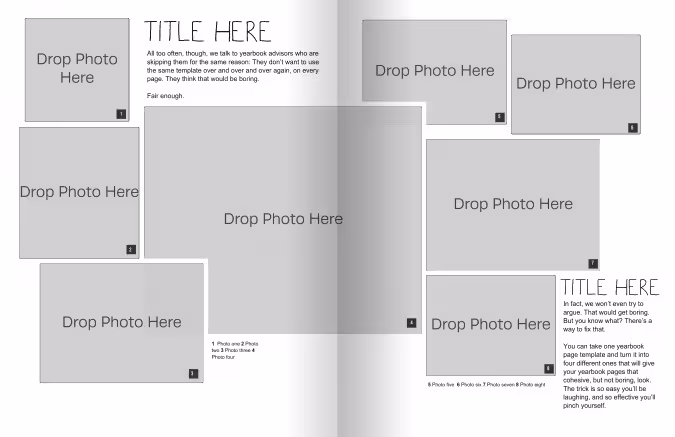
Now, let’s flip it vertically:
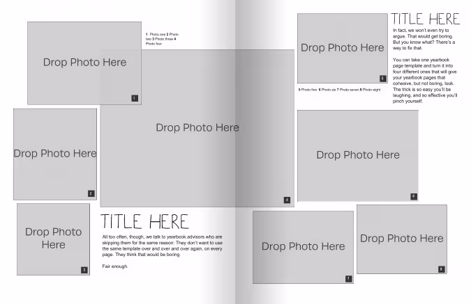
Then, we’ll take that template and flip it horizontally:
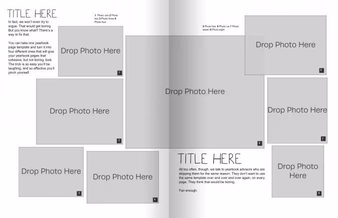
Last, let’s go back to the original template and flip it horizontally:
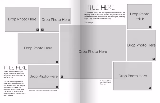
Notice how each one looks similar to the other, but still different enough to give some variety? That’s exactly what we’re going for.
By re-drawing the original template in different directions, you end up with four page layouts. Each one is unique enough to add variety to your pages, yet similar enough to give your yearbook a cohesive feel.
If you want more than four options, you can further adjust each template by adding or removing text or photo boxes to create new layouts. Or, you can mix up the portrait and landscape orienttaions of the photos.
These small alterations don’t take much time, but they give your entire yearbook a fresh feel. By approaching your yearbook layout this way, you get all the benefits of a yearbook page template—without the repetition.

28 clever headlines to use in your winter sports spread
- “Headers & Footers”
Wrestling
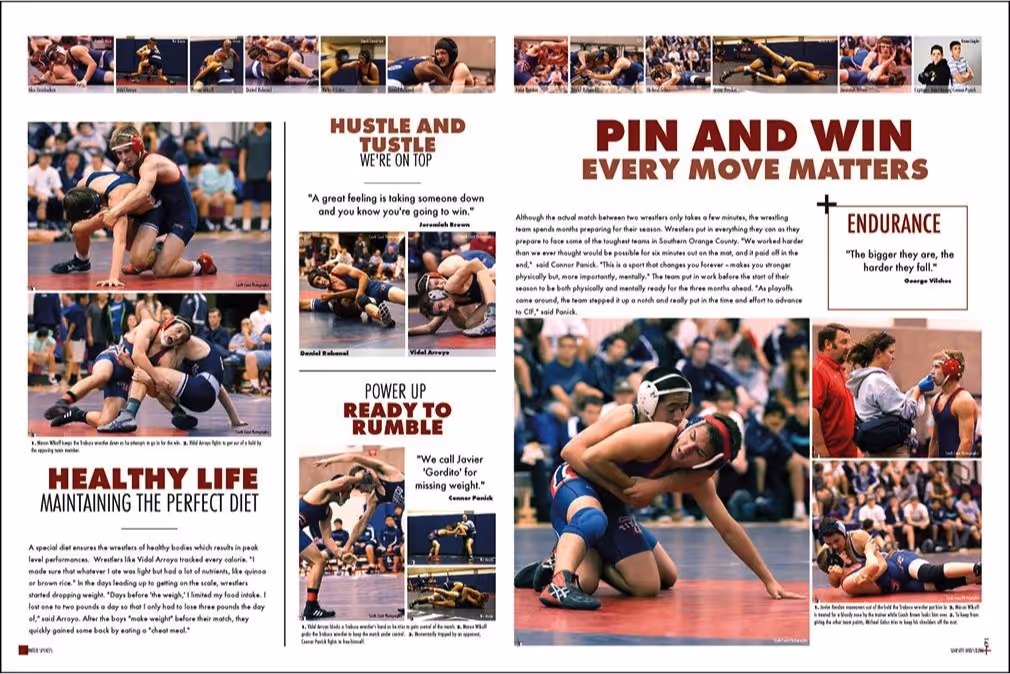
This yearbook page shows several headlines that work well for a wrestling spread. A number of bold headlines make a statement while still bringing the main headline “Pin and Win: Every Move Matters” to the reader’s immediate focus. The other titles maximize rhymes and take advantage of sports lingo: “Hustle and Tustle” and “Pin and Win” both rhyme and make references to wrestling jargon.
Here are some other fun slogans you can use for your school’s wrestling spread:
- “No Pain. No Gain”
- “Ready to Rumble”
- “Rock Solid”
- “Pin It to Win It”
- “Out on Top”
- “Toughest Six Minutes There Is”
- “Grapple Up”
Swimming
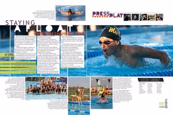
In this yearbook layout, “Staying Afloat Through Changing Times” is an engaging headline that both cleverly references swimming and makes the reader curious to know what changes have happened. The “Press Play” headline complements the film roll aesthetic of the photos next to it.
For more swimming spread-related slogans, check out some of our headline ideas:
- “Instant Athlete: Just Add Water”
- “[Your Team Name] Made Waves”
- “Sink Or Swim”
- “Life In The Fast Lane”
- “[Your Team Name] Made A Splash”
- “Dive Deeper”
- “Testing The Waters”
If you want to get your readers paying more attention to your main story, dig into your theme, your school’s culture, and sports terms to find ways to add a dose of clever to your winter sports spreads. It’ll help you steal a smile from your reader or unify your theme across multiple pages. In short, it’s worth the creative effort.
Fresh ideas for yearbook spreads highlighting your teachers
Teachers are the greatest, so you don’t want their yearbook pages to fall flat. The one thing teachers truly deserve (besides a raise) is an amazing yearbook spread or two. So let’s give these hardworking folks their due and give the student body something to talk about by including fun and clever teacher spreads in this year’s book.
Here are some fresh yearbook spread ideas to capture a more dynamic view of your teachers and staff on your book’s pages.
Throwback
Did you know that teachers were once students themselves? Well, of course. But this concept might be mind-blowing to some of the students at your school. Ask your teachers to submit images of themselves when they were the age of their current students and give a little insight into what they were like.
When I was a junior, our Chemistry teacher showed us a commercial that he starred in when he was a high school track star. It was hilarious (those shorts!) and it gave us a glimpse into our teacher’s background.
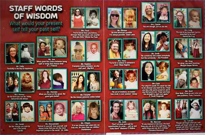
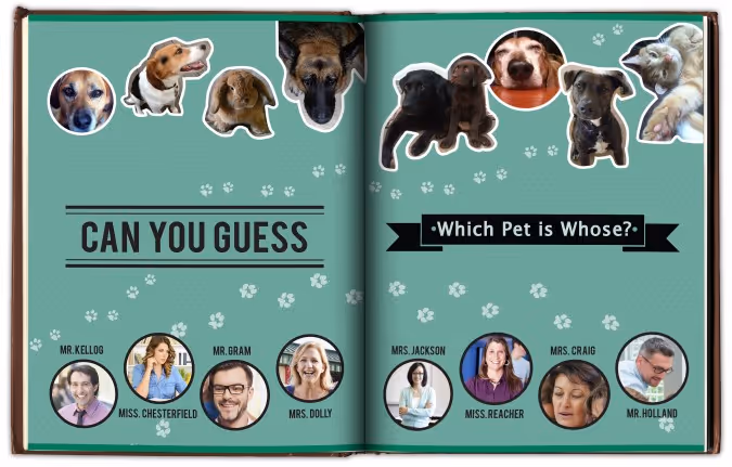
Teacher’s Pet(s)
Create a collection of photos featuring your teachers with their adorable animals. Whether it’s a poodle or a piranha, there is a lot to be discovered by displaying these companions. To add some dimension, you could create a mod displaying quotes about different teacher’s childhood pets. Another idea would be to create a guessing game where you have to match the pet to the teacher.However you style it, animals are a big hit.
Just Like Us
Teachers seem like a different species to your students sometimes. So for a spread to tie everyone together, gather some similarities between your teachers and the students. You might have to poke around a bit, but you won’t have to look too far to find some teachers that enjoy a snow day, Taco Tuesday, or cheering on the team. Teachers stay up late to finish their work, play games on their smartphones, and like to get all decked out for Halloween. Finding similarities between the teachers and students will remind the reader that they are all part of a tight-knit community.
If I Wasn’t a Teacher
Poll your teachers on what they thought they were going to be when they grew up. Pick some of the best responses and use illustrations or Photoshop to make these ideas come to life. Everyone will get a little chuckle out of seeing their favorite teachers outfitted as cowboys, astronauts, soccer players, or mad scientists.
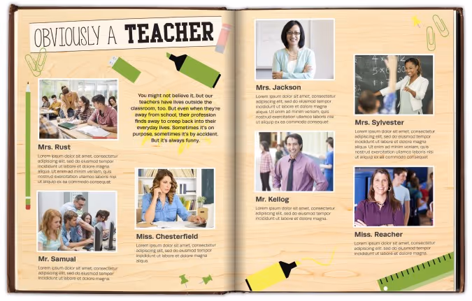
Obviously a Teacher
A while back I was out to dinner with my sister. She reached into her pocket to retrieve her chapstick and managed to fish out two glue sticks and a flashcard. I immediately glanced at her inky fingers and the pencil in her hair. She was such a teacher at that moment.
So for an ‘obviously a teacher’ spread, ask teachers to identify their own moments like these and photograph the evidence. Whether it’s the day they realized that all their shoes were built for comfort or when they referenced their nephew being born “last semester,” every teacher gets the self-realization epiphany now and then. These moments are usually marked by a quick giggle; make room to share the laughs in your yearbook.
Two Truths and a Lie
It’s a simple game, on the surface: each participant provides three statements–two are true, and one is false. It’s up to everyone else to determine which is which. And it’s a great idea for a spread about your teachers.
Ask teachers to craft their three statements, and have them pose for the camera with their best poker face. Whether you include the answer key is up to you, but we’d recommend hiding the answers somewhere in the ads. For additional photos, you can show a mix of the facts and the fantasy for a really fun and creative spread.
The annual yearbook is a great platform to show your teachers’ human sides and cement a lasting impression for years to come. The best spread ideas contain an unexpected, personal glimpse into the teachers’ lives. So step away from the blackboards and apples, and provide a new, exciting spread.
Your goal is to add another dimension to the teachers that all work so hard educating today’s students. These teachers are wholly invested in their students’ futures, and the yearbook should be equally tenacious in capturing our teachers in their best light—as themselves.
Use a style tile as your yearbook style guide
Templates and online inspiration can make creating your yearbook so much easier…except when they don’t fit the style you’re going for.
It might sound like a big problem, but it’s not. You can easily fix any of this with a yearbook style guide.
Here are three tips on how to keep yourself honest—and your yearbook style consistent—with the easiest style guide of them all: a style tile.
Apply Your Style Tile to a Template
Going into your spreads after they’re laid out and applying your style to each page works–but it’s not the cleanest option. What can save you time would be to apply the style to your templated page layouts before any content is added, and have each page start out styled correctly.
When to Use: Before you start creating content and sorting through your photos, you will probably have some templated layouts you’re going to use for your pages. These might be provided by your yearbook company, and can be a boon when it comes to organizing. But they can be a bit generic, which is why you want to use the style tile to apply your design elements to each page.
How to Use: Your template has space allotted for different elements like photos, an article, and pull quotes. Using your style tile, you can update the fonts and sizes, and figure out where to incorporate additional splashes of color that align with your pre-determined style choices.
Why: If you’re applying your style after the fact, it’s easy to miss a color or font or caption somewhere. It’s much better to give a template the style treatment and standardize the style elements before you add content. Also, if you apply your style tile to the template and don’t like the look you’ve created, it’s easy to switch up your style before you’re in too deep.
Apply Your Style Tile to Outside Inspiration
There is great inspiration everywhere, and some of our best yearbook ideas can grow from a spread, picture, or concept we’ve found online or in previous yearbooks. But if you just take an idea verbatim, its style will probably clash with the rest of your book–which is why you need to reach, once again, for that style tile.
When to Use: Say you find an amazing spread layout, but it doesn’t conform to your style. Well, it’s time to bust out your style tile and get to work making it fit. Make that inspiration your own, and tie it into the rest of your book.
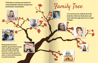
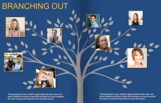
How to Use: In most cases, you will be off to a great start by swapping some colors and updating the fonts. For example, we found a great spin on a “family tree.” In order to make it work with the rest of our book, we switched our font and used a background graphic that matched our colors. With a few simple tweaks, it looks like it belongs with the rest of our yearbook.
Why: There are so many great ideas out there, but it can sometimes feel like fitting a round peg into a square hole. If you keep your style tile within reach while you’re surfing for inspiration, you will have a handy tool to help you visualize how something can work within the style of your yearbook.
Do a Final Run-Through, Style Tile in Hand
Before the book goes to print, you’re going to be doing multiple read-throughs, checking everything. Make sure design is one of those things you’re checking, and that consistency exists across all the pages of your book.
When to Use: You will want to proof the design on each page before your book goes to print. Style tile in hand, make one read-through just for style inconsistencies, just to be safe.
How to Use: Walk through your yearbook page by page with an eye on the style sheet. If something feels out of place, you can easily correct it by altering fonts or adding an additional color from your toolkit.
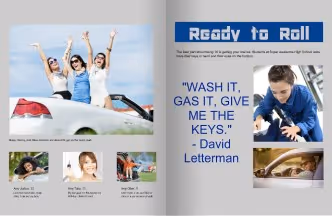
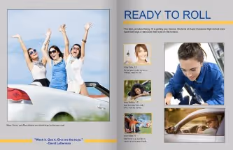
For example, as you assess the spread on the left, you would look at your style tile and determine the incorrect or missing elements. In this case, the size of the pull quote is gigantic and the font of your headline is different. This is easily fixed by correcting the font size, rearranging the content, and consulting your style tile for the correct headline font.
Why: There are a ton of things to look for when you are going through your final proof, so you need to take time to do individual run-throughs for each element, or something might get missed. For one read-through, keep your style tile close at hand, and hone in just on it. In doing so, you are making sure that the final design is consistent throughout your yearbook.
Style Tiles Keep Your Yearbook Consistent
Using a style tile can help you stay consistent when customizing pre-designed templates and designing your own. What’s more, it’ll help you keep your design in check when you’re pulling inspiration from across the board. You’ve deliberately chosen each element of your yearbook’s style, from color to font, and your style tile will help that vision come to life by keeping a strong hold on your original intentions.
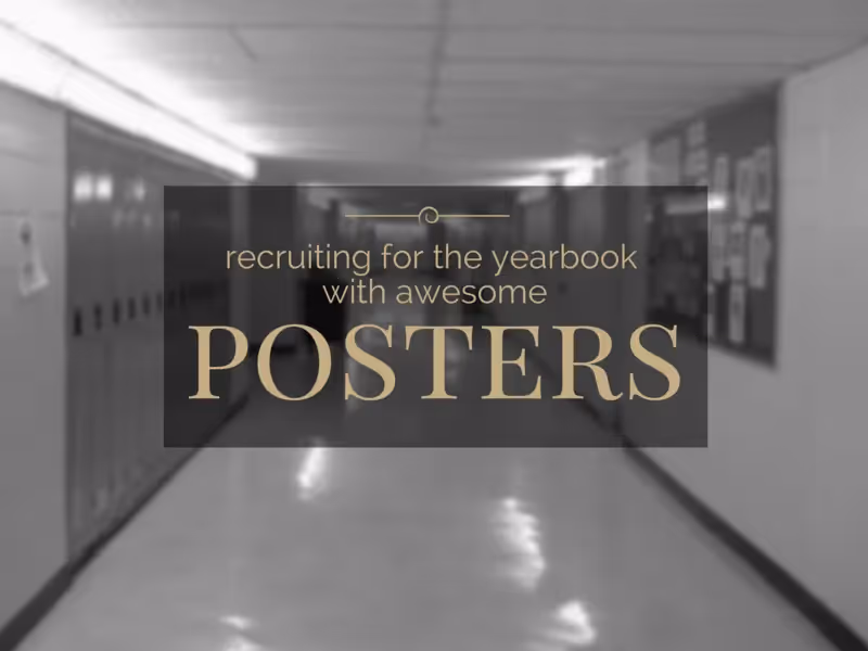
Join yearbook: flyer & poster ideas to recruit new members
When recruiting for your yearbook committee, you’ll want to attract students who are passionate about what the yearbook stands for, students who have talents that can help you create a great yearbook, and students who might be able to help you solve some common yearbook problems. To reach all three at once, use recruiting posters.
A recruiting poster is sorta like a marketing or sales poster, but it is different in one key way: You’re not asking people to buy the yearbook. You’re asking people to create the yearbook.
When it comes to making that ask, all the great recruiting posters we’ve seen fit these three guidelines:
- They’re specific about what’s needed. If you are looking for photographers, make sure you put that in. If you are looking for people with a flair for visual design, mention that. There might be people who are unsure of how their talents will fit into a yearbook staff and are hesitant to join unless they see a specific calling they can identify with.
- They’re open and inclusive. This doesn’t contradict the above advice. Encourage students who are unsure about what they can do to apply. You never know what you might find. You could discover someone with an unbelievable knack for writing killer headlines, or for eliciting the best quotes during interviews. There is talent all over the school. The right recruiting can help you find it.
- They provide pertinent information. Your poster needs to say more than simply “Join Yearbook!” Interested students should be able to quickly and easily get a good picture of what’s involved, and also have no doubt about how to find more information. Adviser name, classroom, meeting times, signup sheet—provide whatever information they need to make joining stress-free and inviting.
Types Of Posters You Can Use
Even though a white piece of paper with yellow lettering saying “Yearbook Looking For Staff. Come To Room 237” might meet the above criteria, it probably isn’t going to draw anyone in. You need to catch some attention, too. You can do that by making sure your poster is catchy, shows your spirit, and makes people want to join.
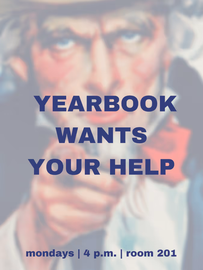
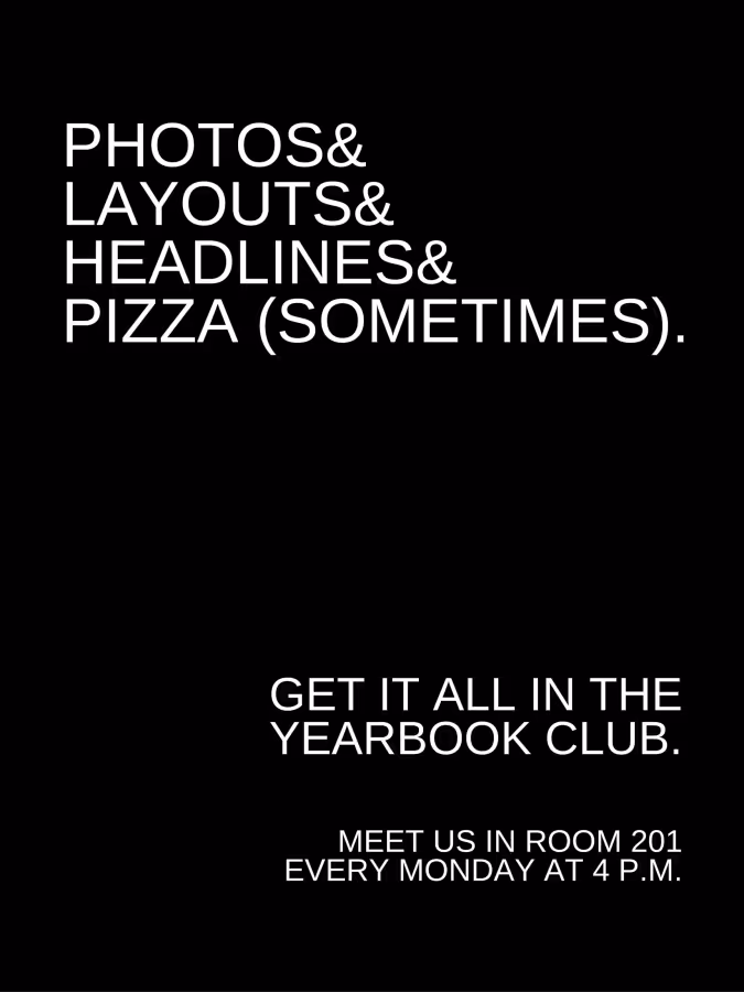
To show you what we mean, we came up with three posters that you can pass off as your own. Just click on the poster you like, save the folder to your Google Drive, and edit the bottom line so it’s accurate for your school. Or, take the suggestions for types of posters, and have fun creating your own.
- Go For A Historical Look. Retro is in, so why not draw your potential recruits’ attention with a good-ol’-fashioned recruiting poster? Using an established campaign and playing with it is a great way to show the sense of fun on the staff.
- Reference Yearbook Elements. Form serves function here. Incorporating elements of design, such as graphic layout or use of interesting fonts and clever wordplay not only attracts the eye, but shows what you are all about. It’ll capture the interest of people with passion and talent for these fields.
- Pop Culture. With great yearbooks come great responsibility. Appealing to our love of superheroes or other pop culture icons can be a great way to draw attention. Use something big now, like Mad Max. “Oh what a day! What a lovely day (to join yearbook)!”

Bonus points if your poster is humorous or punny—if a student stops and chuckles, the seed is planted, and you’re halfway there.
Find what resonates with your audience, and they’ll be lining up outside your door to beg for a spot or to fill out a yearbook staff application. Your committee is what makes your yearbook a success, so make sure your posters are reaching all the students who can make your yearbook the best and letting them know all yearbook has to offer.

Why you need a yearbook ladder for your planning efforts
A yearbook ladder is a nice—and concise—chart representing the yearbook’s pages. Use it at the beginning of the year, and you’ll be able to better plan your book length, prioritize all the ideas you have for sections and stories, and determine what you have room to cover. Best yet, it doubles as a visual reminder of what your book is supposed to look like when it’s done. It’s basically one huge, visual post-it note.
When it comes to planning a yearbook, our favorite piece of advice for new yearbook advisers is this: Begin at the end.
Tweet
It might sound counterintuitive, but knowing where you want to go before you start will help you get to that end goal a little faster—and a little happier. You can achieve most of that by picking your deadline, theme, and coverage goals, but there is one tool that will get you the rest of the way.
It’s the yearbook ladder.
Here’s what one looks like:
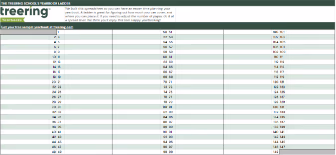
A Ladder Makes Yearbook Planning Easier
Other yearbook planning tools, like project management spreadsheets, editorial calendars and deadline charts, might seem to do everything except make your morning coffee for you, but those tools miss a key element that yearbook ladders offer: a “big picture” view.
Have you ever struggled to remember where, exactly, your Halloween parade collage is set to go? Or how many pages you had reserved for prom night?
Your yearbook ladder will tell you right away.
Because a ladder can show you your book from the proverbial 50,000-foot view, you’ll never be more than a quick glance away from knowing where in your book you planned for each feature to go (and how much room you gave them).
The ladder is an especially useful device that can help you determine the layout and flow of the book, to make sure that you’re not forgetting anything, and to check and see that any multi-page features look as good as possible in the way they span the pages.
Tips for Using a Yearbook Ladder
To help you, we’ve compiled a quick list of things to do when you’re setting out to create your yearbook ladder:
- Start with last year’s book. Of course, you’re going to want to mix things up and try some new ideas, but there’s no reason to reinvent the wheel. Just move certain sections around based on your new theme and ideas. (If you didn’t have a book, or are trying a new type of coverage, start by listing everything you plan to cover.)
- Begin your ladder with your first page. Your first page on your ladder should be one that contains content. That means page one should be on the right side of the ladder, with no facing page. If you also list pages that don’t (or can’t) contain photos and text, you may confuse how many pages you actually need for your yearbook.
- Adjust as you go. You don’t want to mess with your plan too much, but the beauty of the ladder is that it can be easily rearranged to determine what looks and fits best. (That’s why we like our digital!) It’s a fluid document, so, if things change, you can easily adjust while still sticking to your original plan.
- Highlight pages on the ladder once they’re completed, and check them off once you’ve signed off those pages. Doing so will let you know exactly how close you are to finishing at all times.
- Teach others about the ladder. Even if you’re planning to control the document, you’ll want everyone to be familiar with how to read it. Ideas can flow better when people see everything laid out right in front of them.
Put Your Yearbook Ladder To Use
Yearbooks are usually designed in facing pages, also known as spreads, where you will have one “story” on each spread. Keep this in the back of your mind when planning your layout, so you can make sure the content on your pages flows as smoothly as possible.
If you find yourself with features that are one or three pages long, consider placing candid photos, quotes, or filler items on the opposite page to complement the feature. It’ll help keep each spread cohesive.
And you know a good tool to easily tell if you’re going to run into that issue, right? Of course you do. Grab a yearbook ladder and get to work. It’ll help you make an even better yearbook.
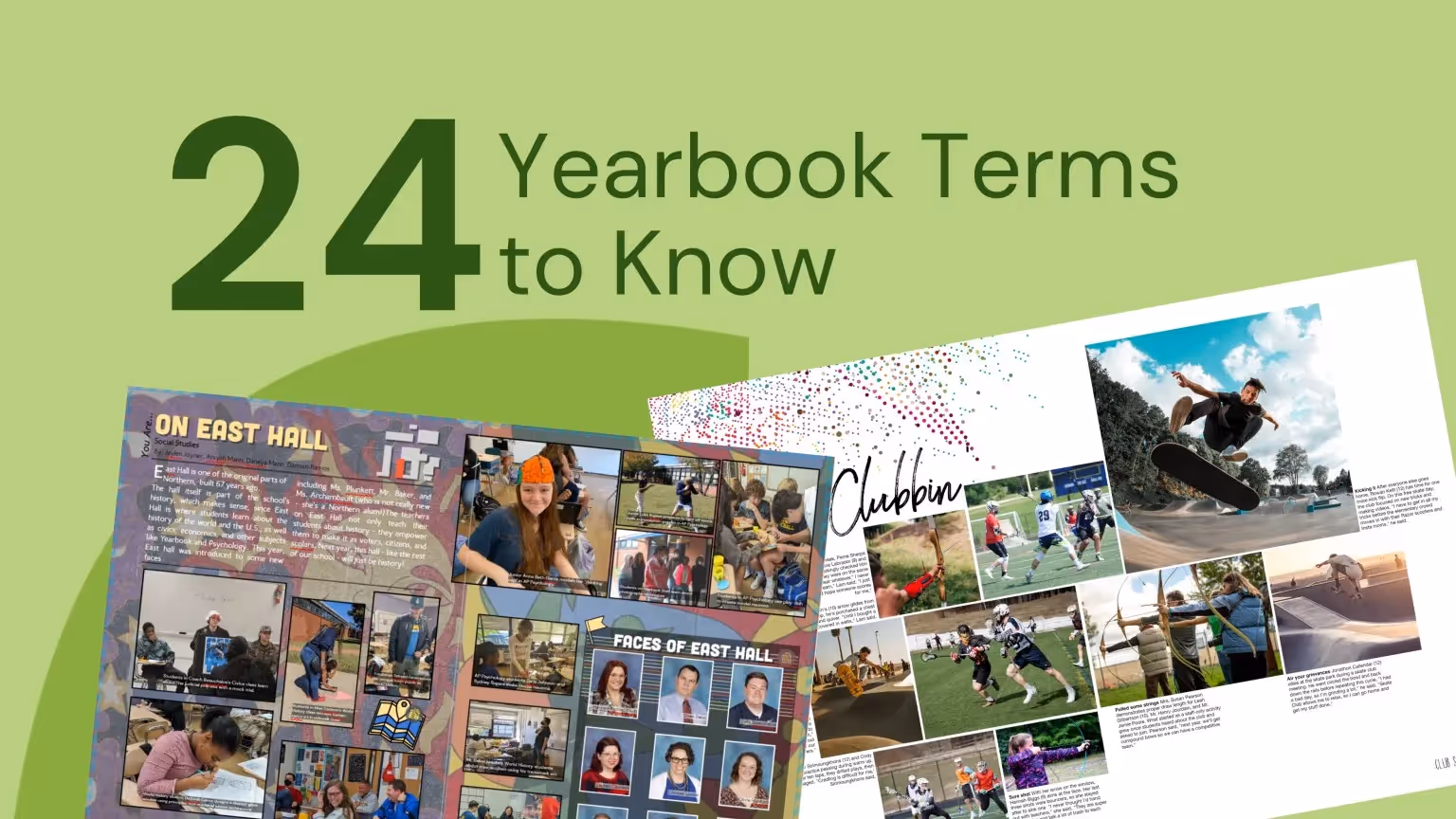
Teaching yearbook: 24 yearbook terms
Stuff. Thingamajig. Whatchamacallit.
If your day job isn’t in desktop publishing or graphic design (or teaching it), you and your yearbook team probably use those words to get across what you’re trying to say. You know what it is you’re trying to say, but you just … can’t … find … the yearbook terms you need to do it in a way that makes sense to everyone.
So, you use filler that causes more confusion than clarity.
We’ve talked to a bunch of yearbook advisers, and a lack of proper yearbook vocabulary is a common problem. Especially when new people join the team. We figured, then, that it would be good to pull together a list of yearbook terms everyone needs to know (and a whole bunch more that just about everyone should know).
Study up, and you could be skipping this type of painful conversation in nearly no time at all:
“We need to get that thing on page 8 done, so we can get those pages proofed?”
“What stuff?”
“You know… the… the… It’s right next to the whatchamacallit.”
“I’m not really sure what you’re talking about… You mean the thingamajig that I was working on?”
(Ouch.)
And, besides avoiding a conversation as bad and confusing as this, who doesn’t like learning new… uhh… stuff?
A List of Yearbook Terms Everyone Needs to Know
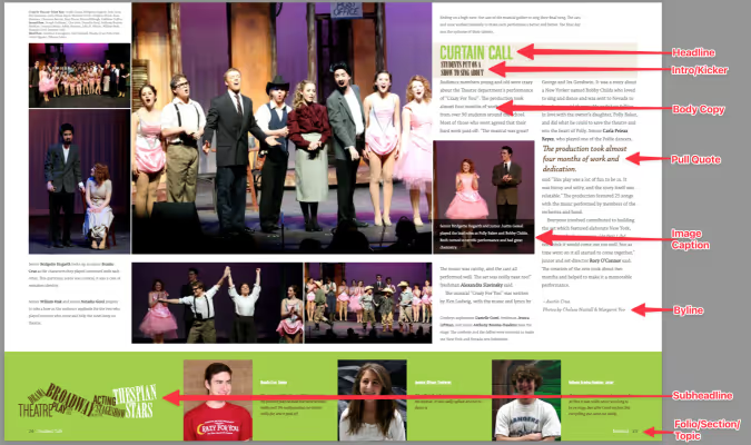
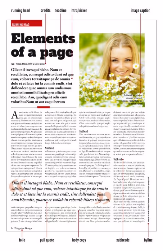
- Bleed. The bleed is extra space around your page that is intentionally printed, then trimmed by the printer. The standard bleed size is 1/8 inch, and is usually used to allow for movement the paper during printing.
- Byline. A byline is a line that gives credit to the author of a story. It can appear either at the beginning or end of copy.
- Candids. Candids are photos that are captured without posing your subjects or distracting them from what they’re doing. They’re great for capturing everyday aspects of school life.
- Caption. A caption is a page element that explains the who, what, when, where, and why of a photo. Captions can also be used in the yearbook to tell readers something they would not otherwise know when looking at a photograph.
- Copy. Copy is the content of an article or news element. (Basically, it’s the words used to tell a story.)
- Copy Editing. Copy editing is work done to improve the format, style, and accuracy of a story. Though copy editing can involve correcting grammar and spelling, the primary reason to copy edit a story is to improve its clarity and ensure it aligns with a yearbook’s style.
- Dominant Element. A dominant element is the element on a page that immediately attracts a reader’s attention.
- Drop Cap. Drop cap is a design treatment used to introduce copy. It is distinguishable by a large letter (usually capital) that appears at the beginning of a text block and has the depth of two or more lines of regular text.
- Folio. Folio is page numbering that appears on the outside portion of pages, usually at the bottom. A folio may also contain the title of your yearbook or your section title.
- Gutter. No, it’s not attached to your roof. And, no, you don’t have to keep your mind out of it. When it comes to yearbooks, a gutter is the space between two facing pages (an important place to keep clear, because, when a yearbook is bound, the space between the pages shrinks). It’s best to apply a 1/2 inch margin to both sides of the gutter, or 1 inch in total.
- Headline. A headline is a line (or lines) of large type used to introduce the most important fact to the reader.
- Kerning. Kerning is the space between two letters that are next to one another. You can adjust the kerning to avoid gaps in your text (for example: if character pairs are spaced too far apart).
- Ladder. A ladder is a chart that represents the pages in a yearbook. It can be helpful when planning section placement and page content.
- Layout. A layout is a design plan for a page or spread in a yearbook. It accounts for the size and position of all elements on a page.
- Lead (or Lede). The lead is the introductory portion of a news story; usually the first sentence or paragraph. It relays to the reader the most essential information. In traditional journalism, it is spelled “lede.”
- Leading. Leading is the space between lines of text. You can adjust the leading of a text block to increase its readability or to squeeze more text onto a page. (Rule of thumb: The more space there is between lines of text, the easier that text is to read.)
- Modules. A module, also called a “mod,” is, essentially, the yearbook equivalent of a sidebar. It is a smaller amount of text with accompanying photos that supports a page’s main story.
- Portraits. Portraits are posed photographs of individuals. These photos are the photos that are usually being referred to when someone is talking about their “yearbook photo” or “school portrait.”
- Proof. A proof is a copy of the yearbook’s final pages that are sent to the staff for a final review and approval.
- Proofreading. Proofreading is used to catch any typos before sending a yearbook to print. It’s the last read of the yearbook and should be done on a printed proof.
- Pull Quote. A pull quote is a phrase or quote pulled from a story and used as a graphic element. It highlights a key topic or point in a story and is usually placed in larger, more distinctive type.
- Spread. A spread refers to two pages that face each other in a yearbook.
- Theme. A yearbook theme is an idea or concept that’s used to tie together the various sections and stories found throughout the yearbook.
- Template. A template is a predesigned layout that helps maintain visual consistency throughout a book. Different sections may have different templates.
Some More Yearbook Vocabulary For Overachievers
- CMYK. CMYK is a color model traditionally used in printing. Printers use subtractive color, or CMYK, where cyan, magenta, yellow, and black inks are applied to paper. The color of the inks is altered by subtracting (or absorbing) light wavelengths.
- DPI. The abbreviation for dots per inch, DPI is a measurement of an image’s resolution. The higher the DPI of an image, the clearer and more detailed that image will print.
- Golden Ratio. The Golden Ratio is a mathematical rule that’s used to repeatedly create visually pleasing designs. In yearbooks, you can use it to create different layouts, and it’s best to visualize the Golden Ratio as a rectangle with its length (side B) being roughly one and a half (1.618) times its width (side A).
- Monospaced Fonts. Monospaced fonts are fonts that have equal width for each letter. They can be serifed or sans serifed.
- Orphans. Orphans aren’t just in Annie or Charles Dickens’ books. In yearbook publishing, they’re also a word, part of a word, or a small line of text that falls at the end of a paragraph on a line by itself. These “hangers” (if you will) create unwanted white space and are distracting to readers.
- Pica. A pica is a unit of measurement, often used to determine the width of an element on a yearbook page. It is equal to ⅙ inch (or 12 points).
- Resolution. Resolution is the sharpness of an image. In print, resolution is measured in DPI. In digital, it is measured in pixels.
- RGB. RGB is a color model traditionally used in digital publishing. Colors are created in the RGB color model by adding red, green, and blue pixels to a black base.
- Rule of Thirds. The “rule of thirds” is a guideline in photography that encourages a photographer to move the primary subject of the photograph away from the center.
- Sans Serif Fonts. Sans serif fonts lack the decorative elements found on serif fonts. They’re great for digital projects, since they are easy to read on computer screens, but are also very popular for printed headlines.
- Serif Fonts. Serif fonts have small decorative elements (called serifs) at the end of letter strokes. These fonts are more legible at smaller sizes and are great to use in large bodies of text, like the body copy in your yearbook.
- Style Guide. A style guide is a set of standards used to create consistency in your yearbook. Also known as a style sheet, it can be used for typographic, graphic design, and copywriting.
- White Space. White space, also known as negative space, is the empty area around an object. White space can be used to draw the viewer into a particular spot in the design. It prevents content from overcrowding the page.
- Widows. A widow is a word or line of text that sits alone at the start of a column or page. They’re similar to orphans in that they are distracting to readers.
Got ‘em?
Though it might seem like a waste to study these terms, we promise it’ll prove helpful in the long run. Just imagine how much more sense it will make to talk about finishing your “mod” (instead of “thingamajig”) or how you need to find someone to do “copy editing” (instead of “editing all this stuff”).
Test your new-found knowledge with our quiz.


How to take great yearbook photos with an iPhone
here’s an old adage in photography that your best camera is the one you have with you. For most of us now, that “one you have with you” is your smartphone.
Even though the quality of smartphone photography has increased significantly over the last couple years, the cameras in our iPhone, Android and Windows phones aren’t at the level of those cameras professional photographers use.
But that doesn’t mean we can’t teach you how to take great yearbook photos using your iPhone. You just need to follow a couple basic rules. (For more in-depth yearbook photo guides and ideas, visit our Photography Tips and Tutorials board on Pinterest.)
Hold With Two Hands
The steadier you are able to keep your phone, the less likelihood for blurry photos or accidentally out-of-focus elements.
Smartphone cameras are getting better at image stabilization, but you don’t want to rely on that technology. Instead, ensure your camera is steady by taking the responsibility into your own hands. Literally.
Several companies are now making tripods for smartphones. If you’re a photo enthusiast, they’re worth the purchase. They’re relatively inexpensive, easy to pack away and work well. If you’re just looking to get a good shot, however, you can do one of two things: find a level, sturdy foundation on which to place your phone or hold your phone using two hands.
Though it may take a few extra moments to place your phone or steady the camera with both hands, either option works far better than aiming with one hand – especially in poor light.
Do Not Zoom
Smartphone cameras feature a digital zoom – something that’s different from a traditional camera lens. The “digital” means the camera is actually “zooming in” on the photo itself, not the subject that you are shooting.
That “zoom” is really just a crop of the photo, meaning you’ll lose data in the photo and end up with an image that is less clear and less sharp than an image that was taking without zooming.
If you are looking to get a closer shot using a smartphone camera, do you best to get closer. If you can’t do that (say you’re at a soccer game), think about different photos you might be able to take. You could capture the sideline reaction to a good play, a more “artsy” shot of the action from behind the goal and other creative takes on a soccer game.
And, if you’re truly looking for in-uniform action shots, consider using practice, warm-ups or post-game activities as a photo shoot.
Keep Shooting
With Apple’s latest change to its iPhone operating system, it updated the camera software to take up to 10 photos per second. Other smartphones offer the same “burst mode” capabilities and they’re great to use in almost any situation.
Whether it is an action shot at the soccer game, the school play or the choir, you’ll never know when a “burst mode” shot will capture something you otherwise might not have.
If using the “burst mode,” lock your focus and exposure. That way, you’ll have a consistent depth of field and exposure.
Use The Grid
We’ve already covered several tips for composing great photos. Most smartphone cameras will help you with this effort by providing you a grid.
Turn it on when you’re really focused on composition. The grid will help you align your photo and balance your shot – both of which are especially important when trying new angles and invoking the rule of thirds.
Avoid The Flash
The flashes on smartphone cameras often produce harsh results that look far different than the scene you are experiencing.
To avoid this, turn off your flash and see what your results look like. Most smartphone cameras are getting better at shooting in low light. You might need to touch up your photo, but your shots should be generally useable.
If they’re not, and if you need some extra lighting, borrow someone else’s phone.
Instead of using the flash on your phone, use the flashlight on their phone to light the scene. You’ll have better control of the light, create dramatic effects and produce better photos.
Download Apps
Instagram’s explosion in popularity has opened up most people’s eyes to the “magic” a filter can provide to photograph.
While Instagram is the undisputed leader in popularity, there are several other filter apps that can create different feels for your photos. We’ve gotten good results from VSCOcam and Camera+. Consider checking out the “contenders” in addition to the champ. (Try to share this yearbook idea with your entire school.)
Whichever you use, make sure you save a version of the photo to your phone.
Have you been using smartphone photos in your yearbook? What has been your secret to great photos?

These yearbook photo tips will have your book looking better in two minutes or less
The easiest way to improve your yearbook photography is to spend two minutes editing your photos before you add them to your book. That’s because, in two minutes, you can make the two biggest improvements to any photo you have: composition and white balance.
It doesn’t matter if you or your staff purposely took the photo for use in the yearbook or if a parent snapped a shot on their phone and only gave it to you once you asked for help filling your book’s pages. If you spend one minute on each of these areas of improvement, you’ll have a yearbook photo that’s way, way better than the one you started with. We guarantee it.
In this blog post, we’ll walk you through why you should spend two minutes using these yearbook photo tips for composition and white balance, what you should think about before you make any changes, and how you can easily make those edits.
Why You Should Edit Using These Yearbook Photo Tips
The normal process for editing yearbook photos can be a total drain on your time. The results are worth it, because, well, let’s face it: not-so-great yearbook photography makes a yearbook seem not so great.
Great photos, on the other hand, can evoke emotion, tell a story, and captivate an audience—all at the same time. And sometimes, a photo needs a bit of editing to get there. Cropping your photos for better composition can eliminate distractions and correcting the color to improve white balance and lighting can help your photos stand out more.
Spend enough hours eking every last ounce of potential out of a photo, though, and you’re bound to wonder whether it’s all worth it.
If that’s you, or if you’re totally pressed for time, you never need to get to that point.
That’s because two of the quickest, easiest editing techniques you can use will get your photo more than 90% of the way to its full potential.
If you want to keep going for that final 10%, go right ahead.
But if you’re pressed for time or stressed about deadlines, crop your photo to improve its composition, use color correction to improve white balance, and move on to your next photo. Because, when you have hundreds of photos you want to add to your yearbook, 90% of full potential is pretty darn good.
What to Think About Before Using Our Yearbook Photo Tips
Just using our two yearbook photo tips will give you great photos and save you a bunch of time. But you can always save more.
The trick lies in the old “work smarter, not harder” saying.
Here’s what you need to think about to save yourself even more time and sanity during your photo editing process:
- If your yearbook publishing software lets you crop your photos after you’ve added them to your pages, wait until then to take that step. Doing so will increase your flexibility when it comes to adjusting layouts on the fly.
- Start with an idea of how many photos you need for your book. This sounds daunting, but 1) it’s not, and 2) it’s super helpful to pre-plan and know what you need to make your pages awesome. If you’re using templates or master pages, this is a total breeze.
- Review the photos you have and start making two lists: likely to use, not likely to use. How you make these depends on how you organize your photos, but here’s one way that works for just about every scenario: Rename all “likely to use” photos with “a_” at the beginning of the file name and all “not likely to use” photos with “b_” at the beginning. That way, everything’s clearly labeled and, if you sort by name, your best photos show up first.
- Edit your “likely to use” photos. If you’ve got enough, your work is done. Sweet, right? If you’re still short some yearbook photos, you can go back through and find the best of the “not likely to use” photos or start hassling your school community to send you great photos.
If you’re cropping your photos before adding them to yearbook pages, you’ll also want to keep this in mind: You’ll need a variety of photo constraints and orientations.
Which is a perfect transition to…
Yearbook Photo Tip #1: Composition
We’ve talked before about the three tips you should keep in mind when composing yearbook photos, but that doesn’t guarantee you’re always going to nail them. Or that people who are giving you pictures will, either.
Sometimes, the only way to save a yearbook photo is to crop it.
Take this before-and-after as an example:


There’s a lot of good stuff going on with the photo on the left: It’s well lit, the students’ faces are clear, and it’s easy to identify where they are.
The problem?
It’s the same one that haunts many yearbook photos: Drop it into a spread or collage and it’s not exactly going to be easy to identify these students. They were too far away from the camera when the photo was taken, and there’s just too much empty space around them.
You can solve that by tightening the composition. Notice how much more the two students fill the frame in the photo on the right?
That’s exactly what we’re going for.
When you’re cropping yearbook photos, keep these two tips in mind:
- Fill the Frame. What matters most in a yearbook photo is capturing the person or people who are the subjects. Make sure to keep the attention on them. As a photographer, the best way to do that is to get very, very close to your subject. If that didn’t happen, though, you can crop out the empty space surrounding your subjects.
- Use the Rule of Thirds. If the “rule of thirds” is a new yearbook term to you, it’s basically a guideline in photography that encourages a photographer to move the primary subject of the photograph away from the center. The easiest way to do this is to use a grid overlay function while cropping, and move your subject to one of the intersecting set of lines.
Of course, we’d be slacking in our advice if we didn’t mention that, no matter what, you should be cropping with a purpose. Or if you want to frame this advice slightly differently: Don’t crop for the sake of cropping. The new constraints for your photo should make your photo better or make your page layout better. If your photos are already great, and they look great in your layout, you can skip cropping.
Yearbook Photo Tip #2: White Balance
Ever feel like your photos don’t really look like the breath-taking scenes you saw with your naked eye? We feel you.
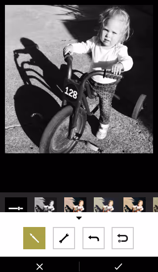
Outside of cropping your photo, the easiest way to restore some of that magic is to make the colors of your yearbook photo more vivid and more lifelike. And you can do that by using the levels tool in your editing software.
To do that, though, you need to know some basics about that tool and histograms, the chart associated with it.
Here’s the crash course version:
A histogram is a graphical representation of your photo’s color distribution. The dark aspects of your photo are plotted on the left of the graph; the light aspects of the photo are plotted on the right. When you’re reading a histogram, you want to look for sharp peaks at either end of the scale. A sharp peak on the left side of the graph indicates underexposure, a peak on the right indicates overexposure.
When you’re looking to tweak the color composition of your photo, it’s those peaks you want to be looking for.
Here’s the quickest — and easiest — way to use a histogram to improve your photo’s color:
- Drag your black slider (located on the left of the histogram) to the right until the chart shows blacks being registered (or the beginning first upward slope).
- Then drag your white slider (located on the right of the histogram) to the left, until the chart shows no more whites being registered (or the end of the last downward slope).
These two steps take about a minute to complete, and the result is awesome. You’ll see an improvement in contrast, richer and deeper colors, and an enhanced lightness that reveals hidden aspects of photos that are obscured by overly bright areas.
Here’s an example:


Notice how the red in the stairs and the fire extinguisher really pops in the one on the right? It’s less muted and, since the reds are deeper, it makes the person on the stairs stand out more, as well. We dig this change.
And really, that’s it.
It doesn’t matter who takes the photos. If you can spare two minutes and follow these yearbook photo tips, you can make your photos so much better by improving composition and white balance.
Yearbook fonts can make or break your yearbook design
owhere in yearbook design can a series of small or minor changes add up to create a dramatic difference as easily as yearbook fonts. Really, it’s true. Science says so: A Microsoft researcher and MIT professor found in two different studies that good typography can make a person feel better while reading and can actually make them think they’re reading for shorter amounts of time. Moral of the story? Pay attention to your yearbook fonts. Your readers will be happier, and they’ll spend more time with their yearbooks.
In this all-purpose guide, we’ll introduce you to the basics of fonts and typography, how to create a font strategy for your yearbook (which includes picking yearbook fonts, pairing them, and setting their size), and how to make the yearbook fonts you choose look great on your pages.
- The Basics of Yearbook Fonts
- How to Create Your Yearbook Font Strategy
- How to Make Your Yearbook Fonts Look Good on Page
The Basics of Yearbook Fonts
In addition to making us feel what we are reading, fonts can actually speed up—or slow down—how quickly you can read. Science has our backs once again.
Readability is an important factor when setting your yearbook style guide. On printed paper—like yearbooks—the fastest, easiest-to-read fonts are usually serifs. On computer screens, like on this blog, the fastest, easiest-to-read fonts are usually sans serifs.
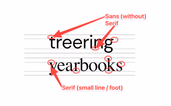
Sans Serif Fonts
Sans serif fonts are different from serif fonts in that they don’t have decorative elements at the end of the strokes.
Sans serifs are more commonly used online and in digital projects since they’re easier to read on computer screens. Because so many people read on computer—and phone—screens, though, sans serifs are more familiar to readers and growing more popular in print. They’re also considered to be a little hipper than a serif.
Some of the most common sans serif fonts include:
- Arial
- Helvetica (period)
- Calibri
- Open Sans
- Gill Sans
There are, of course, some other fonts, like scripts and decorative fonts. While they can be plenty attractive, they’re often not great for legibility—especially in large blocks of text. If you’re planning to use something a little different, it’s best to reserve those scripts and decorative fonts for headlines and your folio.
Serif Fonts
Serif fonts have small, decorative elements at the end of the strokes on the letters. They’re more legible at smaller point sizes and are generally considered more conservative (think newspapers and academic journals). Like we mentioned above, they’re also easier to read on a printed page.
Some of the most common serif fonts include:
- Times New Roman
- Garamond
- Georgia
- Baskerville
- Cambria
How to Create Your Yearbook Font Strategy
We already mentioned that fonts can change a reader’s mood, make text easier to comprehend, and speed up the process of actually reading while making it more enjoyable.
To do that, ask yourself these questions:
- How do you want people to feel when they’re reading your yearbook?
- Do you want your yearbook to look buttoned-up or trendy?
- Should the fonts you use be familiar to your readers?
- If you were to describe the look and feel of your designed yearbook pages, what words would you use?
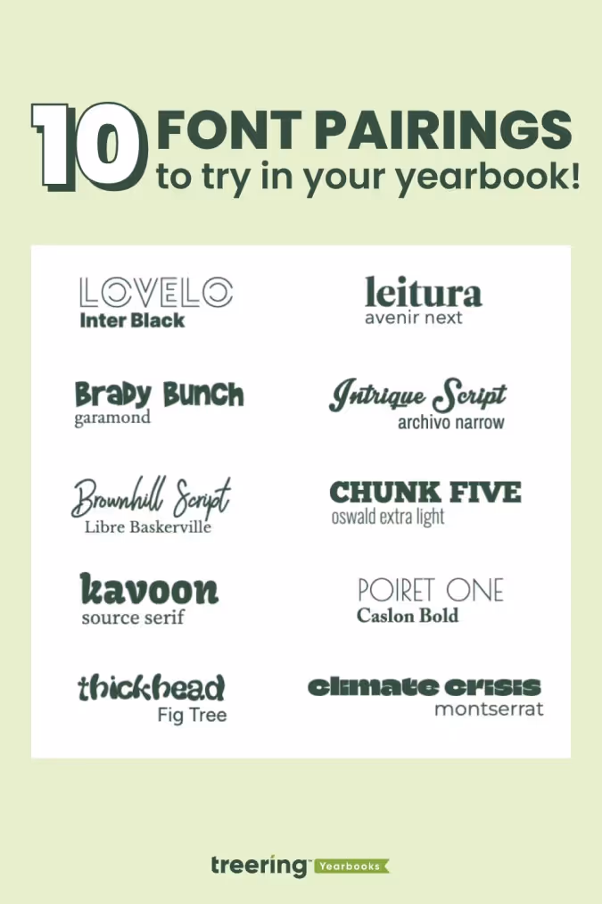
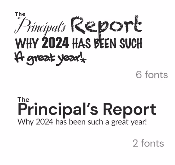
The answers will give you a strategy for your yearbook fonts, something that will help you cut down your potential choices to something more manageable. With thousands of fonts in existence, and hundreds in the Treering app, it’s easy to get overwhelmed. Your total number of yearbook fonts should pretty much always be two, and shouldn’t really exceed three.
How Many Fonts Should I Use in the Yearbook?
Consistency is key for a balanced yearbook. Fonts are no exception. It’s better to use a couple of (literally two) well-chosen fonts than to have so many that they distract from your design. By limiting your yearbook to two (max three) fonts and assigning them distinct roles, you establish a precedent.
Create a style guide where you’ll be using the fonts you end up choosing. Your style guide should include every printed element of your yearbook like headlines, sub-headlines, body copy, photo captions, pull quotes, and page numbers. Once you’ve listed out everything, you’ll want to bucket these items into two groups:
- Theme elements: This is the group for headlines, sub-heads, and folio information (like page numbers, book title, and section title).
- Copy elements: This is the group for narrative text, photo captions, and pull quotes.
Historically, serif fonts have been used for copy elements, because they’re more legible in large bodies of text. (This adviser loves Garamond.) Sans-serif and decorative fonts, on the other hand, have historically been used for theme elements, since they’re generally considered to be more flexible.
If you’re to follow those historical queues, your font palette may look something like this:
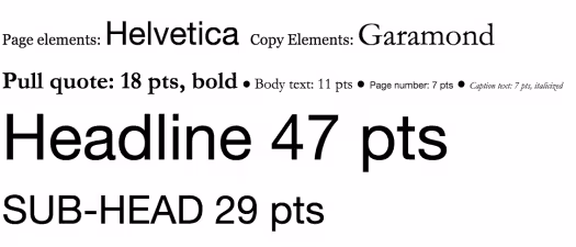
Two things to note here:
- First, just because folks have historically chosen serifs for copy elements and sans serifs for page elements, that doesn’t mean you have to.
- Second, you probably noticed the font sizes here. The best way to determine the various size elements is to use a scale.
When someone opens the book and focuses on a message, they’ll know what a headline is going to look like and what a caption is going to look like. They don’t need to think. Consistency allows your message to get right to the reader without distraction.
Setting Your Font Sizes
Because your yearbook fonts can vary in legibility so much, you’ll want to determine a set of sizes that work best for the fonts you pick—and for your readers. Do that by setting a scale.
A font scale is an organized approach to increasing or reducing your font size, based on where that font is going. It’s easy to do, and once it’s set up, it’ll save you a ton of time.
To create one:
- Pick what you consider your most important element. For the sake of an example, let’s say “body copy.”
- Find a font size that feels nice and legible. Rule of thumb: Something between 10 and 12 pts usually works best for body copy. We’ll split the difference and use 11 for this example.
- Multiply—and divide—that font size by a predetermined ratio to get the font sizes for your other elements. There are a lot of ratios that typographers and designers use when scaling fonts, but one of the oldest is the Golden Ratio (we’ve been crushing on it for a long time ourselves). The Golden Ratio roughly translates to 1.618. So, you’ll use that number to scale up—and down—until you find the right sizes for each of your elements.
At this point, you’ve got a fully developed yearbook font strategy. Document it somewhere. That way, your team will have access to it when designing pages.
How to Make Your Yearbook Fonts Look Good on Page
The cool thing about yearbook fonts is that you can slightly manipulate the way you use them to create a variety of different looks.
Justifying Your Text
One of the easiest, and most impactful, ways to create different looks is to play with your font’s justification. Justification is basically a fancy term for how you align your text.
There are a few different ways you can align text and different reasons why you might choose one style over another:
- Left Align. Your text is flushed with the left-hand side of the margin. This is pretty much a default these days, since left-aligned tends to be easier to read, and has a reputation as being more modern.
- Center Align. Your text is in the center of your margin, so it’ll end up surrounded by a good amount of white space. This helps draw attention to your text, so you’ll want to use this when you have something you want the reader to focus on, like, say, a headline.
- Right Align. Your text is flushed with the right-hand side of the margin. Given the fact that readers read from left to right, a right-aligned font block has a distinctive look. Some might even say unnatural. But if you use it correctly, it’ll look great. Use it for a pull quote to separate that block of text from the rest of the page.
- Full Justification. Your text is aligned to both margins. It’s a very traditional look that’s still used in legal briefs, court decisions, and things like that. If you’re looking for something really buttoned-up, this would work well for you (especially if paired with a serif font). Beware, though: If you justify your text, you’ll probably end up with some weird spacing between words.
Here’s an example of a page that features just about all of them:
Accenting Your Text
One of the best ways to make your text stand out (without switching fonts) is to punch it up with accents. You can use drop caps, accent them with graphic elements like highlighting, and stack your text to create more compelling visuals.
Here are a few headline examples to help you visualize the possibilities.
Drop Cap
Highlighting Text
Stacking Your Text
Remember, fonts impact the way people feel when they’re reading your yearbook, so have fun selecting the right ones!