Treering Blog

Looking for inspiration, design tricks, how to make a great cover, promoting your yearbook and engaging your community?

August 18, 2025

New 2025 yearbook themes inspired by you

Like what you see?

Get a free book of yearbook ideas
Get free book

Most popular

August 12, 2025

New school year, new us

May 20, 2025

Traditional vs. Trendy

May 6, 2025

The 5 game-changing blog posts you’ve (somehow) been missing

January 14, 2025

How to build a yearbook staff manual

June 11, 2024

4 ways to simplify yearbook creation

May 23, 2023

5 yearbook volunteers to recruit

Subscribe to our blog

Subscribe

Most recent

Thank you! Your submission has been received!
Oops! Something went wrong while submitting the form.

How to take great yearbook photos with an iPhone

here’s an old adage in photography that your best camera is the one you have with you. For most of us now, that “one you have with you” is your smartphone.

Even though the quality of smartphone photography has increased significantly over the last couple years, the cameras in our iPhone, Android and Windows phones aren’t at the level of those cameras professional photographers use.

But that doesn’t mean we can’t teach you how to take great yearbook photos using your iPhone. You just need to follow a couple basic rules. (For more in-depth yearbook photo guides and ideas, visit our Photography Tips and Tutorials board on Pinterest.)

Hold With Two Hands

The steadier you are able to keep your phone, the less likelihood for blurry photos or accidentally out-of-focus elements.

Smartphone cameras are getting better at image stabilization, but you don’t want to rely on that technology. Instead, ensure your camera is steady by taking the responsibility into your own hands. Literally.

Several companies are now making tripods for smartphones. If you’re a photo enthusiast, they’re worth the purchase. They’re relatively inexpensive, easy to pack away and work well. If you’re just looking to get a good shot, however, you can do one of two things: find a level, sturdy foundation on which to place your phone or hold your phone using two hands.

Though it may take a few extra moments to place your phone or steady the camera with both hands, either option works far better than aiming with one hand – especially in poor light.

Do Not Zoom

Smartphone cameras feature a digital zoom – something that’s different from a traditional camera lens. The “digital” means the camera is actually “zooming in” on the photo itself, not the subject that you are shooting.

That “zoom” is really just a crop of the photo, meaning you’ll lose data in the photo and end up with an image that is less clear and less sharp than an image that was taking without zooming.

If you are looking to get a closer shot using a smartphone camera, do you best to get closer. If you can’t do that (say you’re at a soccer game), think about different photos you might be able to take. You could capture the sideline reaction to a good play, a more “artsy” shot of the action from behind the goal and other creative takes on a soccer game.

And, if you’re truly looking for in-uniform action shots, consider using practice, warm-ups or post-game activities as a photo shoot.

Keep Shooting

With Apple’s latest change to its iPhone operating system, it updated the camera software to take up to 10 photos per second. Other smartphones offer the same “burst mode” capabilities and they’re great to use in almost any situation.

Whether it is an action shot at the soccer game, the school play or the choir, you’ll never know when a “burst mode” shot will capture something you otherwise might not have.

If using the “burst mode,” lock your focus and exposure. That way, you’ll have a consistent depth of field and exposure.

Use The Grid

We’ve already covered several tips for composing great photos. Most smartphone cameras will help you with this effort by providing you a grid.

Turn it on when you’re really focused on composition. The grid will help you align your photo and balance your shot – both of which are especially important when trying new angles and invoking the rule of thirds.

Avoid The Flash

The flashes on smartphone cameras often produce harsh results that look far different than the scene you are experiencing.

To avoid this, turn off your flash and see what your results look like. Most smartphone cameras are getting better at shooting in low light. You might need to touch up your photo, but your shots should be generally useable.

If they’re not, and if you need some extra lighting, borrow someone else’s phone.

Instead of using the flash on your phone, use the flashlight on their phone to light the scene. You’ll have better control of the light, create dramatic effects and produce better photos.

Download Apps

Instagram’s explosion in popularity has opened up most people’s eyes to the “magic” a filter can provide to photograph.

While Instagram is the undisputed leader in popularity, there are several other filter apps that can create different feels for your photos. We’ve gotten good results from VSCOcam and Camera+. Consider checking out the “contenders” in addition to the champ. (Try to share this yearbook idea with your entire school.)

VSCOcam is a Solid iPhone Photo App

Whichever you use, make sure you save a version of the photo to your phone.

Have you been using smartphone photos in your yearbook? What has been your secret to great photos?

These yearbook photo tips will have your book looking better in two minutes or less

The easiest way to improve your yearbook photography is to spend two minutes editing your photos before you add them to your book. That’s because, in two minutes, you can make the two biggest improvements to any photo you have: composition and white balance.

It doesn’t matter if you or your staff purposely took the photo for use in the yearbook or if a parent snapped a shot on their phone and only gave it to you once you asked for help filling your book’s pages. If you spend one minute on each of these areas of improvement, you’ll have a yearbook photo that’s way, way better than the one you started with. We guarantee it.

In this blog post, we’ll walk you through why you should spend two minutes using these yearbook photo tips for composition and white balance, what you should think about before you make any changes, and how you can easily make those edits.

Why You Should Edit Using These Yearbook Photo Tips

The normal process for editing yearbook photos can be a total drain on your time. The results are worth it, because, well, let’s face it: not-so-great yearbook photography makes a yearbook seem not so great.

Great photos, on the other hand, can evoke emotion, tell a story, and captivate an audience—all at the same time. And sometimes, a photo needs a bit of editing to get there. Cropping your photos for better composition can eliminate distractions and correcting the color to improve white balance and lighting can help your photos stand out more.

Spend enough hours eking every last ounce of potential out of a photo, though, and you’re bound to wonder whether it’s all worth it.

If that’s you, or if you’re totally pressed for time, you never need to get to that point.

That’s because two of the quickest, easiest editing techniques you can use will get your photo more than 90% of the way to its full potential.

If you want to keep going for that final 10%, go right ahead.

But if you’re pressed for time or stressed about deadlines, crop your photo to improve its composition, use color correction to improve white balance, and move on to your next photo. Because, when you have hundreds of photos you want to add to your yearbook, 90% of full potential is pretty darn good.

What to Think About Before Using Our Yearbook Photo Tips

Just using our two yearbook photo tips will give you great photos and save you a bunch of time. But you can always save more.

The trick lies in the old “work smarter, not harder” saying.

Here’s what you need to think about to save yourself even more time and sanity during your photo editing process:

  • If your yearbook publishing software lets you crop your photos after you’ve added them to your pages, wait until then to take that step. Doing so will increase your flexibility when it comes to adjusting layouts on the fly.
  • Start with an idea of how many photos you need for your book. This sounds daunting, but 1) it’s not, and 2) it’s super helpful to pre-plan and know what you need to make your pages awesome. If you’re using templates or master pages, this is a total breeze.
  • Review the photos you have and start making two lists: likely to use, not likely to use. How you make these depends on how you organize your photos, but here’s one way that works for just about every scenario: Rename all “likely to use” photos with “a_” at the beginning of the file name and all “not likely to use” photos with “b_” at the beginning. That way, everything’s clearly labeled and, if you sort by name, your best photos show up first.
  • Edit your “likely to use” photos. If you’ve got enough, your work is done. Sweet, right? If you’re still short some yearbook photos, you can go back through and find the best of the “not likely to use” photos or start hassling your school community to send you great photos.

If you’re cropping your photos before adding them to yearbook pages, you’ll also want to keep this in mind: You’ll need a variety of photo constraints and orientations.

Which is a perfect transition to…

Yearbook Photo Tip #1: Composition

We’ve talked before about the three tips you should keep in mind when composing yearbook photos, but that doesn’t guarantee you’re always going to nail them. Or that people who are giving you pictures will, either.

Sometimes, the only way to save a yearbook photo is to crop it.

Take this before-and-after as an example:

yearbook photo tips 1: crop 1

yearbook photo tips 1: crop 2

There’s a lot of good stuff going on with the photo on the left: It’s well lit, the students’ faces are clear, and it’s easy to identify where they are.

The problem?

It’s the same one that haunts many yearbook photos: Drop it into a spread or collage and it’s not exactly going to be easy to identify these students. They were too far away from the camera when the photo was taken, and there’s just too much empty space around them.

You can solve that by tightening the composition. Notice how much more the two students fill the frame in the photo on the right?

That’s exactly what we’re going for.

When you’re cropping yearbook photos, keep these two tips in mind:

  • Fill the Frame. What matters most in a yearbook photo is capturing the person or people who are the subjects. Make sure to keep the attention on them. As a photographer, the best way to do that is to get very, very close to your subject. If that didn’t happen, though, you can crop out the empty space surrounding your subjects.
  • Use the Rule of Thirds. If the “rule of thirds” is a new yearbook term to you, it’s basically a guideline in photography that encourages a photographer to move the primary subject of the photograph away from the center. The easiest way to do this is to use a grid overlay function while cropping, and move your subject to one of the intersecting set of lines.

Of course, we’d be slacking in our advice if we didn’t mention that, no matter what, you should be cropping with a purpose. Or if you want to frame this advice slightly differently: Don’t crop for the sake of cropping. The new constraints for your photo should make your photo better or make your page layout better. If your photos are already great, and they look great in your layout, you can skip cropping.

Yearbook Photo Tip #2: White Balance

Ever feel like your photos don’t really look like the breath-taking scenes you saw with your naked eye? We feel you.

Outside of cropping your photo, the easiest way to restore some of that magic is to make the colors of your yearbook photo more vivid and more lifelike. And you can do that by using the levels tool in your editing software.

To do that, though, you need to know some basics about that tool and histograms, the chart associated with it.

Here’s the crash course version:

A histogram is a graphical representation of your photo’s color distribution. The dark aspects of your photo are plotted on the left of the graph; the light aspects of the photo are plotted on the right. When you’re reading a histogram, you want to look for sharp peaks at either end of the scale. A sharp peak on the left side of the graph indicates underexposure, a peak on the right indicates overexposure.

When you’re looking to tweak the color composition of your photo, it’s those peaks you want to be looking for.

Here’s the quickest — and easiest — way to use a histogram to improve your photo’s color:

  • Drag your black slider (located on the left of the histogram) to the right until the chart shows blacks being registered (or the beginning first upward slope).
  • Then drag your white slider (located on the right of the histogram) to the left, until the chart shows no more whites being registered (or the end of the last downward slope).

These two steps take about a minute to complete, and the result is awesome. You’ll see an improvement in contrast, richer and deeper colors, and an enhanced lightness that reveals hidden aspects of photos that are obscured by overly bright areas.

Here’s an example:

yearbook photo tips 2: levels 1

yearbook photo tips 2: levels 2

Notice how the red in the stairs and the fire extinguisher really pops in the one on the right? It’s less muted and, since the reds are deeper, it makes the person on the stairs stand out more, as well. We dig this change.

And really, that’s it.

It doesn’t matter who takes the photos. If you can spare two minutes and follow these yearbook photo tips, you can make your photos so much better by improving composition and white balance.  

Yearbook fonts can make or break your yearbook design

owhere in yearbook design can a series of small or minor changes add up to create a dramatic difference as easily as yearbook fonts. Really, it’s true. Science says so: A Microsoft researcher and MIT professor found in two different studies that good typography can make a person feel better while reading and can actually make them think they’re reading for shorter amounts of time. Moral of the story? Pay attention to your yearbook fonts. Your readers will be happier, and they’ll spend more time with their yearbooks.

In this all-purpose guide, we’ll introduce you to the basics of fonts and typography, how to create a font strategy for your yearbook (which includes picking yearbook fonts, pairing them, and setting their size), and how to make the yearbook fonts you choose look great on your pages.

  1. The Basics of Yearbook Fonts
    1. Sans Serif Fonts
    2. Serif Fonts
  2. How to Create Your Yearbook Font Strategy
    1. How Many Fonts Should I Use in the Yearbook?
    2. Setting Your Font Sizes
  3. How to Make Your Yearbook Fonts Look Good on Page
    1. Justifying Your Text

The Basics of Yearbook Fonts

In addition to making us feel what we are reading, fonts can actually speed up—or slow down—how quickly you can read. Science has our backs once again.

Readability is an important factor when setting your yearbook style guide. On printed paper—like yearbooks—the fastest, easiest-to-read fonts are usually serifs. On computer screens, like on this blog, the fastest, easiest-to-read fonts are usually sans serifs.

Notice the feet on yearbooks? Those are serifs.

Sans Serif Fonts

Sans serif fonts are different from serif fonts in that they don’t have decorative elements at the end of the strokes.

Sans serifs are more commonly used online and in digital projects since they’re easier to read on computer screens. Because so many people read on computer—and phone—screens, though, sans serifs are more familiar to readers and growing more popular in print. They’re also considered to be a little hipper than a serif.

Some of the most common sans serif fonts include:

  • Arial
  • Helvetica (period)
  • Calibri
  • Open Sans
  • Gill Sans

There are, of course, some other fonts, like scripts and decorative fonts. While they can be plenty attractive, they’re often not great for legibility—especially in large blocks of text. If you’re planning to use something a little different, it’s best to reserve those scripts and decorative fonts for headlines and your folio.

Serif Fonts

Serif fonts have small, decorative elements at the end of the strokes on the letters. They’re more legible at smaller point sizes and are generally considered more conservative (think newspapers and academic journals). Like we mentioned above, they’re also easier to read on a printed page.

Some of the most common serif fonts include:

  • Times New Roman
  • Garamond
  • Georgia
  • Baskerville
  • Cambria

How to Create Your Yearbook Font Strategy

We already mentioned that fonts can change a reader’s mood, make text easier to comprehend, and speed up the process of actually reading while making it more enjoyable.

To do that, ask yourself these questions:

  • How do you want people to feel when they’re reading your yearbook?
  • Do you want your yearbook to look buttoned-up or trendy?
  • Should the fonts you use be familiar to your readers?
  • If you were to describe the look and feel of your designed yearbook pages, what words would you use?

The answers will give you a strategy for your yearbook fonts, something that will help you cut down your potential choices to something more manageable. With thousands of fonts in existence, and hundreds in the Treering app, it’s easy to get overwhelmed. Your total number of yearbook fonts should pretty much always be two, and shouldn’t really exceed three.

These combos are available in the the Treering app.

How Many Fonts Should I Use in the Yearbook?

Consistency is key for a balanced yearbook. Fonts are no exception. It’s better to use a couple of (literally two) well-chosen fonts than to have so many that they distract from your design. By limiting your yearbook to two (max three) fonts and assigning them distinct roles, you establish a precedent.

Two sans serif fonts present a stronger visual than six.

Create a style guide where you’ll be using the fonts you end up choosing. Your style guide should include every printed element of your yearbook like headlines, sub-headlines, body copy, photo captions, pull quotes, and page numbers. Once you’ve listed out everything, you’ll want to bucket these items into two groups:

  • Theme elements: This is the group for headlines, sub-heads, and folio information (like page numbers, book title, and section title).
  • Copy elements: This is the group for narrative text, photo captions, and pull quotes.

Historically, serif fonts have been used for copy elements, because they’re more legible in large bodies of text. (This adviser loves Garamond.) Sans-serif and decorative fonts, on the other hand, have historically been used for theme elements, since they’re generally considered to be more flexible.

If you’re to follow those historical queues, your font palette may look something like this:

What a yearbook font palette looks like

Two things to note here:

  • First, just because folks have historically chosen serifs for copy elements and sans serifs for page elements, that doesn’t mean you have to.
  • Second, you probably noticed the font sizes here. The best way to determine the various size elements is to use a scale.

When someone opens the book and focuses on a message, they’ll know what a headline is going to look like and what a caption is going to look like. They don’t need to think. Consistency allows your message to get right to the reader without distraction.

A style guide will help you keep all of the sizes and treatments straight.

Setting Your Font Sizes

Because your yearbook fonts can vary in legibility so much, you’ll want to determine a set of sizes that work best for the fonts you pick—and for your readers. Do that by setting a scale.

A font scale is an organized approach to increasing or reducing your font size, based on where that font is going. It’s easy to do, and once it’s set up, it’ll save you a ton of time.

To create one:

  • Pick what you consider your most important element. For the sake of an example, let’s say “body copy.”
  • Find a font size that feels nice and legible. Rule of thumb: Something between 10 and 12 pts usually works best for body copy. We’ll split the difference and use 11 for this example.
  • Multiply—and divide—that font size by a predetermined ratio to get the font sizes for your other elements. There are a lot of ratios that typographers and designers use when scaling fonts, but one of the oldest is the Golden Ratio (we’ve been crushing on it for a long time ourselves). The Golden Ratio roughly translates to 1.618. So, you’ll use that number to scale up—and down—until you find the right sizes for each of your elements.

At this point, you’ve got a fully developed yearbook font strategy. Document it somewhere. That way, your team will have access to it when designing pages.

How to Make Your Yearbook Fonts Look Good on Page

The cool thing about yearbook fonts is that you can slightly manipulate the way you use them to create a variety of different looks.

Justifying Your Text

One of the easiest, and most impactful, ways to create different looks is to play with your font’s justification. Justification is basically a fancy term for how you align your text.

There are a few different ways you can align text and different reasons why you might choose one style over another:

  • Left Align. Your text is flushed with the left-hand side of the margin. This is pretty much a default these days, since left-aligned tends to be easier to read, and has a reputation as being more modern.
  • Center Align. Your text is in the center of your margin, so it’ll end up surrounded by a good amount of white space. This helps draw attention to your text, so you’ll want to use this when you have something you want the reader to focus on, like, say, a headline.
  • Right Align. Your text is flushed with the right-hand side of the margin. Given the fact that readers read from left to right, a right-aligned font block has a distinctive look. Some might even say unnatural. But if you use it correctly, it’ll look great. Use it for a pull quote to separate that block of text from the rest of the page.
  • Full Justification. Your text is aligned to both margins. It’s a very traditional look that’s still used in legal briefs, court decisions, and things like that. If you’re looking for something really buttoned-up, this would work well for you (especially if paired with a serif font). Beware, though: If you justify your text, you’ll probably end up with some weird spacing between words.

Here’s an example of a page that features just about all of them:

anatomy of a print publication
Image courtesy of piim.newschool.edu.

Accenting Your Text

One of the best ways to make your text stand out (without switching fonts) is to punch it up with accents. You can use drop caps, accent them with graphic elements like highlighting, and stack your text to create more compelling visuals.

Here are a few headline examples to help you visualize the possibilities.

Drop Cap

Highlighting Text

Stacking Your Text

Remember, fonts impact the way people feel when they’re reading your yearbook, so have fun selecting the right ones!

Yearbook design tips: The golden ratio


In Dan Brown’s popular book, The Da Vinci Code, Harvard Professor Robert Langdon sets out to solve secret codes and messages related to the golden ratio. While the book is a work of fiction, there is science to the importance of the golden ration in design.

Rumor is the Egyptians used it to build the Pyramids, Leonardo Da Vinci himself was a scholar of its applications, and modern day financial markets create models around it. Designs built around the golden ratio are said to be the most pleasing to the eyes.

So, what exactly is the golden ratio, and how does it apply to yearbook design? Without completely getting bogged down in complicated math, think of it as a rectangle with length (side B) roughly one and a half (1.618) times the width (side A).

In an interview in Science Daily, Duke University professor, Adrian Bejan, explains why the golden ratio is so pervasive in art and design:

When you look at what so many people have been drawing and building, you see these proportions everywhere. It is well known that the eyes take in information more efficiently when they scan side-to-side, as opposed to up and down.

Bejan goes on to explain that animals have evolved their vision to scan for danger from side-to-side, or along a horizontal plane. Predators and danger typically come from behind or the sides and almost never from above or below.

As animals developed organs for vision, they minimized the danger from ahead and the sides.

If you’re interested in reading more about Bejan’s connections between nature and the golden ratio, he has a fascinating blog.

There is a lot of debate surrounding the exact science behind why we gravitate towards design that follows the golden ratio, but what is known, is that we do love it. And what’s most important to us is creating more pleasing design, right? Let’s talk about a few yearbook design tips incorporating the golden ratio.

Creating a Rectangle

Let’s start with the easiest application: Building a rectangle. Choose the length of the rectangle’s short side. For this example, we’ll use 600 pixels. Now multiply 600 pixels by 1.618 to get a rectangle of 600 by 971 pixels. This rectangle follows the dimensions of the golden ratio.

Creating Golden Text Ratios

You’ll want your headlines to be in proportion to your body copy. In order to follow the golden ratio, simply multiple 1.618 by your body text size. For example, if your text is size 10, your headline will be 10 times 1.618, or size 16.
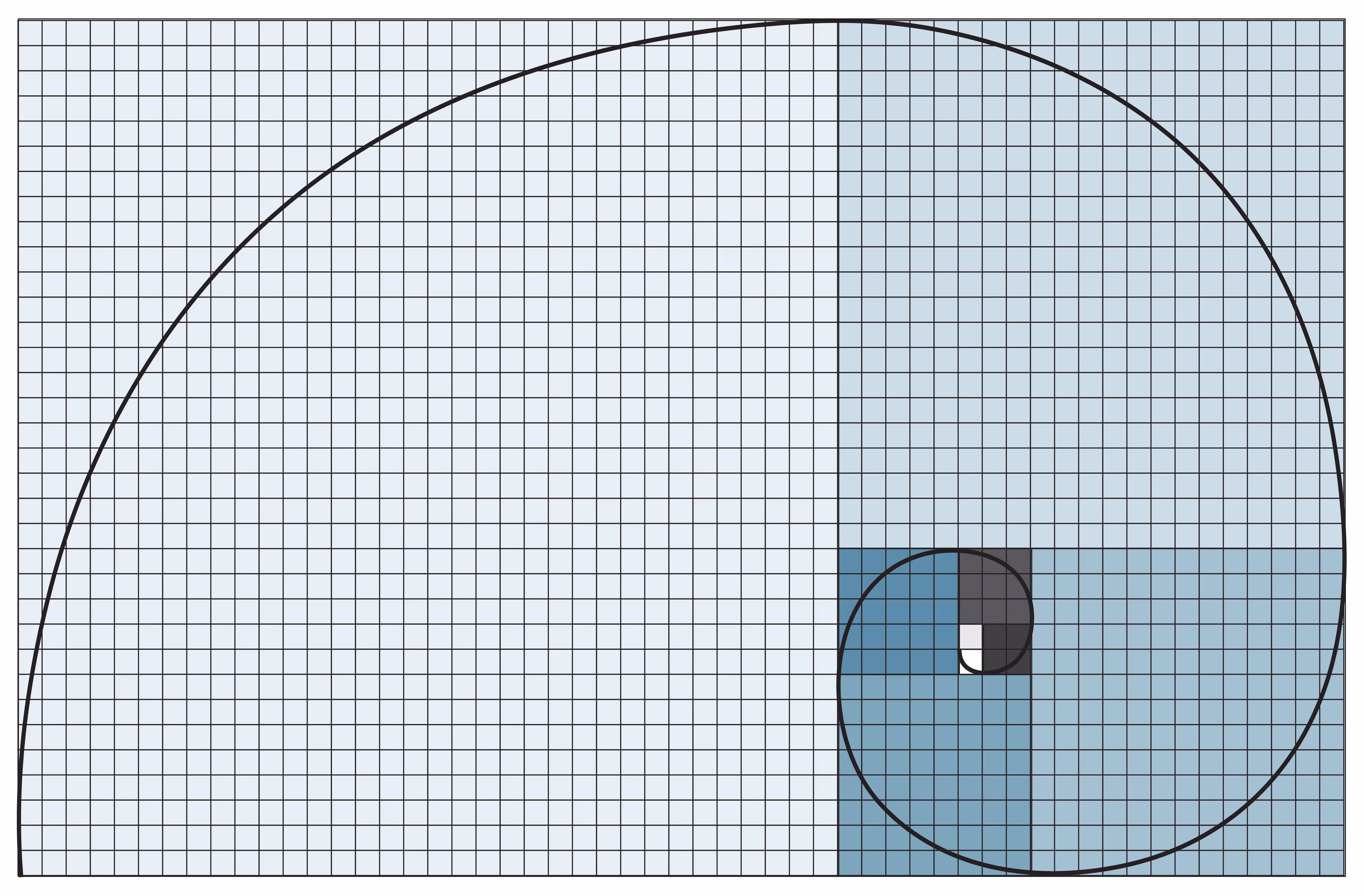
Fibonacci Sequences

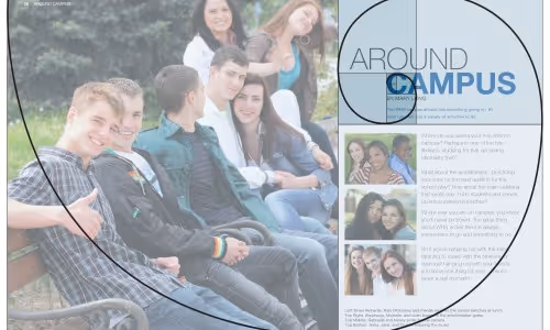
The simplest tool to creating design linked to the golden ration, is to use Fibonacci sequencing. Fibonacci sequences begin with 0 and 1. Add the previous two numbers together to get the next number in the sequence. 0,1,1,2,3,5,8,13,21…and so on. The image below is a good example of a creating Fibonacci sequence for page layout.

Example of a Fibonacci Sequence

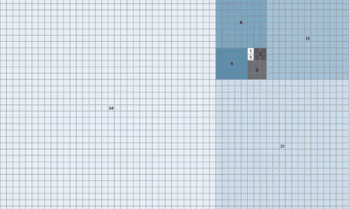
See how the page spread below, using Fibonacci sequencing, could create a very pleasing layout for your yearbook?

Yearbook page layout showing Fibonacci Sequence

Creating a yearbook style guide: Advice to Follow

A yearbook style guide is your key to maintaining a consistent visual identity throughout your project, but let’s face it—it won’t work unless you put it to use. The real challenge often lies in the creation phase. Designing a yearbook involves juggling various elements—headlines, captions, stories, photos, layouts, mods, clip art—and each demands thoughtful design decisions. Crafting a comprehensive style guide is a significant task, considering the multitude of components and choices involved. This post serves as your guide, covering what should be included in your style guide, why it’s essential, and practical tips on its creation and distribution. To make things even easier for you, we’re throwing in a free, pre-made yearbook style guide template.

What’s a Yearbook Style Guide, Anyway?

A yearbook style guide isn’t just a set of rules; it’s your playbook for presenting a cohesive and impactful yearbook. This guide, encompassing design and writing, ensures a unified style while serving as a coaching tool for your team during the layout and design process. Beyond that, it acts as a visionary tool, allowing early development of a creative direction for your book. By providing clear instructions on elements like fonts and colors, the style guide liberates your team to focus on what truly matters—developing coverage ideas, capturing compelling photos and quotes, and crafting stellar layouts—rather than being bogged down by font and color decisions. It’s the key to eliminating distractions and letting creativity flourish.

get a free yearbook style guide template

Design: The Visual Part of Your Style Guide

If you’re going to do that, though, you need to cover all your bases and not leave room for interpretation. To do that, focus on locking down font choices, color choices, and how specific aspects of your layouts should look (like whether all photos need captions and, if you have a caption, what that looks like).

Though you can include other aspects of your yearbook’s appearance, here are the three most significant areas for mistakes and inconsistencies

Choosing a Font Palette

With hundreds of fonts from which to choose, resist the temptation to use more than three. Everyone has a preference (#TeamGaramond). Here’s the thing, though. Constantly changing them impacts your readers’ ability to comprehend what’s happening, according to science. Yearbook fonts should complement each other. Ideally, you’ll have one serif font and one sans serif font. If you include a third font, you’ll probably end up with a script or something fancy.

When you pick them, define their use:

  • Reserve your primary font for page elements, like headlines, subheads, and page numbers.
  • Utilize your secondary font for copy elements like body text, captions, and pull quotes.
  • If you’re using a third font, use it sparingly and only for specific elements (e.g., a headline and subhead combination or when dedicating full pages to section dividers).

Sizes

To bring some order to your pages, you’ll want to assign each of those uses a font size. It sounds basic, but you can’t have a page number on one page being more prominent than a page number on another. That’d just be weird.

Font Colors

When selecting font colors for your style guide, prioritize readability over themes or creative expression. Begin by ensuring the words on the page are easily readable before delving into other color considerations. We’ll delve into the specifics of choosing colors shortly, but remember to keep your options streamlined, similar to your font choices. Emphasize aligning colors with font purposes to establish recognizable patterns and hierarchy for your readers.

Choosing a Color Palette

We mentioned above that focusing on readability is the first step to choosing font colors.

That applies here, too.

Now, onto the fun part: choosing colors. As a practical guideline, stick to three main colors (plus black or dark grey for body copy fonts). We get it; you might be tired of hearing this advice, but trust us, it leads to better results. For the best color palette results, use a color wheel.

A color wheel is the easiest way to see the relationship between colors.

color wheel

When using a color wheel, start with the color you like the most and plan to use the most.

From there, select split complementary colors. (To find them, take your first color, and look directly opposite it on the color wheel. Then, use the colors directly to the left and right of that. Those are split complementary colors.)

Here’s an example. Our primary color choice is at the top of the wheel, and its split complementary colors are below:

yearbook style guide: color wheel choices

If that feels intimidating, using one of Treering’s 200+ themes gives you access to a proven color palette.

Writing: The Second Part of Your Style Guide

Observing newspapers or magazines, you’ll notice consistent details, like how a reporter refers to someone on second reference (Is it “Mrs. Ybarra” or just “Ybarra,” for instance?). These consistencies aren’t mere coincidences; they’re a deliberate effort to maintain uniformity, and that’s where your style guide’s second part comes into play. Even in writing, rules are necessary to retain reader focus. News sources often adhere to The AP Stylebook, while academics and trade publishers opt for the Chicago Manual of Style.

Instead of investing excessive hours in an in-house style guide creation, we recommend leveraging the comprehensive AP Stylebook with minimal adjustments for your yearbook. Establish a basic agreement with your team on tone, jargon, and voice, using a simple outline. Ensure consistency by reviewing each section of copy against your agreed-upon style.

Aside from that, you should consider how you will identify students’ grades, for example, is it Montoya, (11), or Montoya, ‘28, or Montoya, a junior?

Tone

All writing has at least one theme, and the mood is the atmosphere and feeling you create when approaching this theme. The tone, however, is very distinct from the mood. While mood refers to creating an overarching feeling for the reader, the tone refers to you as the author – how you feel about the subject and how you want the reader to feel. Words and images will shape your yearbook tone. Will yours be playful, academic, serious, or nostalgic?

Jargon

Be cautious when using jargon, slang, or idioms in your yearbook. While they might feel accessible to you, they can be difficult for outsiders to understand. And your book should be easy for everyone to understand. It’s better to use everyday English where you can.

Voice

In the same way that various musical instruments have unique sounds, a writer’s voice (words) can be dramatically different from another. Modern comedic writers, for example, use a flat-out sarcastic voice, while a non-fiction writer might have a dry and matter-of-fact voice. (Here on the Treering Yearbook Ideas blog, we go for “Internet colloquial:” a little sarcastic, some plain-spoken English, and a dash of Dad joke humor.)

Now, the only thing left is to create that style guide. Use our template, and you’ll be well on your way to creating a more balanced, consistent style throughout your book.

Why camera aperture is critical to taking good yearbook photos


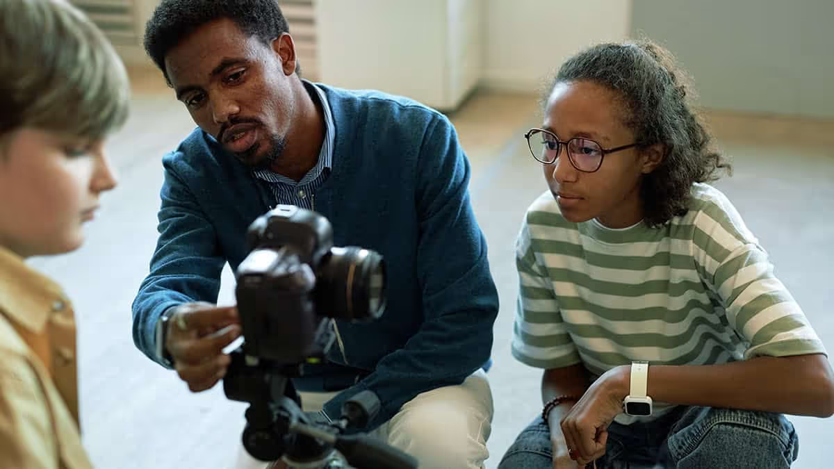
If you’re a shutterbug like me, you’re always after the perfect yearbook photo. But perfect shots are relative to the elements and subjects we’re aiming at. If it’s a picturesque landscape in Yosemite National Park, we’ll want Bridalveil falls and all surrounding elements in focus. If it’s a ladybug perched on the petal of a yellow daisy, this time, we’ll want to draw the viewers attention to the insect’s red shape. And, like most yearbook photos, if it’s of a group of students, we’ll want to make sure all of their smiling faces are crisp and clear. When it comes to achieving these goals you’ll need to master depth of field. And you can only do it through use of your camera’s aperture.

What is the Aperture?

Simply put, the aperture is the physical opening in the lens that allows light to pass through. The wider the aperture opens, the more light can pass through. Want to know how to take yearbook photos, and for that matter, great ones? Master the aperture.
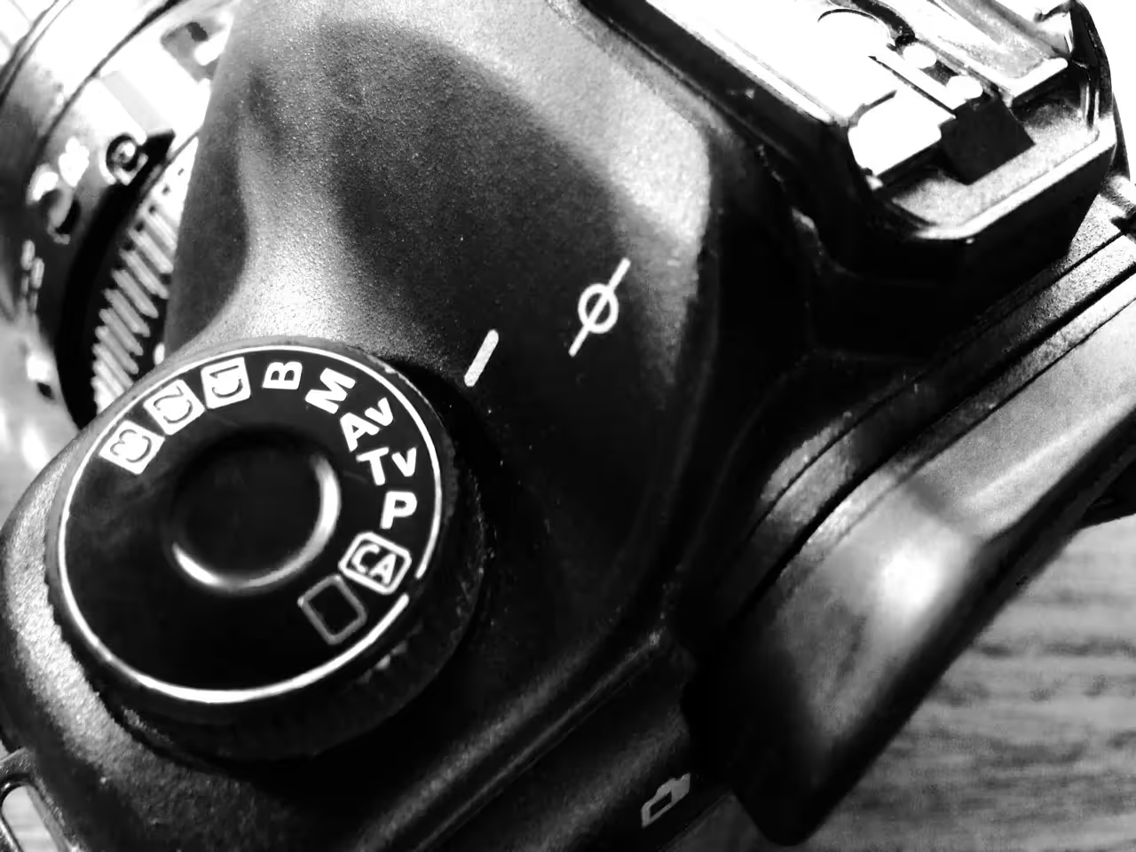
F-Stops

Cameras measure their aperture settings in what are called f-stops, written f/1.4, f/8 and so on. You can typically find the maximum aperture marked on the lens itself. What’s important to remember, is that a camera’s f-stop setting shares an inverse relationship with the the width of the aperture opening. Huh? In a dark room, with low lighting, by setting your camera to f/2.8 or smaller, you’ll be creating a very wide aperture opening, thus letting a lot of light in. A smaller f-stop number equals larger aperture opening. Remember this inverse relationships as I’ll refer to f-stop numbers for the rest of the post.

Large F-Stop Numbers

There is something else that happens by using different f-stops, and sometimes with dramatic effects. Depth of field. In the image below, the f-stop is set at f/8. Some professionals call this the “sweet spot” because it is the aperture setting that provides the sharpest focus for a lens. Notice how all of the elements of the photograph are in focus?

Small F-Stop Numbers

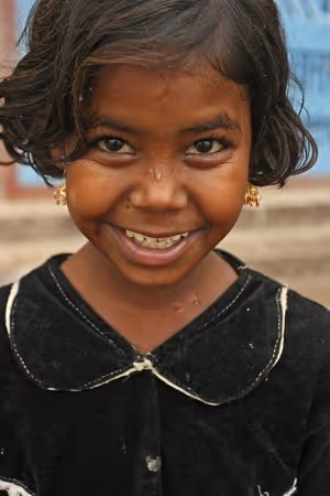
Now, let’s take it to the extreme by setting the camera on a wide open aperture setting (remember this means a small f-stop number). The photo below was taken by a lens with a maximum aperture setting of f/1.4. Notice how the baby’s eye is practically the only thing in focus, and that even her ear begins to “vanish”. This can create moody and dramatic effects with your photographs, especially for portraits or single elements.

Photo with an aperture of f/2 or lower

Depth of field and the aesthetic quality of the blurred portions of photographs is such an important part of photography, that the Japanese have turned it into an art. They call it boke. Boke • BOH – KAY focuses on the parts of a photograph that are not in the current plane of focus. We see these areas as blurry or hazy in the final work. The following photograph illustrates the beauty of Boke. Notice how the background almost appears to be painted due to its smooth texture?

Example of a photograph with blurred background

3 Tips for Using Aperture in Your Yearbook Photos

Let’s cover a few technical applications of depth of field depending on the subject matter in your yearbook photos.

Portraits

Yearbook portraits are probably one of the most common yearbook photos your school will capture. You’ll want to follow some key rules of composition, being certain that you are filling the frame with faces, but you’ll also want to make sure that the critical element of the photograph is in focus: The face. When taking portraits of one person, you’ll have a lot of flexibility in choosing your aperture setting. Be sure to focus on the subject’s eyes when using a low f-stop number (f/5.6 or lower).

Portraits with the focal point on the eyes

Yearbook Setting Shots

When taking photographs of the school grounds and building, or of events and activities with large gatherings of people, be sure to use an f-stop setting of f/8 – f/11. This will ensure that the focus of all the elements in the photograph are sharp.

Street scene shot with a narrow aperture

Yearbook Group Photos

The great documentary photographer, Arthur Fellig, when asked how he was able to capture critical moments of rapidly changing events, simply replied “f/8 and be there.” When taking group photos, you’ll also want to use an f-stop number of f/8 or larger. That way, the faces of all of your subjects will be sharp. This will also allow you to focus on your composition.

Example of a group photograph with a narrow aperture

The history of the yearbook: How technology is reshaping it.

The History of the Yearbook Begins
We all know it’s a steadfast tradition in American schools, but what exactly is the history of the yearbook?  According to a story by NPR, a Boston photographer named George Warren leveraged an advancement in photographic technology called the glass negative process to easily create many prints from one photograph.  Warren encouraged his student subjects to purchase multiple portraits, share them with each other and then turn those collections of portraits into professionally bound books.  The “Warren Yearbook” was born.  The National Museum of History in Washington D.C. has the 1860 Rutgers College Yearbook on display, an example of a Warren Yearbook.

1900s and the Printing Press

The next big shift in the history of the yearbook came in the early 1900s with the invention and adoption of the printing press.  Those books that were previously hand bound, one of a kind albums, could be mass produced with the creation of printing plates.  Costs dropped, making the yearbook more accessible to schools and students from all walks of life.  The stage was set for the growth of the traditional school yearbook

The Computer Age

Between 1985 and 2008 an explosion of technology brought on massive changes in the yearbook’s history, like desktop publishing, digital printing, social media and the widespread adoption of digital photography.  The computer age disrupted almost every industry in the world including incremental improvements to the yearbook.  Desktop software made it easier for schools to layout yearbook designs and digital photography provided a larger variety of shots from throughout the year.
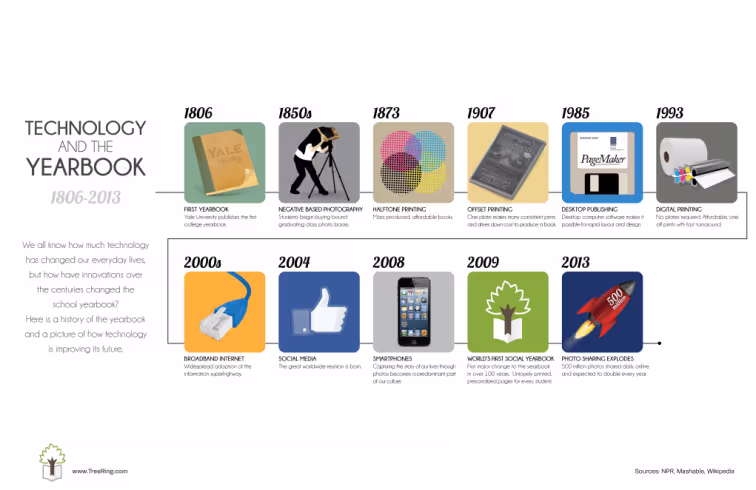
History of the Yearbook Infographic

The Social Yearbook

In 2009, with the mass adoption of social media and its prevalence as a part of the American culture, the yearbook made its first major shift in over 100 years.  Digital cameras and innovations in online software make it easy for students and parents to create their own memories and add them to their uniquely printed version of the yearbook.

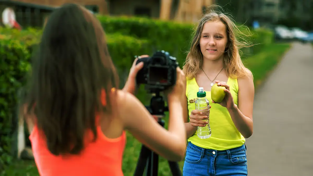
Yearbook Photo Ideas: 3 Tips On Composition

By improving the composition and lighting of your photos, you’ll be able to use any device with confidence. While drool-worthy mirrorless cameras are all the rage and DSLRs “look the part,” cellphones, tablets, and point-and-shoots can also produce great photos. The key is your perspective and awareness of the action.

Composition Basics

Composition creates compelling photos. When composing a shot, think about elements like background, framing, balance, leading lines, depth of field, and viewpoint. Even at sporting events or the school musical—when you’re limited on where you can stand—take some time to go through this list in your head to intentionally get the strongest photos.

In the digital age (did you read that in my grandma voice?), just clicking away and hoping for a usable image can be a waste of time. Being intentional for five to ten moments will help you anticipate action and yield more authentic images.

Book Fairs are visually busy events, as shown on the left. By lowering the camera, on the right, the tables become leading lines to draw the eye to the subject. He also blocks seven of the eight people in the original image.

Background

If it’s not drawing the eye to your subject, you might want to get rid of it. Take time to assess what is behind your subject:

  • If possible, remove distractions like garbage cans, signs, or other people
  • At sporting events, stand on the opponent’s side so you get your fans’ reactions
  • Position a photographer backstage or in the sound booth to capture behind-the-scenes action

Simple camera fixes such as adjusting the aperture (see “Depth of Field” below) or environmental ones (see “Leading Lines”) can help improve your photos’ backgrounds.

Framing

Your photos should focus on key interactions. For example, a tight frame on a student meeting their teacher on the first day of school captures a meaningful moment.

Alternatively, a wider frame might show the atmosphere of an event. Consider how close you want to be and what details you want in the shot.

If the event and space allow, move around to add diversity to how you frame your subjects. My yearbook adviser used to say, “Zoom with your feet.” It’s the second-best piece of photo advice I’ve received. (Lighting takes first billing for those of you playing along at home.)
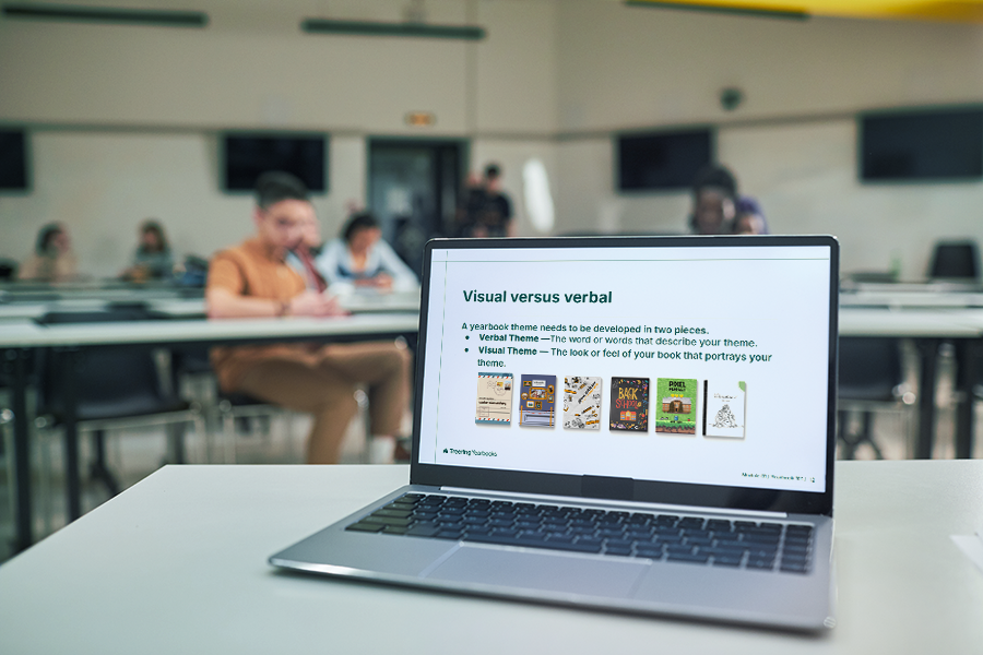
Although a student studying isn’t the traditional action shot, this photo is an active portrait. Our off-center subject is moving off the frame and yet his eyes take us to the laptop in the center of the image. (Bonus points for the subtle reflection in the glass.)

Balance

While symmetry works well in group shots, you might also want asymmetry to draw the eye to a specific part of the frame. Think about how elements are weighted in the frame to achieve the mood you want.

In the example above, the laptop is what holds us captive.

This photo exemplifies both leading lines and depth of field. Despite the action in the background, our subject pops because the rail connects her to the foreground and background, and the other students are slightly blurred.

Leading Lines

Use natural lines—like desks, edges of buildings, or stripes on the school bus—to draw the viewer’s eye towards the subject.

Depth of Field

This can be easily achieved with portrait settings on phones and cameras. Blurring the background adds drama and focuses attention on the subject. Whether you’re using a DSLR or a smartphone, depth of field, or aperture, can elevate your images.

Viewpoint

Experiment with angles. Try taking shots from above, below, or behind to add variety and interest. Different perspectives help tell the story more creatively and capture aspects that a straight-on shot might miss.

These five lessons will help improve composition.

Lighting Essentials

To say lighting is crucial is an understatement. In photography, too much or too little light can impact the photo’s quality. Be aware of your main light source. If you’re at an event, take a moment to assess from where the best light is coming.

Tips for Indoor Photography

Windows can be problematic if they are behind your subject. Unless you are aiming for a silhouette, keep them to your side.

If the lighting isn’t ideal, adjust. Sometimes, just asking students to move to a better-lit area can make a big difference. They’re usually happy to accommodate. For example, if you are photographing a dance, set up an area to take group photos with good lighting.

Using flash can also help in tricky lighting. For instance, in a situation with backlighting (like a window behind your subject), a fill flash will illuminate the subject and balance the exposure. In low-light conditions, adjusting your camera’s ISO or shutter speed with the help of a tripod can also help capture the shot without losing detail.

Except for the sun’s angle evident in image 3, these outdoor shots have little shadows or pinched expressions.

Outdoor Photography Considerations

Outside, natural sunlight is ideal, and just like inside, positioning is important. Move so the sun is off to the side or behind your subject to reduce harsh shadows and prevent squinting. Most professional photographers avoid outdoor photoshoots when the sun is overhead for this reason. (Basically, when the fun run is happening.)

We recommend using a tripod and angling yourself so the sun is at your subject’s side.

Remember that a good photographer’s eye matters more than fancy equipment. Whether using a DSLR or a smartphone, focus on framing, lighting, and timing to compose meaningful moments.

This blog is adapted from Sandra Violette’s Photography session from TRL 24 POV: I’m on the Yearbook Team. Violette, a professional photographer and PTO mom, serves on the Onboarding and Engagement Team at Treering Yearbooks.