April 2, 2025
2
Min Read Time
The easiest way to improve your yearbook photography is to spend two minutes editing your photos before you add them to your book. That’s because, in two minutes, you can make the two biggest improvements to any photo you have: composition and white balance.
It doesn’t matter if you or your staff purposely took the photo for use in the yearbook or if a parent snapped a shot on their phone and only gave it to you once you asked for help filling your book’s pages. If you spend one minute on each of these areas of improvement, you’ll have a yearbook photo that’s way, way better than the one you started with. We guarantee it.
In this blog post, we’ll walk you through why you should spend two minutes using these yearbook photo tips for composition and white balance, what you should think about before you make any changes, and how you can easily make those edits.
The normal process for editing yearbook photos can be a total drain on your time. The results are worth it, because, well, let’s face it: not-so-great yearbook photography makes a yearbook seem not so great.
Great photos, on the other hand, can evoke emotion, tell a story, and captivate an audience—all at the same time. And sometimes, a photo needs a bit of editing to get there. Cropping your photos for better composition can eliminate distractions and correcting the color to improve white balance and lighting can help your photos stand out more.
Spend enough hours eking every last ounce of potential out of a photo, though, and you’re bound to wonder whether it’s all worth it.
If that’s you, or if you’re totally pressed for time, you never need to get to that point.
That’s because two of the quickest, easiest editing techniques you can use will get your photo more than 90% of the way to its full potential.
If you want to keep going for that final 10%, go right ahead.
But if you’re pressed for time or stressed about deadlines, crop your photo to improve its composition, use color correction to improve white balance, and move on to your next photo. Because, when you have hundreds of photos you want to add to your yearbook, 90% of full potential is pretty darn good.
Just using our two yearbook photo tips will give you great photos and save you a bunch of time. But you can always save more.
The trick lies in the old “work smarter, not harder” saying.
Here’s what you need to think about to save yourself even more time and sanity during your photo editing process:
If you’re cropping your photos before adding them to yearbook pages, you’ll also want to keep this in mind: You’ll need a variety of photo constraints and orientations.
Which is a perfect transition to…
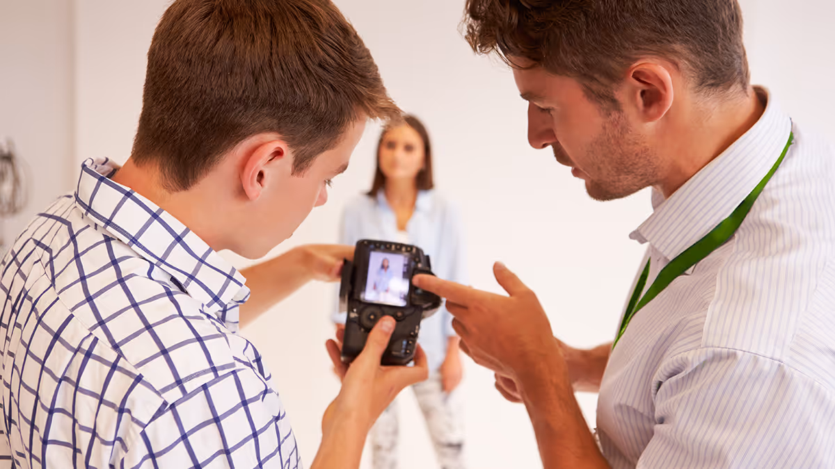
We’ve talked before about the three tips you should keep in mind when composing yearbook photos, but that doesn’t guarantee you’re always going to nail them. Or that people who are giving you pictures will, either.
Sometimes, the only way to save a yearbook photo is to crop it.
Take this before-and-after as an example:


There’s a lot of good stuff going on with the photo on the top: It’s well lit, the students’ faces are clear, and it’s easy to identify where they are.
The problem?
It’s the same one that haunts many yearbook photos: Drop it into a spread or collage and it’s not exactly going to be easy to identify these students. They were too far away from the camera when the photo was taken, and there’s just too much empty space around them.
You can solve that by tightening the composition. Notice how much more the two students fill the frame in the photo on the right?
That’s exactly what we’re going for.
When you’re cropping yearbook photos, keep these two tips in mind:
Of course, we’d be slacking in our advice if we didn’t mention that, no matter what, you should be cropping with a purpose. Or if you want to frame this advice slightly differently: Don’t crop for the sake of cropping. The new constraints for your photo should make your photo better or make your page layout better. If your photos are already great, and they look great in your layout, you can skip cropping.
Ever feel like your photos don’t really look like the breath-taking scenes you saw with your naked eye? We feel you.
Outside of cropping your photo, the easiest way to restore some of that magic is to make the colors of your yearbook photo more vivid and more lifelike. And you can do that by using the levels tool in your editing software.
To do that, though, you need to know some basics about that tool and histograms, the chart associated with it.
Here’s the crash course version:
A histogram is a graphical representation of your photo’s color distribution. The dark aspects of your photo are plotted on the left of the graph; the light aspects of the photo are plotted on the right. When you’re reading a histogram, you want to look for sharp peaks at either end of the scale. A sharp peak on the left side of the graph indicates underexposure, a peak on the right indicates overexposure.
When you’re looking to tweak the color composition of your photo, it’s those peaks you want to be looking for.
Here’s the quickest — and easiest — way to use a histogram to improve your photo’s color:
These two steps take about a minute to complete, and the result is awesome. You’ll see an improvement in contrast, richer and deeper colors, and an enhanced lightness that reveals hidden aspects of photos that are obscured by overly bright areas.
Here’s an example:
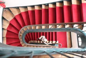
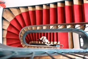
Notice how the red in the stairs and the fire extinguisher really pops in the one on the bottom? It’s less muted and, since the reds are deeper, it makes the person on the stairs stand out more, as well. We dig this change.
And really, that’s it.
It doesn’t matter who takes the photos. If you can spare two minutes and follow these yearbook photo tips, you can make your photos so much better by improving composition and white balance.