June 18, 2026
2
Min Read Time

Treering’s annual design contest celebrates the creativity, storytelling, and talent that make yearbooks meaningful. This year, we combined the contests for cover, custom pages, and spreads, creating our biggest challenge yet.
Your response was incredible.
Three groups of judges evaluated over 1,000 entries from parents and school leaders for
Connections to the communities they feature became the overarching message from the top ten spread submissions. The winners emerged because they transformed school coverage into student-centric narratives. Rather than showcasing school traditions, these top spreads preserved them.
.png)
“It ticks all the boxes,” one judge said as she identified the use of hierarchy of text and the modular design. Everyone else leaned in during the final round and started calling out additional details:
The spread teaches something while entertaining. The consistent visual language becomes part of the narrative explaining Neill’s version of the Ron Clark House System. Since their mascot is the Longhorn, they round up students into Herds to build connections across grades and encourage positive behavior.
“It was the most challenging spread in the book,” parent volunteer Jennifer Griffiths said.
Because so much happens during the school day that parents don’t see, she designed the whole yearbook with the family in mind. She intentionally paired photography with concise, purposeful copy to help readers understand what they were seeing and why it mattered.
On a single spread, she successfully explained Herd lunches, the "Leader of P.A.C." recognition program, herd identities and colors, and the P.R.I.D.E. values that connect them all. Every design element worked together to support the story.
“I think it paints a clear picture of how [the Herd System] all works,” Griffiths said.
.png)
Judges praised the spread for organizing a large amount of information. The overlapping edges create depth and visual interest, making it feel immersive. The details made us engage with the page rather than simply scan it.
Most importantly, the consistent card structure brings order to what could have become design chaos. Repetition creates a clear visual framework, while variations in photography, card details, and special character cards keep the spread engaging from start to finish.
The trading cards themselves began as a celebration of the district-wide faculty and staff kickball games and a fundraiser for the faculty and staff end-of-year fund. Designed by STEM Specialist Katy McDonald and printed in the district printing office, they became a phenomenon. Students traded them. The school had to do at least four print runs. Card 67 was in high demand, as were the two “rare” mascot cards featuring Shadow the white tiger
As PTA Yearbook Vice Chair, professional photographer, and one of the creative leaders behind the book's overall visual direction, Jen Betrand recognized that the trading card craze had become an important part of the school year.
PTA dad and yearbook co-editor Brandon Baker “designed [the spread] to feel nostalgic and interactive, as if the cards had been scattered across a dining room table during an afternoon of trading with friends.”
What was a placeholder for a staff feature became a moment in time: Baker and Betrand revitalized the traditional “here are the teachers” approach.
"We wanted viewers to feel invited into the experience," Baker said.
This design relies on a strong grid structure that creates immediate organization while allowing each student's personality to shine.
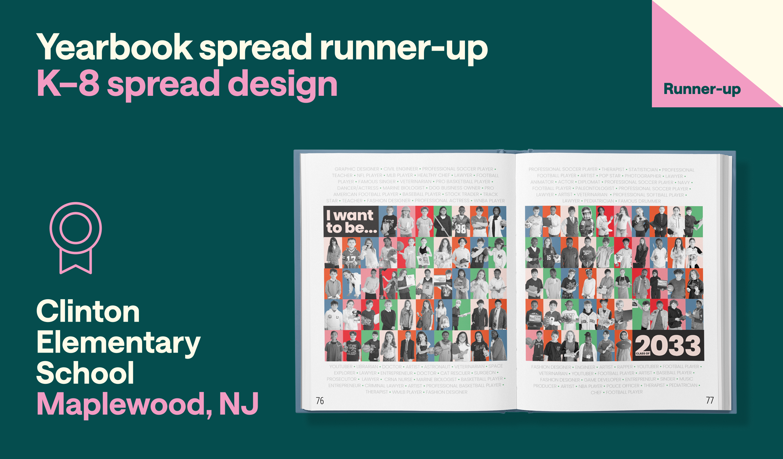
First-time editor Leslie Torre said, “I saw the page laid out in my head.”
Rather than overwhelming the page with decorative elements, Torre’s design uses repetition strategically to create a cohesive look that feels polished and energetic:
The original photographs were part of a display showcasing the 5th graders' career goals. Torre added it to the book as part of their permanent record.
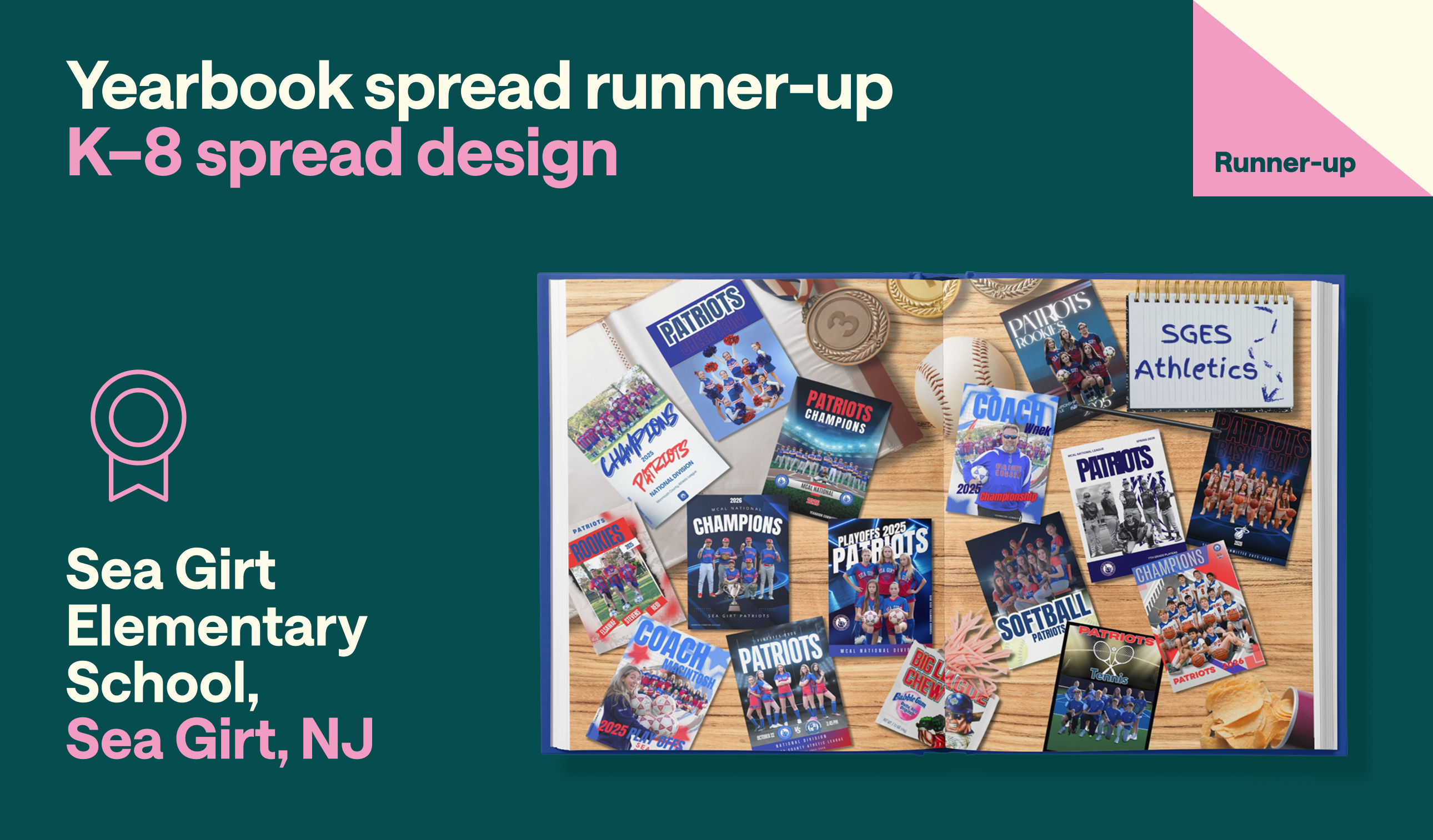
Judges noted that every element on Sea Girt Elementary’s athletic divider felt purposeful, contributing to a cohesive aesthetic that elevated the story beyond a standard sports feature. They explored the layered objects and intentional props. Strong composition, thoughtful use of scale, and attention to detail give the photorealistic layout depth, while the consistent visual treatment ties the entire spread together.
Photographer Doreen Werdann created the athletics cards for teams. She featured rookies, 7th and 8th graders, and coaches; this spread is a small part of the collection.
Werdann uploaded the cards to the Treering app, and Yearbook coordinator Kristy DeCresce helped make it more photorealistic by adding shadows and elements such as trading card sleeves, chips, and elements you’d see on a student’s desk. Their memorabilia-inspired approach presented the cards as cherished keepsakes rather than mere participant records.
It was easy to imagine this scene in any Sea Girt student’s home.
Honorable mentions

As you can see, the judges consistently rewarded authentic representation over decoration and storytelling over trends. We are proud to showcase the top entries to represent the creativity, passion, and student-centered connections that preserve school memories beyond a social feed.