June 19, 2026
2
Min Read Time
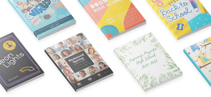
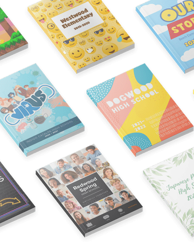
Treering’s annual design contest celebrates the creativity, storytelling, and talent that make yearbooks meaningful. This year, we combined the contests for cover, custom pages, and spreads, creating our biggest challenge yet.
Your response was incredible.
Three groups of judges evaluated over 1,000 entries from parents and school leaders for
These winners showcase deeply personal moments in professional ways. They distinguished themselves by blending rigorous design fundamentals with a deep commitment to the student experience.
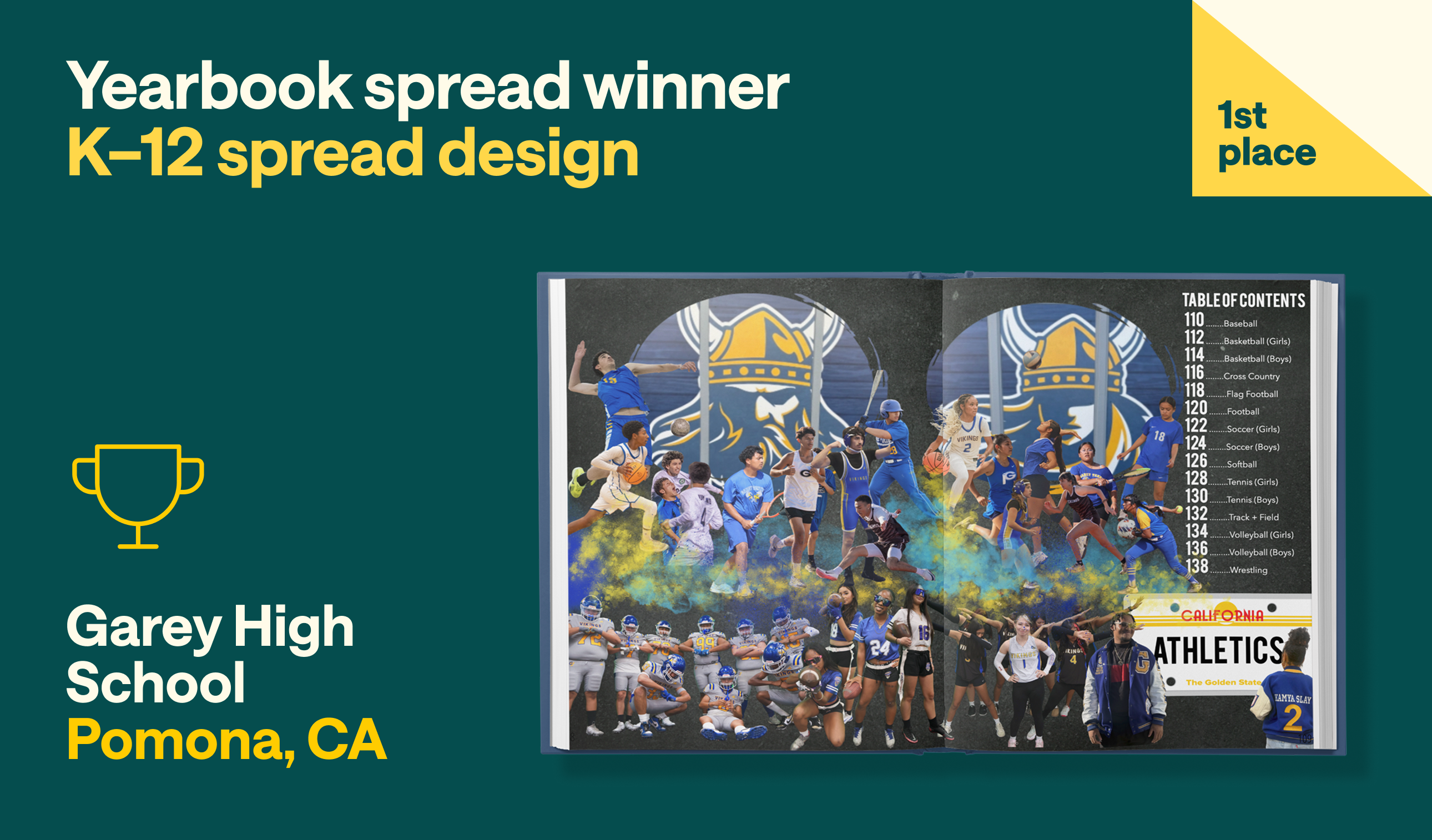
“This is how a student-athlete wants to be seen,” said one judge.
“It defines ‘main character energy,’” said another.
This spread was bold. It was confident. As a divider, the layout transforms student-athletes into larger-than-life figures through dramatic portraiture, layered graphics, and poster-inspired composition.
And it almost didn’t happen.
Garey’s yearbook class was canceled. Talks of an online-only solution for the 2025-2026 school year were circulating. Recognizing that someone, somehow, would still have to create the book, first-year adviser Kara Montgomery-Roa took over the yearbook club with a brand-new staff. She was also new to photography and to Treering.
The club took the game day photos across the top. Montgomery-Roa held media day photoshoots and took the posed images across the bottom.
The senior-focused photoshoots originated as a fundraiser for the yearbook club. “I ended up offering the option to our sports teams as a free media day because they were so happy to see themselves,” Montgomery-Roa said. (They made money doing hotdog sales instead.)
After using free online tools to remove the backgrounds, she “used Treering editing, especially spray paints, smoke effects, and lots of trial-and-error layers to achieve the effects.”
Garey’s yearbook went from almost not happening to doubling in sales. And that’s what meaningful coverage does.
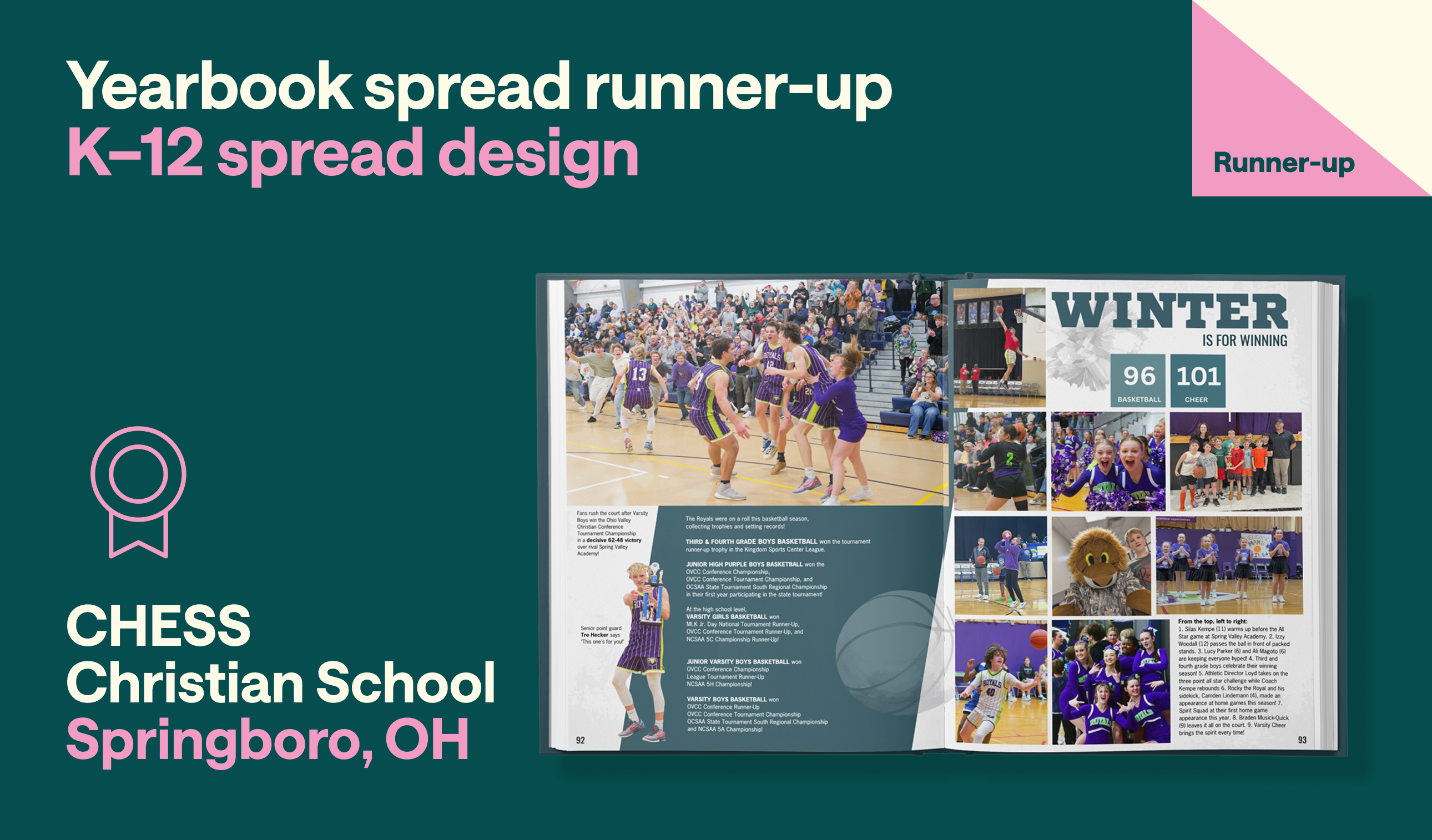
A masterclass in visual organization and design discipline, CHESS demonstrated the power of strong fundamentals.
The result is a spread that feels balanced, readable, and professional without sacrificing energy or visual interest.
“This is our title page leading into our winter sports section,” adviser Erin Fullam said. “We had so much happening that season that we wanted to get some team highlights on the lead-in spread.”
In many ways, Fullam’s team demonstrates why classic yearbook design principles continue to endure: they prioritize storytelling, readability, and reader experience. In a competition filled with ambitious concepts and experimental approaches, CHESS stood out by demonstrating just how powerful strong yearbook fundamentals can be when executed at the highest level.
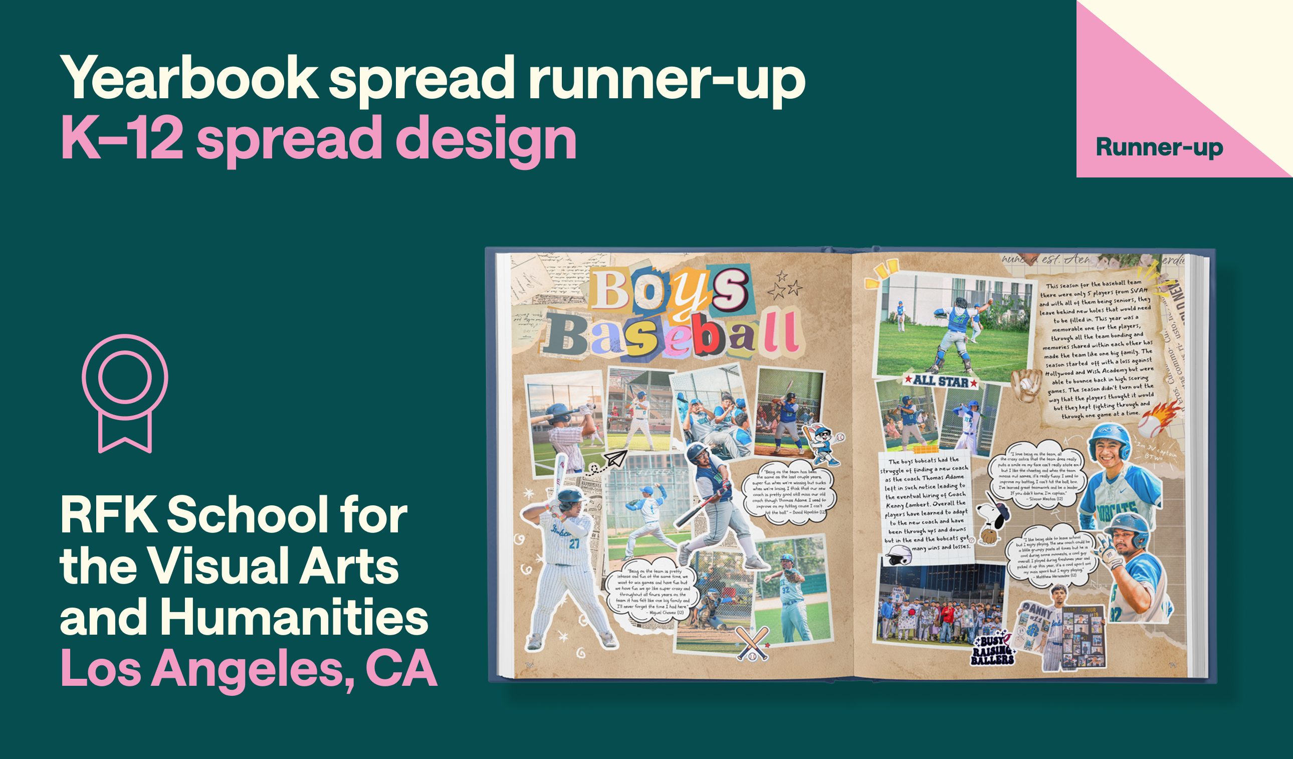
What judges appreciated most about RFK School for the Visual Arts and Humanities' baseball spread was its ability to balance thematic consistency with creative independence. As part of a yearbook built with the theme “Scrapbook Memories,” student Miguel Chavez-Juarez embraced the handmade, collected feel of a scrapbook while still developing a visual identity uniquely suited to the baseball team.
As a member of the baseball team, Chavez-Juarez took most of the photos on the spread from the dugout. He interviewed his teammates and created the stickers.
“You have to throw elements around and see what works to convey a message,” he said.
“[Chavez-Juarez] is in the CTE Animation pathway, which means he has work-based learning and technical skills,” yearbook adviser Andy Hwang said. “He was able to transfer some of these graphic design and photography skills to yearbook, which is a standalone elective course.”
In a yearbook where every spread was uniquely designed rather than built from a template, this entry showed how a consistent theme can unite a book without limiting creative expression. The result is a spread with a clear connection between concept and content.
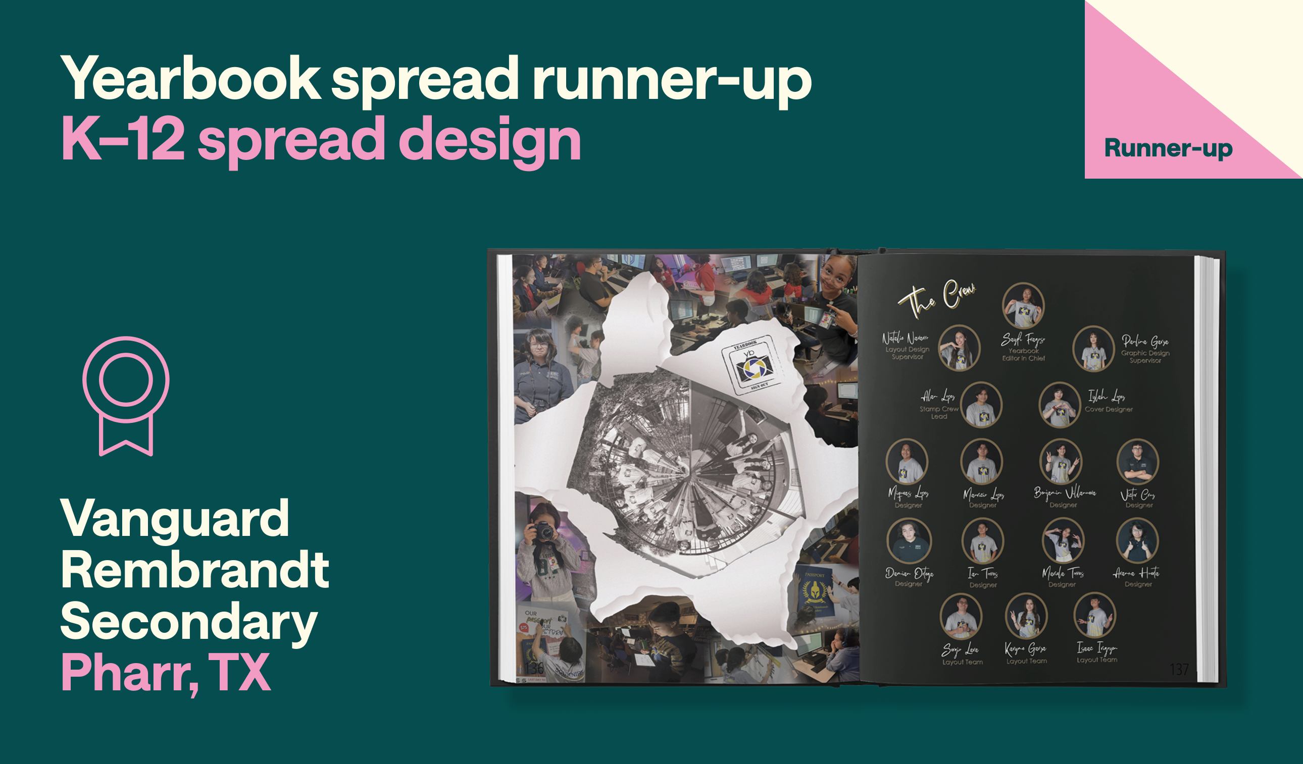
The wow factor of this design comes from its technical proficiency. The intentional layout decisions showcase the behind-the-scenes work that goes into building a yearbook. Every element feels intentional, from the alignment of content and balance of white space to the careful organization of photography.
Created within a CTE program where students earn Adobe Certified Professional and progress to Adobe Visual Designer, the layout demonstrates how professional-level training can be applied to tell meaningful stories about a school community. The yearbook is the final portfolio piece for graphic design seniors.
“I treat it like a real-life studio,” adviser Kereen Rodriguez said. “Students get to really come out of their comfort zone and work with customers (teachers or other students), we problem solve as a team, and definitely a breakthrough to their own creative cave.”
While the spread highlights the yearbook program's technical capabilities, its greatest strength is that those skills are consistently used in the service of the students being featured.
As you can see, the judges consistently rewarded authentic representation over decoration and storytelling over trends. We are proud to showcase the top entries to represent the creativity, passion, and student-centered connections that preserve school memories beyond a social feed.