June 24, 2026
2
Min Read Time
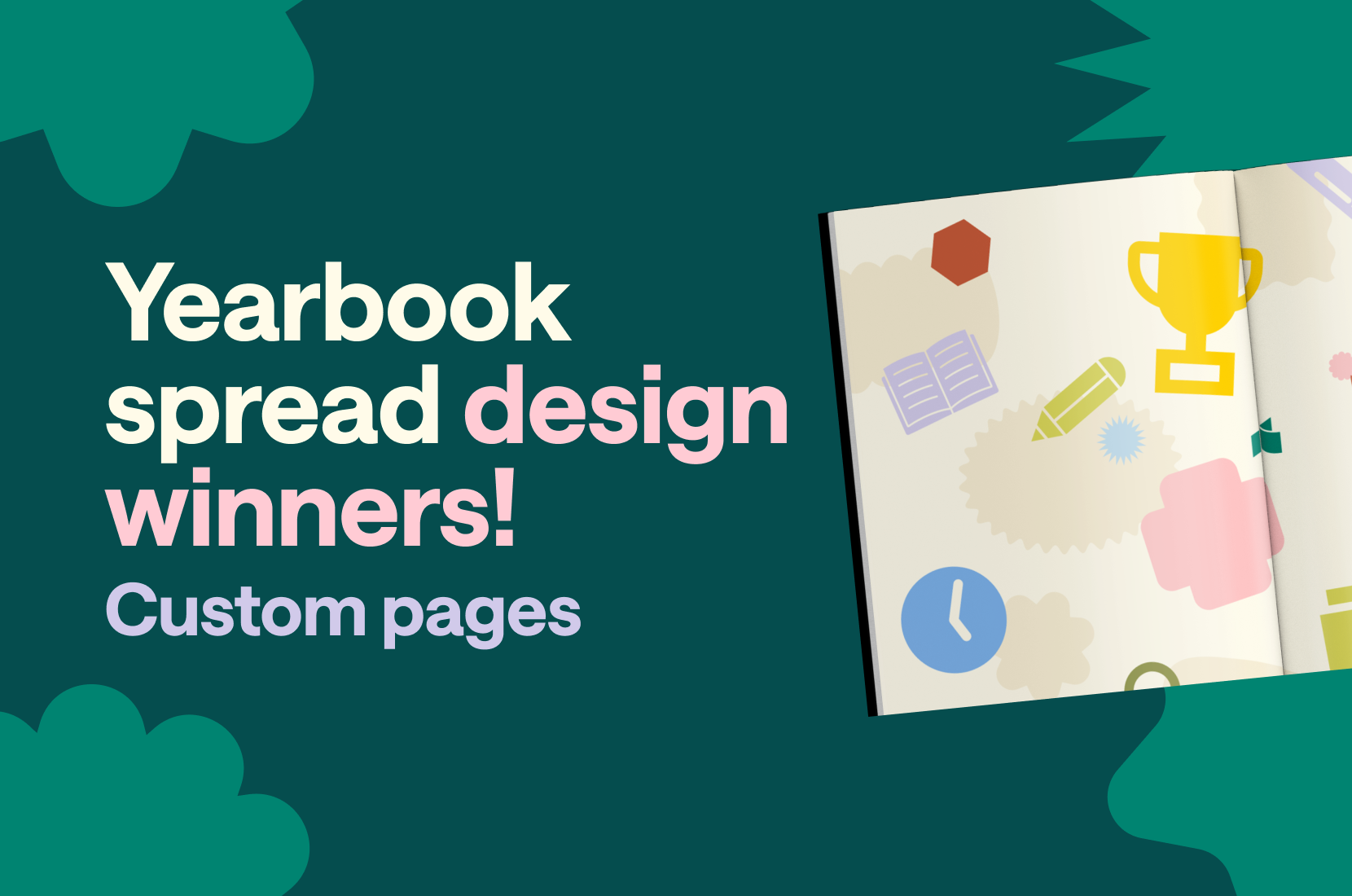
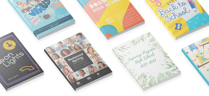
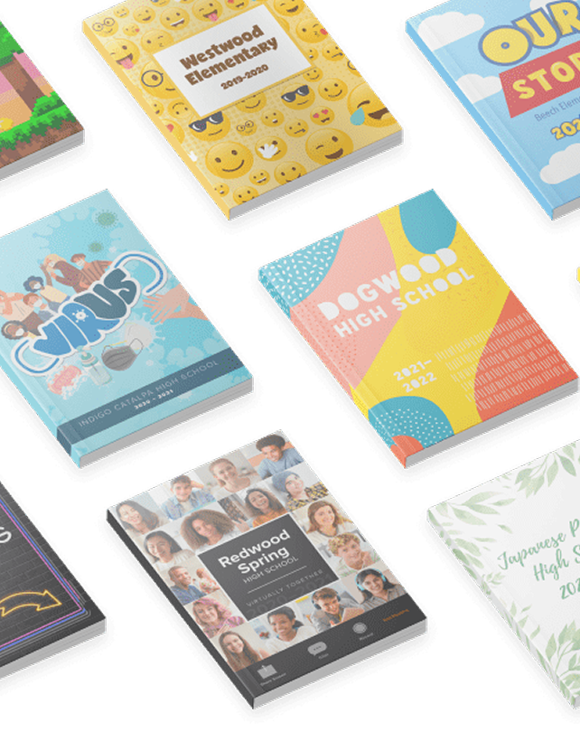
Treering’s annual design contest celebrates the creativity, storytelling, and talent that make yearbooks meaningful. This year, we combined the contests for cover, custom pages, and spreads, creating our biggest challenge yet.
Your response was incredible.
Three groups of judges evaluated over 1,000 entries from parents and school leaders for
Unlike traditional yearbooks, Treering gives families the option to add two personalized pages to their child's book. Those custom pages print only in their copy, creating a yearbook uniquely theirs. Some families use the space for milestone moments. Others create memory books, passion projects, travel journals, or family tributes.
This year's winners demonstrated exactly why customization matters. From a retirement handbook created by an entire school community to a first-grade time capsule, a student-designed historical travel journal, and a magazine-inspired celebration of a milestone year, each entry used the format in a different way.
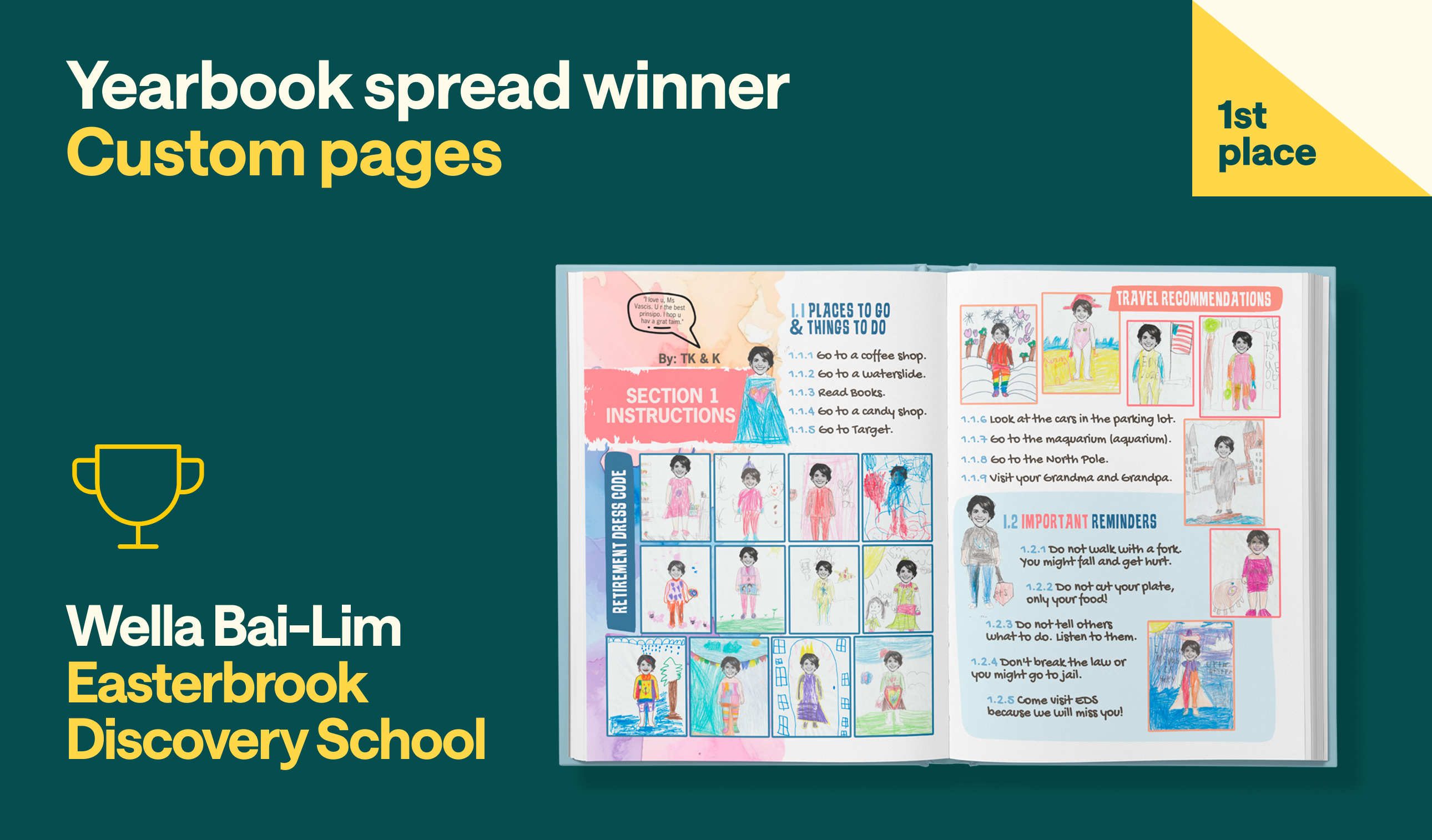
Some entries impressed the judges with design. Some impressed them with storytelling. Wella Bai-Lim overwhelmed them with both.
Created as a surprise retirement gift for beloved principal Sherri Vasquez, The Official Retirement Handbook transformed Treering's custom pages into something far larger than a personal keepsake. Students from every grade level across a school of 950 students contributed artwork, advice, and encouragement, creating a collaborative farewell.

Visually, the project succeeds through restraint. Soft watercolor backgrounds provide a consistent foundation, while student artwork becomes the focal point on every spread. The handbook has hierarchy and organization, allowing hundreds of individual contributions to feel cohesive rather than chaotic.
Repeated illustrations of Vasquez tie the pages together, while hand-drawn portraits and retirement recommendations preserve the unique voice of each grade level. Bai-Lim created the template using Vasquez’s school portrait.
More importantly, every design choice serves the story. The costume-themed illustrations reference Ms. Vasquez's love of costumes and her roots as a kindergarten teacher. The handbook structure turns retirement advice into a playful narrative device. The result feels less like a scrapbook and more like a publication created by an entire community.
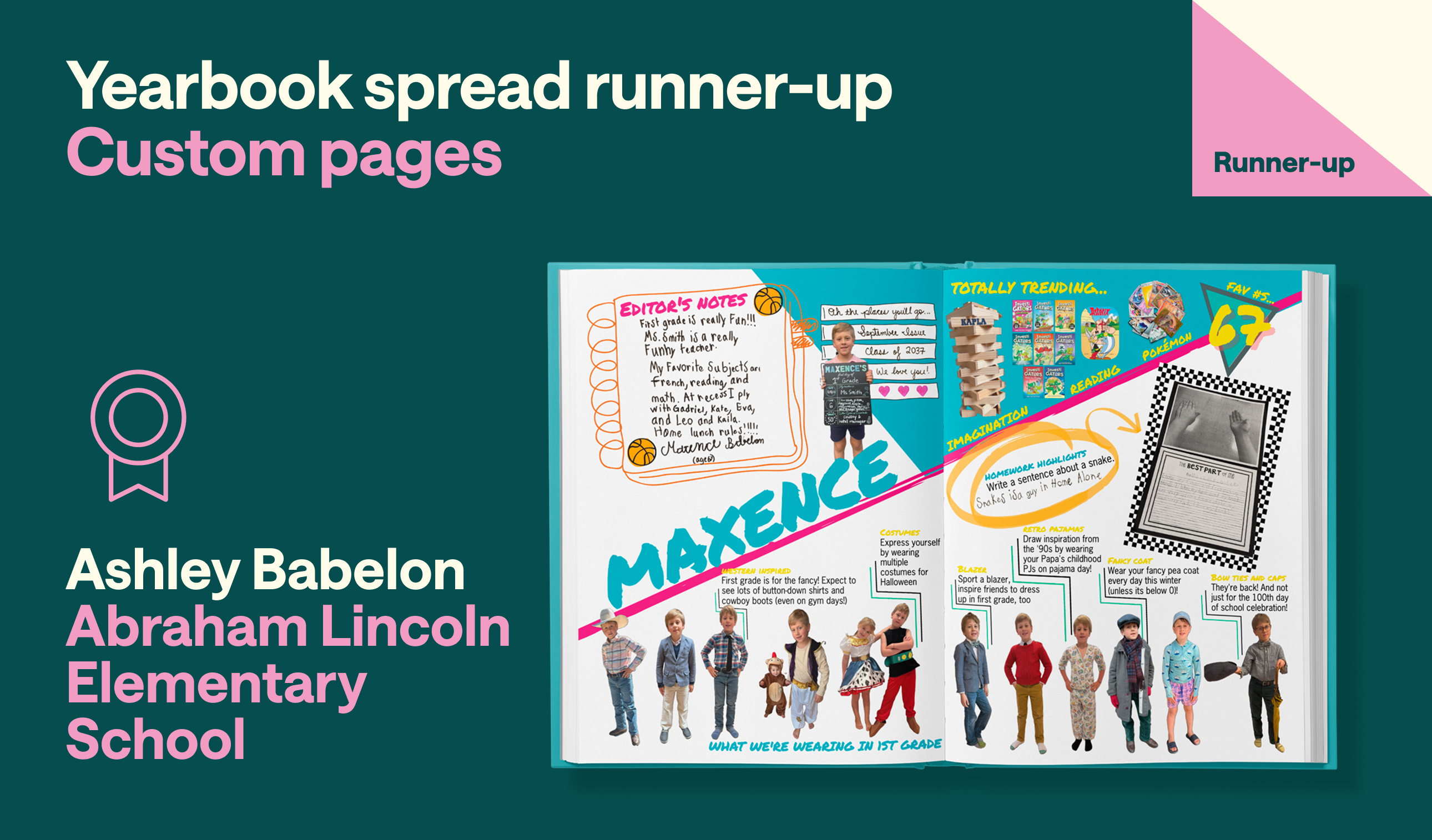
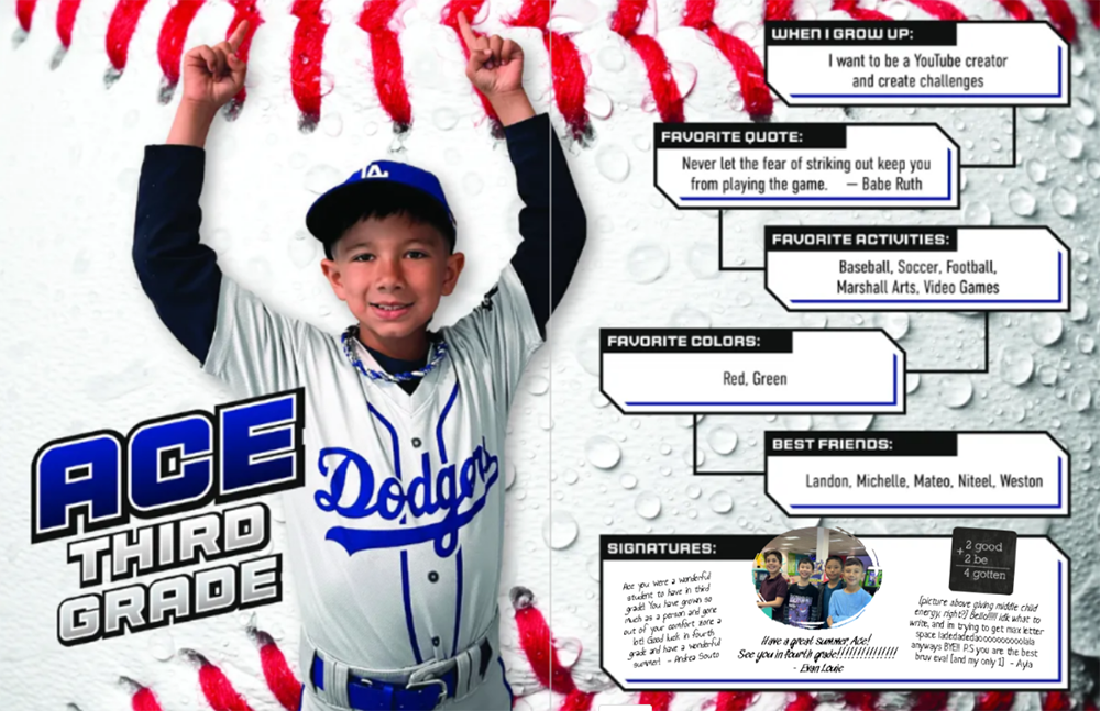
Ashley Babelon's pages capture first grade through the lens of her son Maxence's personality. Inspired by bright, energetic 90s ‘zines, the design combines handwriting samples, favorite books, Pokémon cards, schoolwork, fashion choices, and snapshots of everyday interests into a visual record of who Maxence is right now.
Judges loved the confidence of the layout. Bold colors, angled elements, hand-drawn notes, and layered graphics create movement throughout the spread. The mods are playful.
What elevates this spread is its authenticity. The spread celebrates the everyday moments of Maxence’s childhood.
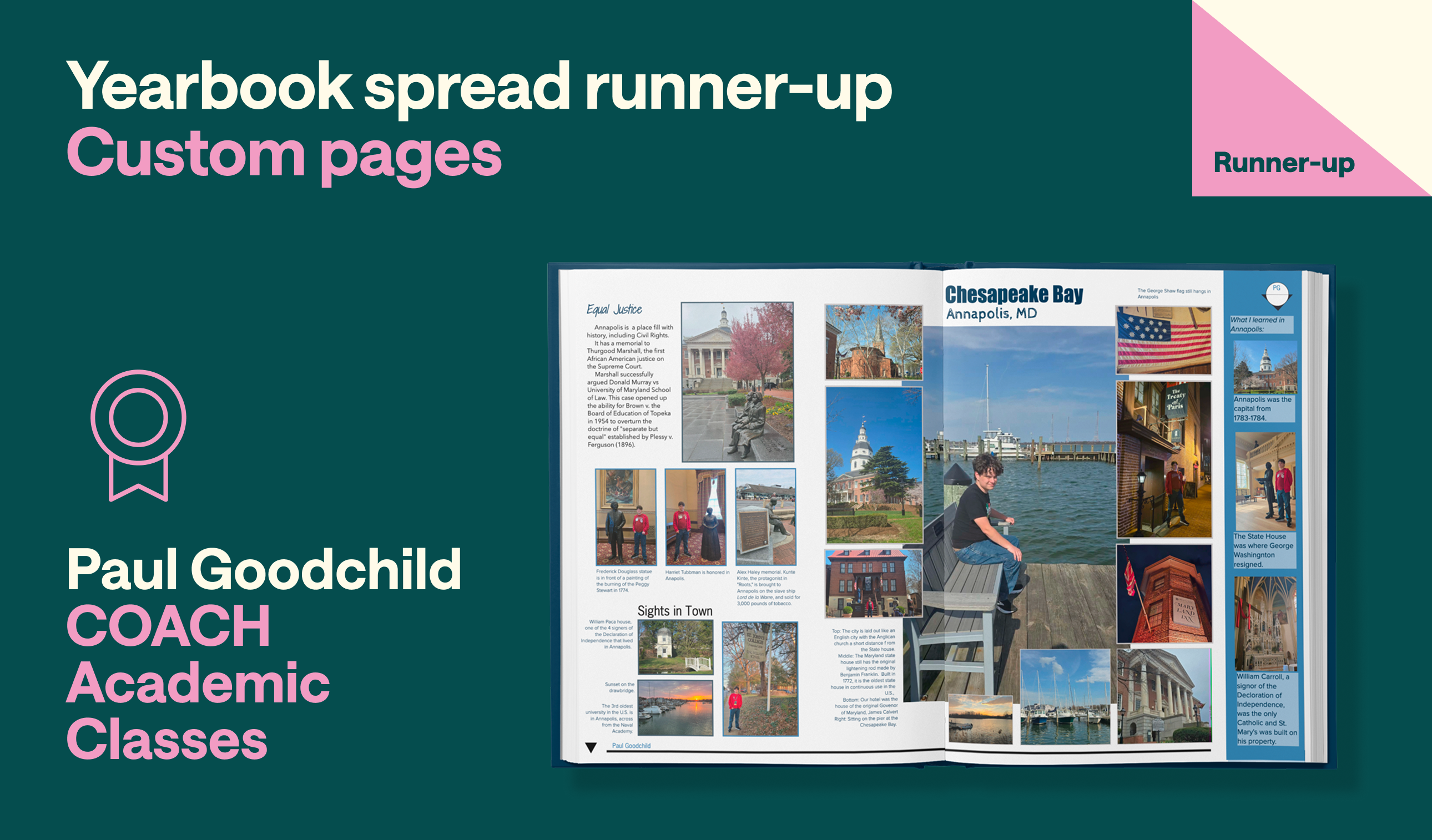
Many custom pages document memories. Paul Goodchild used his to document learning.
Created by Goodchild, a student, this spread chronicles a trip to Annapolis, Maryland, where classroom lessons from dual-credit U.S. History became real-world experiences. Historic landmarks, waterfront scenes, and reflections on Black history are combined into a layout that feels both educational and personal.
Judges appreciated the adherence to design rules: a dominant central image establishes focus, while supporting photos create structure and rhythm throughout the page. Informational sidebars and modular content blocks provide context without overwhelming the photography. The blueprint-inspired visual language seamlessly connects with the yearbook's theme, making the custom page feel like a natural extension of the book rather than an add-on.
Most importantly, the spread demonstrates thoughtful storytelling. Rather than simply documenting where he traveled, Goodchild explained what he learned and why the experience mattered.
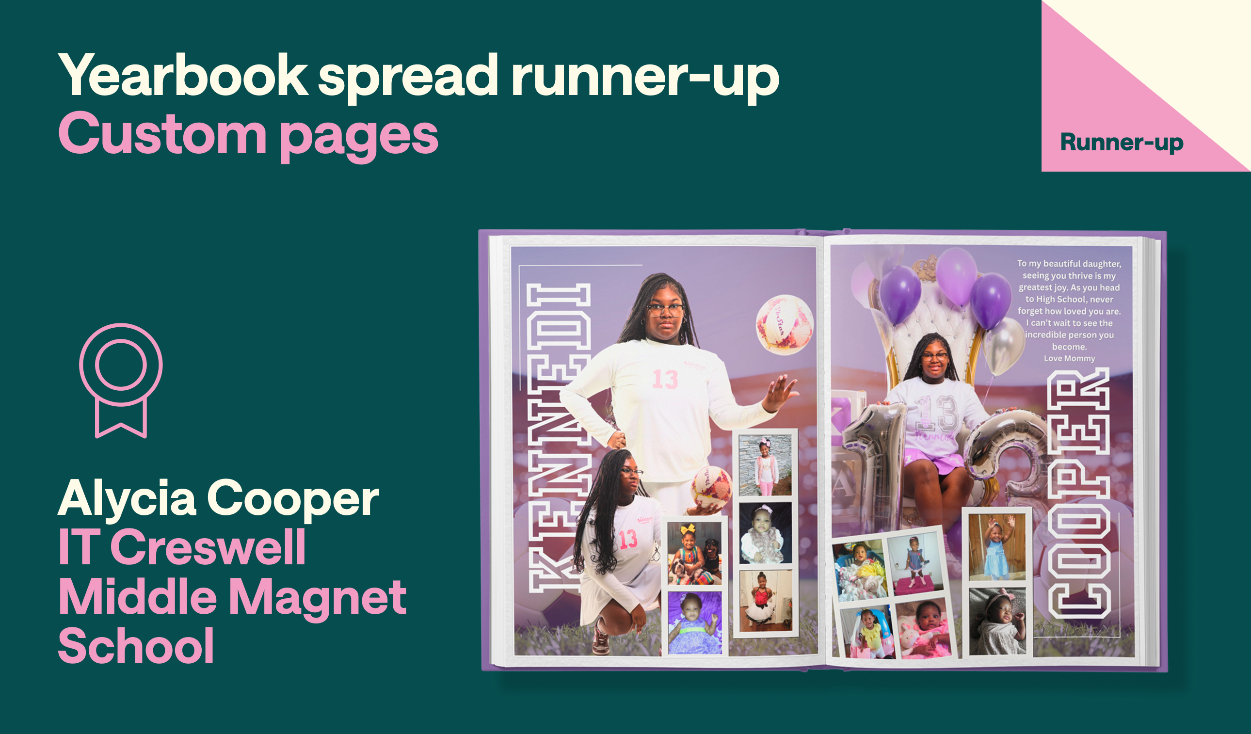
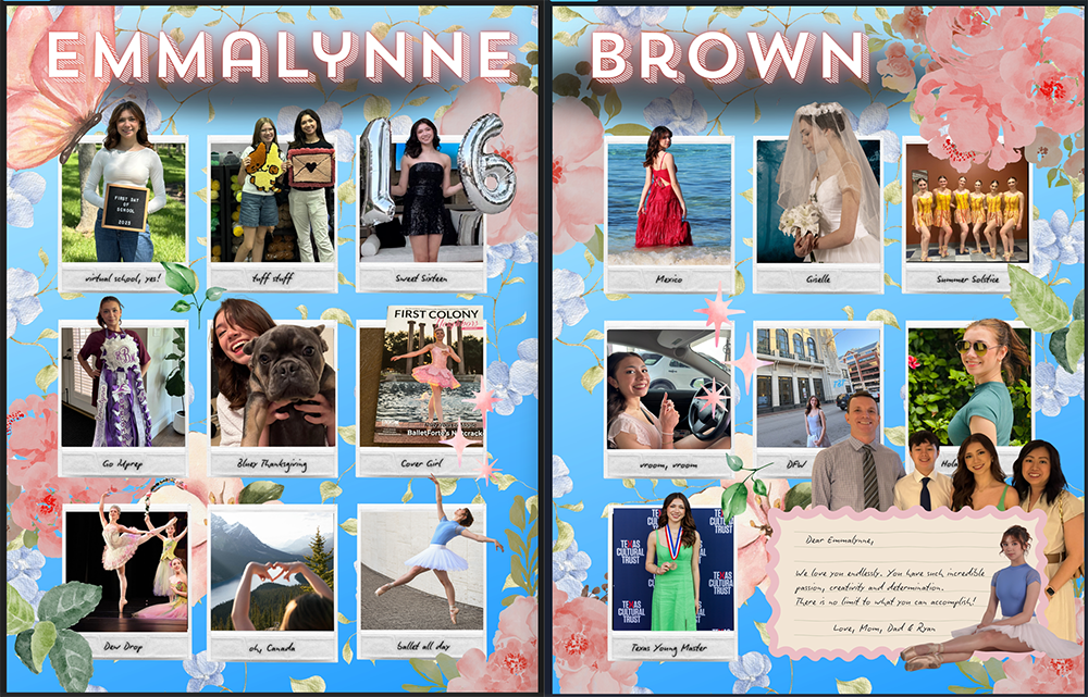
Alycia Cooper's tribute to her daughter, Kennedi, embraces the excitement and significance of completing middle school. Large studio portraits, childhood photographs, celebratory props, and a heartfelt parent message work together to create a keepsake centered on a major life milestone.
Judges were drawn to the visual presentation. Oversized typography creates an immediate impact, while the consistent lavender color palette ties the spread together. The contrast between contemporary portraits and childhood snapshots creates a clear visual narrative of growth over time. Layered photography, dimensional effects, and strong focal points give the design the feel of a commemorative magazine feature.
More than any other category, this one revealed what makes Treering different. Custom pages are the personal stories that appear alongside portraits, athletics, academics, clubs, and organizations, making your book truly yours.