November 4, 2025
2
Min Read Time

People often ask about the process behind creating yearbook themes—how we come up with ideas, what inspires the designs, and what steps go into making them both creative and versatile. To help answer those questions, I’ve gathered the most common ones I hear, along with insights into how we approach theme development.
– Allison Vecchio, Design Director
– Ashlyn Wong, Associate Graphic Designer
Allison: The very first step is listening. We start with focus groups, inviting editors and advisers to react to early design inspiration and share what excites them. That feedback becomes ourcompass—it points us toward where to explore next. From there, the design team dives into inspiration.
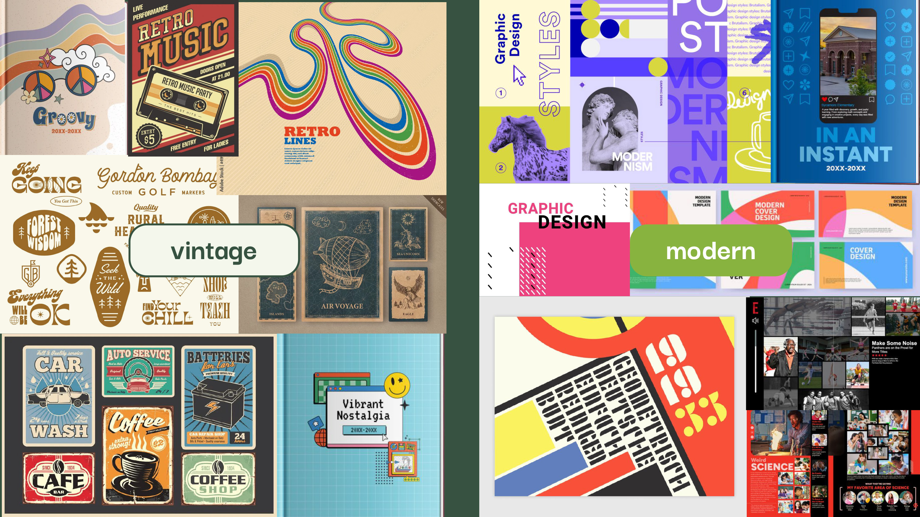
Allison: Inspiration comes from anywhere and everywhere—online platforms like Pinterest and Designspiration, opening credits in films and series, the type treatments on city signage, or the latest work from leading agencies like Pentagram. We also keep a close eye on current graphic design trends. Those pieces come together in a mood board, much like a collection of magazine tears, so we can see the direction starting to take shape. We cast a wide net at first, then refine and narrow down as we go.
One of the biggest themes actually came directly from our users during a focus group. The Gallery theme idea originated in a focus group session where a few customers described looking through a yearbook as feeling like walking through a gallery.

And, the idea for Gallery was born!

My most recent spark came during a trip to Madrid, where I visited the Museo del Prado, and the Museo Reina Sofía. My creative mind expanded tenfold viewing works by the old masters whom I studied years ago, such as Caravaggio, El Greco, Fra Angelico, and Heironymus Bosch.
Allison: Our process is customer-focused and data-driven. After running focus groups, we analyze the usage data in our application to see which themes are trending across schools. We combine that with customer feedback to understand why something resonates. Once we have that insight, the design team begins exploring themes that can work across different grade levels and schools.
Many questions come into play when we think about what to design. Does the theme make sense for all genders? Will it look too feminine, or too masculine? How can we achieve a healthy balance? Is this primarily for an elementary school, or could it be designed in a manner to apply to all grade levels?
Ashlyn: Color and typography decisions always begin with exploration and testing. We build out several palette and type combinations, then test them — dropping them into sample spreads, pairing them with backgrounds, and checking legibility. We look at how bold or neutral tones interact with student photography, and we make adjustments based on feedback from internal collaboration. It’s a cycle of experimenting, testing, and refining until the theme feels balanced and cohesive.
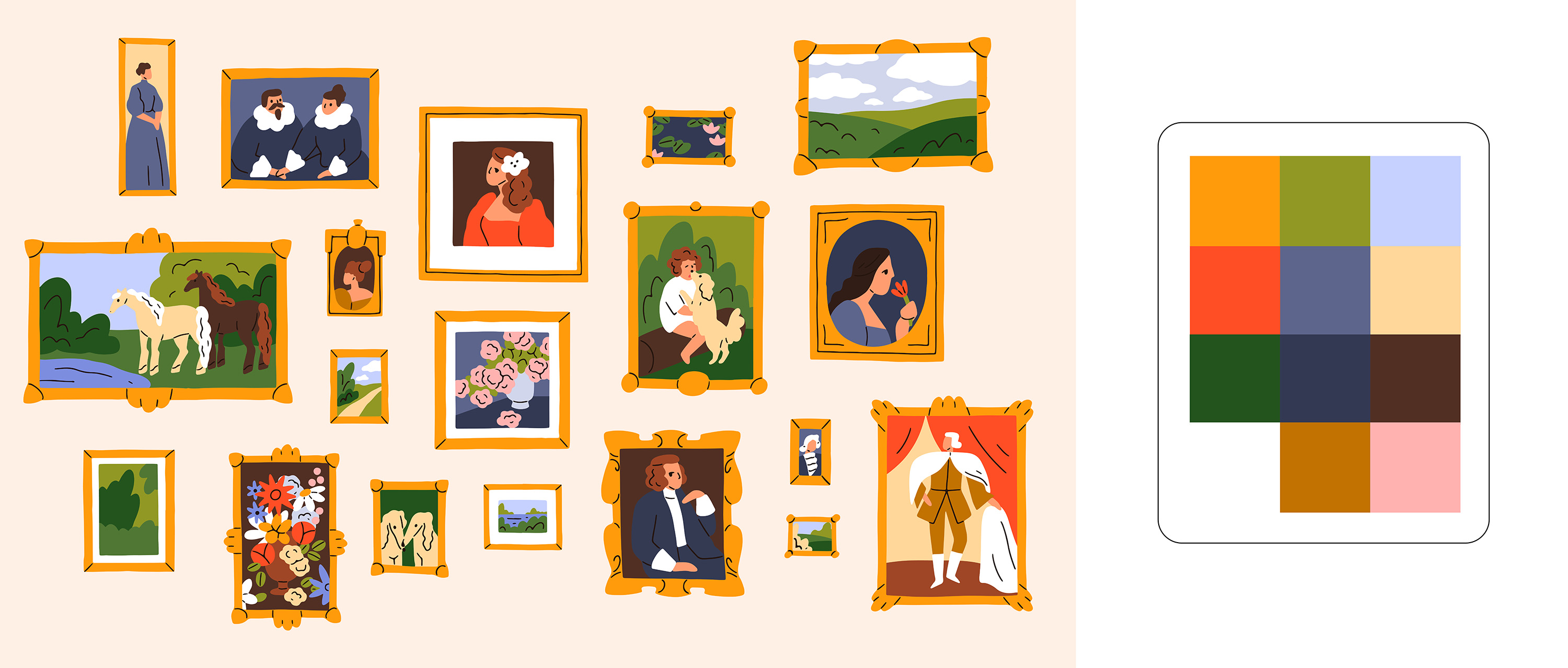

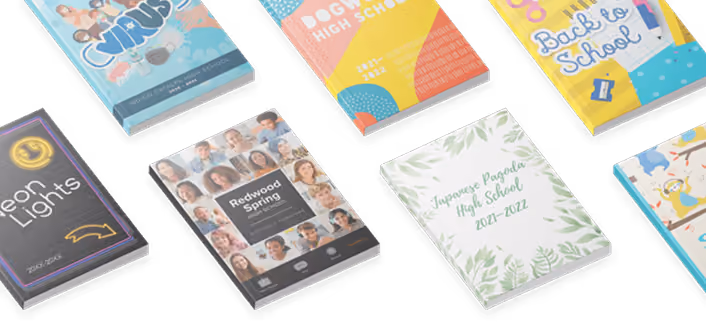
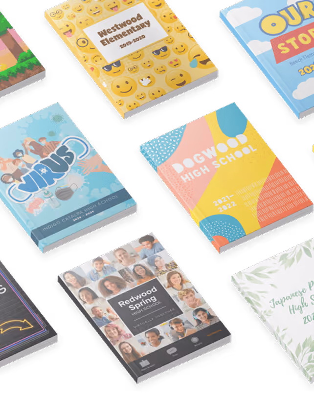
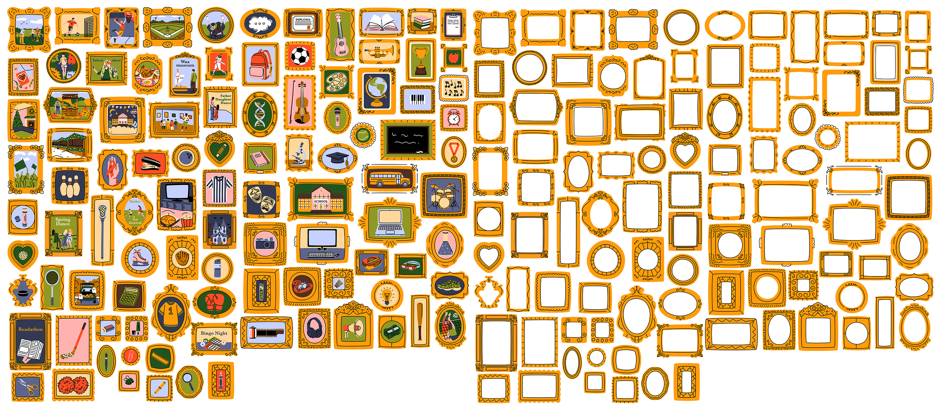
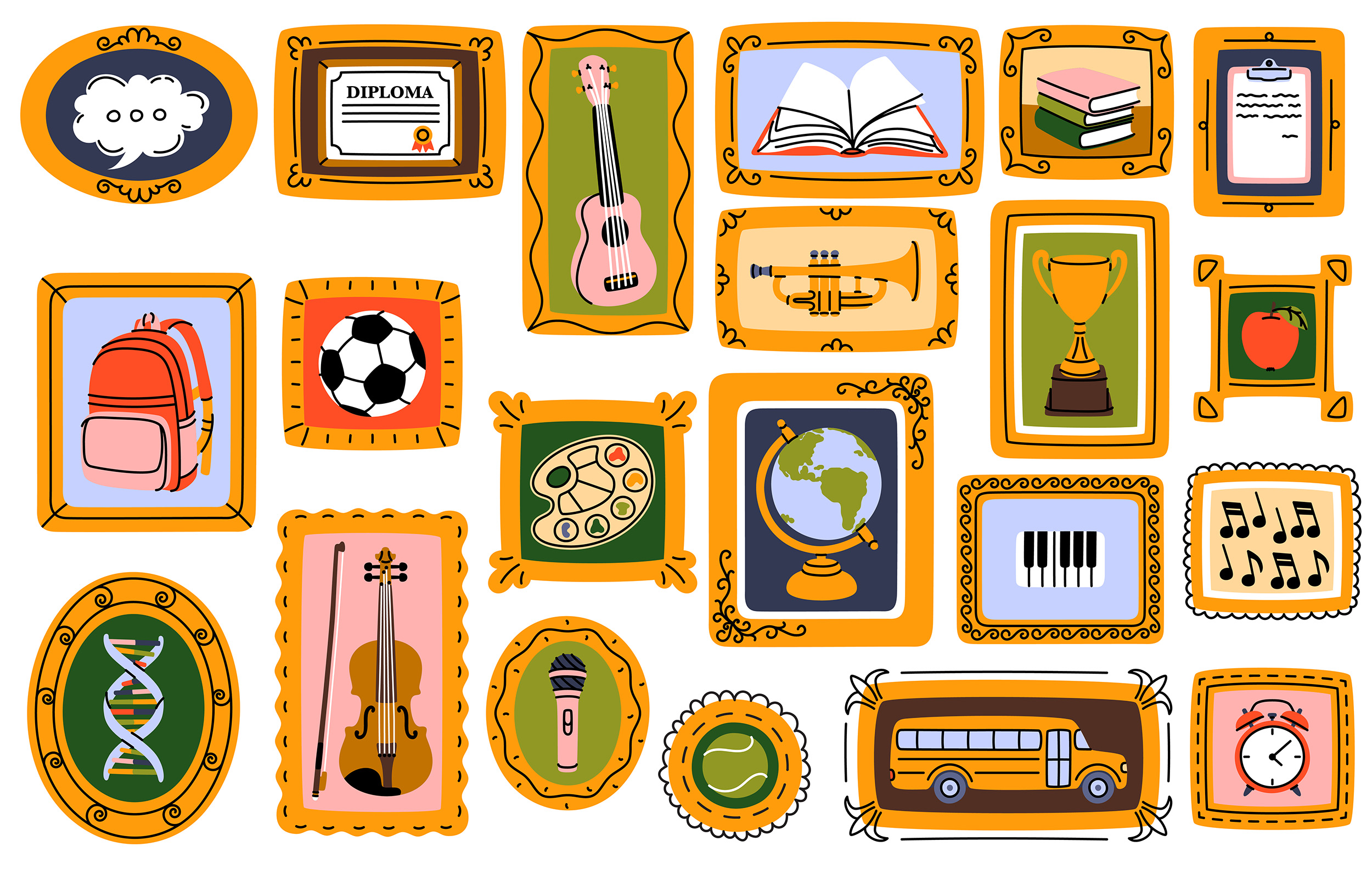
Allison: In our focus groups, customers told us they wanted the same collection of graphics across every theme. We set out to do this by working with illustrators to create bespoke artwork. Finding the right illustrator takes time. We review portfolios until we find one whose aesthetic aligns with the concept. For example, with the Gallery theme, we partnered with illustrator Ekaterina, whose warm, approachable style was a perfect fit. She created more than 100 illustrations that together gave the theme the feeling of walking through a gallery.
Ashlyn: The focus groups revealed that records and decades were popular, and we really wanted to give our users a full, cohesive theme that could synthesize these concepts. For the Record stands out because it challenged us to unify five distinct decades into one cohesive theme. Although we hit roadblocks and had to pivot several times, the final product was something fun, flexible, and unique. I’m proud of the way our team was able to not only fulfill our customers’ requests despite challenges, but problem-solve to create something revolutionary.
Allison: The themes that stand out most for me are the ones I see schools using again and again. Dream Big is one that always gives me the feels. It carries the charm of a children’s book, with richly illustrative backgrounds I created in Photoshop. Small details—a child holding a kite or soaring into the sky—symbolize limitless potential, inspiring students with the idea that they can achieve anything they set their minds to.