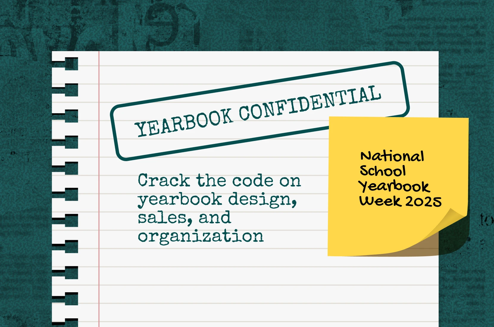
2
Min Read Time
Retro yearbook theme packages offer a nostalgic twist to your yearbook, bringing back the charm of past eras. They can transport you to different times and evoke a sense of nostalgia. Nostalgia in design is powerful. Fueled by shared experiences and moments with others, it reinforces feelings of connectedness and belonging. Embracing these themes can give your yearbook a bridge between past and present for your collective memories.
Retro yearbook themes use elements that are typically associated with non-contemporary looks. From vintage illustrations to classic color palettes, we’ll break down each decade in design below. Consider this the Eras Tour of Treering.
The Treering yearbook theme highlights Y2K aesthetic with futuristic elements and nods to retro design styles from the 1990s and earlier.
Could a OS-inspired theme be more early 2000s?
This retro futurism yearbook theme looks especially turn of the century when done in silver foil.
Since retro typically refers to events 20 years past, we begin with the advent of internet-influenced design. Remember when we stockpiled groceries and awaited the digital doomsday? A yearbook influenced by the turn of the millennium is characterized by a distinct blend of futuristic and traditional elements layered:
The 1990s embraced an eclectic mix of styles, often blending influences from different decades and cultures.
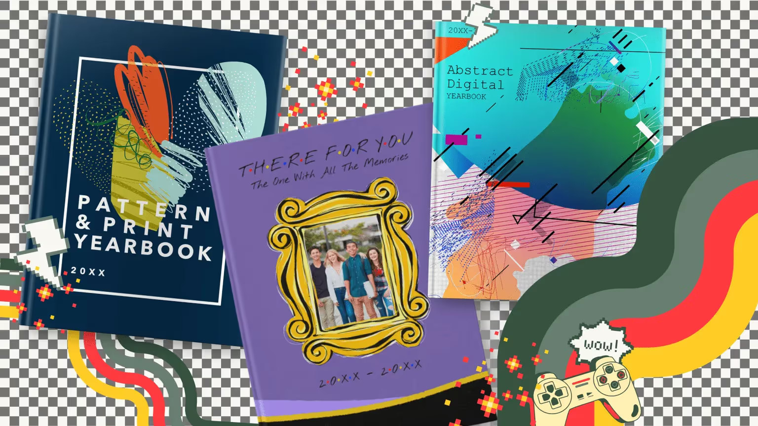
A pop culture-inspired theme is one way to add a retro look to your yearbook.
With the rise of technology, artists began to explore digital mediums to create interactive and multimedia artworks. The themes of the nineties centered around identity. In pop culture, it was the era of Friends and TGIF, and design often incorporated references to these cultural phenomena. With desktop publishing becoming more available to consumers, emerging designers pushed the boundaries of traditional design rules to use asymmetrical arrangements and overlapping elements.
Famously, the bold colors and gestural brushwork of Neo-Expressionism dominate eighties design. It’s also the period that saw the rise of digital technology, a pop culture explosion, and a distinct visual style that continues to be recognized and celebrated during spirit weeks across the nation.
It’s not a 1980s-inspired retro yearbook theme if it doesn’t include some of these:
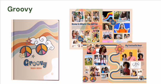
Graphic artists of the 1970s made ideas and concepts the focus over traditional artistic mediums. Artists often challenged the notion of art as a physical object. The color palette of the time featured earthy and warm tones, including browns, oranges, yellows, and olive greens. These colors were reflective of the era’s emphasis on nature and a more relaxed, organic aesthetic. While disco culture inspired illustrations with a sense of movement and rhythm, typography also showed some personality with exaggerated serifs, curves, and swashes.
Consider your distribution party for your retro-themed yearbook a piece of performance art.
The 1960s embraced bold and vibrant color palettes, including electric blues, neon pinks, and acid greens.
The retro yearbook theme inspired by the London Underground emphasizes clean lines, simplicity, and a focus on essential elements.
Customize the colors of Geometric Bold’s shapes in the page editor.
This was the decade of contrasts. Pop art and its bright colors celebrated mass culture, consumerism, and everyday objects at the start of the 1960s. Remember the soup cans? Later, major socio-political shifts impacted design and this period became synonymous with breaking away from the norm.
A yearbook with a counter-culture theme might want to incorporate retro elements inspired by
Consider this: your grandkids will produce a retro yearbook theme using key design trends from the 2020s: eco-conscious and minimalistic with sensory-friendly and accessible design.